
Spring 2014
Fry like a spy
The comic strip simplicity of Len Deighton’s Action Cook Book taught bachelors how to cook
The Action Cook Book was the product of a friendship between a great thriller writer and a great designer. The book was remarkable not just for the effect it had on a generation of previously maladroit bachelors whose culinary skills were lamentable at best, but also because in their own way, writer Len Deighton and designer Raymond Hawkey were simultaneously pioneering a new approach within their chosen creative fields.
It was Deighton who wrote The Ipcress File (1962) one of the archetypal spy thrillers of the 1960s, and it was Hawkey who had set about introducing the principles of graphic and information design to the popular press in a way that transformed the use of design on Fleet Street.
Both had studied at London’s Royal College of Art, Len Deighton arriving at the college in 1952, a couple of years after Hawkey who had recently gained a National Diploma in Design at the Plymouth School of Art. Both pursued an interest in illustration, though eventually Hawkey asked to move to the graphic design course. They first met, almost by accident, at a party at which Deighton was an uninvited guest. However, rather than turf him out (as he had been asked) Hawkey struck up a conversation with the gatecrasher and their friendship and years of fruitful collaboration began.
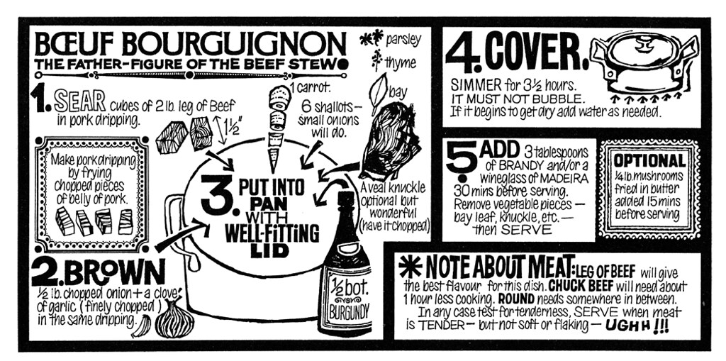
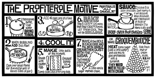
Cook strip from the Action Cook Book.
Deighton, in order to pay his way through the RCA, and alongside the occasional commission for illustrations, had taken a job in the kitchens of the Festival Hall. His understanding of cooking, and a particular affinity with offal, had started at the family home in Marylebone (he describes his mother as a ‘superb’ cook). Rather than take his growing collection of valuable cookery books to his new place of work, he set about summarising key dishes using illustrations and much shorter instructive text.
These ‘strips’ would be stuck to a neighbouring surface (usually a cooker), out of the way of implements and ingredients. It was about this time that Hawkey became design director of The Daily Express and with his colleague Michael Rand began transforming the appearance of newspapers, using graphic design to guide the reader through a paper, and illustration to bring complex, dramatic and important news stories to life in the form of infographics. Airline disasters, crime scenes, and even Apollo 13 received the illustrative treatment.
Deighton’s hospitality was to be the catalyst behind the appearance of his handmade cook strips in the national press. It was Hawkey – now at The Observer – who spotted one of these cook strips during supper at Deighton’s house. He suggested improvements, including the attention of a lettering expert to improve on Deighton’s own hand and the addition of a rudimentary grid. With those, he felt the strips might be publishable. They would form another piece of an increasingly graphic approach to the look of newspapers.
Almost instantly, the newspaper versions of the cook strips became essential material for bachelors. The brevity and economy which Deighton employed in paring a recipe down to its essentials (not dissimilar to the spartan prose of his novels) was perfectly suited to a generation of men for whom cooking was not a fashionable or regular pursuit. At the least, this new ‘capsule’ approach to cooking gave novices more confidence; at best, the resulting improvements would encourage previously reticent house-guests to stay for tea.
Hawkey and Deighton’s most important graphic collaboration, also on a book, had come some years earlier with the publication of Deighton’s debut novel The Ipcress File. Hawkey’s cover for the first edition was an austere yet beautifully judged piece of design that almost overnight transformed the approach to the design not just of airport thrillers but book jackets the world over.
This same beautifully calm drama would characterise much of Hawkey’s subsequent work, particularly his stunning title sequence for the film version of Oh! What a Lovely War, for which Deighton was screenwriter.
Cook strip from the Action Cook Book.
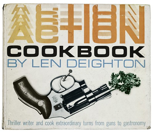
The first edition of Len Deighton’s Action Cook Book was published in 1965, the same year that the film version of The Ipcress File had its cinematic debut. Featuring Michael Caine as the book’s central character, Harry Palmer, Deighton provided hands-on support to Caine in the shooting of a sequence in which Palmer prepares an omelette for a fellow agent. In the end, it is Deighton’s hands that are featured in the close-ups of the preparation. In the film’s title sequence, a bleary-eyed Palmer fixes himself a cup of fresh coffee with a grinder and a cafetière. At least a couple of cook strips are pinned to the breakfast bar in shot.
The Action Cook Book was not Deighton’s first piece of culinary literature. In 1964, Haymarket published Drinks-man-ship, a collection of pieces on wine and spirits from Town magazine, which Deighton had edited. However, the Action Cook Book certainly capitalised on the author’s growing fame. The first edition evokes the graphic approach Hawkey took on The Ipcress File, dispensing with the bullets and chipped coffee cup, but reprising the agent’s Smith & Wesson with a sprig of fresh parsley tucked neatly into its barrel. The publisher’s copy line shamelessly borrows from the vernacular of the thriller, describing the book as ‘The secret weapon in the kitchen’.
The cover changes completely on a later Penguin edition. Also designed by Hawkey, the revolver is replaced by a lantern-jawed man of the world, deftly lifting al dente spaghetti from a cooking pot. The young woman at his shoulder is steadying herself, rendered weak at the knees by her man’s way with utensils. The content though, is the same, and it is this version that was re-published in 2009 coinciding with Deighton’s 80th birthday.
As a collection of culinary advice and recipes from the late middle of the last century, the book has clearly aged in some respects. Coffee was described as a ‘luxury drink’ (and instant coffee, though not worth drinking ‘should be kept in the flavouring cupboard’). The suggestion that bacon can be stored in a cool place wrapped in paper would certainly cause panic among today’s home economists. Some of the advice is unequivocal. When preparing a pork loaf, you should ask your butcher to grind the pork. If the butcher complains, you should ‘shop elsewhere’. There are instructive passages on building a wine cellar, the bringing together of a store cupboard, and the likely requirements for a drinks party.
Yet in many ways the book is absolutely contemporary. Its desire to simplify what might once have seemed complex, and to strip back to the essentials could easily inspire the production of an app that would appeal to today’s man about town – even in a world of Jamie and Nigella.
Looking back, it was the good fortune of a generation of men that Deighton wrote as adeptly about omelettes as he did about double agents, and a happy coincidence that the transformation of the daily newspaper – so wonderfully choreographed by Hawkey – came together in what was to become arguably his most influential work.
With grateful thanks to Rob Mallows’ website and blog: deightondossier.blogspot.com
Raymond Hawkey’s cover for the Action Cook Book echoes his jacket designs for other Deighton best-sellers such as The Ipcress File and Billion Dollar Brain.
Patrick Baglee, writer, strategist, New York
First published in Eye no. 87 vol. 22 2014
Eye is the world’s most beautiful and collectable graphic design journal, published quarterly for professional designers, students and anyone interested in critical, informed writing about graphic design and visual culture. It is available from all good design bookshops and online at the Eye shop, where you can buy subscriptions, back issues and single copies of the latest issue. You can see what Eye 87 looks like at Eye before You Buy on Vimeo.