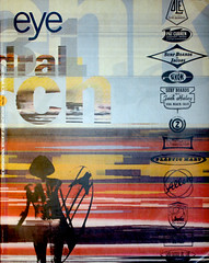
Spring 1995
Go-faster graphics
Designers Republic
Ian Anderson
Chris Ashworth
David Smith
Nice
Ian Swift
Mister Edwards
Radical young designers changed the face of British design in the 1980s. A decade later, their inventions have been softened into easily identifiable styles endlessly recycled by the commercial mainstream
Since the late 1980s, an easily identified design vernacular has evolved around British youth culture. Laden with stylistic tics, the dominant aesthetic is derivative and repetitive, consistently relying on a handful of voguish graphic tricks. Once a radical alternative to the mainstream, today’s youth-orientated magazines, music packaging and television graphics seem to have become immutably commodified.
The style can be seen everywhere from television commercials and ‘youth TV’ title sequences, to point-of-sale promotions and fashion spreads in the Sunday newspapers; from the pages of teen title Sky and the reinvented Face, to younger pretenders to the style magazine crown such as GSpot and Dazed & Confused. It is the inevitable choice for the mass-market music compilations pumped out by the likes of Telstar. The company’s The Best of Dance 94 is not only a hotchpotch of music, but a rogues’ gallery of graphic clichés. Ian Swift, designer of sleeves for the booming ‘new jazz’ market, was dismayed to see that Telstar’s 100% Acid Jazz album mimicked the visual identity he had created for the genre over several years. ‘It’s like a Butlin’s holiday camp version of my stuff,’ he complains.
This ubiquitous vernacular uses a number of predictable devices: outline and shadow fonts are preferred, often italicised to denote speed and excitement; descenders may be elongated to form points or swirls, again giving an impression of movement. If a fifth colour – silver or gold – is available to block in the inside of the letters, so much the better, otherwise brilliant white, cut out of a bright purple or orange background, will do. An outline Franklin Gothic Extra Bold Italic is particularly popular, often framing a textured image. Fluorescent pinks, oranges and greens are splashed on deliberately washed-out photographic images.
For body copy, either anonymous sans or quasi-typewriter faces are the order of the day, with lines of text boxed off in capsules, parts of which may be reversed out or laid one on top of the other to achieve a stacking or concertina effect. Otherwise lines are laid at angles as reversed-out strips of type, shooting out from a central image like rays from a star. Boxes rounded at two corners, bitmapped outline and other cod-computer fonts, characters (usually sans caps) printed over each other in translucent inks, ultra-thin overlapping letterforms, words resting on top of one another with no leading whatsoever, bands of parallel lines – the graphic equivalent of the go-faster stripe – abound.
A deliberately trashy, disposable sensibility comes across, a watered-down 1990s take on the punk aesthetic. There is ‘attitude,’ but it is highly self-conscious, almost as if it were mimicking the real thing – which, of course, it is.
Roots of the vernacular
It was in the aftermath of punk during the late 1970s that T-shirts, record sleeves and fly posters took over from airline liveries and annual reports as the most vibrant forms of contemporary graphic expression in the UK. Independence from corporate constraints meant an uncompromising, expressive, at times even political, aesthetic could develop. Barney Bubbles at Stiff Records, and later Malcolm Garrett at Assorted Images and Peter Saville at Factory Records, broke new ground and wrote the rules. Then it was the turn of the style magazine art directors to force the pace, in particular Neville Brody at The Face and Terry Jones at the more extreme i-D.
A decade and a half on, most of these pioneers of what came to be known as ‘street style’ have become so accepted as to be part of the establishment. But what they left behind them is a spirit of independence and irreverence which the next, mid-1980s generation of young Turks – ‘dancefloor designers’ like Trevor Jackson and Ian Swift, Phil Bicker at The Face and Stephen Male at i-D – assumed as their birthright.
Here, and slightly further down the family tree, in the work of dozens of earnest young graphic design companies plying their trade in small pockets throughout the country, lie the roots of the current vernacular. Encouraged by the government’s Enterprise Allowance Scheme and cut-price new technology, graduating design students have increasingly been able to set up shop themselves rather than join an established studio as a junior. Influenced primarily by street fashion and club culture (and more recently, Apple Macintosh culture), such designers often start on the periphery of the music industry, producing work for specialist shops, nightclubs, independent labels or fanzines. With this genre of street-level design, there is a clear trade-off between cash and self-expression: it is a safe bet they are not doing it for the money.
But curiously, the client-base appears to be shifting, and canny corporations keen to target the lucrative but capricious youth market are increasingly turning to finger-on-the-pulse designers to provide their products with that elusive dose of street credibility. A new respectability has been bestowed on what was once considered radical – even subversive – design, more through a change in social attitudes and the cultural climate than anything to do with the spirit of the design itself.
As a result, this second wave of street-style designers is developing an agenda of its own: an idealism tempered with pragmatism, a willingness to play the corporate game if the terms and the price are right. This has proved a mixed blessing. Worst of all, it has inadvertently spawned the seemingly self-perpetuating street-style vernacular. In theory, the mainstream appetite for youth-oriented graphics should allow innovative designers to address larger and hitherto unreachable audiences. But how far is it possible to retain a cutting edge when working in the mainstream, and how much do today’s designers have to compromise to please the large corporate clients who want to buy in street-wise design? Practitioners have coped with this dilemma in different ways and with varying degrees of success.
Overground underground
Nice, formed four years ago by Stephen Male, Neil Edwards and Richard Bonner-Morgan, was, until its recent decision to disband, one of the best-established of the second generation of street stylists. i-D, which Male and Bonner-Morgan continued to work on after setting up Nice, became a monthly portfolio for them, and record companies and other clients began to offer them work. If Nice finally deserted the ‘underground’ territory it once occupied, Male believes it is because such a concept no longer exists. A more democratised, mass-market ethos prevails in the clubs and the sense of exclusivity which at one time fed a school of cliquey, spiky graphic design has all but disappeared. ‘We have a sort of overground underground now,’ he says.
Male accepts that many clients were, and still are, paying him for a slice of what they perceive to be street style. ‘I have a lot of baggage left over from i-D, and I do have a bit of a problem with it,’ he admits. ‘One of the major criticisms of the style magazines was that they were just that – all style – and as soon as a big, more mainstream client buys into it, it becomes even more apparent that it’s only a style. It’s buying a surface sheen that only lasts until the next thing comes along.’
Early Nice design has many of the hallmarks of i-D: raw energy, brash colours, type laid over wayward images, and a cartoony retro feel, with references drawn from B movies, 1960s toy packaging, Tex Avery cartoons and interesting garbage. A 1989 12-inch cover for Queen B, a vampish pop tart enjoying her 15 minutes of fame, has her photographed in a skimpy tinfoil dress superimposed on a swirling, two-tone kaleidoscope. The main headline (her name) uses convex type in the style of boxing logos; song titles are set in a loopy, over-the-top psychedelic face, each framed in a bright capsule.
For Nice, the major transformation occurred three years ago when it was approached by Levi Strauss to produce a range of promotional and point-of-sale material. The relationship subsequently accounted for about 70 per cent of the group’s business. The work has obvious links to i-D, but is starker and more rudimentary, with an emphasis on simple black and white photography. Type, when used at all, is often in the Macintosh default face, Courier – a deliberate negation of the act of typeface selection and an attempt to keep the furniture around the central image as neutral as possible. Male and Bonner-Morgan have no qualms about applying their solutions in a more commercial context. Their interests have changed, and in pursuing a role that is an exercise in art direction as much as design, they have increasingly seemed to be trying to shed the baggage of the street-style vernacular.
Need for compromise
Also from a style magazine background and currently ensconced at Straight No Chaser, a five-times-a-year low-budget jazz-fusion title, Ian Swift too has declared his intention to move his career on to a more commercial footing. ‘You’ve always got to compromise to some extent,’ he says, ‘but I hope that people will be coming to me for my style anyway.’ Steeped in the traditions of the Atlantic and Blue Note sleeve designers, Swift has applied an updated version of the genre to club flyers and record sleeves in the UK, Germany and Japan, as well as to the 30000-circulation magazine. He inclines to large, brash, sliced-up letterforms which dance on the baseline, and funky, highly contoured or flowery fonts with a ‘Swinging Sixties’ mood. He often achieves a vigorous sense of movement in his handling of type, suggesting immediacy, but at the same time a slightly trashy, throw-away quality.
Swift recognises that his audience to date has been specialist, and he wants to widen the net. ‘At the moment, I’m trying to reach 1000 kids who go to certain record shops,’ he says. He has taken on an agent and is selling digitised versions of two customised fonts, Dolce Vita and Miles Ahead; he plans to issue fonts at regular intervals and sell them through Straight No Chaser. In Japan, where his design enjoys considerable kudos because of the popularity of the acid jazz scene, he has created an advertising campaign for a brand of Japanese jeans. ‘They paid me well for doing what I’d normally do for £50 on a club flyer,’ he says.
In Britain, Swift has contributed type to commercials for Lion chocolate bars and the Observer newspaper, and hopes to increase the proportion of his work in this field in the future. The Lion Bar commercial, with its charging, see-through outline type, fell into the trap of regurgitating the vernacular’s most repeated device and is a salutary example of the way even the most idiosyncratic voices can be muffled.
While it might seem that the graphic conventions of street style were long ago overworked to the point of fatal exhaustion, at its furthest reaches the vernacular continues to mutate from the same recognisable core elements. In the vanguard are Sheffield-based Designers Republic, self-proclaimed descendents of Malcolm Garrett, who have adopted not only his dogma of applying a corporate treatment to bands, but also his commitment to the Macintosh. Using the computer, DR has gradually forged a signature baroque, a compendium of graphic mannerisms which, thanks to the liberal use of repeated horizontal lines and arrows, appears to move at an exhilarating pace. A wrap-around cover design for Emigre constitutes the high flowering of the genre, a labyrinthine system of repeated symbols and cryptic slogans detailed to the point of near abstraction. ‘We find it difficult to do anything simple,’ admits DR’s Ian Anderson. ‘Detail has almost become an addiction.’
Computer fragmentation
This ultra-complex style has become so recognisable that it now says as much about Designers Republic as it does about their clients, which include record labels, television production companies, Nike and MTV USA. Fuelled by an obsession with Japanese manga, anthropomorphic computer icons, science fiction and international trademarks (Sony, Pepsi and Westinghouse logos have been remodelled, decontextualised and redeployed), a DR canvas is an elaborate exercise in computer fragmentation and pop deconstruction which is seemingly chaotic but which in fact adheres rigorously to a grid.
Evidence that this offshoot is becoming the basis of a related street-style sub-genre can be seen in the work of 24-year-old Chris Ashworth, now trading under the name Invisible and partnered by former DR member David Smith. Their work bears the Designers Republic hallmarks of computer-generated speed and hyper-detail, but in a more distorted, fragmented form. Blurred, overlayered and overloaded, Ashworth’s design is characterised by row after row of horizontal lines, barcodes, fractured letterforms, random numbers and snatches of words and phrases. ‘My work tends to be complex and labour-intensive,’ says Ashworth. ‘It takes me a great deal of time until I’m satisfied with it.’
In 1990, immediately after leaving college, Ashworth co-founded the now-defunct design company Orange. For the York-based retailer Depth Charge Records he created a rhythmic and ever-deconstructing corporate identity which was applied to everything from record bags and flyers to postcards and labels. The design is fast and fuzzy, with an anarchic quality reminiscent of Nice’s early work, but with a colder, harder, less flippant side.
Supermarket of style
Based in Sheffield at Eg.G for 18 months, Ashworth pulled a team of like-minded designers together to create cover, credit and facing page designs for Interference, a collection of images by Manchester photographer John Holden. Interference is a photographic essay on the sinister and dehumanising effects of security surveillance, shot in the Arndale Shopping Centre in Manchester and the city’s international airport. The graphics evoke a feeling of agitation and paranoia, comprising layer upon layer of visual clues, many of them found objects (a receipt, a piece of a carrier bag), as if someone were being followed, measured and recorded through the flotsam and jetsam of their everyday transactions. Random numbers are scattered throughout the abstract images, which are characterised by mutating bands of parallel lines screaming across the pages. There is a threatening sense of pace, adrenaline and danger, and the feeling that for this particular vernacular a limit has been reached.
And if it has, the obvious question is: what happens next? The oppositional subculture that spawned Garrett, Brody, Saville and the radicals of the early 1980s no longer exists. The lines of demarcation have become steadily more blurred; until today the edge has become the centre, and the ‘underground’ – as Stephen Male puts it – is out in the open for everyone to see. Popular culture is so thoroughly institutionalised that it is a matter of routine for designers such as Chris Ashworth and David Smith to be welcomed with open arms into an MOR company like MTV, where their current brief is to monitor and design output.
From psychedelia to punk, radical design styles came about as a reaction to the status quo, a way of defining your difference from others as a subcultural group. But in a popular culture that has become steadily more fragmented, while at the same time becoming more accepting and inclusive, it is difficult, perhaps even impossible, to be ‘radical’ in the same way. There are some clever, funny and sometimes even challenging graphics out there, but the overall impression given by the dominance of the 1980s vernacular and its diffusion into mainstream media is that the record is struck. At the ‘Street Style’ exhibition held at the Victoria & Albert Museum at the end of 1994, the concluding section was entitled ‘The Supermarket of Style,’ the implication being that street fashion is played out, that next year’s big thing is more likely to be a pick ’n’ mix variation on style we have seen before than anything new. Could this be equally true of Britain’s once vital youth-culture graphics?
Jim Davies, design journalist, London
First published in Eye no. 16 vol. 4 1995
Eye is the world’s most beautiful and collectable graphic design journal, published quarterly for professional designers, students and anyone interested in critical, informed writing about graphic design and visual culture. It is available from all good design bookshops and online at the Eye shop, where you can buy subscriptions and single issues.