Winter 2006
Gothic horror
The Nazi party’s obsession with cultural dominance extended far into calligraphy, lettering and type
During their period of rule over Germany (1933-45), the Nazis politicised art and nationalised aesthetics in an attempt to control all aspects of life. And they succeeded. No detail was too minute, no facet of everyday existence too arcane for a master plan devised and administered by a slew of functionaries both high and low. All art forms were strictly scrutinised and rules established to insure conformity within the bounds of ideological purity.
Early in the rise to power of the National Socialist German Workers Party (nsdap, commonly known as the Nazi party), infighting triggered fierce debates between proponents of Modernism (i.e. those who accepted Expressionism and, to a certain extent, Bauhaus ideas) and Völkism (i.e. those who revered Teutonic folk traditions). Ultimately a rigid, retrograde Nazi style developed that inveigled its way into society through the concept of Gleichschaltung (literally, ‘synchronisation’), the integration and consolidation of National Socialist cultural dominance over everything from architecture to typeface design.
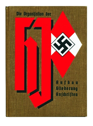
Top: Die Organisation der Hitler-Jugend, 1937. This boldly designed cover showing the Hitler Youth’s diamond-shaped logo and stylised elongated gothic HJ is an example of the nationalisation of typographic form.
Below: Das Programm der N.S.D.A.P., 1931. Before coming to state power, the Nazis codified their programme in annual manifestoes reminding members of party dictates. The lettering here is not völkisch but comprises bold sans serif capitals that echo the decidedly modern swastika.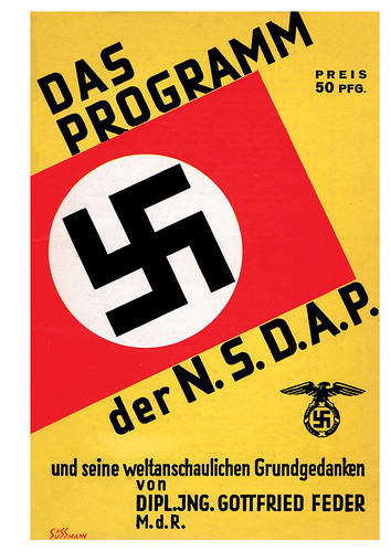
Propagating the rightness of commonplace letterforms became part of the Nazi party’s culture-creating mission as a direct consequence of its belief that stringent doctrines, issued through extra-legal decrees and enforced by slavish bureaucracies , were the way to German hearts and minds. The cumbersome title of Alfred Rosenberg’s Office for the Supervision of the Entire Cultural and Ideological Education and Training of the National Socialist German Workers Party, speaks volumes about the weight Hitler placed on artistic matters, and graphic design was included. The Führer Princip (or principle of the ‘Leader State’) demanded that unquestioning conformity begin at the top and trickle down through bureaucrats, some of whom, by virtue of their early party membership, assumed undue dominion over the ‘new’ graphic and typographic design.
In order to be allowed to work, graphic designers, calligraphers and typographers were compelled to join the Reichskulturkammern (the ‘state chambers of culture’ that had replaced outlawed trade and crafts unions) and adhere to their dubious regulations. The aesthetic guidelines formulated somewhere in the bowels of these chambers dictated the use of lettering not only in party and government documents but even in unofficial usages, and their control went beyond the Deutsche Propaganda-Atelier, the graphic design division of Josef Goebbels’ Reich Ministry for Popular Enlightenment and Propaganda (rmvap), to every ‘creative’ office, agency and studio.
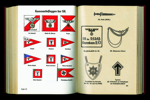
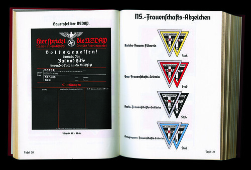
Organisationsbuch der NSDAP, 3rd edition, 1937. Edited by Robert Ley, the Reichsorganisations leader, this set down in more than 500 pages everything a Nazi functionary needed to know to be a viable leader. The pages here show various banners, pennants, signs and regalia for party officials, as well as a standard letter and billhead.
Blackletter and ‘spiritual health
There was no sanctioned central office of type doctrine, so those bureaucrats concerned with lettering routinely attempted to second-guess Hitler’s prejudiced desires and interpret his rambling pronouncements (for example, his identification of ‘two dangers’: the ‘spoilers of art’, a nebulous degenerate group, and then the Cubists, Futurists, Dadaists, etc. This cultural auxiliary to political destruction was tolerable neither from the racial nor from the national point of view’). Different ministries established their own styles within prescriptions, though one in particular, the Labour Front (DAF), directed by Hitler’s close ally Robert Ley (who also administered the pseudo-Modernist Strength Through Joy movement), was given jurisdiction over many culture chambers, including those overseeing graphic design and typographic style.
Ley’s departments were responsible for developing teaching materials and issuing organisational handbooks that included design guides, they also produced annual type specimen books featuring a limited number of favoured typefaces, most of which were in the blackletter and Fraktur families. In addition, however, Rosenberg’s cultural organisations, notably the Kampfbund für deutsche Kultur (Combat League for German Culture) and Amt für Kunstpflege (Office for the Cultivation of Art) controlled the content and look of vast amounts of cultural publicity (or advertising) until Goebbels’ ministry started flexing its muscles after 1935.
Cover, from Typographisches Skizzieren und Drucksachenentwerfen, Teil 1: Typoskizze, c. 1936.
Edited by Georg Schaus and published by Robert Ley’s office, this official type handbook explains the art of drawing and comping type. This spread displays the accepted letterforms, but also, surprisingly, a subsection devoted to Grotesk.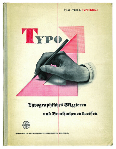
Regardless of who kept the flame at any given moment, printing was strictly controlled by Party and State, and type was deemed a critical art form scrutinised as much for its pragmatic traits as for its German roots and racial origin. Obviously verboten were typefaces designed by Jews and other ‘cultural Bolsheviks’. (Lucian Bernhard’s typefaces were outlawed because he was thought to be a Jew, though he was not.)
Nonetheless during the shift in power from emasculated republic to totalitarian Nazi regime it was not always clear who the enemy was. ‘A bitter and systematic resistance has been organised against the New National Socialist ideal of a spiritually healthy art anchored in the race,’ railed Alfred Rosenberg, the editor of the official Nazi newspaper, the Völkischer Beobachter, in 1933. Rosenberg’s typically bombastic editorial overtly condemned the National Socialist Student Association and all those who argued for certain Modernist forms instead of the kitsch perpetuated by the völkisch old guard. In these ‘progressive’ Nazi quarters, Fraktur types were also branded as kitsch. Thus, the likes of Paul Renner, the designer of Futura, who wrote a book entitled Kulturbolshewismus (Cultural Bolshevism) attacking Nazism’s anti-Semitism and medievalism in art, found curious allies in these Nazi ‘revolutionaries’. Yet they lost their struggle. And given Hitler’s calculated adoption of as a strategy to engage the worker and peasant classes, it was not difficult to foresee that in the ultimate search for racial symbolism, as Helmut Lehmann-Haupt pointed out, ‘the Gothic alphabet would prove especially useful’.
Moderne Reklame-Schriften by Gerhard Hantzsch, c. 1936. This was not an official party or government publication but a handbook showing how to handletter all kinds of traditional and modern faces. Not bound by völkisch proscriptions, this lettering is as eclectic as would be found in any other commercial country.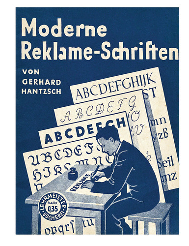
The idea was not new to the Nazis. Gothic style in calligraphy and printing was appropriated as a nationalistic symbol and perpetuated as Teutonic virtue by German chauvinists during the late nineteenth century. Of course, as Lehmann-Haupt observed, the international origins of Gothic art were ignored in the Nazis’ fervent embrace of their exclusionary mythology, in the same way that in their co-option of the swastika they ignored much of the symbol’s complex historical roots. The fact that in the nineteenth century spiky Gothic type had been retained as a text face only in central and northern European countries, however, as Lehmann-Haupt explained, ‘furnished welcome reinforcement of the myth of the Gothic alphabet as a Nordic symbol’.
In the years 1933-35, rejection of non-German Roman alphabets was a recurring theme in Rosenberg’s cultural propaganda, which included stickers admonishing citizens to exclusively embrace Gothic letters. In the vanguard of this struggle was Die zeitgemässe Schrift, an educational and trade magazine devoted to propagation of Gothic calligraphy. Lettering designers regularly sponsored national lettering competitions among school children and art students. In a 1935 editorial, ‘Writing and lettering in the service of the new state’, Die zeitgemässe Schrift explained the cultural significance of Nazi dictates: ‘[...] because our new conception of the State, which claims as its own all the phenomena of racial life, is definitely concerned with the training of the growing generation, moreover, the system of education and instruction, newly reorganised by the State, is forced to utilise all measures and possibilities which may serve to put the new ideas in to practice [...] Among such education measures special attention to writing and lettering is included, and certain indications permit us to recognise that the interest of the State in both these important branches of instruction is increasing.’
Die zeitgemässe Schrift did, on occasion, exhibit samples of sans serif lettering and calligraphy as well as many variants of Fraktur, Schwabacher, Rundgotisch and Kanzlei. The editors even published a laudatory article on Peter Behrens, the father of AEG’s Modernist corporate identity, for the. But mostly they played it safe, propagating Fraktur as the pre-eminent German face.
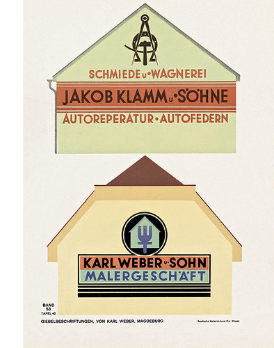
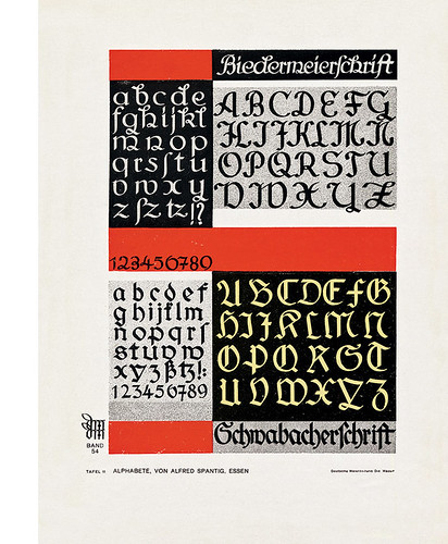
Specimen sheets published by Die Mappe (The Portfolio): Illustrierte Zeitscrift für Farbige Raugestaltung, 1934-35. This arts and crafts journal provided a wide range of models from which to create approved German wares. Lettering and calligraphy in blackletter was a huge pastime and these samples, Alfred Spantig and Karl Weber, were aimed at local artisans for small business.
Grotesk anomalies
Nonetheless, many were shocked in 1935 when Hitler warned against both ‘degenerate’ Modern art and the Teutonic art of ‘petrified backward-lookers’ as ‘dangers to National Socialism’, and railed, as only he could, against those who ‘offer us railroad stations in original German Renaissance style, street signs and typewriter keyboards with genuine Gothic letters’. In a 1936 edition of Ley’s DAF type book, Typographisches Skizzieren und Drucksachenentwerfen, were added Antiqua, Medieval, Grotesk (which looked suspiciously like Futura), Egyptienne and other crypto-Modern faces. And in style guides such as Moderne Reklame-Schriften, which taught students and neophytes how to letter, various anomalies reared their grotesque faces.
Once he had total power over the German nation Hitler calculated that certain ‘branding’ conceits of the fledgling NSDAP were no longer necessary. As Führer, he called for a new definition of artistic virtue. ‘To be German means to be clear!’ he said, and for him clarity meant with political purpose. Anything that might be confusing, not to say ridiculous, even type, endangered the political programme.
Although blackletter was never entirely rejected, a shift in graphic design policy did start to take hold. One reason given for this was that Josef Goebbels was afraid that Gothic type – a reading challenge for anyone who didn’t understand the German language – would compromise his foreign propaganda, which had been given high priority. Also, Hermann Göring complained that his pilots found blackletter difficult to read when used as markings on aeroplanes. Then there was the need for a more universal type solution for signs in occupied lands. Whatever the reason, a directive issued by Deputy Führer Martin Bormann in January 1941 stated: ‘The Führer has decided that Roman type . . . shall be designated as the normal type.’2 As Lehmann-Haupt pointed out in his Art Under a Dictatorship, ‘the harmless name “Schwabacher” furnished the necessary scapegoat’.
Nazi Germany was not an extreme example of nationalising aesthetics, though it was especially cognisant of its typography. Iron-fisted regimes from Fascist Italy to Communist China have licensed their designers and artists in order to control and direct their expression in the service of the state. The branding of totalitarian nations – on the right or the left – has demanded that strict guidelines circumscribe the manners and styles used to define them. In Germany, a country with a long tradition of exceptional graphics, it was not surprising that these techniques were adopted to the business of politics.
Steven Heller, design writer, New York
First published in Eye no. 62 vol. 16 2006
Eye is the world’s most beautiful and collectable graphic design journal, published quarterly for professional designers, students and anyone interested in critical, informed writing about graphic design and visual culture. It is available from all good design bookshops and online at the Eye shop, where you can buy subscriptions and single issues.