Autumn 2008
Illuminated thought
The practice is said to ‘signal a break with the past’ but GTF has an unforced ‘style’ that is impossible to copy
Though you know, intuitively, that large amounts of research and graft must go into each project by Graphic Thought Facility (GTF), the results always feel unforced and unpretentious. The absence of ‘style’ – an obvious graphic formula – is deceptive; GTF’s style, in the best sense of the word, is derived from their understanding of each project’s content and limitations, and in their choice of clients. Like the best film directors and record producers, they know when to say ‘yes’, and when to say ‘no’.
However there are certain elements that signal a piece of GTF work, which they helpfully listed in our Reputations (Eye no. 39 vol. 10) interview with co-founders Paul Neale and Andy Stevens. These include: systems; vernacular; materials; technology, interesting suppliers; and ‘lots of bits’ from different sources. They also talked about ‘playing the straight card’ and ‘wrecking expectations’. Examine any GTF work, and look again, and you can see these (potentially contradictory) elements at play.
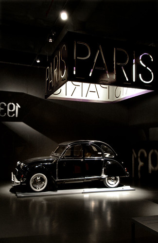
This is particularly true of their exhibition design, and their easy command of two-dimensional graphics for three-dimensional space is demonstrated by two recent shows: their graphics for ‘Design Cities’, and a retrospective show of their own work at the Art Institute of Chicago (AIC), which ran from March until August 2008. The touring exhibition ‘Design Cities’, which opened at Istanbul Modern in April 2008, has just moved to London.
From ‘Design cities’, a touring exhibition first seen at Istanbul Modern, April 2008. Exhibition design: Ben Kelly Design. Graphic design: GTF. Photograph: Ahmet Unver.
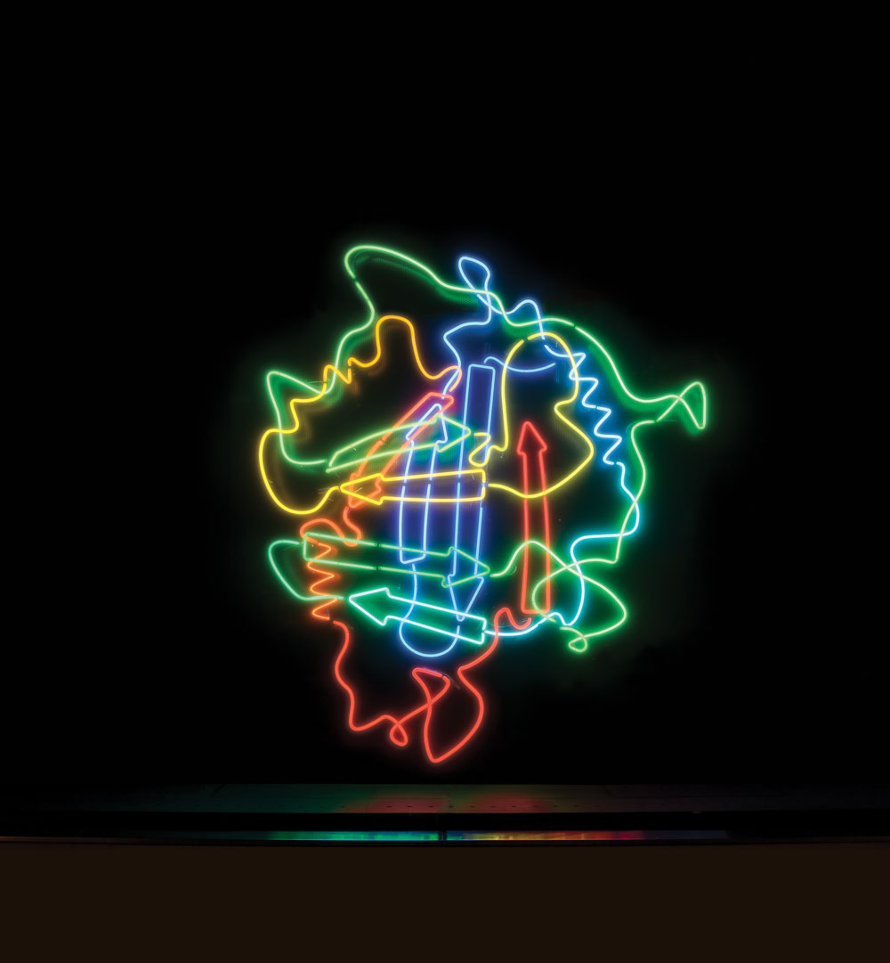
Top: one of a series of neon window displays, each more than two metres high, for the Wellcome Trust’s London headquarters in the Euston Road, 2007. Manufacturer: Neon Circus. Design: Graphic Thought Facility, Huw Morgan, Paul Neal and Andy Stevens. Photograph: Francis Ware.
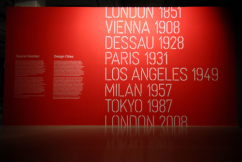
The exhibition design is by Ben Kelly, with graphics by GTF. The show, curated by the Design Museum’s director Deyan Sudjic, takes seven significant places and times (eight different years, since London appears twice, in 1851 and now) to focus on design’s relationship with urban life over the past century and a half, through Vienna, Dessau, Paris, Los Angeles, Milan and Tokyo.
Kelly, presented with a big, featureless exhibition space in the Turkish venue, opted to keep the show quite dark. ‘Each city is a little pool of light,’ explains Stevens. GTF’s custom stencil-like lettering is cut into a series of lanterns that illuminate the exhibits. The system works in such a way that the slot in the card lampshades is a uniform width. The letters are scaled according to the size of the word, so that Los Angeles, for example, appears more ‘bold’ than Milan.
Slots are everywhere: the signage is made from slotted cardboard in a flexible system ideal for a touring exhibition. Wedge-shaped folded cards, mounted in slots on tables, are used for the captions. The information placards are similarly slotted and folded for wall mounting.
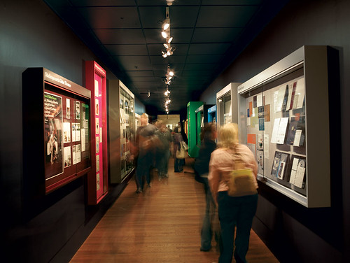
The challenges of designing an exhibition of their own work at Chicago took them ‘back to GTF territory,’ in Stevens’ words, by which he meant that the restrictions of the AIC’s long, narrow space (almost a corridor) demanded an original response. ‘We couldn’t use flat viewing spaces,’ said Stevens. GTF’s solution is borrowed from the vernacular of library or school display cabinets; of the community noticeboards you see by parks and churches, full of cards and papers stuck with pins.
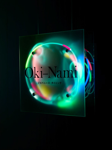
Neon sign for Oki-Nami, a Japanese restaurant in Brighton, UK, 2008. GTF’s original identity for the eating house included origami chopstick sleeves. Photograph: Angela Moore.
The designers’ work is displayed in glass-fronted aluminium cases, differently coloured for each project, with matching push pins and felt background. The pins, made using gramophone needles, were manufactured and dyed specially for the project, as were the cabinets, whose depth was varied according to the size of the exhibits displayed.
Three-dimensional illustrations
This is not the first time GTF have employed custom pins – they used a similar approach in their exhibition design for the Wellcome Collection’s ‘From Atoms To Patterns’ (2008). The Wellcome Trust has quickly acquired a reputation as an imaginative and prolific client, commissioning work by designers such as Kerr / Noble and Gitta Gschwendtner (see Eye 65) and illustrators such as Steven Appleby.
One of GTF’s more flamboyant collaborations with the organisation was a series of neon window displays for the Wellcome Trust’s headquarters in the Euston Road. These colourful, three-dimensional illustrations represent scientific models – diagrams of the action of protein structures. The colour-coding, they discovered, was almost GTF-like in its simplicity. Scientists express the passage of time with the colours of the rainbow: the red actions happen first, followed by orange, yellow, green, etc.
The Wellcome display wasn’t the first time GTF had worked in neon: in 1993 they designed an illuminated sign for Oki-Nami, a Japanese restaurant in Brighton. (GTF’s Paul Neale, always keen to learn from expert suppliers, had invited a guest speaker, complete with glowing briefcase, from the British School of Neon while he and Stevens were at the Royal College of Art.)
Stevens notes that the neon medium was ‘perfect for the Euston Road, with its constant stream of passers-by.’ And though the medium can be expensive, GTF kept the job simple by having one, grid-based fixing system and one supplier: Neon Circus. This specialist company works with a variety of clients – from brands such as DKNY to artists such as Cerith Wyn Evans.
Colour-coded display cabinets show graphic design work, project by project, at ‘Graphic Thought Facility: Resourceful Design’, Gallery 24, Art Institute of Chicago, 2008. Exhibition design: GTF. Photographs: Angela Moore.
Earlier this year, Oki-Nami, now co-owned by chef Mike Dodd and DJ Norman Cook (aka Fatboy Slim), commissioned a replacement sign for the restaurant, a loose bundle of neon hanging between frosted glass plates in the front window.
A break from the past
In ‘Resourceful Design’, an extended essay for the AIC exhibition catalogue about Graphic Thought Facility’s oeuvre, curator Zoë Ryan makes some grand claims for the practice: ‘GTF’s work signals a break from the past. Graphic design in the first half of the twentieth century was grounded in the tenets of clean, minimalist design based on pure geometries of form.’
After noting the way such tendencies descend into blandness, Ryan writes that contemporary designers (such as GTF) now seek relevance to contemporary society through a multifaceted approach that inspires ‘original and significant graphic expressions’ in which ‘each project is approached with a new set of criteria, resulting in unique outcomes that differ from one project to the next.’
From ‘Design cities’, a touring exhibition first seen at Istanbul Modern, April 2008. Exhibition design: Ben Kelly Design. Graphic design: GTF. Photograph: Ahmet Unver.
Sure enough, the Chicago display cabinets were manufactured specially to deal with the sizes and shapes of the practice’s major projects: the groundbreaking catalogue and signage for the ICA’s Stealing Beauty (1999); theatre posters for Shakespeare’s Globe; collaborations with designers such as Ron Arad and Tord Boontje (see Eye no. 64 vol. 16); and work with long-term clients such as the Design Museum, Frieze Art Fair, Habitat, Royal Jelly Factory and the RCA, which spawned the practice in 1990.
GTF’s Chicago show was well received by critics and designers as an ingenious and engaging solution to the problem of presenting graphic design’s complexities to a lay public. Will such flattery lead to imitation from other galleries faced with the challenge of explaining graphic design to a lay public? Don’t bet on it. So much of the effectiveness of their work lies in the details, in the rigorous relationship between concept and craft. GTF have long been popular with other designers, but they are a hard act to follow.
John L. Walters, editor of Eye, London
First published in Eye no. 69 vol. 18 2008
Eye is the world’s most beautiful and collectable graphic design journal, published quarterly for professional designers, students and anyone interested in critical, informed writing about graphic design and visual culture. It is available from all good design bookshops and online at the Eye shop, where you can buy subscriptions and single issues.