
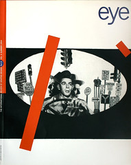
Summer 1994
In the beginning was the picture
How are publishers coping with the advent of new media? Two ambitious series expand the format of the illustrated book.
NEW HORIZONS
Thames and Hudson
Editions Gallimard, one of France’s largest and most progressive book publishing houses, launched its Decouvertes series in the late 1980’s, the brainchild of Pierre Marchant, president of the imprint Gallimard Jeunesse. The pocket-sized volumes cover a vast swathe of subject matter, from lost civilisations and ancient history to cosmogonic theory and monographs on artists. From its very beginnings, the series was conceived as in international venture which would involve collaboration with like-minded publishers throughout the world; without this global network, the generously illustrated paperbacks could not have been cost-effective. Today the books exist in 12 languages, including Japanese, Greek and Polish.
London-based arts publisher Thames and Hudson bought an exclusive British option on the series and launched its first titles back in 1992. By the end of 1994 it will have published about 40 volumes. Aimed at older schoolchildren and adults, the remit, according to Thames and Hudson director Jamie Camplin, is to “educate in an entertaining way”. The highly considered graphic approach instigated by Editions Gallimard has been the key to achieving this end.
Dispensing with the traditional half-title and title pages, New Horizons books invariably kick off with what Camplin calls an eight – or ten-page “cinema-influenced trailer”. In essence, this is a sequence of full-bleed photographs or illustrations, prefaced by an enticing pull-quote on the inside front cove, that provides a taste of the delights to follow. In Picasso: Master of the New, for instance, the reader is greeted by a brief outline of the film-maker Henri-Georges Clouzot’s suggestion as to how the artist might be captured on celluloid from behind one of his paintings by using coloured inks which soak through the paper. The next 13 pages are devoted to a photographic record of this process. The Celts: First Masters of Europe opens with a series of bronze masks and hoary faces carved in stone.
It is a deliberate contrast to the traditional textbook, whose unbroken text its intimidating to many students. The exam-crammer’s “study guide” is much derided for its one-dimensional solutions, but at least its segmented presentation is true to its objectives. The material has been pre-digested so it can be retained in the minimum possible time. There is no need for learning to be difficult, and New Horizons recognises this.
Its publishers are also canny enough to admit that, at last as far as pacing is concerned, there are lessons to be learned from barometers of the cultural climate such as MTV and video games. Speed (or at least an impression of speed) is king, and to reflect this each spread is prepared with well-researched photographs, information is served up in punchy, bite-sixed chunks, and every effort is made to ensure that the reader is diverted by an arsenal of graphic devices. The selection is visuals is critical: “Our aim is not to exclude familiar image entirely,” explains Camplin, “but to shake people up by showing them images they might not have seen before.”
New Horizon happily adopts many graphic techniques common to magazines and newspapers; transported to the more fusty context of book design, they appear all but radical. Photographic cut-outs combined with runaround test are used extensively to break up potentially daunting slabs of copy; bold standfirsts usher each chapter; a new running head features on every right-hand page as a different line of thought is introduced. A fairly typical string of running heads from The Life and Lore of the Elephant reads: “The vulnerability of war elephants”; “Games in the Circus Maximus”; “general amazement”; “The friend of children”; “King Babar”.
Extended captions re another favoured stratagem, and every so often a purely visual double-page spread will be introduced to broaden the mix of presentation styles. And as if this were not enough, the occasional fold-out – perhaps one or two per book (of around 200 pages each) – brings a small, but not entirely insignificant, sense of interactivity to the experience of reading a New Horizons title.
At the back of each book is the “Documents” section, an archive of more detailed documentary information printed on a different, tinted paper stock. In The Changing Universe: Big Bang and After, there are essays by Stephen Hawking and Carl Sagan, a 1991 extract from Astronomy magazine and a glossary of astronomical terms. Though some co-publishers print the French version in full, Thames and Hudson reformulates the back section, tailoring the material to suit the nuances of the UK market.
With so much packed into such a small format (178 mm by 125 mm), New Horizon’s slogan, “the expending universe between two covers”, seems singularly apt. The size, maintains its publisher, takes into account current lifestyles and living spaces, while the price, a mere £6.95, nods to these recessionary times.
Apart from the cover, which is considered afresh for each national edition, and sometimes the typeface (in the case of the UK, Adobe Garamond is preferred), the design remains identical from country to country. Thames and Hudson receives a disk containing the layout from Gallimard, suppresses the French test and then simply runs in its own. The English translators work spread by spread, fine-tuning their copy to fit the existing Macintosh-generated layout.
French words and sentence structures are generally longer than English ones, so it is not uncommon for the translated text to fall short. Disparities in length are dealt with by loosening or tightening runarounds or varying the sizes of cross-heads and pull-quotes. The translation costs are shared with Harry N. Abrams of New York, which produces the series in the US under the title Discoveries. The American version is then re-edited to take into account English spelling, punctuation and idiom, or vice-versa.
To date Thames and Hudson has had the luxury of plundering Gallimard’s back catalogue, tending to pass over more parochial works on, for instance, classical French authors. Gallimard published its 200th title (on Utopia) in March. But for the failure of the England football team to qualify for the 1994 World Cup Finals, the London publisher would have initiated its own book in the history of the competition; eventually it anticipates originating its own material on a regular basis. In theory, provided there is international appeal, any of the participating co-publishers could generate titles, with the existing production framework remaining intact.
Does all this rationalisation hold up in the market place? “It’s most certainly been a success so far, “ claims Jamie Camplin, ‘but if you believe in something as strongly as I believe in this, and can see the potential of having 1,000 titles 10,000 titles, you have fairly over-the-top ideas about what might be.”
EYEWITNESS GUIDES
Dorling Kindersley
Peter Kindersley, head of Convent Garden-based publishers Dorling Kindersley, has an intriguing visual pedigree. He is the son of David Kindersley, who has an apprentice in Eric Gill’s Piggots workshops during the 1930s, and the brother of Richard Kindersley, one of the UK’s foremost monumental stone masons.
With his own background in art and design, he is a staunch believer in the power of the image and maintains that the juxtaposition of picture and text is the key to communicating information quickly and efficiently. Through the picture I see reality, through the word I understand it” is a suitably New Age mantra for a publishing empire part-owned by the software giant Microsoft and set to become one of the major UK players in the CD-ROM market.
Launched in 1988 from an idea conceived by Kindersley himself, the Eyewitness Guides, a series of highly pictorial educational books aimed primarily at children, is one of DK’s most successful ventures. Subject matter leans towards ancient and natural history, though transport and technology are also covered, and the format is flexible enough to tackle more abstract concepts such as weather and writing. The book’s titles are disarmingly direct – Bird; Car; Dinosaur; Tree; Music – intended to mimic dictionary entries and confer authority. Sold in at least 40 countries and published in a Babel of different languages (four in Spain alone), the 64th title will be unveiled later this year. To date, some 17 million of the books have been sold worldwide.
Dorling Kindersley releases eight Eyewitness books a year. Each has a full-time editor and designer, with researchers and photographers drafted in as the need arises. “It’s machine almost,” confides series editor Simon Adams, “Some of the people have worked on seven or eight books over a period of three or four years. The knowledge and the people are taken from book to book.” In contrast to more traditional publishing, the author is usually the last person to be signed up. Laid out on Macintoshes I QuarkXPress, the 64-page, 276 mm by 216 mm hardbacks take about a year to complete and retail at 38.99, a cover price which could not be achieved without international partners.
Like the New Horizons series, the Eyewitness Guides are co-published by Editions Gallimard, but this time the disk is sent from the UK to France for translation. Miraculously, Gallimard has French copy, new cover design and any other alterations completed to join the English language version on press in Singapore a month later.
Armed with research into educational psychology, the Eyewitness series aims to achieve a synthesis of photographs and text which will arouse the reader’s curiosity and encourage further digging, Typically for Dorling Kindersley, which seems to have a slogan for every occasion, someone has come up with a name for it: “Lexigraphics”. “In the past,” explains Kindersley, “you’d just write a text, and then you’d find illustrations. But there was no relationship between those two elements, and no realisation that they had different qualities and could do different things. This is what we have tried to address.”
Eyewitness has also borrowed freely from the conventions of magazine design. Each spread is a self-contained unit, introduced by a headline and what is in effect a standfirst. The visual aesthetic and extensive use of captions also nods to the magazine. Many titles are produced in association with museums – usually remunerated on a royalty basis – which means access to the untold riches hidden away in the stores. There is a heavy emphasis on photography and a distinctive, clean house style that features crisp white paper and the typefaces Palatino and Berkeley. Kindersley insists that only serif faces are used in UK books in the belief that they are more legible.
As far as possible, objects are photographed from above on a white background and the shot used actually size on the page with a drop shadow to give a three-dimensional effect. If an existing photograph from a museum or photographic library has been used, it will be cut out and dressed to achieve a similar effect. Dramatic “exploded” photography is also employed. In Bird, an owl’s wing has been pulled apart and reconstructed to show the various functions of different types of feather and the way the interconnect. In Music, a Fender Stratocaster guitar has been dismantled to demystify it constituent parts, with italic annotations that clarify smaller details, right down to the screw which attaches the strap to your guitar. Related smaller-scale images, often Victorian engravings or explanatory line drawings, are dotted around the perimeter of the central photograph, accompanied by more anecdotal copy. Intelligently juxtaposed subsidiary photographs make additional points: on a spread from Insect featuring a dismembered beetle, a library shot of a tank is used to out over the idea of the creature’s armour plating.
Time-lapse photography is another Eyewitness stick-in-trade. In Plant we witness the two-fifths of a second in which a damselfly is ensnared by a Venus flytrap; in Reptile a snake hatches from its egg. Scale models, cross-sections and extreme close-ups also play a part of seducing the reader.
Never allowing the reader to slip back into his or her natural state of indifference has been a key factor in Eyewitness’ continuing appeal. But its real breakthrough has been in recognising the immediacy of visual language and incorporating it into the format of a book. “What we’re trying to do is communicate information,” says Peter Kindersley. “That’s the sole purpose of a non-fiction book. Words have been very dominant for a long period of time, but people are finally beginning to realise that pictures are far more motivational…the world isn’t made up of words.”
First published in Eye no. 13 vol. 4 1994
Eye is the world’s most beautiful and collectable graphic design journal, published quarterly for professional designers, students and anyone interested in critical, informed writing about graphic design and visual culture. It is available from all good design bookshops and online at the Eye shop, where you can buy subscriptions and single issues.