
Spring 2014
Labelled with love
The new craft beers come in bottles, ideal for trendy bars and hipsters who want to display what they’re drinking. By Paul Keers
Craft beers are the brewing equivalent of artisan foods. Made by enthusiasts in tiny volumes, they echo the ‘back to basics’ approach of farmers’ markets and street food joints. The railway arches of London’s old industrial areas offer cheap, basic homes for these micro breweries, while the city itself provides the outlets they need for commercial viability. Real ale is still served primarily from the barrel; the new craft beers come in bottles, ideal for restaurant tables, trendy bars and hipsters who want to display what they’re drinking. Which is where the labels come in.
Ultra-simple kraft paper labels make The Kernel’s beers instantly recognisable.
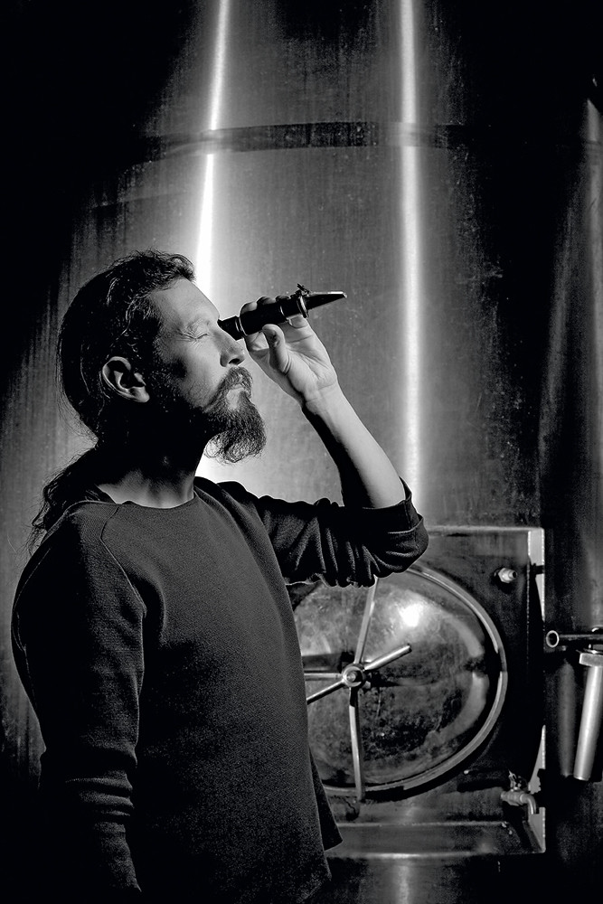
Top: Founder Evin O’Riordain checks the gravity of the wort with a refractometer at The Kernel’s southeast London headquarters. O’Riordain explains that this is to ‘measure the amount of sugar before fermentation to get an idea of potential alcohol levels.’ Portrait by Phil Sayer, 2013.
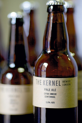
It’s just a beer: The Kernel
Each label for The Kernel’s bottles may look like a clever, knowing representation of a hand-stamped label – but a hand-stamped label is exactly what it was. ‘The genesis of my beer was in home brewing,’ explains founder Evin O’Riordain. ‘I didn’t label much then, but when I wanted to give some to people I cut thin strips of cardboard, stamped them with the name and taped them to the bottles. Apart from anything else, the cardboard buffered the bottles slightly one from another. I must have stamped hundreds of thousands of bottles by hand.’
But O’Riordain also liked the look, and the flexibility, so when commercial production increased, his partner Ute Kanngiesser, who has a background in design, helped to create a printable label to continue the hand-stamped look. With recycled paper replacing the original card, the labels still bear only the name of the beer, the date bottled and the strength.
‘I don’t want to “market” it,’ says O’Riordain. ‘I don’t want to tell people what they should be tasting. There’s so much information we’re being bombarded with, I think it’s nice to just be told it’s a beer. I have faith in people.’
Beavertown’s pyramid design, created by illustrator Jonah Schulz in 2011, was at its simplest on the Americana-inspired ‘8-ball’ brew. It has since been adapted for each of the brewery’s subsequent beers.
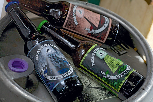
Pyramid selling: Beavertown Brewery
The name is taken from the Cockney corruption of De Beauvoir Town, the North London district where Logan Plant began his Beavertown Brewery as just ‘one man and a bath’. Plant wanted ‘some kind of iconic symbol’ for his fledgling brewery and was reading a book on the Knights Templar, and all things Masonic, when he came across the image of the pyramid and the all-seeing eye (which many will know from the US dollar bill). ‘For me, it was something everyone has seen, or knows about, but which has a lot of connotations.’
Illustrator Jonah Schulz created the central image (with the eye itself replaced by a ‘B’) and then proceeded to vary it for the label of each of the brewery’s core beers.
So the label of Smog Rocket, their smoked porter, ‘goes back to the Industrial Revolution when porter was drunk’ with a viaduct, steam trains and chimneys belching smoke. For Black Betty, the pyramid is turned into its namesake penitentiary wagon; while the label of Neck Oil (a Black Country term for beer) shows the pyramid as a gushing oil derrick.
‘I like the idea of someone picking up the bottle and looking into it, of the label being suggestive and yet also maintaining that iconic symbol, that continuous piece of art. And once you get to know us, you’ll always spot it.’
Label design: The Tenfold Collective, Colorado, US. Tenfold worked with US craft brewers before redesigning Camden’s labels. ‘Craft entrepreneurs are kindred spirits,’ says Tenfold’s Josh Emrich.
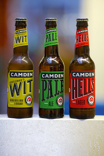
It works in the hand: Camden Town Brewery
‘Proud, simple and strong’ is the motto of Camden Town Brewery, and it is an attitude clearly reflected in their labels. Of all the young craft breweries, perhaps Camden have taken the most professional approach to their graphics. It may have helped that founder Jasper Cuppaidge’s father-in-law is Sir John Hegarty, a senior figure in advertising. It was Hegarty who created their circular logo, with its visual references to the Horseshoe pub where they were founded – and the Castle series of Camden pubs. He has given them advice from the outset. The company worked with a few agencies to achieve a look aimed at an audience that Cuppaidge describes as ‘young-at-mind’.
The current labels were designed by Colorado agency The Tenfold Collective, who they met at a craft beer conference. ‘We start from the idea that our graphics have to work in the hand,’ says Cuppaidge. ‘After that we’ve tweaked things, using whites and shadows on those single main colours, to sit better on a shelf or in a pub fridge and stand out within the crowd of the boring.’
Camden Town Brewery is always updating the labels, so the Pale label has changed three times in recent years. The brewery is already working on new designs with London’s Studio Juice. ‘Over three years we have had completely different labels. It’s taken us a long time to be proud of what we do, but within another three years we might change them again,’ says Cuppaidge. ‘Just so long as they are never too crafty or anoraky or corporate.’
Wu Gang Chops the Tree, 2013. Illustration: Ching-Li Chew.
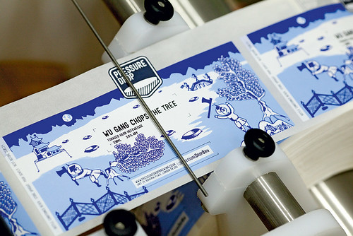
Like little album covers: Pressure Drop
As Graham O’Brien, one of Pressure Drop’s three founders explains, each of their labels has its own unique image, created ‘not just to work on a shelf in a bottle shop, or to be identifiable in a fridge, but to say something about each beer and to reward the drinker who scrutinises it a little more closely.’
Their logo, created by designer Francis Redman, was stamped onto a plain label for their pilot brewing runs. ‘But we always had it in mind to swap out the plain green background for something more illustrative, and to reflect the character of each beer.’
Two of the first labels (Bosko and Pale Fire) were created by O’Brien himself. Since then, using illustrators such as Matt Jeffs and Jake Blanchard, they have commissioned or found new images for each beer – ‘like little album covers’. Illustrator Ching-Li Chew has been responsible for two: Street Porter and Wu Gang Chops the Tree, based on the willow pattern and a Chinese proverb about a tree that regrows each time it is cut down. The wraparound label can be turned in the hand to show the Sisyphean regrowth and chopping down.
The brewery will continue to look for new illustrators, and may even consider a small exhibition of the beer label work because, says O’Brien, ‘it’s a creative process worth celebrating in its own right.’
Paul Keers, writer, co-founder of the Sediment wine blog, London
First published in Eye no. 87 vol. 22 2014
Eye is the world’s most beautiful and collectable graphic design journal, published quarterly for professional designers, students and anyone interested in critical, informed writing about graphic design and visual culture. It is available from all good design bookshops and online at the Eye shop, where you can buy subscriptions, back issues and single copies of the latest issue. You can see what Eye 87 looks like at Eye before You Buy on Vimeo.