Winter 2010
Life’s little detours
Eric Heiman salutes the ‘Edward Hopper of design and comic art’

Memorable information design pulls clarity, beauty and poetry out of the seemingly neutral. The Stop sign is an ubiquitous example of calm coherence. Massimo Vignelli’s 1972 New York Subway map is a cornerstone of Modernist elegance. Maya Lin’s Vietnam Memorial is a silent requiem of fallen soldiers’ names carved in granite.
Above all, though, these works are efficient. And while efficiency isn’t necessarily a bad thing, it is rarely warm and fuzzy. This is the conundrum of design in the modern age, information or otherwise. While I highly admire all three aforementioned works, their emotional distance makes them hard to really love.
I do love almost everything Chris Ware creates, though. Has there ever been an artist who employs the lexicon of information design to evoke loneliness, melancholy and loss in such a powerful way? He’s the Edward Hopper of design and comic art.
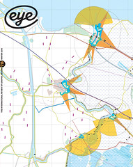
One of Ware’s many graphic triumphs is the inside of the fold-out poster cover for his graphic novel Jimmy Corrigan: The Smartest Kid on Earth. An almost wordless road map of the 380-page epic contained within, it uses charts, floor plans, decorative motifs and directional arrows to stitch together the multiple visual narratives that tell the eponymous antihero’s story.
What is being tracked here, though, is not a truly physical or linear route. Ware is a master cartographer of the weaving paths the mind might take as it skips from ruing the past, confronting the present and (in Jimmy’s case) both dreading and longing for whatever the future might bring.
Using the objective veneer of the infographic aesthetic to map the instability of internal, ‘mental’ time – where the dead-end tangents are as important as the primary plot line – Ware creates an unsettling friction for the reader. Do we really need to know that the childhood maid of Jimmy’s grandfather, who barely figures in the overall story, is the child of slaves? Or that a family photo album is eventually thrown away? Practically, no. Narratively, yes, because that tiny drawing of the photo album in the metal garbage can is an oddly moving microcosm of Jimmy Corrigan’s most pervasive theme – that too many of our idealistic hopes are inevitably crushed by life’s messy realities.
Ware’s aims are literary, not pragmatic. But his work is still a subtle reminder that no amount of order we – as designers or otherwise – impose on our lives can ever eliminate the unexpected twists and turns they take. Quantitative data, no matter how clearly and beautifully presented, is not always the know-all, end-all answer, even in this age of Google analytics.
Ware’s work may not literally be ‘information’ but in the socially networked, ‘human-centred’ design world of today, literature such as Jimmy Corrigan that raises questions about what it is to be human seems more important than ever.
Eric Heiman is principal of Volume Inc. and a professor of design at the California College of the Arts.
First published in Eye no. 78 vol. 20.