
Spring 2014
Luxury of less is more
‘Roundhead’ Sean Perkins explains North’s designs for restaurateur Alan Yau and the St Pancras Hotel
One of the most memorable and entertaining moments at the 2013 AGI Open in the Barbican Theatre, London was the debate ‘Cavaliers vs Roundheads’. In this session, Stefan Sagmeister and Marian Bantjes – advocating flamboyant decoration – were pitted against the austere Modernism (and neomodernism) of North’s Sean Perkins, Sascha Lobe of L2M3 in Germany, and Dean Poole of New Zealand’s Alt Group. (All are members of AGI, the elite Alliance Graphique Internationale, which meets in a different city each year.)
Perkins gave an impassioned plea for the ‘less is more’ faction, and added a personal angle to the debate by saying that his views might be rooted in a Yorkshire upbringing, showing images of dry stone walls and open moorland to support his arguments. He also cited the influence of Japanese artefacts that his father brought back to the family home in Doncaster. North’s website contains no images at all, just a few lines of type. When Sagmeister and Bantjes unveiled a ‘Cavalier’ version of the site, smothered in ornament, Perkins took the joke with good grace.
Perkins founded North in 1995, after stints at Wolff Olins, Cartlidge Levene and Imagination London. He was joined by partners Stephen Gilmore in 1998 and Jeremy Coysten in 2001. The studio’s client list embraces many national institutions, from the RAC to the The Royal Mint. Their identity design for the bank First Direct has been an influential, long-running example of late Modernism in the financial sector.
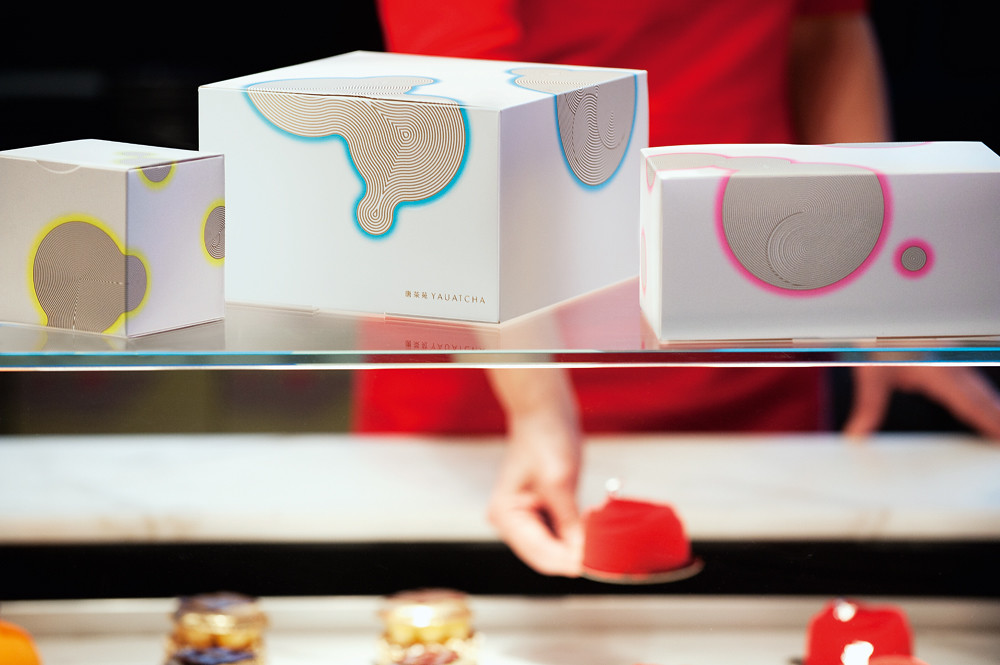
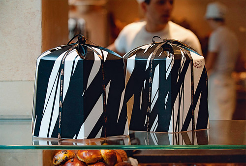
Yet on first impression, North’s work in the hospitality sector plunges deep into the realm of ornamentation and pampered, highly patterned luxury. Their portfolio includes a parade of glamorous venues launched by restaurateur Alan Yau, including Busaba Eathai, Hakkasan, Aaya, Cha Cha Moon, Naamyaa Café and Yauatcha. North’s identity design for the spectacular St Pancras Renaissance Hotel in London’s King’s Cross, reopened in 2011, features pattern at every opportunity: on menus, signs and business cards. The elegantly branded items North designed for Princi’s – a small chain of Italian bakers working in collaboration with Yau – displays patterning on most surfaces, from takeaway coffee cups to panettone boxes.
Perkins sees no conflict between his Modernist, minimalist sensibilities and this line of work. ‘Less is more is still appropriate, but it has to be enough,’ he says, quoting Mies van der Rohe. ‘We’re in an entertainment world,’ he says, ‘and people want an experience.’
[…]
Princi’s bakery and coffee bar, Soho, central London, 2008.
Top: Yauatcha products include luxury teas, macaroons, cakes and chocolates, 2007.
John L. Walters, editor of Eye, London
Read the full version in Eye no. 87 vol. 22 2014
Eye is the world’s most beautiful and collectable graphic design journal, published quarterly for professional designers, students and anyone interested in critical, informed writing about graphic design and visual culture. It is available from all good design bookshops and online at the Eye shop, where you can buy subscriptions, back issues and single copies of the latest issue. You can see what Eye 87 looks like at Eye before You Buy on Vimeo.