Winter 2010
Paper planet
Joost Grootens, whose background is in multimedia and architectural design, is reinventing the atlas for the 21st century
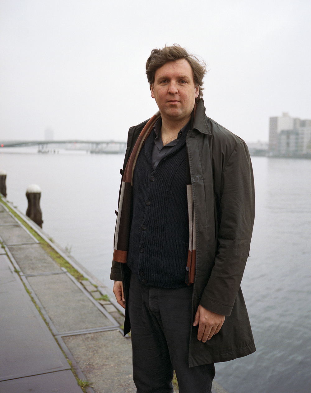
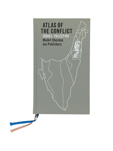
In a little more than a decade, Joost Grootens has become known as one of the most strikingly original designers of his generation. His Amsterdam-based studio is responsible for the design of more than 100 books, but his reputation rests on a handful of extraordinary atlases, the most recent of which is Malkit Shoshan’s Atlas of the Conflict: Israel-Palestine.
These beautifully produced collections of maps and diagrams interpret and reveal complex information with a clarity and visual flair that reinvents and reinvigorates the form. ‘It’s a misconception that something which is complex should also look complicated,’ says Grootens, who studied architectural design before moving sideways into book design, a field in which he’s become quietly successful. Along the way he has been festooned with awards: two Gold Medals in the ‘Best Book Design from all over the World’ competition in Leipzig, the Dutch Design Award for Graphic Design, the Red Dot: Grand Prix editorial design, a D&AD ‘yellow pencil’ in 2010 and in 2009 the Rotterdam Design Prize, whose judges observed that: ‘In visualising data he has breathed new life into the tradition of visual statistics developed in the 1920s and 1930s by Gerd Arntz and Willem Sandberg.’
His forthcoming monograph, I swear I use no art at all (010 Publishers, 2010), describes Grootens’ approach and processes in detail, arguing lucidly that the digitisation of information has enabled the printed book to develop in new and more meaningful ways. (The title comes from Shakespeare’s Hamlet – it’s the response given by Polonius when Gertrude asks him for ‘More matter, with less art’.)
Though many of Grootens’ productions, such as his book about jewellery designer Ted Noten and an H. N. Werkman monograph, employ detailed indexes, diagrams, maps and other graphic devices, it’s a collection of five atlases for 010 that best demonstrates the intensive approach of his studio. The Atlas of the Conflict was preceded by the Limes Atlas and the Metropolitan World Atlas (both in 2005), the Vinex Atlas (2008) and the Atlas Nieuwe Hollandse Waterlinie (2009), also published in English as Atlas of the New Dutch Water Defence Line.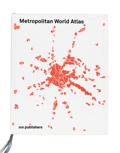
The atlases take up a disproportionate amount of the studio’s time – Grootens likens them to ‘Formula 1 racing cars’ in comparison to the ‘family hatchbacks’ of his other work – but they are far from flashy. Grootens’ atlases have a sobriety and typographic sensitivity that sets them apart from both conventional map layout and contemporary Dutch design, in which he is something of an outsider.
Grootens was born in Breda in 1971, and grew up in the small town of Oss in the south of Holland. As a teenager Grootens had ambitions to be a painter. When he was sixteen, he sent a fan letter to Willem De Kooning. ‘I was from the provinces,’ he says. ‘Being creative meant being an artist. I never realised there were such things as designers.’ He went to Amsterdam’s Gerrit Rietveld Academy to study fine art, but after just a few days there he stopped painting and transferred to architectural design. But then, during five years of study at the Rietveld, Grootens slowly realised that ‘the representation of architecture itself interested me more than buildings’.
As part of his course, he spent nine months as an intern in the London office of Chora, working on research into ‘urban dynamics’, and struck up a friendship with principal Raoul Bunschoten and his wife, architectural photographer Hélène Binet, best known for her photographs of work by Peter Zumthor and Zaha Hadid. This made a big impression on Grootens, providing an environment in which he encountered ‘both ends of architectural representation’.
‘Hadid found the perfect photographer in Binet,’ he says, ‘bringing the photographs of her buildings back to the language of her sketches. The buildings are almost like the vehicle for Hélène to make the photographs look like her original sketches.’ Grootens is currently finishing the design of a monograph about Binet for publisher Phaidon.
Just before he left for his London internship, Frans Bevers, one of Grootens’ teachers at Rietveld had showed him the possibilities of multimedia: ‘I was really fascinated by Macromedia Director,’ says Grootens. ‘At Raoul’s office I was doing everything by hand again, but during my nine months of not touching any computers I thought a lot about multimedia.’
On his return to Amsterdam he bought a new computer and immersed himself in the technology, learning to use Director and Photoshop and crafting a final-year diploma project that used sound, animation and colour, graduating in 1995. The young Grootens was excited by the possibilities of representation: ‘How can you translate architectural drawings or ideas into interactive animations and multimedia?’
Though Grootens had been one of the first in his department to work with a computer, these were early days for architectural multimedia. ‘The graphic design departments were the first to adopt computers fully. Architectural and product design followed later … partly due to the processor speed of the computers in those days. Rendering 3D images took forever and even then didn’t look any good.’ His main interest was in finding new ways to represent architecture ‘beyond the building, the use, its context.’
On graduation, Grootens had originally intended to take a Masters degree at the Architectural Association in London (where Bunschoten taught), but two things changed his mind: ‘I was really disappointed by the attitude of the students at the time because ‘design’ was a dirty word for them; it was all about research and about theory. I thought this is not the kind of environment I want to be in – I want to design. Theory is nice but it only becomes meaningful if an architect is able to translate it into architecture.’
The other influencing factor was that the mid-1990s were a boom time for Dutch design and architecture: ‘The word Dutch really meant something then. It was very easy to get commissions.’ His first projects included office interiors, a women’s prison courtyard and collaborations with architects MVRDV on the Dutch pavilion for Expo 2000 in Hanover. For Grootens, there was little incentive to do a masters when he could learn through client work.
Yet he resisted many contemporary trends, and retains a distaste for certain stylistic tics of the 1990s. He says: ‘I hate layering. You’re fooling yourself if you do it. Superimposing graphic information on to something else is based on the misconception that visual complexity can visualise a plurality of meaning.’ Grootens did admire projects such as Mediamatic’s Doors of Perception CD-ROM, and Max Kisman’s work for VPRO, but he was never particularly interested in game-like projects such as Myst. ‘After a few years this became a problem,’ he says. ‘I didn’t like playing, reading or using multimedia but I was designing it.’
His interactive work became more sober and simple. ‘The first thing to go was sound, and then the colours became more monochrome.’ In 1997, he made an interactive piece for Chora’s exhibition ‘Liminal Bodies’, held in a storefront gallery in New York. ‘We went to see publisher Duncan McCorquodale of Black Dog Publishing in London, and he said “I cannot publish a CD-ROM, you have to design a book around it.”’ Grootens spent a year making the book, Metaspaces: ‘I found out that anything I tried to pursue in multimedia I could do, maybe better, in a book.’
If his unusual career trajectory – from art to multimedia via architecture and eventually to book design – partially explains the sheer originality of Grootens’ vision, it’s his understanding of content that determines the form, look and feel of each project. The layered, expressive styles of the decade in which he graduated have little appeal for him, nor is he in thrall to traditional book design. He admires the ‘pleasant lightness’ of Cornel Windlin’s photography books, the architectural monographs of Reynoud Homan and Lars Müller’s quest to make what he calls a ‘visual reader’.
Back to first principles
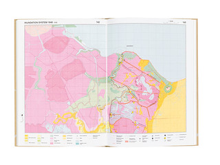
Sometimes he appears to have reinvented the form of his atlases, indexes and all, from first principles, but with an acute sensibility to the materiality of the book, using metallic and fluorescent inks on light, almost transparent paper. He explains that when he made his first atlas (De grote / the big / der grosse KAN Atlas, 010 Publishers, 2003) he looked at the medium from a technical standpoint: ‘010’s Peter de Winter, on seeing the authors’ materials, came up with the idea of making it into an atlas,’ says Grootens. In a quest to discover why old atlases look better than new ones, he sought out old copies of the Bosatlas (the essential school atlas in Holland) and made a significant discovery. ‘I bought three different editions of the Bosatlas, one in CMYK and two older editions in twelve and ten colours. I studied these books in detail. I found out that the atlases became ugly in the 1970s when they went from twelve solid colours to CMYK.’
By reading the small print he found exact information on the use of colours in the older maps. Though Grootens admits that it would be impossible to go back to printing in twelve colours: ‘My publishers would kill me!’ However this close examination of old maps and atlases inspired Grootens to start using different inks, including fluorescent and metallic, and choose his special colours carefully in relation to the paper for each book.
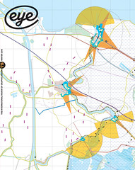
For instance, the maps of the Limes Atlas deal with the history of the Dutch landscape, the colours showing the transition between water to swamp to polder, from blue to green. Grootens explains: ‘I made a family of patterns with blue and green dots that illustrate this transition. And then there was the limes itself, the Northern border of the Roman empire, and in later times the invisible remains of the buildings, ships, etc., as most of these were sunken into the land / swamp […] to give this a special presence on the page I used a metallic ink, gold. Flipping the page the gold becomes more visible or not. It is as if you turn it on or off.
‘The Limes Atlas is about the tension between this blue becoming green and the gold, which sometimes lights up and other times dissolves. All other information is done in black. And I added a varnish that covers the maps and seals it off as if it were covered by a sheet of glass. The edges of the paper that one touches when leafing through the book are unvarnished and here the texture, the full tactility of the paper, can be experienced. Finding the right kind of blue turned out to be difficult and in the end this was mixed at the press. I don’t like blues that are too blue, especially when making an atlas about the Netherlands with all the water – you quickly end up with a book that is too blue. I am still not too happy with the blue in Limes Atlas. It is too strong, too dark. For Vinex Atlas and Atlas of the New Dutch Water Defence Line I found a much nicer blue. Which is more a light grey with a bit of blue.’
Grootens usually makes one or two 70 x 100cm test prints, on which he can put many variations of patterns and ink mixes, trying out different papers. He likes to use thin paper, too. Where some designers fret about show-through, Grootens waxes lyrical about a transparency that makes the book’s structural system visible and tangible, with elements that ‘shimmer through on the next page.’ He designs his books as physical interfaces, always considering the way his special inks reflect light back to the reader.
For Limes Atlas he wanted ‘a paper that was a bit rough’ to make the metallic ink look like galvanised steel, and chose Eurobulk Matt, which he also used for the Metropolitan World Atlas. For Atlas of the Conflict he tested seven or eight different paper stocks before settling on Gardapat Kiara for the maps and diagrams and Royal Print Matt for the lexicon at the end.
Grootens also thinks carefully about the size and weight of each book, and the way it lies in the user’s hands. ‘A reader continuously holds the cover,’ he writes in his monograph. ‘I often use a material that has a certain texture and I use embossing or foil blocking.’
As a graphic designer, Grootens is self-taught, though hardly ‘feral’ (to use Steven Heller’s term). ‘I was learning while doing,’ he says. ‘The first few years of doing books was my training, being very insecure about everything.’ However he credits Hans Oldewarris and Peter de Winter of publishers 010 with really teaching him the trade, and regards each book as part of a continuous educational process: ‘I got to work with a lot of great authors. I was also learning about typography, inks, all those things …’ Each atlas, he points out, is a three-way collaboration with the printers (Lecturis) and 010.
His methods are labour-intensive, occupying the time of a carefully picked staff of five: a full-time assistant, two part-time designers and two interns. The studio operates four days a week, Monday to Thursday; Fridays are for admin, and reading, study and reflection. ‘The great thing if you’re self-taught is that you’re never finished. If you’re taught in a school at some point you get a diploma and you stop thinking about it.’
However Grootens also teaches one day a week, and has taught regularly for the past thirteen years – eight of them at Design Academy Eindhoven, where he was recently appointed head of the new department of Information Design at Design Academy Eindhoven’s Master Course.
His studio takes on interns six months at a time and pays them according to the guidelines of the BNO (the Dutch design association). ‘I tend to go for people with a great sensitivity for typography,’ he says. ‘The other things I can teach them, but the typography they have to bring themselves – some kind of precision and sense for detail.’ He notes, with amusement, that he often takes on Swiss or German interns. ‘The German guys also have the advantage of being less opinionated. Not like the Dutch – if you ask them something they always come up with a different answer to you because they start thinking. Sometimes I want them to just do it!’
There’s no formula to his atlas design: Grootens’ methods change from project to project, and throughout the design and production process. ‘It’s a constant discussion from the first moments to the last moments, more like parallel processes than a series of steps. However what we do often confronts the author with new insights or new possibilities and they start to rethink their contents. So we have to do things over and over again.’
The Atlas of the Conflict has had a lengthy gestation period, and publication was delayed when Grootens made a radical change to its format. After a year’s work on the project he went on holiday and chanced upon an old Hachette Guide Bleu. This inspired him to make the atlas smaller.
‘A heavy topic doesn’t necessarily need to have a big heavy book. One has a completely different experience with a book if its size is close to the hand; you are more likely to study a smaller book up close,’ he says. ‘So we redid all the maps and all the typography!’
The strong personality evident in Grootens’ work can lead some observers to think of him as a designer-author, but he is quick to clarify the limits of his involvement, as shaper and catalyst for each book’s content. In I swear I use no art at all, he writes: ‘Narrative, the artist’s main currency, is sometimes not enough in this era of information obesity. With complex content, where differences are measured in shades of grey, in decimals, or with information brimming with qualifications and conditions, devices such as visual rhyme, zooming-in, montage and layering don’t suffice. The reader wants to be able to survey and inspect the information. This comes with chronology, overview, completeness and juxtaposition.’
In conversation, he warms to the subject. ‘I like narrative and I like to read it but not make it – I make tools with information that people can use. In effect that’s what the author and I do, it’s a ‘half-product’. We make half a thing and then somebody else can make their own narrative with it.’
He compares this approach to the non-linear literature of Julian Barnes’s A History of the World in 10½ Chapters or David Mitchell’s Ghostwritten or Cloud Atlas, which show the same events from different viewpoints.
‘To me as an architect these books feel spatial. The coherence between the pieces is more important than the individual pieces, more urban design than architecture. Many of the atlases show the same thing several times in a different way. With the Vinex Atlas it’s photographs, maps, data and text – the four elements. With the Metropolitan World Atlas it is a map and its data.’
There are parallels to this approach in contemporary technological culture, from computer games, through songs you can mix online, to iPod and iPhone apps: many designers now make programmes or experiences that are deliberately ‘unfinished’. Yet few designers think this way in the medium of the printed book. Asked whether he might move into website design, Grootens replies by saying that the Metropolitan World Atlas is almost like a website, in content and design. ‘It’s my idea about what a website could be – almost a program for a website.’
He sometimes proposes that the books he’s commissioned to design should be something other than a book – a website and a print-on-demand publication, for example. ‘I’m the first to question whether or not to make it a book.’ But so far that has never happened; his clients want books.
The key to the effectiveness of Grootens’ atlases may lie in their cool detachment; he serves the content provided by his collaborators with a degree of disinterest that means his design is the servant of both author and reader. Rick Poynor, the only graphic design specialist on the Rotterdam jury that unanimously awarded Grootens the 2009 prize says: ‘Grootens’ work doesn’t look especially Dutch, but it owes a lot to the national tradition of excellent typography and fine printing, and it comes from a culture that has long valued the social role of design.’
And like many Dutch practitioners past and present, Grootens has found a graphic medium that demands a critical dialogue between client and designer: ‘I have to question my author about their methods. I’m not into the content all the time but I can talk about the methodology. It’s quite a vulnerable position, because I have to believe the author, that whatever they are saying is true,’ he says.
‘You have to find out together what’s possible. And sometimes I’ll say ´I don’t think it’s possible to put that much information in a map.’ And a somewhat strong-headed author will say ´it is, I know it is. I know it’s possible. You just have to do it.’ These are the comments I have to work with!’
Smaller, shorter forms?
When I tell Grootens about a recent D&AD forum in which Fuel’s Damon Murray remarked that the physical book is a very ‘developed medium’ compared to websites and apps, he concurs immediately: ‘Absolutely. A book is both simple and complex. Simple in its physical straightforwardness. And complex, because it has a history.’
But can the book form develop further? Grootens believes that the internet offers new roles for the book: ‘On the one hand it can be more specific as some of the things it had to do in the past are now done better on the internet. The architectural monograph is a very interesting case. These used to be ‘pimped-up’ company brochures but nowadays this information can be found on websites.’
This, in turn, he argues, provides new opportunities for the printed book. ‘The monograph as book can become more meaningful,’ he says. ‘It can deal with the process or reflect upon theoretical issues.’ But can traditional book design learn from the internet and from hand-held devices such as the iPhone and the iPad? Grootens has no doubts that it can. ‘There are many new ways of organising information developed in digital media in the past decade. Simple things – like the thumbnail images you see being used in almost every book design nowadays.’
Conversely, he believes that there is potential in applying the atlas methodology he has developed to non-topographic content. ‘I would like to try making an architecture or design monograph or a book on a collection of a museum in the form of an atlas: neutral, comparable, and with graphic translations of data, etc.’
He looks forward to a time when manual tasks, such as data visualisation and visual indexes could be done by computers running open-source software: ‘It is ridiculous that we are so dependent on Adobe!’ Typically, he doesn’t want to do this to save labour, but in order to find new variations and new ways of presenting the data.
But with regard to the form of the book, Grootens believes that new technology will encourage us to make smaller, slimmer volumes in the future. ‘It is so easy to make a book with lots of pages,’ he says. ‘It is like making a seven-minute pop song; to make a short one is much harder.’
First published in Eye no. 78 vol. 20.