
Spring 2014
Process and poetry
Stranger & Stranger and Fernando Gutiérrez tell Paul Keers about the ways in which bottles and labels communicate the intangible (and occasionally imaginary) character of wine and spirits
‘Consider this,’ says Kevin Shaw, founder and creative director of Stranger & Stranger, a design company specialising in alcoholic drinks, ‘there are 6000 California Pinot Noirs to choose from and, to the average consumer, they all taste pretty much the same and they come in the same shaped bottle. They all have the same innocuous copy on the back label and, although some are ten times more expensive than others, you can’t taste the product before you buy it to know if there’s any real difference. We have to make people pick up a bottle without tasting it, in a sea of competition and often at a price premium. And if we don’t succeed, we’re fired. It’s a brutal discipline.’
From giant New World brands such as McGuigan, whose wine is in every major UK supermarket, to ‘artisan’ wines such as the Spanish Matallana, of which less than 5000 bottles are made each year, there is only one visible means of communicating a wine’s character – the label.
This was not always the case: in the seventeenth century, wine bottles bore the seal of the customer. Diarist Samuel Pepys writes that he ‘saw some of my new bottles being made, with my crest upon them, filled with wine.’
In the nineteenth century, paper labels were introduced in France. The homogenous designs seen on most regional wines came about largely as a result of using the same local printer. New producers then announced their regional character by copying that recognisable template. Châteauneuf-du-Pape, for example, has more than 80 top-class estates and many other wines, but most of them use a Gothic typeface (like Linotype Wilhelm Klingspor Gotisch) on their labels. Bordeaux labels tend to show the château from which a wine comes; and Burgundy wines – where several winemakers often work from the same vineyard and so have nothing exclusive to depict – have predominantly typographic labels.
In the world of wine and spirits, where drinks can take decades to mature, most brands reflect their heritage by keeping the same label year after year. Only one top name, Château Mouton Rothschild, bucks the trend. In 1945, they commissioned their first artist label, from Philippe Jullian, to celebrate the Liberation of France. This innovation has continued, with artists including Braque, Picasso, Warhol, Bacon, Lucian Freud and Anish Kapoor illustrating the label – and getting paid in wine. But Château Mouton Rothschild can afford to be different: it sells on its reputation and its entire output is sold before it is even bottled.
In contrast, new brands and drinks in the spirits sector and wines from the New World have been marketed without any historical or regional pedigree to display – their designs can be free of the constraints of the past. Yet one aspect of design remains stubbornly conventional: the wine bottle shape.
‘In twenty years we’ve done just four bespoke wine bottle shapes, the rest we buy off the shelf from the same half-dozen firms as everyone else,’ explains Stranger & Stranger’s Shaw. ‘Spirits briefs, on the other hand, usually call for bespoke bottle designs and the sky is the limit in an attempt to stand out … The largest wine firms in the world can afford to do bespoke glass but don’t do anything interesting because they are afraid of alienating consumers.’
Whether despite or because of the similarity of their bottles, in the wine market a label alone can have a huge impact on sales. One Bordeaux white wine eschewed the region’s traditional formality and instead emulated a modern New World wine, complete with butcher’s paper label, uncluttered design and a name (Stone Rock) that sounded as if it came from Australasia rather than France. The brief was to design the bottle to look like a New Zealand wine. The wine was also blended to resemble a New Zealand Sauvignon Blanc. The strategy paid off: sales grew from less than 50 cases a year to more than 1000 cases a month.
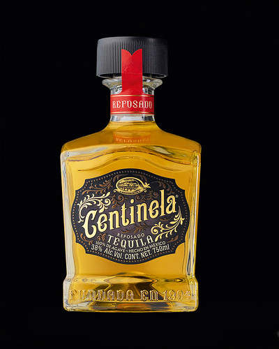
Centinela Tequila, 2012.
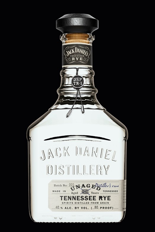
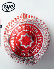
Top: Jack Daniel’s Unaged Tennessee Rye. Design: Stranger & Stranger, 2012.
Reassuringly cool and expensive
Roxy Music’s Bryan Ferry once objected to the wine ordered by a journalist who interviewed the songwriter for the Wall Street Journal. ‘I hate that,’ said Ferry. ‘You hate the wine?’, asked the interviewer. ‘No, the label,’ he said. ‘I can’t drink a wine if it has an ugly label.’ (Château Figeac is one of Ferry’s favourites, partly because of its label.)
Shaw says: ‘You can be cool and subtle on a restaurant wine label, where the consumer doesn’t even see the label before purchase and it only needs to look reassuringly cool and expensive on a linen tablecloth. In a bar, with the lights and the competition, completely different rules apply.’
In a different sector of the wine market, Fernando Gutiérrez (see Eye 36) designs labels for small Spanish vineyards. ‘Wine is a very closed world,’ he says. ‘The people I work with don’t have big budgets and they tend to be very suspicious of design, seeing it as something superficial. They feel they don’t really need to design a label because good wine will sell out in advance, so they have not made the effort.
‘But’, he goes on, ‘there has been a renaissance in Spanish wine, and it doesn’t have the baggage of the French. The Spanish had to reassess their identity, they had to start from scratch, and so they will take risks and reinterpret what wine is all about. His first wine label in 1999, was for Gago wine from the Toro region, which features a bold lower case ‘g’ augmented by a bull’s horn.
‘I’m very close to the vineyards I work with,’ he says, ‘and I want the design to be inspiring for the guys working in the winery, to make them proud of their work. I never think of strategy and I don’t believe it’s a branding exercise; the more branded, the more superficial it gets.’
Gutiérrez explains the thinking behind the label he designed for Valdesil, a range of six wines produced from old vines by a father and his three sons. ‘The wine comes from Galicia, which is very stark, and a very white label reflected that. So I created a system, with a graphic illustration on the base of a very white label. The ground there is slate, so it’s based on that geometry, with slate colours of grey, blue and purple.’ His design for the sweet Malaga wine, Molino Real, uses a coloured die-stamp of a lizard, ‘because in that area the grapes are toasted on the roofs in the sun and lizards are everywhere.’ The label for Pegaso features an illustration of a rusty mattress, which Gutiérrez says ‘looks like their old vines.’
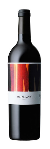
Gutiérrez often returns to his designs. ‘It’s like a Formula One car,’ he says. ‘You’re tweaking it all the time.’ So the label for M2, illustrated by Alan Kitching’s letterpress print, is being reworked to wrap around the bottle like its parent wine, Matallana. And his Rioja range, Lanzaga, is now being redesigned because the wine has, in his phrase, ‘moved up’. He wants to use typography and reference Rioja’s nineteenth-century industrialisation.
Even in the more commercial arena, the origin of any drink is of fundamental importance. ‘The first thing we ask about, and one of the most valuable commodities these days in spirits, is provenance,’ says Stranger & Stranger’s Kevin Shaw. ‘People are buying local produce more and more. In the US there are many spirits that you won’t find outside of one state, one town even. Craft is king right now and provenance is everything.’
Matallana, 2003. Alan Kitching (see Eye 15 and 74) produced the letterpress artwork. Kitching has also made label images for Matallana’s ‘sibling’ wines M2 and No. 2.
Communicate the feeling
Curiously, a label’s design rarely attempts to reflect the taste of the drink. Is that because designers rarely taste it?
‘I don’t taste the wines,’ says Gutiérrez. ‘After fifteen years of doing this, I’m only just able to differentiate between them! I’m more interested in the winemaker, the person behind the product, who’s looking for uniqueness. I’m bringing my talent to communicating in an authentic way how they feel about that product.’
Shaw goes further. ‘We try to not taste the product at all before launch,’ he says. ‘We’ve had a few disappointments, and that definitely has a negative effect on the creative process. It’s always best to focus on the totally amazing imaginary taste of the product.’
The evolving technology of label printing provides another opportunity for designers. ‘Labels come in huge self-adhesive rolls, which are taken off on the bottling line by little suckers and rolled onto bottles at high speeds,’ says Shaw. ‘The paper is really thin, usually less than 100gsm, and specially made to work under stress and to take a huge amount of finishing. Some of the printers have thirteen stations (for thirteen special colours) or maybe six specials, a couple of varnishes, a few stepped embossings and a few foils. You can have any combination of inks, texture rollers, varnishes, foils and embossings. It gives a richness to labels that you can’t get close to with regular CMYK print.’
Some traditional labels have embraced the opportunity to update their brands. Stranger & Stranger worked with Jack Daniel’s on new products such as Unaged (where the design ‘had to straddle the fine line between stripped back and finely crafted’), Winter Jack and White Rabbit, retaining some elements of the original typography and styling, but radically inventing others. However, only a few historic wines, such as the Château Lyonnat claret, the Coto de Imaz Rioja and Château Rauzan-Ségla with its 2009 Karl Lagerfeld label, have made the leap.
Not everyone approves. Gutiérrez argues that ‘cleaning up’ a label risks losing its identity. ‘A label’s got to have character, it’s got to be genuine.’ Designing for wine is, for Gutiérrez, about capturing an essence: ‘I believe in the poetry. And I want to be part of the story.’
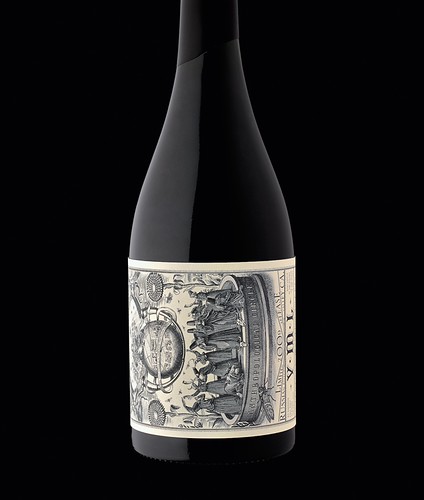
VML Californian Pinot Noir label. Design: Stranger & Stranger, 2009. Modern wines, in contrast to spirits, remain in traditional bottles, so the label must create all the interest. That can be done with stark simplicity or with intriguing complexity. The VML label draws upon the arcane, almost mystical complexities of biodynamic winemaking.
Paul Keers, writer, co-founder of the Sediment wine blog, London
First published in Eye no. 87 vol. 22 2014
Eye is the world’s most beautiful and collectable graphic design journal, published quarterly for professional designers, students and anyone interested in critical, informed writing about graphic design and visual culture. It is available from all good design bookshops and online at the Eye shop, where you can buy subscriptions, back issues and single copies of the latest issue. You can see what Eye 87 looks like at Eye before You Buy on Vimeo.