Spring 2014
Raw like sushi
James Casey
Brian McMullen
Lotta Jörgensen
David Lane
Rob Lowe
Marcus Nilsson
Jess Bonham
Bela Borsodi
Alternative food zines scramble the conventions of magazine design to make a more authentic flavour
This is a boom time for magazines about food. But while mainstream food magazines maintain healthy circulation figures with the help of ‘how to’ features and celebrity chefs, there are a host of ‘alternative’ food magazines that take a different approach. Rejecting such conventions as cooking tips and recipes, they favour a wider sensibility, linking food to issues such as personal identity, sexuality, music, travel, culture, art and literature.
The articles within these publications range across such subjects as the future of fish and its sustainability; erotic food scenes in film; ‘hippophagy’ or eating horsemeat; eroding topsoil; or baking through chemistry. They may also include extensively researched photographic portraits of food in situ, such as the stunning series of alive-to-dead portraits of ducks in the first edition of Fool (Malmö, Sweden).
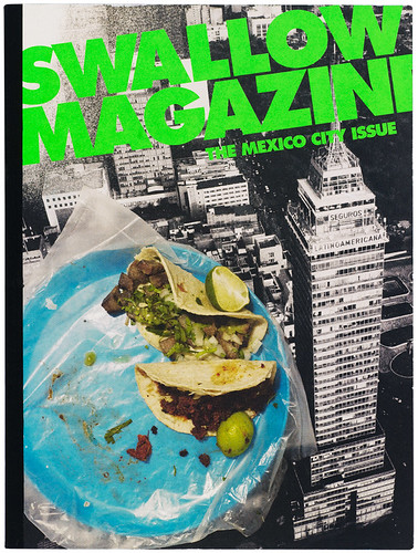
Cover of the region-specific biannual magazine in its third issue – Nordic, Trans-Siberian, Mexico City – positions itself within the ‘realm of culture and how food and drink relates to it’, says James Casey, Swallow’s founder and creative director.
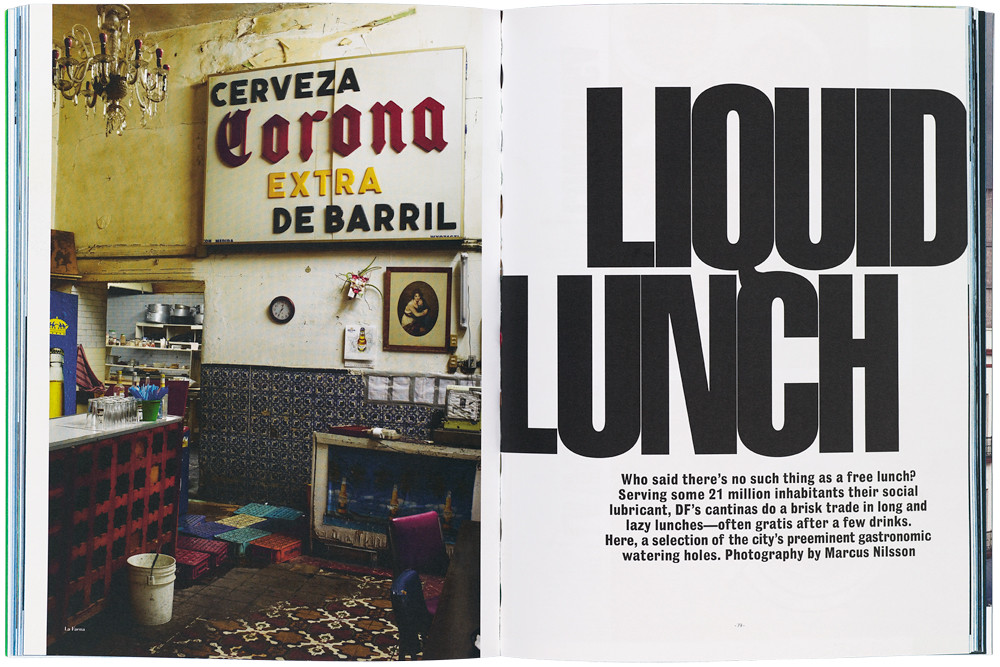
Top: spread of ‘Liquid Lunch’, from Swallow Magazine no. 3, 2013, photographed by Marcus Nilsson. Founder and creative director: James Casey.
Alt-food zines
Faced with a stack of alternative food magazines – some of them more like zines – it is hard to distinguish the American titles from British, European or Middle Eastern examples. Despite the diversity of content and editorial design, they have a few elements in common – their visual language and their attitude.
Magazines such as Meatpaper (San Francisco), Put A Egg On It (Brooklyn) and Swallow Magazine (New York) all tend to feature raw, realistic photographic portrayals of all things edible, alongside expressive illustrations, bespoke lettering and universally available typefaces. The editorial design tends to adopt a light and playful manner.
The forerunner of 21st-century alternative food zine publishing may be Gastronomica (California) which launched in 2001. This magazine remains on the market today, virtually unchanged in format and its approach to ‘critical food studies’.
Alt-food zines have been emerging ever since, including Alimentum (Nashville), Diner Journal (New York), Remedy Quarterly and Saucy (Brooklyn), Runcible Spoon (Washington), McSweeney’s Lucky Peach (San Francisco), Haute Food and Gather Journal (New York). Meanwhile in Europe there were La Brousse (Marseille), Alla Carta (Milan), Mood (Brussels), Fire & Knives (London and Cambridge), Cereal (Bristol) and, more recently, The Gourmand (London).
There are also many hard-to-find zines and one-off alt-food magazines made by locals for locals. And there are mags with a noticeable attachment to their cities of origin, including The Carton (Beirut, Lebanon) and Acqtaste (Toronto). MagCulture founder Jeremy Leslie notes that food is an area in which local traditions and culture can appeal to a global audience. ‘Part of the current growth in indie food titles is built on this,’ says Leslie. ‘People proudly share their local eating customs with a global audience.’
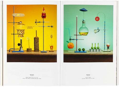
Spreads from The Gourmand no. 2, 2013. ‘Measures of Quality: The Five Cocktail Families’ featuring a hot toddy recipe (left) and margarita recipe (right). Set design: Jamie Julien-Brown. Photography: Jess Bonham.
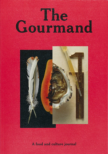
Cover of The Gourmand no. 1, 2012. Art director: David Lane. Editors: David Lane and Marina Tweed.
Provocative photography
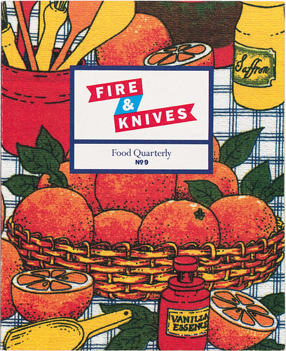
Alternative food magazines take design inspiration from traditional cook books, kitchens, menus and even grocers’ signs – things that give the reader a sense of familiarity. The Gourmand, for instance, features a wipe-clean cover, while an issue of Fire & Knives features scanned tea towels on its covers.
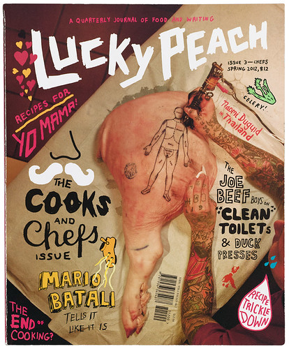
Lucky Peach’s logotype (designed by McSweeney’s Brian McMullen) bears a close resemblance to a butcher’s handwritten label. These elements permit food-related sub-narratives to develop within a familiar space. But this shared ground is often disrupted – perhaps by photographs of raw, smeared, half-eaten or bug-infested food and packaging that diverges from conventional food photography in both content and style.
Rawness features regularly. Not only are photos of raw ingredients and unprepared foodstuffs used as illustrations for step-by-step recipes; they also make a visual statement. Pictures of uncooked chicken breasts are prominent in Lucky Peach (no. 6), while disturbing images of half-plucked poultry appear in the third issue of the ‘anti-foodie’ title Swallow Magazine.
James Casey, Swallow Magazine’s New York-based founder and creative director, says: ‘There’s no universal approach [to photography]. It comes from a desire to see things new and unexpected on the page. From the established to the up-and-coming, it’s all relevant. Many references come from fashion in the 1990s, especially fashion from the UK. Handheld cameras, film, grain – things that, in their time, spoke of … authenticity. Generally, the retouched is to be avoided, and anything that proves to provoke a response – good or bad – is never a bad thing.’
Eliciting a response from readers is at the heart of the best alternative food magazines. So it is unsurprising that photographs from these publications have been exhibited in galleries, such as images from Swallow in 18 Hewett Street, and from The Gourmand in KK Outlet, both in London. Some magazines, such as Alimentum, Diner Journal, Meatpaper and Fire & Knives, broke from highly styled food photography in early editions and substituted illustrations. But later editions saw a return to professionally photographed and styled images, often of obscure food scenes akin to contemporary art photography. Two examples of this are photographer Bela Borsodi and food stylist Victoria Granof’s Mexican High Baroque series (Swallow, no. 3), and ‘The Serpent That Ate Its Own Tail’ (The Gourmand, no. 2). Lucky Peach also employs photography in an equally provocative manner, but with images shown en masse rather than as striking individual pictures.
Many photographs show evidence of digital manipulation: ‘Lo-fi’ grainy photos are frequently used, either to invoke nostalgia or to follow online trends. Retouching often mimics filters supplied by applications such as Instagram and Hipstamatic. These filters may alter tone, exposure or saturation, overlay non-existent scratches to the ‘emulsion’, or add Polaroid-type borders to otherwise mediocre photos.
Alternative food magazines are generally made by people with a passion for the subject. Rob Lowe, art director of Fire & Knives (now closed) says, ‘The magazine’s remit was always that the authors should write like amateurs, in as much as they should write about something that they were passionate about in a fan-like way. The design of the magazine reflected this in that the techniques I used were very much those of an amateur.’
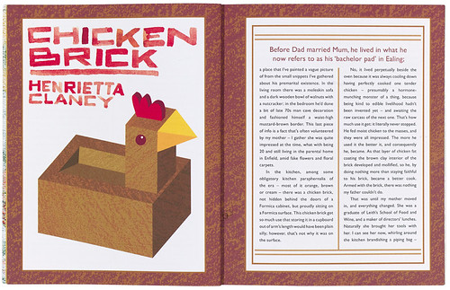
The reference to the magazine’s design as ‘amateur’ should be taken lightly. The subtleties of Lowe’s approach, combined with his confident use of space, separated the design of Fire & Knives from the more derivative visual language of, say, Runcible Spoon, which borrows from the cut-and-paste and photocopier aesthetics of early fanzines. Lowe says that his design choices were totally informed by the copy. ‘Some are more obvious than others,’ he says. ‘For example, for an article about ketchup, I wrote the headline in ketchup and photographed it. I’m a big fan of going for the simple idea.’
Chicken brick lettering. Spread from Fire & Knives no. 9, 2011. Design and art direction: Rob Lowe. Lowe introduced bespoke lettering, including handwriting, in the fifth issue (2010) and continued until the final one in 2013.
Scanned tea-towel cover of Fire & Knives no. 9, 2011. Design and art direction: Rob Lowe.
Interpretive illustration
The balance between text and image influences the pace of a publication. Magazines such as Put a Egg On It and Lucky Peach make strong use of visual essays and illustration. These visual elements are a secondary narrative that can make the complexities of food systems easier to engage with, and can also allow for interpretive readings of social, political and cultural situations. Lucky Peach exemplifies this function of illustration with such hard-edged pieces as ‘The Apocalypse is Upon Us’ (by Robyn O’Neil, Josh Cochran and Scott Teplin, no. 6), and ‘Sushi, USA’ (by Lauren Weinstein, no. 4). In the latter, which is heavily researched and loaded with facts about the history of sushi in America, Weinstein’s watercolour image shows the realities of Western versus Japanese sushi menus, highlighting the potential for various chemicals to end up in a consumer’s salmon-skin roll.
Alternative food magazines reject the food publishing model that prioritises celebrity chefs, over-elaborate recipes and ‘perfectly styled’ (or artificially styled) images of food. While many such magazines include (or were initiated by) chefs, the dialogue that has developed within this genre of independent publishing deals with food beyond its usual role as a basic human necessity. Each item has a symbolism that transcends its edibility. Food and drink are at the centre of many fundamental human interactions. The links between eating and other areas of culture – from music to literature – will continue both in daily life and on the pages of alternative food magazines for years to come.
Many of these magazines ask their readers to reconsider the production and consumption of food – and its role in society – with more thought. They draw attention to the way that food punctuates our lives. They offer fresh perspectives, sharp contrasts and brutal truths that can expose the hidden beauties and flaws of food, fresh on the table like pieces of raw meat, fish or vegetables on a slab.
Lucky Peach is published by McSweeney’s (see Eye 78) in San Francisco. Logotype: Brian McMullen. Pig tattoo cover for no. 3, 2012, by Cody Miller of Blackheart Tattoo. Photograph: Chris Ying.
Eye is the world’s most beautiful and collectable graphic design journal, published quarterly for professional designers, students and anyone interested in critical, informed writing about graphic design and visual culture. It is available from all good design bookshops and online at the Eye shop, where you can buy subscriptions, back issues and single copies of the latest issue. You can see what Eye 87 looks like at Eye before You Buy on Vimeo.

