
Autumn 2000
Read me! Part 1. Literacy in graphic design
Graphic designers are responsible for the communication of ideas through words, signs and pictures. Yet experimentation and new aesthetics cannot emerge without a thorough understanding of reading and writing: if we accept that language is important, we must be prepared to protect it
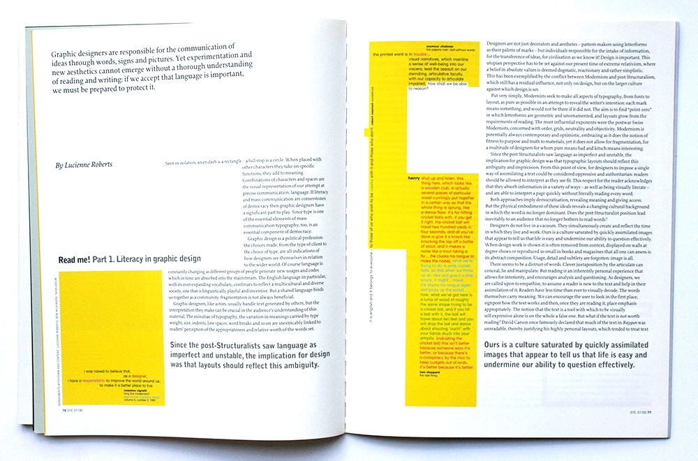
Seen in isolation, an en dash is a rectangle – a full stop is a circle. When placed with other characters they take on specific functions, they add to meaning. Combinations of characters and spaces are the visual representation of our attempt at precise communication: language. If literacy and mass communication are cornerstones of democracy then graphic designers have a significant part to play. Since type is one of the essential elements of mass communication typography, too, is an essential component of democracy.
Graphic design is a political profession: the choices made, from the type of client to the choice of type, are all indications of how designers see themselves in relation to the wider world. Of course language is constantly changing as different groups of people generate new usages and codes which in time are absorbed into the mainstream. The English language in particular, with its ever-expanding vocabulary, continues to reflect a multicultural and diverse society, one that is linguistically playful and inventive. But a shared language binds us together as a community: fragmentation is not always beneficial.
Graphic designers, like actors, usually handle text generated by others, but the interpretation they make can be crucial in the audience’s understanding of this material. The minutiae of typography, the variation in meanings carried by type weight, size, indents, line spaces, word breaks and so on are inextricably linked to readers’ perception of the appropriateness and relative worth of the words set.
Designers are not just decorators and aesthetes – pattern-makers using letterforms as their palette of marks – but individuals responsible for the intake of information, for the transference of ideas, for civilisation as we know it! Design is important. This utopian perspective has to be set against our present time of extreme relativism, where a belief in absolute values is deemed dogmatic, reactionary and rather simplistic. This has been exemplified by the conflict between Modernism and post-Structuralism, which still has a residual influence, not only on design, but on the larger culture against which design is set.
Put very simply, Modernists seek to make all aspects of typography, from fonts to layout, as pure as possible in an attempt to reveal the writer’s intention: each mark means something, and would not be there if it did not. The aim is to find ‘point zero’ in which letterforms are geometric and unornamented, and layouts grow from the requirements of reading. The most influential exponents were the postwar Swiss Modernists, concerned with order, grids, neutrality and objectivity. Modernism is potentially always contemporary and optimistic, embracing as it does the notion of fitness to purpose and truth to materials, yet it does not allow for fragmentation, for a multitude of designers for whom pure means bad and kitsch means interesting.
Since the post-Structuralists saw language as imperfect and unstable, the implication for graphic design was that typographic layouts should reflect this ambiguity and imprecision. From this point of view, for designers to impose a single way of assimilating a text could be considered oppressive and authoritarian: readers should be allowed to interpret as they see fit. This respect for the reader acknowledges that they absorb information in a variety of ways – as well as being visually literate – and are able to interpret a page quickly without literally reading every word.
Both approaches imply democratisation, revealing meaning and giving access. But the physical embodiment of these ideals reveals a changing cultural background in which the word is no longer dominant. Does the post-Structuralist position lead inevitably to an audience that no longer bothers to read words?
Designers do not live in a vacuum. They simultaneously create and reflect the time in which they live and work. Ours is a culture saturated by quickly assimilated images that appear to tell us that life is easy and undermine our ability to question effectively. When design work is shown it is often removed from context, displayed on walls at degree shows or reproduced so small in books and magazines that all one can assess is its abstract composition. Usage, detail and subtlety are forgotten: image is all.
There seems to be a distrust of words. Clever juxtaposition by the articulate can conceal, lie and manipulate. But reading is an inherently personal experience that allows for interiority, and encourages analysis and questioning. As designers, we are called upon to empathise, to assume a reader is new to the text and help in their assimilation of it. Readers have less time than ever to visually decode. The words themselves carry meaning. We can encourage the user to look in the first place, signpost how the text works and then, once they are reading it, place emphasis appropriately. The notion that the text is a tool with which to be visually self-expressive alone is on the whole a false one. But what if the text is not worth reading? David Carson once famously declared that much of the text in Raygun was unreadable, thereby justifying his highly personal layouts, which tended to treat text primarily as image. Are graphic designers equipped to take on this editorial role?
Typographers have often been preoccupied with questioning the ‘agreed’ or ‘approved’ way to set type. While language needs to be fixed in order to communicate it is also in a constant state of change that reflects the surrounding culture. Details of layout and typography used to reflect these changes more slowly, but the democratisation of design and typesetting through technology has transformed some of the hierarchies still in place a decade ago. Ranged left setting, the use of sans serif text and the asymmetric grid are all examples of typographic experiments that have now become accepted norms. Though rooted in usage, at the time they challenged conventional wisdom. There is still plenty of scope for new typographic experimentation. For example, why use a full stop at the end of a paragraph when it is obviously the end of a sentence? Being a literate designer does not necessarily mean being restricted and bound by convention. Responsibility to the text can mean that the aesthetic grows from the requirements of the copy.
In Britain, the traditionally literate were always valued more highly than the visually aware. Text was sacred. Designers had to refer back to the author (who often felt entitled to comment on their work). Now technology gives designers direct access to text, permitting them to blur and distort meaning, to become ‘authors’ themselves.
There is nothing new about the fear of change, but designers have been required to extend their skills enormously since the advent of new technology. (I’ve never quite understood why the Macintosh computer was greeted as a creative and liberating tool when much of the day-to-day work previously undertaken by skilled comps and proof-readers was suddenly added to distract designers from their primary function.) The blurred edges between professions have resulted in a kind of no-man’s-land between designer and client. Responsibilities are less clear. At one end of the spectrum, designers are at liberty to question the validity of the text and make editorial judgments, while at the other, basic errors creep in as each party assumes that others are watching out for consistency and detail.
If we accept that it is our written, typeset language that unites us and gives us our principal means of expression then we must be prepared to protect it – from the humblest en dash to the final full stop.
‘I was raised to believe that, as a designer, I have a responsibility to improve the world around us, to make it a better place to live’, Massimo Vignelli, ‘Long live Modernism!’, AIGA Journal of Graphic Design no. 2 vol. 9, 1991.
Lucienne Roberts, designer, Sans + Baum, London
First published in Eye no. 37 vol. 10, 2000
Eye is the world’s most beautiful and collectable graphic design journal, published quarterly for professional designers, students and anyone interested in critical, informed writing about graphic design and visual culture. It is available from all good design bookshops and online at the Eye shop, where you can buy subscriptions and single issues.