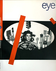
Summer 1994
Reputations: Anthon Beeke
‘I don’t think I could have come out on the streets with these posters in Berlin, Paris, or London – not to mention America’
Anthon Beeke was born in Amsterdam, Netherlands in 1940. Apart from a few months of evening classes at the school of applied arts, he received no formal design training. After working as an apprentice for a number of overseas designers, he spent an important formative year as an assistant to Jan van Toorn. In 1963, Beeke established his own graphic design practice, working mainly for literary publishers, museums, cultural magazines and theatre companies. His independent career was interrupted from 1976 to 1982, when he was assistant director of Total Design; until the foundation of his own Studio Anthon Beeke in 1987 he occasionally worked with Dutch designer Swip Stolk. Beeke’s designs have always generated controversy, from his 1969 alphabet composed entirely of naked women, to his notorious 1980 poster for Shakespeare’s Troilus and Cressida – intended, the designer claims, as a feminist statement. Beeke now employs a staff of eight in his Amsterdam office. He has been awarded innumerable prizes for posters, books, magazines and calendars. His clients include the Stedelijk Museum, Toneelgroep, the newspaper publisher Perscombinatie and book publisher Prometheus. He is currently involved in the international trend-forecasting magazine View on Colour.
Carel Kuitenbrouwer: Are you pleased by the stir your posters sometimes cause?
Anthon Beeke: Yes, of course. That’s what I find most important in a poster: that it’s a means of communication, it can make people angry, you can use it to stir up debate. That’s when the medium really works. It’s the sort of power I have from time to time – a power that’s granted me by my clients. I’m not always provoking, that would reduce the tension. You have to measure out the indignation and anger, not walk around toting a red hot poker all the time. If you do that, you’re nothing but a pain in the neck.
Those posters that show genitals, for the theatre group Toneelgroep Amsterdam among others, are statements made by me as a man to women. I’m talking about a rat in the kitchen, that part of us in which we as men are not kosher when it comes to women, yet which we see as completely natural.
CA: Why make these statements?
AB: If, like me, you live in a community of reasonably humane, culturally well grounded freethinkers, in a city which has manifested its mercantile spirit from the sixteenth century by systematically plundering the world and accumulating an enormous wealth, a city which offers a tremendous amount of energy and in which this spirit of free trade has gathered considerable wind power, then it is your duty to defend those achievements. Amsterdam gives me a lot of energy, so I try to give Amsterdam some of my energy back. My poster may be a curse to some, but they confirm what others already feel. We are allowed, indeed given government subsidies, to post them up freely, and this is a good I would like to preserve. I don’t think I could have come out on the streets with these posters in Berlin, Paris, Madrid, London or wherever, not to mention America, where they begin to tremble if you post them on the walls of their so-called progressive art schools. So you might say I do it to set an example.
CK: How do you express your involvement in your projects?
AB: There are many ways to do that, whether for theatre or museum posters. Some exhibitions, for instance, have a second subject apart from the visual art. Take the example of the exhibition of Latin American art at the Stedelijk Museum, which gave me the opportunity to show something more of Latin America than I was asked to do.
CK: How did that work?
AB: The title of the exhibition was “UABC”, the initial letters of the countries the works came from: Uruguay, Argentina, Brazil, and Chile. It was a large exhibition intended to draw a large crowd, so the poster had to be fresh and eye-catching, clear and not cryptic. To begin with I used warm, vivid colours of the Latin America we all long for – samba-rumba, so to speak. But we also know about the “foolish” mothers walking around the Plaza de Mayo in Argentina and the many intellectuals in Chile who had their hair shaved off. We know a lot more is going on there – we’ve read about it in the papers, seen it on television, we know people who’ve fled and the stories they’ve told us. Of course, it’s impossible to explain all this in a poster that’s meant to publicise the new visual art of these countries, and I’m not being asked for a political statement. But you can nevertheless try to indicate something of the mentality of that part of the world, and your own feelings about it.
So if in the “U” of Uruguay – a country where most of the Indians had been massacred – I show the mourning colours of those Indians in feathers, at first sight it might seem like nothing but a bit of folklore. Then in the “A” of Argentina I put the most dangerous cactuses, the sort that spit little arrows. In the “B” of Brazil I put meat – not because of the cattle, but because of the life of the Indian is worth nothing there. The cut-off hair in the “C” of Chile disrupts the seemingly folkloristic concept. Where does the hair come from? Collected by Pinochet’s barbers, of course. Until recently, if you didn’t agree with the authorities in Chile you were awarded distinction of a crew cut – one big concentration camp, really.
CK: You’ve never had any training as a designer?
AB: No, I’ve never had any training at all. My father was a plasterer and he was 56 when I was born. So when I was fourteen and could leave school, he wanted me to learn a trade as soon as possible. He wanted me to become a plasterer, and I wanted anything but that. I wanted to become an advertisement artist – someone who would paint those enormous film posters you saw hanging above the cinema entrance. But that dream couldn’t come true because you weren’t allowed into drawing school unless you had finished secondary school. So through a series of coincidences I ended up in the butchery trade.
But I found drawing wouldn’t leave me alone. So at fifteen I secretly took the entrance exam for the school of applied arts (now the Rietveld Academy). I was amazed to hear I’d passed – on the strength of five sawn-out, ink-filled Walk Disney gnomes and some battle scenes. Picasso was my middle name!
CK: What did your father think?
AB: I didn’t tell him – I had hardly any contact with him. He was a widower when he met my mother and he had sons with children much older than me. My school pals’ parents were younger than my half-brothers, which was very confusing. I never knew where I stood in the line of generations.
When I started to attend the school of applied arts in the evenings, I found that, too, was a world in which I did not belong. I’d been to a museum twice when I was at primary school, that’s all. Most of the other students were much older, had the right education or had already done their military service, had jobs, were engaged or had a family. They were far more aware of what they were doing.
CK: Further confusion because of a missing link with your peers?
AB: Exactly. And a missing link with education. I had not learned what it is to learn. Then about a year later my father found out I was at that “goat’s wool sock” school instead of at butchery evening school. He kicked me out of the house and said “If you are so cocksure, then go ahead and look after yourself.” A good decision, I think, with hindsight. I entered day school, but though I was among people from my own generation, they had all been to grammar school and it didn’t take them long to find out I was an illiterate. I was thrown out and the world sank beneath my feet. I worked nights in a chip shop. Then I started to play pantomime, which I thought would be fun, but I found myself once again among people who came from secondary school and had conversations about theories I couldn’t follow. So it was back to my drawing table, where I felt best, king in my own kingdom.
Eventually a friend helped me to get a spell of work for an American designer, Ed Callahan, in Düsseldorf. He was an engineer, with a very precise approach. He spoke English in a country where they all spoke German, and I had only learned Dutch. I felt totally lost. I came back to Holland via Brussels and did all sort of jobs, including one at an ad agency, to try to make money.
CK: You were a jack-of-all-trades?
AB: Yes, indeed. All those experiences did teach me a lot about human nature though. Then came Jan van Toorn, who was looking for an assistant for a year because he was doing the prestigious Philips journal Range. He needed someone with a lot of experience to help on his day-to-day work. And I did have a lot of experience.
Jan had only just started, but I felt I could learn a great deal from him. I sensed that this was a chance to get a grip on my broken past and find out what I could do with it in the future. Apart from an intellectual approach to the profession, working for Jan taught me a lot of technique. I put in an idiotic amount of energy – I worked with him from early morning until way into the night, seven days a week. It drove Jan crazy. After a year he fired me, exhausted with work and endless discussions, but he sent me off with an insanely valuable present – a commission I could live on.
At last I felt I was on the right track. I was about 22 or 23 and I would have to find some way to make my mark in an area others had been trained for. I still thought of myself as an amateur, but suddenly I began to see my amateur status as a good starting point. You are less bound by convention and sacred truths. I could draw a little, paint, had done some photograph, pantomime and even singing, had travelled all over Europe, and most importantly could look after myself. In short, I had lots of experience that should give something special to my graphic work. It was not difficult to put myself at right angles to the commonly accepted position. And by adopting a different approach I swept all my so-called backwardness off the table at a stroke. That feeling has given me great freedom.
When I started out there were maybe 20 graphic designers in Holland, and in my eyes they were all gentlemen. I was not against them, but I wanted something for myself too. I would never be able to catch up with them, so I would have to find a totally different way to place myself in the world. What could be better, then, than to come in with a bang? Graphic design was like a flat, untouched snowy landscape modelled by Crouwel and his clones – you would only have to pull a finger through it to break the serenity. But that’s not what I did: I took a flying somersault so that I would leave not just a trace, but an irreplaceable scar. I felt I had to make that statement.
CK: Why was that?
AB: I was, and still am, a jazz freak. You can clearly see in that world that musicians playing in someone else’s idiom may well be better at it than the originators, but they nevertheless remain shadowy figures. I was not going to be one of them. I had a role model in Thelonious Monk: with his unbridled imagination and limited piano technique he managed to become one of the greatest in his genre. Added to this, I had a strong suspicion that I had nothing to lose.
The world is wound up, just as merry-go-round is wound up, and then spins for a while. Winding it up is done by individuals, who each give the world a twist, their twist. This sort of spinning, dancing, is what interests me.
CK: Did Van Toorn spur you on to make that choice?
AB: No, Jan tried to bring an intellectual attitude into the profession. He was intrigued by the Russian avant-garde, which has had its run-up in the 1920s but never managed to grow to full stature. He tried to bring the Constructivist mentality and formal language into play in his work. In the mid-1960s, that fitted in well with the climate. But with him it wasn’t cynical, it came from the heart.
CK: Were you ever politically active?
AB: No, politics is not what I’m interested in. At the school of applied arts I was a member of OPSJ, the Organisation of Progressive Students, a Communist youth movement, so I had some political schooling. But I’m not someone who believes in politics. I believe in the individual. If you want to make a political statement, you have to do it by yourself, you have to be able to make your own independent choice.
CK: What are you views on graphic design today?
AB: The profession has become much broader – not better, but broader. It has become much more commercial, there are so many more people making a living out of it. But it is hardly being thought about. There are some 3000 graphic designers in the Netherlands and they are all doing the same thing, there is no debate. I invited Gert Dumbar to pick up the historic debate where Van Toorn and Crouwel left off, but though he is one of the most provocative figures in Dutch graphic design, he says it will lead to nothing because he believes we are all doing the same thing. That’s ridiculous. The principles on which we base our designs are radically different. They don’t look alike because his are based on form and mine on content. It’s not about who’s right and who’s wrong, but a debate like this would give you so much energy. Gert has stuck his neck out, and so have I. Why shouldn’t we bang these stubborn heads of ours against each other for a change?
CK: Nowadays almost anyone is a bit of a designer. If you have a computer and some good examples, it’s not difficult to come up with something.
AB: That is precisely why we have to think about our function. If anyone can do it, we might as well abandon graphic design as a profession. But fortunately it hasn’t come to that yet – conjuring up a dish of spaghetti on a computer is not what I call design. If you called anyone a singer who claims they can sing well – because it sounds good in the shower – and gave them broadcasting time, you can imagine what it would do to your ears. It’s the same with graphic design. It’s a discipline you perform with your brain, your heart and only then with your eyes (although you do need some taste). If you use those ingredients, and back them up with a solid understanding of graphic technology and especially of the culture you are part of, then you might come up with a reasonable piece of design now and again. That’s not something I can see people doing by mucking about on a Macintosh from time to time.
It’s still a profession you have to study hard if you want to fill your life with it. But in the institutes nowadays hardly anyone is thinking about what they are doing. The academies deliver only the unique artists – the Crouwels, Sandbergs, Jan Bos’s – even though there are no more than three clients in the Netherlands who would require a poster made by one of them. The 3000 or 30,000 others are middle-of-the-road, and they are not prepared to do the jobs that are asked of them. If I were asked to make a Dutch edition of Newsweek, I wouldn’t know how to handle it. Despite the butter mountain of graphic designers, there’s no one with the professional training to tackle such a job.
I think education should be segmented, specialised. Perhaps some of the academies should go, but there’s no long-range concept that would make that possible: there are no buildings, administrators, cleaners who all need jobs, which means you need so many students. I think we should take a look at education from a radical perspective: what is going on in this profession and what schools do we need to prepare people for it? Then the schools should focus on the average student instead of on the two or three who would have made it anyway.
CK: You are attached to values such as individuality and originality – which you rightly feel explain the greater part of your own success – yet you seem to want to discard them when it comes to the majority of people.
AB: I can’t have made myself clear. What I mean is that not everyone is born to be a goal-scorer like Cruyff [Dutch footballer]. There are great achievements in the midfield and defence as well, but they don’t attract as much attention. Myself, I’m a goal-getter – I think I’ve proved that by now. I’m prepared to keep on digging and I’m always up for adventure. Most of my clients appreciate my method, probably because I give them the feeling they are getting more than they asked for.
CK: Why do you do that?
AB: It’s a need I have. A graphic designer is like a fashion designer. He or she puts a company in new clothes, supplies the right shirts, jackets, trousers. These garments should fit like a glove, not too tight (not enough guts), but certainly not too large. If the company grows, you have to make new garments to suit the new demands. I am a person who likes people and things that are a bit eccentric, and that’s how I approach what I have to design. In the beginning it takes some pushing, but after a while the clients find they feel happy in their new jacket, it gives them room to move and stand out in their environment. Of course, you can’t do that for any company – the seeds must be there. But it generates a lot of energy and gives them charisma. This isn’t about design alone – I find design so incredibly uninteresting. Taste is something we have all acquired, but now any greengrocer is capable of dressing his shop window to perfection. So what do we have in this profession besides what anyone can do?
CK: Functionalists like Crouwel had social ideals. They wanted to improve communication by creating unpolluted streams of information.
AB: I have come to realise the value of that. But I think my way of communicating in the 1960s and 1970s was a vital attempt to destroy that world outlook, because that style also exuded an air of: “There’s nothing wrong, folks, go to sleep and we’ll take care of you.” Its design looked well groomed, giving the impression that the content would be in order too. What was needed was disruption. Nowadays you might almost long for that purity, but not sterile or “contently correct”. It seems as though people today are all speaking with their mouths full of bubblegum, not making any sense. Rococo design, one great concubinage of quotes and plagiarism, a lot of fun from time to time, but for the most part completely empty. Good for selling angora jumpers in well-off streets.
CK: You never went in for that, did you?
AB: In the early 1960s I came across the work of George Maciunas, the “inventor” of the Fluxus movement. The anarchy, humour, cynicism, but also the concern for society were all aspects I found in my own character. That was the attitude I worked with – not a formal principle, but a content-related concept in which form was an indispensable side issue and an area of free experiment. I still work like that. Of course, I occasionally dipped a toe in that hot bath called rococo, but it doesn’t give me satisfaction. It’s too aesthetic and shallow. It’s very much limited to arranging things, so it’s as if you come back to that neat Dutch design of the 1960s. And thought I realise this sort of formal constraint is greatly appreciated by clients, I believe that’s because many clients don’t have a lot to say, but they can still get themselves an image in this way. No message, all form.
CK: Where is your work going now?
AB: I call it generic design, working from the genes, from your origin. To see how you can use less outward show – to the point where you become almost invisible – to arrive at solutions that can recharge the batteries for a time. To find simplicity coupled with the enormous expressive power you see in drawings by Modigliani or Rodin.
CK: Could you give an example?
AB: Take the calendar we made for the Perscombinatie newspaper publishers a few years ago. Fifty-two large-scale press photographs printed on newsprint, simple typography, three staples, a sheet of cardboard and there you have it. An enormous success – and not only among the recipients of the product. My colleagues, too, seized on it like bees on honey, though most of them were experimenting with highly sophisticated technological combinations and types of paper at the time. It was even chosen as the best calendar in ten years! So why did those designers fall for a product that looks as though it was made by the printshop around the corner? I think it was because they recognised something they would like to have made themselves, a kind of absolution.
CK: But where does that leave us? Should we limit ourselves to making calendars on newsprint?
AB: I’ve no idea what the future will be like, or should be like. I think a calendar like this shows that you can make something valuable without having to jump a triple axle, that a strong personality can express itself in simple materials. But it was the concept – press photographs presented in the manner best suited for that medium – that was the decisive factor in its success.
Many young designers try to imitate a video clip on paper. But I don’t think we need 10,000 typefaces and 8 million colours. I think what we have to do as the communicators of today is get our act together. The difference between now and 30 years ago is that people have learned to recognise images. That widens the scope for combinations of images and typography.
CK: You are becoming an authority in Dutch design, but without the accompanying position in juries and committees that Crouwel or Dumbar hold.
AB: I still see myself as an amateur, an adventurer. I’m still searching for innovation, but that takes time because it’s still me who is pushing the pencil across the paper. Crouwel is a superb organiser: most designs could be made very swiftly on the basis of the grid he works with. Dumbar is a talker, not a doer; a conductor, stimulating, coaching people. I do often participate in juries, and I have been invited on to the board of the Design Institute, where I feel I can make a substantial contribution.
At a restaurant where my studio and I went to eat the other day there was a gathering of designers from my generation. I was sitting at a table with their sons and daughters, who had all taken up designing too. So then there were jokes, like: “When are you going to grow up?” The other day I was given a prize for a theatre poster, and a radio reporter asked me: “Mr. Beeke, don’t you think this prize should be given to a young designer?” So I tell him: “I am a young designer.” And I meant it.
CK: You still have a reputation for not showing up for appointments, that you’d better not be put on committees or you’ll always keep the other members waiting.
AB: That’s history. I’ve more or less got the hang of it, though I now know that almost everyone shows up late, I was just always the last! At work I have someone to keep a close watch on my appointments. My private explanation for that tendency to be late is that I was born late – that came and took me out by Caesarian, which is an experience it takes you the rest of your life to get over.
CK: Can you keep a studio of eight people together just by doing interesting work? Can you still attract clients with that attitude?
AB: I reserve my provocative tricks for suitable places and there is plenty of work still coming our way. More and more, you might say, and not only in the cultural sector – we are breaking new ground in commerce too. So recognition is beginning to come from clients as well as from my colleagues. That gives me the opportunity to choose, though I don’t feel too good for anyone – ten small clients are as important as one big one. But they have to be if they can’t, I usually say they are right, tell them I got it wrong, and go off to make something else.
First published in Eye no. 13 vol. 4, 1994
Eye is the world’s most beautiful and collectable graphic design journal, published quarterly for professional designers, students and anyone interested in critical, informed writing about graphic design and visual culture. It is available from all good design bookshops and online at the Eye shop, where you can buy subscriptions and single issues.