Autumn 2018
Reputations: David Driver
‘That was the buzz one got about publishing. What do people want? Where are the gaps in the market? You wanted it to push boundaries … give people information that they never possessed before.’ Interview by Martin Colyer
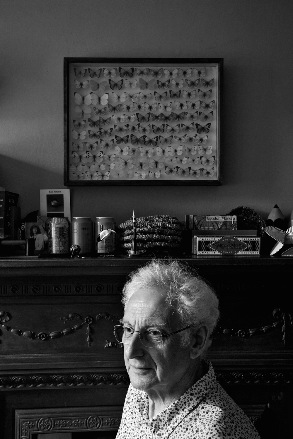
The profession listed in David Driver’s passport is journalist, not designer. This choice says something about his particular skill set as an art director whose portfolio has included Harper’s Bazaar, Welcome Aboard, The Times and (most famously) Radio Times. Driver’s editorial design has always been based on a deep understanding of the written word. When he makes a magazine, the whole is greater than the sum of its parts.
Over a career that has been almost totally concerned with imparting information in a mixture of words and pictures with clarity and wit – often working at the limits of the technology that he had at his disposal – David Driver has mentored an enormous number of designers, illustrators, photographers and graphic artists. He has a reputation for bringing together groups of talented people and using their various skills to tell stories, up against near-impossible deadlines. And, as a designer with a background as an illustrator, his output has always balanced the grace and deftness of an artist with the rigour of an engineer’s eye.
If you sit and talk with him, though, he is slightly diffident about his place in the scheme of things. He thinks back on the fraught complexities of office politics and the constant demands of steering the design department of a national newspaper, The Times, juggling and matching the needs of editors, contributors, news and features to create a compelling and coherent whole, day after day. Of battling with digital production methods as they were being invented, with the added drama of the change in technology bringing huge social shifts. Or of going into a national institution, Radio Times, in his mid-twenties, with the express intention of progress and disruption, and having to handle the fall-out.
Nowadays the technological dust has settled, but re-brands and re-launches are part and parcel of the fast-moving magazine world. In the mid- to late-1960s, however, although societal change was happening on a vast scale, mainstream media was still evolutionary, not revolutionary. Magazines changed organically over the years, and the arrival of a new editor did not mean radical shifts in design and a raft of new writers. For the BBC to put its multi-million circulation flagship in the hands of two Afghan coat-wearing longhairs was a bold move.
Ask colleagues from Driver’s long and distinguished career and they are unstinting in their admiration. ‘It’s common knowledge that he’s a truly superb designer,’ says designer John Grimwade, who now lectures at Ohio University’s School of Visual Communication, ‘but I also remember David’s journalistic intelligence, and his absolute commitment to getting things right. He never cut corners, never overlooked the details, and (quite rightly) expected the same from others.’ Illustrator Peter Brookes (see Eye 93) feels that ‘the quality he showed above all others in that long period of time was enthusiasm. And it takes a truly remarkable designer / commissioner to maintain it at such a high level for so long.’
For magazine designer Robert Priest, (see Eye 96) who benefited from Driver’s talent-spotting, it was his innovation: ‘David had created Welcome Aboard, an in-flight magazine … and was doing things I’d never seen before. He combined a big-picture vision with an attention to detail that was incredible.’
Author and journalist Richard Williams has fond memories of his time sharing an office at The Times. ‘He was excellent fun in the office, not least in the company of the cartoonist Peter Brookes. They were good at teasing each other. And – perhaps the most important thing of all about him – he kept his childhood Dinky Toys in mint condition, in their original boxes. In another person that might have denoted a tiresome obsessiveness. In David it was part of a love of precision as an aspect of beauty in itself.’
As I sat and talked with Driver, his enthusiasm and delight still shone through. He has a mischievous, almost gleeful way of recounting his story. It was hard to square these swashbuckling tales of working with the ‘good, the bad, and the ugly’ of Fleet Street (and beyond) with his recollections of being a naturally anti-social and insular person.
During a long career, he has generously supported talent wherever he saw it, and put his faith in those who also had enthusiasm, relishing being surrounded by people who could deliver under pressure. Most who worked with him became better at what they did, and working with him was often a launchpad to a more fulfilling career. At one point Driver says, ‘That’s it, isn’t it? To be surrounded by people who aren’t limited by their job description.’ Which stands as an excellent characterisation of David Driver himself.
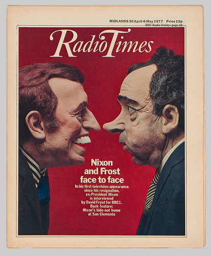
Radio Times after its reinvention under editor Geoffrey Cannon and art director David Driver.
30 April-6 May 1977. Before Driver and Cannon’s redesign, a programme such as David Frost’s interview with disgraced former US president Richard Nixon would have used a press release picture taken during the filming. Driver preferred to commission portraits or illustrations – in this case a model made by Roger Law and Peter Fluck (who, as Luck and Flaw, would later create the satirical TV programme Spitting Image).
Top: Portrait by Philip Sayer.
Martin Colyer: Were your parents artistic?
David Driver: No. My father was a very skilful engineer who worked on planes during the Second World War. He also drew and made things, and after the war he retrained and became chief accountant at the Cambridge-based Pye TV and radio company. He was very creative. He’d make something like a new door, all with pegs, no screws or nails. It was fantastic to watch him work. I learnt a great deal from observing him.
Did he try to pass those skills on?
He was a difficult person, but he did want me to be involved with the craft. He liked the fact that I was trying to do things of that nature.
Luckily, you went to a school that actively encouraged creativity.
Yes, I went to the Perse School in Cambridge on an assisted place. It’s a school that’s had many successful pupils in different fields. Peter Hall was there, David Gilmour of Pink Floyd, F. R. Leavis … scientists and artists. The school had a fantastic art class. I was crippled with asthma and I had time away from group activities – so I was drawing, doing information and graphics, world maps with tribal or economic lines, reading and assembling and gathering stuff to tell stories visually. I saw myself as a potential editor. I recall very clearly a mock GCE Art exam, being asked to do something about a new musical that had just opened in America, called West Side Story. I got under the skin of that, and I thought I wanted to design for the stage. I was amazed by the story and the music. I remember being in assembly on the last day of term, before going to the sixth form – the hall was at the stage of painting and developing the set for the school play, and it dawned on me that I wanted to leave and go to art school.
What did you do then?
I went and saw the Headmaster on my own and said, ‘I don’t want to go to the sixth form, I want to leave and go to art school.’ He said, ‘Oh right. I’ll make some inquiries about it. Your parents are happy with this?’ I said, ‘they don’t know!’
And what did he say to that?
He said, ‘I think you should talk to them.’ But they didn’t understand it anyway, so we worked together, the head and me, and went and sorted out an interview.
That was Cambridge School of Art. Did it live up to your expectations?
Both the teaching and the students were wonderful. It was a really rich experience. Roger Law, Peter Fluck, [illustrator] Julian Allen. It was a very inspirational set-up.
Were you primarily drawing or were you doing typography?
Drawing, but we did the principles of typography, setting type, and design. Roger Law was doing a student magazine called Granta [not the literary magazine]. Every term it came out, and it was a tradition set up by Roger that the students in a senior position at college would be the art editors of Granta. So I did that with two other friends.
Your illustrations are stylistically precise. Was your approach to design similar?
My main interest in doing the design work is the storytelling aspect. When I first started working in London, which was in 1963, design was considered to be like icing sugar. It wasn’t integral at all. I never could go along with that.
And your teachers?
We had teachers who were working in London, the art director of The Spectator, say, or Peter Dunbar, the art director of The Economist who came and did a day on Fridays. And he used to give me work in my holidays. So I’d go into The Economist, helping with design.
Peter Dunbar used to do those fantastic typographic covers for The Economist …
He did, he was very good. He was our style icon. There were certain people in our class who were very struck by the way Dunbar dressed, so they tried, on limited funds, to dress like him. And the crucial thing was having substantial crepe-soled shoes. Very important. And braces.
So you were getting work experience with The Economist. Anywhere else?
Roger Law got hold of me when I was in my very first year of college, because he liked what I was doing. I’d go around to his house near the college in Orchard Street and spend all night doing paste-ups, mainly for Granta. He’d go off to the pub for hours. But I didn’t mind because I knew this guy was a ‘leader of men’. He was a very powerful figure. He used to come to London and do freelance work when he was a student. He was doing double-page spreads and big pieces for Tom Wolsey on Town magazine (see Eye 96).
While still at college as a student?
Roger went to the Cambridge School of Art when he was fourteen, completely and utterly uneducated! Incredible. My God, he built an education for himself. And a lot of inspiration came from him working for magazines in London. So before one left college, one would set up interviews. You know, putting coins in a phone box at the end of the road. Phoning up Town magazine, Queen, House & Garden, Vogue. Getting interviews. And he obviously was helpful, because when you phoned up you said you’re a student with Roger Law, you got an appointment.
I got in to see Vogue. Nightmare. I was kept waiting all day, sitting in reception, across from the lift. I didn’t know how lifts worked. I’d never come across one. I was very nervous and the receptionist said, ‘Would you like to go to the sixth floor?’ And so I went up the stairs. And when I got up the stairs, to this glamorous reception area, with glamorous women walking around, I couldn’t talk. My voice had gone. So I had to write a note saying ‘I have an interview.’ It was not a great day. But they loved what I did and they said they’d be in touch.
At the end of July, I’d just left college and I heard a noise at the front door. There, lying on the doormat, was this yellow envelope. A telegram, because we didn’t have a telephone at home. It said: ‘Please phone Tom Wolsey at Queen.’ Tom Wolsey had left Town to do Queen. I went down to the phone box, put all these coins in, and phoned him, and he said, ‘Could you come straight away to London?’ I said, ‘What, now?’ And he said, ‘Yes.’
And that’s where I met Brian Haynes (see Eye 85) and Barney Wan, who was a fantastic fashion designer and illustrator as well. I met Tom Wolsey, who was a man of very few words. He told me he wanted a double-page spread illustration for an extract from Vladimir Nabokov’s novel The Gift. It was an August Bank Holiday. I spent three days and nights non-stop and rushed back to London with it. And then they said: ‘Will you work with Brian on the layout?’
Brian had been at the Royal College of Art at the same time as Hockney and designed the college magazine Ark (see Eye 16). It was entirely done by the students – even the advertising manager would be a student … and the students would design the ads. I went up to the RCA to see their end-of-year shows. It was incredible. I thought, my God, I’ve been in the provinces all this time and look at what’s going on here!
What was Brian Haynes like?
He always knew what things were likely to happen, trends or whatever. And when he was still working in publishing he said, ‘Oh, the future is definitely going to be something you won’t know about. It’s going to be satellite broadcasting.’ No one did know, because nobody had launched a rocket yet! In fact, he was involved with setting up the first European satellite organisation. He did exactly what he said! He designed something in the very early days, and said, ‘What do you think of this?’ It was a Union Jack tea caddy, with heroes of the Boer War on it. He said ‘The Union Jack’s going to be very, very in.’
This was what, 1963?
Yes. Pre-Carnaby Street.
The Sunday Times Magazine was just starting …
Yes, and there you had Mark Boxer, who had been art editor of Queen.
Did you think of yourself as an illustrator then?
Well, I was doing both. Illustrating fashion and beauty spreads for Vogue, book covers for Alan Aldridge (see Eye 57), the art director at Penguin Books. But I really wanted to work on magazines and I had a contract from Vogue at one point, doing design work as well as illustration. Vogue was a very peculiar place, with peculiar photographers. David Bailey and Terence Donovan. They were really a mean crowd, very unpleasant – it was an arrogant world. They were being paid £30 a spread. It was tiny money, Vogue’s attitude being you should be honoured to work for them. It still is, I think!
Then you went to Fleetway, to do Woman’s Mirror. Was it the anti-Woman, or Woman’s Own?
Yes, they were anathema to us. I mean, Woman and Woman’s Own was all ‘knit your own husband’. Woman’s Mirror was originally, I think, a section in the Daily Mirror, who owned Fleetway Publications [later part of IPC]. So it became a magazine looking to the future, and how society was changing. There was this amazing piece on the morning-after pill. This was in 1967. The pill had only been around for a short time but this is the morning-after pill! Brian Haynes, who was there, would say, ‘What I’d like to do is tell everybody what goes on in Buckingham Palace. We’re going to do it with the lid off.‘ And Nigel Holmes, who was there also, would draw it. Every room, cut away, showing what goes on there. Now it’s normal stuff. It wasn’t then.
A bit like a proto-Cosmopolitan?
No, it was doing what Nova went on to do. It was like a weekly Nova in its editorial direction. Fleetway House was like a magazine factory. On the top floor it had the most incredible kitchen where all the food features were done. Every food editor or writer would cook up in that kitchen. Then you had a floor where all the artists worked, doing strip cartoon bubbles and airbrushing – phenomenal work, all so skilled.
So everything was in-house?
There would always be someone who could do it. You could just go, ‘He’s in the building.’ It was a fantastic set-up. For me, it only lasted a year. Although it was selling over a million a week, that wasn’t enough. So what they thought they’d do is to merge it with Woman and pick up their circulation, thus making the combined circulation close to three million. Within weeks, Woman was back to what it was originally – what they didn’t appreciate was that the readership was completely different. Then they started phasing out the enlightened articles. Nova came out when I was working at Woman’s Mirror. And it was a terrible first edition, and they had to redo it, relaunch it. People don’t remember that. They changed the editor and everything else. Then it became the Nova that we know, but its approach and its statement to the world was very similar to the idea of what Woman’s Mirror was.
What did you do then?
When the merger happened, they tried to push other jobs at me, and I wouldn’t do them. I did freelance there for about two or three years.
By the time you went to Cornmarket Press (later Haymarket) in 1968, what other magazines were you conscious of?
Esquire and New York magazine. Clay Felker, who was the editor of New York, was friends with Clive Irving, one of my bosses at Cornmarket. If you were working at a proper magazine, they’d subscribe and you’d get them all, but in Soho the newsagents would have American magazines in the 1960s. It was a small world. We didn’t have racks and racks of magazines.
At Cornmarket, the job was to produce new products, new magazines, new ideas. We redesigned TV Times, weirdly, which wasn’t implemented. Then we worked on Welcome Aboard for BOAC [The British Overseas Airways Corporation, forerunner of British Airways]. We produced that as an idea. I worked with Nigel Holmes and Brian Haynes, until Brian left to start his own company.
We also had negotiations with Boots the Chemist to do what would have been the first health magazine. Seemed a very good idea to me. We did a dummy but it didn’t lead anywhere. It should have, because it would have still been around now. That was the other great buzz one got about publishing. What do people want? Where are the gaps in the market? All that fascinating conceptual work. You wanted it always to be credible, to push boundaries in terms of giving people information they never possessed before.
How enlightened were the clients?
With the BOAC magazine, they had to see and approve everything, which was sometimes a struggle. I remember when the film Battle of Britain came out, we did this gatefold. The format was small. My whole attitude was to never miniaturise. Design as if it’s a big page. The gatefold featured the special effects and re-enactment of the aerial combat, all of which Nigel drew. I remember the meeting at BOAC to show them, and they said, ‘We can’t do that.’ ‘What do you mean? It’s a big film, why not?’ They said, ‘We can’t have pictures of planes with swastikas on them in our magazine.’ That sort of thing really made me very cross. But we did manage to get quite a lot through. It was nice to get new writing – people like Graham Greene would write a special piece because we were able to offer them free travel in payment. Flying was still special and exclusive then.
When did you meet Geoffrey Cannon?
Geoffrey was involved in secret discussions with the BBC about reappraising Radio Times. The BBC realised they needed to make changes. The magazine had always had eras of greatness, then TV arrived and had demanded colour, and they just added them on. But you can’t do spare-part surgery like that. Geoffrey and Clive Irving at Cornmarket, were negotiating with the BBC to do this, so we did a dummy. We realised that it needed a disruptive and awkward presence to make the necessary changes happen.
Then I was seconded to Harper’s Bazaar, to do a redesign. We were contracted to do three issues. Marcus Morris was the managing director, the man who edited [boys comic] Eagle. So I was working for my hero!
But only three issues?
We had a unit to work on it, but not necessarily stay on it. Marcus said, ‘I’d very much like you to be the art director.’ Then Geoffrey came back and said, ‘Have you heard I’ve been appointed editor of Radio Times – I really want you to work with me.’ I kept him hanging on because I wasn’t keen on doing it. Then I thought, this is madness, because I was so devoted to Radio Times as a child. I’d cut out all the drawings, had scrapbooks of Robin Jacques’ work … Surely I was meant to be on it!
What a dilemma. Geoffrey was so clever. He’d done art and design, but was also a writer; he wrote a pop column for The Guardian, the first one they ever did. And he did work for the underground press, for Oz, but not publicly. We always kept that sort of thing quiet. Particularly at the BBC, where we had our phones tapped. They were paranoid about Communists. It was the Cold War, a very different time.
Tapping phones? Sounds familiar …
I remember having a conversation with Geoffrey on the phone, on a Saturday, because we’d use the weekends to plan things, and I said, ‘I hear a lot of clicking and noise on this phone every time we talk!’ He said, ‘That’s because we’re being listened to.’ ‘Really?’ I said. ‘Yes,’ he said. ‘Well, we haven’t said much that’s interesting, have we?’ The whole world was paranoid. And there was a real threat because all sorts of quite aggressive groups were around, aside from the IRA, like the Angry Brigade. So it was a very touchy time. Geoffrey and I knew quite a few of these people and we were friendly with the Oz people. And I got involved with another magazine in that area.
What was the magazine?
Inside Story. It was very underground. This was during my Radio Times days. Geoffrey did actually say to me, when he found out I was doing that, ‘I really advise you not to, because it could compromise both of us’. Because they used to run anti-BBC stories. I worked on it for about two years. It wasn’t monthly, it was very irregular and always close to bankruptcy… something that was very different from what I was doing every day. The BBC had no idea I was doing it, only Geoffrey knew, and I had to tell him because Inside Story was running this piece, ‘Why I was sacked by the BBC’, and we were publishing the letters the BBC had sent to this person.
Back to your decision to join Radio Times
I went to see Geoffrey and said, ‘I really want to continue at Harpers.’ He said, ‘No you don’t.’ I said, ‘Well, could I come and do part-time?’ He said that would be totally impossible, and of course it would be. I felt very uncomfortable about it, but I did join. Marcus was very upset. ‘I’m sure I asked you first. I’m sure I was asking you first.’
What was it like in the beginning at Radio Times?
Well, in a situation like that opposition is always there, isn’t it? For different reasons. Jealousy. Discomfort. A lot of people were feeling extremely threatened because they wanted to carry on their lives the way it had always been. I understand that. Walking into the subs room was like going back two decades. It was like the civil service, and I come in with very long hair, and you know, looked ridiculous, outrageous, although of course, incredibly nervous, actually.
When I was first there I decided to send a photographer to Jamaica to do a story, and I went to Doug Richardson in the picture department – he’d been there forever. And I said to him, ‘I need you to organise the flights and arrangements for a photographer to go to Jamaica.’ He replied, ‘Jamaica? You know I’ve been here a long time, and the furthest I’ve ever sent a photographer is to Sheffield!’
But that period was not a time for a stick-in-the-mud kind of attitude …
No, although you did actually have some people who’d been there a long time who were focused and happy to embrace a different way of looking at the magazine. Of course we changed it, but the attitude to commissioning illustration and things like that which Radio Times had always had – that went on. But you had people on the staff who hated television. They loved radio, and thought TV was lowest common denominator stuff.
The thing is, that attitude was wrong because it’s the BBC doing television, and that makes a big difference. But they didn’t see that. They hated the fact that Cliff Richard or the Eurovision Song Contest might be on the cover. The magazine had allowed itself to be dictated to by the TV and radio broadcasters, who wanted to write their own articles about their own programmes. That’s not really what journalism is. So everyone was fighting their own corner. Every programme department or programme maker. There were a lot of layers of people to keep in play or keep happy.
How did you win over the broadcasters?
Well, Geoffrey’s cleverness was that he would see transmissions lists of all the upcoming programmes and there’s only one Radio Times cover, so he insisted things be moved – it’s very much more complex than that, but that was a very sane, lateral piece of thinking. And on the cover there shouldn’t be a monotonous thing of two people smiling week after week. Light entertainment one week, science another week, nature another week, radio another – to show what the BBC actually represents, and they weren’t doing that.
What was the reaction to the redesign?
The reaction internally was appalling. And the external reaction was appalling, too. After a week or so I was wandering around the offices and round the corner there was one office that was just absolutely full of mail sacks. And I said, ‘What’s that?’ And they said ‘Letters of complaint.’ They were usually addressed to Radio ‘Awful’ Times or something like that!
What things were influencing you at that time?
When I was working towards the logo for Radio Times it was somewhat influenced by New York magazine. And also the limited fonts – there came a time where you only chose two fonts. It was really unusual at first, because magazines were filled with fonts. Every headline had a different font. At Woman’s Mirror, Gordon Moore, the art editor, would actually say, ‘What font do you think we should use this week?’ It’s Christmas – where’s the snow font?’
There was that book that somebody did recently [Custom Lettering of the 60s and 70s by Rian Hughes – see ‘Drawn to be wild’ in Eye 71.] They rescued a load of artwork from a skip at IPC and it was just, you know, commercial artist’s headlines. Jaunty scripts!
What was most challenging, technically?
A lot of people were warning me about what you could and couldn’t do, production-wise. It’s very horrible, actually, making all those discoveries about printing restrictions. And twenty-odd regional editions. And integrating the gravure colour pages printed six weeks ahead of time with the up-to-date letterpress pages. But I liked the printers. I liked the guys there, they were real craftsmen. And I loved one of the senior overseers who had this magical name, Sid Wedge.
These were people who’d done it for years and years and years?
Yes, although Sid Wedge was only a few years older than me. But he’d been there as an apprentice, a fourteen-year-old. But he was wonderful when you had to do things with [metal] type, when you had to cut bits off characters or typeset complex run rounds. And he loved doing it.
You and Geoffrey fought. Did you always have a slightly adversarial relationship with editors?
Yes, I had a very short fuse really. When I was with Cornmarket Press, I walked out about three times. My disagreements were mainly with the production director, Dennis Curtis. I learned a lot from him but we did have some frightening rows.
At Radio Times you reconnected with some of your art school peers.
Well, [Peter] Fluck and [Roger] Law were doing personality models for the Sunday Times Magazine. There was a whole week of American programmes and I asked them to do ‘the American family‘ as models, and they had a nice feel to them because they linked well with the subject matter. I wouldn’t accept all the set-up photographs of Richard Nixon and David Frost, for the Frost interviews. So I had them modelled by Fluck and Law, face to face. Certainly got a lot of flack for that – why didn’t you use the official photographs? Because everyone’s using those. I wanted it to be different. [Fluck and Law later founded the Spitting Image TV series.]
You used illustrators who had historically worked with the Radio Times, such as Eric Fraser and Robin Jacques, while introducing contemporaries such as Ralph Steadman and Gerald Scarfe.
I had a bit of difficulty with Eric Fraser though, because as much as I admired him, I think people commissioned him lazily prior to my time. It was, ‘Oh yeah right, Eric can do that, Eric can do this.’ Eric ends up doing bloody well everything. And I stopped using Eric altogether at one point and he was wondering whether he’d been fired. He was an amazingly clever guy, very intelligent. The 1920s editions of Radio Times were an inspiration and so I re-introduced illustrated covers.
How did you add Frank Bellamy to the roster?
My attitude to Dr Who was that it was episodic and comic-like, and I thought that Frank would bring that out. I’d obviously followed his work in The Eagle, from the first strip that he did, which was the Winston Churchill story. It was amazing the way he evolved it – he started really cautiously and then he broke out of the frames – he had this incredible compositional skill.
There was one strip that he did for the Sunday Times Magazine, about how to be a journalist, I seem to recall, but at the Radio Times we asked him to do the actual start of a Doctor Who episode, which then carried on in the first episode of the new series on TV. And the Doctor Who producers absolutely adored it.
Did this make the magazine more successful?
It was clear that the variety of subject matter, and the variety of treatments, really worked because the sales did very well, they went well over four million. The circulation was vast – it’s difficult to imagine a magazine selling more than eleven million copies now, as Radio Times did one Christmas in the late 1980s.
You were also art directing The Listener, the BBC’s more literary journal, in your spare time!
I did a re-shaping of it, and I went to the editorial meeting on Fridays, as it was two floors down from Radio Times in Marylebone High Street. It was a wonderfully interesting meeting because the editor was Anthony Howard, an incredible man. Anyway it was him, the staff, Peter Brookes, who drew the covers and a guest, a contributor. So you had Alistair Cooke one week, Roy Hattersley the next, and we’d discuss the content and have a very civilised chat.
You always gave talent its head …
I don’t know about that. Letting people do things was important, but it didn’t mean you’d always be pleased. It was a big challenge for me, because I’d been used to working very much on my own. I got a great deal from what people did, but I’m amazed that I was able to adapt to it because I’m very insular – on reflection, actually pretty anti-social. Although I loved the sociability and I liked people very much, I never saw anyone outside the office.
How did the move to The Times come about?
I was in my garden putting lawn down over the weekend and my wife came to the window. She said, ‘There’s a call for you.’ I said, ‘Who is it?’ She said, ‘Harry Evans.’ He said, ‘You probably heard I’m moving over from The Sunday Times to the The Times as editor. Can you come in tomorrow?’ So I did. Went in, and out of it came working there.
Did you know much about The Times set-up before you said yes?
Well, Harry Evans appointed me to collaborate with Edwin Taylor, a highly inspirational force, who had been design director at the Sunday Times for fifteen years with Harry.
What were the issues with doing a newspaper?
I think the main thing was suddenly – this bloody great piece of paper! Fantastic, but daunting. It was a difficult time because it was being threatened with closure. Do I want to go if it’s being closed? Well I decided to go … Harry invited me to go to a think tank-type meeting about the Times. And I remember there were two people from the design department, and some outsiders including Roland Schenk. You could see immediately that there was a faction who were trying to protect the Times from Harry.
If you redesign a newspaper, people only ask, ‘where’s the TV listings; where’s the crossword?’
That’s right! They say, ‘I’m very pleased that the crossword is in the same place, but it’s not helpful to me being vertical, because I don’t want to have to fold that page’. But that shows the engagement and affection. One of the best things about Harry was incrementally developing new sections, like ‘News in Brief’ – building on the strengths and history, without being too reverential.
What else surprised you about The Times?
Going to The Times, I assumed I’d be impressed by the standard of handling words and subediting. But they were nowhere up to the standard we had at Radio Times. And the way things worked with the print unions meant that you were compromised with schedules and deadlines because of what they said you could and couldn’t do, or what they didn’t want to do. The disciplines in many ways were a good thing, and I really rate printers doing print, not designers doing print. But I had to often secretly pull things back and replace them, because the printers weren’t doing it well.
It’s an incredibly intense workplace.
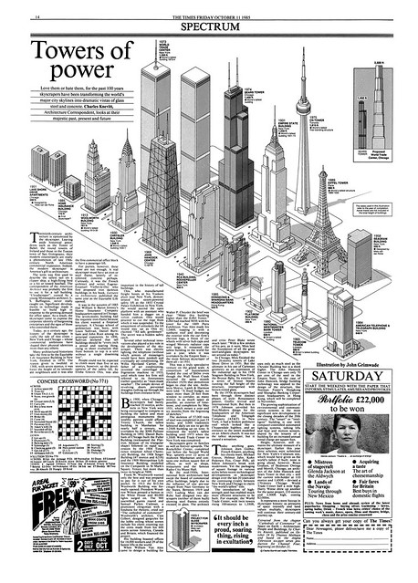
There’s no waiting to make up your mind tomorrow. You have to do it now. Not sort of okay, well I’ll think about that. No. An hour in an afternoon on a paper goes by very fast. But you do so much in that time. Enormous amount, because everything is right up to deadline. So I just kept at it and introduced new things. I mean, we developed and evolved an information graphics department. It was only a map room when I arrived, basically doing weather maps.
So that department wasn’t fit for purpose to convey more complex journalistic information.
No. So we brought in John Grimwade who was working on the Sunday Times. He became a really important colleague, and together we added people to the existing framework. One of the first big graphics – and the Times had not done this sort of thing before – was when the Navy fleet was sent to the Falklands. We designed a full page of every boat that went. And that really opened people’s eyes to what you could do.
No other paper was doing that kind of work?
No daily paper. The Sunday Times obviously had very good graphics because they had time. Daily papers didn’t think they could have that time. But you could do it, if you planned the research. We took every opportunity.
When the Challenger shuttle exploded just after take-off, that was early afternoon in the UK [28 January 1986]. And we did a complete full page graphic by deadline on the same day. So it showed that you could do it. Every graphics person was working on one aspect. John and I worked out what bits should be done by who. And brought them all together.
What I enjoyed most about working on a newspaper was being able to do things like that. To do that kind of work, both in Radio Times and the Times, you had to create the team, to bring in all sorts of talent. That’s what it’s all about isn’t it?
‘Towers of Power’ feature in The Times, 11 October 1985. The illustration is by John Grimwade, who says: ‘Driver’s layouts were artwork in themselves. It is probably hard for today’s InDesign users to get their heads around this kind of old-school craftsmanship. Everything on the page was carefully coordinated to present the graphic in the best possible way.’
Martin Colyer, writer and designer, London
Read more in Eye no. 97 vol. 25, 2018
Eye is the world’s most beautiful and collectable graphic design journal, published quarterly for professional designers, students and anyone interested in critical, informed writing about graphic design and visual culture. It is available from all good design bookshops and online at the Eye shop, where you can buy subscriptions and single issues. You can see what Eye 97 looks like at Eye Before You Buy on Vimeo.