
Winter 2010
Reputations: David Gentleman
‘I did absolutely anything that came my way, which I’ve done throughout my life. But what I know about design, as opposed to wood engravings or illustrating, I learned from stamps – my interest in refining an idea down to an absolute minimum.’
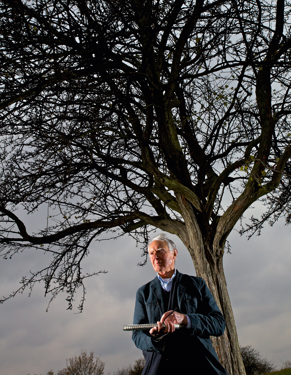
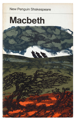
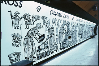
For the best part of six decades, David Gentleman has been working steadily as a designer-illustrator in a tradition of his own making. His is a one-man practice, flexible and versatile enough to embrace identity design for British Steel and the National Trust, stamps for the Royal Mail, wood engravings and watercolours for advertising and book covers – from the New Penguin Shakespeare series to the Highway Code. Not to mention fabric and wallpaper designs, book illustrations, posters and a 100-metre mural for Charing Cross Tube station. His popular travel books, including David Gentleman’s Coastline (1988) and David Gentleman’s India (1994) are complete works of graphic reportage, featuring his paintings, words and layout, and he has also written and illustrated several children’s books.
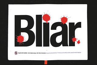
It would be tempting to describe Gentleman as a pillar of the British establishment were it not for his anti-establishment leanings, expressed in projects such as the polemical A Special Relationship (Faber, 1987), a graphic howl of protest against the US military’s use of British airfields. (The book sold poorly but earned him an award from the New York Art Directors Club.) More recently, he has designed posters and other graphics for the Stop the War Coalition’s campaign against the 2003 invasion of Iraq – its logo, an angry splatter of red ink, is possibly his most widely disseminated marque, seen on worldwide mass media during the conflict.
Gentleman inherited his left-wing leanings from his father, Tom, a Scottish painter who supported his family by working as a commercial artist (for Shell and various London advertising and design practices). Winifred, his mother, was also an artist who had met Tom at the Glasgow School of Art.
Born in London in 1930, Gentleman grew up in Hertford, and later attended St Albans School of Art. He spent part of his National Service running an art studio, and went on to study at the Royal College of Art in 1950, where he studied graphic design for a year (under Abram Games) before moving to the illustration course taught by Edward Bawden and John Nash.
After college he taught part-time at the RCA for a couple of years while freelancing: his first job was a series of wood engravings for André L. Simon’s What About Wine? He soon resolved that he would earn a living from design and illustration without teaching or commuting to an office, and (for the most part) without assistants. His independence, together with his nonchalant command of a wide range of technical skills, has enabled him to work with a freedom closer to that of a contemporary illustrator-designer than the more structured design practices of his own generation.
He was elected a Royal Designer for Industry (RDI) in 1970 and has been a member of the Alliance Graphique Internationale (AGI) since 1972. His work is in the collections of Tate Britain, the British Museum and the V&A, among others. Prominent clients include London Transport, the Royal Mint and the Imperial War Museum. Awards include the Prince Philip Designers Prize (2007). An illustrated autobiography, Artwork (Ebury), came out in 2002, and he has been the subject of two monographs, The Wood Engravings of David Gentleman (David Esslemont, 2002) and David Gentleman: Design, by Brian Webb and Peyton Skipwith in the Antique Collectors’ Club Design series (2009). Ask the Fellows Who Cut the Hay (by George Ewart Evans, Full Circle Editions, 2010) is the most recent book he has illustrated.
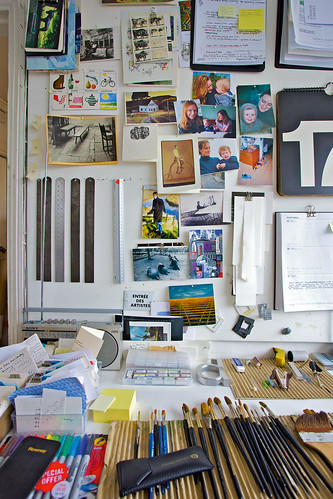
Gentleman has been a resident of Camden in north London since the mid-1950s, living in the same tall house since 1970, where he works in a light and highly organised studio on the top floor, surrounded by prints, books and posters, the fruits of his long career, including a polished brass Victorian hand press and a cupboard full of printing blocks. Pinned to a board are notes for his latest project for Penguin Books, for which he will make a different drawing of London for each day of the year, for publication in 2012.
John L. Walters: Your father [Tom Gentleman] was a painter who also designed …
David Gentleman: Yes, [though] he abandoned painting as a livelihood after a few years. I suppose he had got by on his own, doing wonderful paintings and selling them to Glasgow shipowners, but when he married my mother he came south, like a lot of his friends, working at agencies like Bensons and Crawfords and ending up in Shell-Mex. He worked with McKnight Kauffer and Ashley Havinden.
When Shell packed up advertising during the war he joined the Ministry of Information with Misha Black. Then he freelanced and had a thin time financially but he survived.
JLW: Growing up, did you learn things from your Dad?
DG: Yes, almost everything. I was very interested in what he was doing – paintings in oils and watercolours, painting murals, designing magazine covers, doing lithographs and his own children’s book. He was an all-round artist.
Twice he gave me things to do. I once did the lettering on a poster that he’d done for Crawfords and I felt terribly proud doing this. Dad paid me a fiver for it and my mother was a bit miffed because it was one and a half times her weekly budget. I once drew some spoons for an ad for Brasso or something, black and white reflections on them.
Insofar as Dad had hopes or ambitions for me, he was glad I wanted to be an artist, I don’t think he wanted me specifically to be a designer.
My parents left me absolutely free to do what I wanted to do.
JLW: When you started at the Royal College you applied to study as a graphic designer but then moved to illustration.
DG: I was taught [design] by Abram Games, whom I liked – he was always kind and extremely nice – but … well, he did manage to produce very clever clones!
Also the students in illustration that year were a very bright lot, so I thought it would be good to be one of them. It also meant I could be taught by [Edward] Bawden and John Nash who were really lovely people to have as teachers.
Even so, at the end of my first year I went to see my professor, Dick Guyatt, and said I would like to join the painting school instead please. He said: “I’m not sure they would have you.” I was so dismayed by this prospect that I didn’t even try!
Identity and protest
JLW: So illustration was a mid-way point between design and painting?
DG: Exactly.
JLW: You seem to be able to move easily between design and illustration. At one moment you’re doing a stamp or poster that has to represent an idea; at another you’re drawing buildings or figures in a landscape.
DG: I’ve never felt it a strain to change from one to the other, it was more like fun. I don’t think they’re totally different. Goya and the horrors of war, for example – which do you call that?
JLW: To go back to your time studying with Bawden – how much was that about the craft and how much was that about the ideas?
DG: I think what I learnt most of all from Bawden was a respect for his ability to use his own quirky talents to good effect, to somehow create a life for himself doing extremely personal things which … weren’t necessarily to the general taste, but became his hallmark. (My schoolfriends, when they saw a book of Bawden drawings during the war, just thought his people looked funny.) Bawden was single-minded and energetic, and I think he would have taken on most things. I think those are good things to have picked up.
JLW: You seemed to have had a clear idea of about what kind of practice you would have: that you didn’t want to teach and you would make a living from doing many different things…
DG: Not wanting to teach was the main thing. I stayed on the Royal College staff for a couple of years after I graduated, in a very lowly role. In the senior common room, the tutors didn’t conceal that they would rather be at home working.
Engraving, watercolours, lithography
JLW: So, when you left the RCA, how did you divide your time?
DG: Well it divided itself. I did absolutely anything that came my way, which I’ve done in general throughout my life.
I had done a bit of wood engraving at the college and I’d been taught by a typographer called John Lewis (who has been rather undervalued). He was a very good teacher and an enthusiast for what he called printed ephemera. He was also design director of Cowell’s of Ipswich, which was a good colour printer of the time. He gave me a lot of little jobs to do very early, and these led to a lot of other engraved jobs for advertisers and publishers.
JLW: Does that mean you became “typecast” as a wood engraver?
DG: I think I did. It started off extremely humbly, but John Lewis and John Dreyfus (who was Monotype’s typographical adviser and a kind of European talent scout for the Limited Editions Club of New York and the Cambridge University Press’s visiting typographer) gave me a lot of work early on over those first six or eight years.
I also did some work for Shell. Dad had left Shell by then, but they liked him and this may have been their way of being nice to him.
JLW: What did you paint for Shell?
DG: A series of individual watercolours: three or four of that County series. Geoffrey Grigson had written the text and he had a list of things. The first one we did was Nottinghamshire, so that had to include Newstead Abbey where Byron grew up, the Dukeries – very specific, about a dozen things like the Green Man in Southwell Minster. I’d just bought a car and this was an ideal way to use it.
JLW: So how did you get from watercolours to graphic design?
DG: When I was a student, Penguin had always been my goal. [Hans] Schmoller gave me very responsible commissions, with hindsight, like the E. M. Forster series for Penguin Modern Classics. That was a tremendous heavyweight task, half a dozen novels.
Then I did this enormous job – The Swiss Family Robinson for the Limited Editions Club and that was my entrée into this more rarefied sphere!
JLW: Which you didn’t really care for …
DG: I’m not sure that I do now, except that I’ve done lots of limited edition lithographs, so I can’t be too snooty about the principle.
At the same time I was working on The Swiss Family Robinson and on The Shell Book of Roads – and then I was invited to go in for a stamp competition.
JLW: Did you have ambitions to design stamps?
DG: No. It had never occurred to me. I’d collected them for about six months as a schoolboy and I liked the ones with pictures on them. However I’d always hated going in for competitions, and for the Post Office they were always six-person competitions.
JLW: But you won…
DG: Yes. The first set was for National Productivity Year (1962) and they kept on coming. They were very well paid, if you won.
The Post Office people didn’t know anything about design but they were nice and intelligent and respectable in the way that old-fashioned civil servants were – ‘marketing’ wasn’t around at that point.
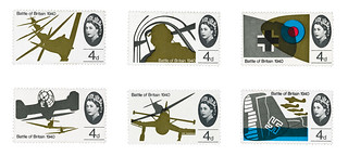
Later they acquired a more visible design adviser, Stuart Rose. He probably backed things of mine that might not have got through without somebody gunning for them. Also when I did the Churchill and the Battle of Britain stamps, which was while Tony Benn was Postmaster General, he got things through by ignoring or overriding the Stamp Advisory Committee.
JLW: Did you have to deal with the committee yourself?
DG: No, only once did I go to a committee meeting. I used to give them a great deal of choice, and I think that probably served my interests, but sometimes they took something second-rate. Only once or twice.
The things that I liked best were sometimes done in a hurry, and needed in a hurry and got through because there wasn’t time for the Post Office to commission something less radical.
JLW: Are you more pleased with them because they put you on the spot and made you work harder, or something, or that there was less fuss?
DG: Both. I hated working under pressure but I also think tight deadlines can be very good.
JLW: Did you have an assistant or anyone to help?
DG: No, never had an assistant, except once or twice for a few months.
JLW: You always produced all the artwork?
DG: Yes. My first wife Rosalind was like a design adviser in that she stiffened my resolve about some of those early things.
It took me a while to get the Battle of Britain stamps into their final form and I think her advice about them was very good. She persuaded me to stick to my guns […] when an idea was in danger of being watered down, or I was being too compliant.
JLW: Did you acquire new techniques for the stamps?
DG: What I know about design, as opposed to wood engravings or illustrating, I really learnt from stamps, like how to use Letrafilm.
The modelling of the loudspeaker horn on the BBC stamp was made by airbrushing Indian ink on to coloured Letrafilm. The interest in refining an idea down to an absolute minimum, that came more intensely with stamps.
JLW: What about your use of type?
DG: Oh, I’ve never really learnt that much about type. Since the 1960s, I’ve used almost nothing but Helvetica. I was friendly with Alan Fletcher – who was clearly going to be a force to be reckoned with even when he was a student at the College – I was full of admiration and awe of what he and his colleagues did from Fletcher Forbes Gill onwards, though I wouldn’t have liked their anonymity.
I did a lot of work for Schweppes in the early 1960s (passed on to me by Bawden) and because of that I bought the Gerstner and Kutter book Die neue Graphik and that was an eye-opener for me. I suddenly thought that Grot typography was really really fascinating, Müller Brockmann, Max Bill and so on …
JLW: How did the British Steel commission come about?
DG: Through a neighbour, Will Camp [British Steel’s director of information services]. They had commissioned ideas already but they didn’t like them, so he came in one day and said will you give it a go.
JLW: Was that done quickly?
DG: Very quickly, yes.
JLW: I’ve read that it stemmed from a visualisation of the steel process – is that true?
DG: It came first from my own wish to suggest that steel was strong and flexible. Only later did I discover that steel was bent in order to test its strength … so I used this as a rationale, but I didn’t know that at the time!
JLW: Did the British Steel job give you a taste for identity work?
DG: Well, I’ve only done about half a dozen logos, ever. The last was for the Bodleian Library in 2002, which was a great labour. I could have done it much quicker if I had got into digital by then. It’s a more pictorial thing, an old Elizabethan building. I would have done more things like this if they’d ever asked me.
The early ones were very geometrical. They were done the same way as [British Steel], cutting out Letrafilm with a knife stuck to a pair of compasses so you could make a beautiful circle very easily.
JLW: It’s a kind of engineer’s dream, isn’t it?
DG: It was dead easy! The British Steel logo is also in A size proportions: 1 to the square root of two.
A sizes are an unbeatably logical way to do it. Anything else seems silly and wasteful.
National interest
JLW: How did you come to design for the National Trust?
DG: What I know about design came partly from stamps, but it also came from the National Trust.
There was a wonderful man that I worked for, Ted Fawcett, the information officer, and he gave me a totally free hand. At that time there was hardly anyone at the Trust – only half a dozen people who counted at the head office.
JLW: And you had to learn new techniques – photography, collage…
DG: Yes, the only photomontage posters I’ve ever done on my life were made for those two National Trust protest posters about Petworth.
JLW: Talking of protest, your Stop the War campaign is your most widely known work in recent years.
DG: Yes. It was also a surprise for people who associated me with rather staid spheres!
JLW: It was one of the most effective graphic symbols of recent times: the image and the idea were completely linked in people’s minds. How did that job come about?
DG: Through the book A Special Relationship, which I made around 25 years ago. I liked doing it but it was a two days’ wonder, and it was instantly forgotten afterwards. I thought that these things would have been better as posters.
[Sue Gentleman joins the conversation]
SG: You got some criticism for that. The Evening Standard or someone published a headline “No longer a gentleman”!
JLW: They thought that because you were entrusted with the Queen’s head on stamps you were a safe pair of hands?
DG: I’d inherited my Dad’s automatic leftiness but I’ve never committed like the people I’ve met in Stop the War, whose lives seem wholly dedicated to the cause. At the back of A Special Relationship there are people carrying “NO” placards. When it began to look as if the war in Iraq was imminent, I made a simple “NO” and stuck it over press photos of people on a march, so that it looked very legible. I sent it to CND a week before the march saying would you like to use this? Not surprisingly, I never heard anything back!
After another march, six months later, I saw Tony Benn and asked him who should I send such an idea to, and he told me about the Stop the War Coalition.
They got the designs printed fantastically quickly. They used East End Offset, which had been Private Eye’s printer. Phil Whaite, an excellent freelance typographer / designer, helped me with the computer side.
JLW: Stop the War is almost another corporate identity, isn’t it?
DG: I’m glad you didn’t use the word “brand”!
SG: Your father would have been pleased with you, though.
DG: He would have been pleased with bits of me. I think he would have been sorry if I had stayed only with the likes of Shell. He didn’t like the advertising world.
SG: But Shell was a good company that invested a lot in design.
DG: They were also a rascally oil company, too, and Dad knew all about that. Dad was extremely radical, so he knew that he was gunning for the wrong side in that job.
SG: He couldn’t have been that radical, or he wouldn’t have stayed.
DG: Well, Shell in the 1930s commissioned excellent designs and he enjoyed that aspect of it. Also, he had me and my brother and my mother to look after.
JLW: I would think that’s the goal of many young designers now, to be able to do work for themselves, and a not-for-profit like Stop the War and a big client with deeper pockets and move between them…
DG: I think that’s a very flattering interpretation. [to Sue] Are you listening?
SG: I’m thinking quite hard about it. I think you’ve been incredibly lucky. You have been able to do pretty much what you wanted to do, and very few jobs (in my time with you) just for the money.
The things you haven’t wanted to do you’ve avoided, like teaching.
DG: Many of the AGI designers are teachers, as well, they think if you’ve got a talent you should pass it on to the younger generation. Yet some of the teachers I’ve come across spend so much time teaching that it uses up all their energy.
Making a book
JLW: Over your career you’ve employed a huge array of different techniques. Do you tend to go magpie-like between them?
DG: I don’t remember thinking about it. Certainly the first lithographs I did were rather like wood engravings, very precise and careful, but then after a bit I began to realise that lithography was rather an interesting free process.
But I packed up engraving after I designed the mural for the Charing Cross Underground station platforms – that was such a lovely job to do, I couldn’t be bothered after that.
JLW: That’s a much-loved example of your work … but they’ve moved the seats round, haven’t they?
DG: They have yes, the buggers.
JLW: Does it make nonsense of the drawings?
DG: It makes nonsense of a key part of it, in a word. I once spoke sadly about it, to someone there, and they said that they would pass it on. But I mind every time I see it. They’ve got metal seats now with armrests in the wrong places. The original was very good for tramps to lie on!
JLW: How did the travel books come about?
DG: The first book was suggested to me by an old friend, John Curtis, who I’d known since he came to Penguin straight from Cambridge. We bumped into each other at someone’s memorial service (Reynolds Stone I think) and he said “what about a book about Britain?” He’d become quite a senior figure at Weidenfeld, and that was the key, because he got it very well done and he was very hands-on as an editor.
JLW: You had thought about becoming a journalist at one point, and you obviously enjoy writing. Was that a secret ambition?
DG: It was an abandoned ambition. It didn’t occur to me that I would ever be asked to write anything. And then John said one day, who shall we get to write it? I said I don’t know, and he said would I do it, so I did.
I laid out the pages of my books, but I don’t trust myself as a page designer. My fellow student and friend Dennis Bailey helped me with the original formula and I stuck to that. But I certainly did the spreads and the sequences of spreads. It’s not typography but it is making a book. I gave a lot of thought to that.
My ambitions have been rather unformed in general – I haven’t been that proactive. I wanted to get the Artwork book done, and A Special Relationship. And having watercolour exhibitions. By and large, apart from my paintings, most of my life I’ve spent doing commissioned work, and only quite late on did I begin to initiate things.
At the end of the six books, when they came to an end, I thought that they were becoming a slight habit, so I didn’t mope. But looking back on them recently I thought this was a good kind of job to have done. I’m really glad to have another one with the new Penguin book about London – I have to do a page for each day of the year. I’ve got to finish it by November 2011.
JLW: Do you have a map in mind that you’re going to follow, or is it serendipity?
DG: It’s half serendipity. There’s got to be a certain structure in my mind. Because of the things that I know are worth putting in, and the new things I’m finding like the new buildings I’ve never seen in the city – I’ve barely looked at the city in about ten years – I want that new stuff to go in … It’ll be predetermined to a degree but I want the rest of it to be just what happens.
JLW: In your notes on your pinboard you wrote something about having more people in the pictures …
DG: I’ve become more interested in people. Not so much more confident about my ability to draw them but I really wish to put them in now – good or bad. In the past I would put them in at the end and sometimes they wouldn’t be up to scratch.
JLW: So each page will show a different part of London at that time of year?
DG: Yes, but I want something slightly more personal – I don’t want it to be a guidebook, it’s more about living in London.
JLW: And you hinted that the illustrative style would be different to your other travel books.
DG: Throughout my life, people have often preferred my roughs to my finished art, and I thought “silly them”. But now I’m beginning to think they knew what they were talking about.
First published in Eye no. 78 vol. 20.
Eye is the world’s most beautiful and collectable graphic design journal, published quarterly for professional designers, students and anyone interested in critical, informed writing about graphic design and visual culture. It is available from all good design bookshops and online at the Eye shop, where you can buy subscriptions and back issues.