Autumn 1998
Reputations: George Lois
‘You can’t research a big idea. The only ideas that truly research well are mediocre ideas. In research, great ideas are always suspect.’
‘You can’t research a big idea. The only ideas that truly research well are mediocre, ‘acceptable’ ideas. In research great ideas are always suspect.’
George Lois, a child of the ‘creative revolution’ of the 1950s, was one of the authors of the ‘Bid Idea’ in US advertising during the 1960s (see Eye no. 22 vol.6). Papert Koenig Lois, his first agency (founded in 1960), was the ‘second creative agency’ in the world. Challenging Doyle Dane Bernbach’s hegemony at the time. Lois’s iconoclastic campaigns for Xerox, Wolfschmidt’s vodka, Coldene, Maypo, Braniff Airlines and scores of other products were among the most memorable of their era and have rightly earned their place in advertising history.
Lois is a critical mass of cultural and political forces, an aficionado of art and an activist in left-wing causes. The son of Greek immigrants, he has enduring sympathy for the working and poor classes. And has used his skill at propaganda in the service of promoting social causes and political candidates. He has a street-smart manner of direct, no-nonsense communication, seasoned with a strong sense of wit, humour and biting satire. Lois’s advertising has been both a revolution in his profession and a commentary on its hypocrisy. Advertising, he believes, is not about forcing people to acquire unnecessary merchandise. Rather. It is medium that informs, entertains and, if executed with intelligence, has the power to alter behaviour – for the better.
The intuition he brings to advertising he uses to sell controversial ideas. Among his work, the most lasting contribution has been the conception and design of 92 Esquire magazine covers produced from the 1960s to the early 1970s. Harnessing the Big Idea, Lois made graphic commentaries that are among the most memorable icons of this unsettling social and political era. One cover shows heavyweight champ Mohammed Ali (Cassius Clay), stripped of his title for refusing to fight in Vietnam, as the martyr St Sebastian pierced of his title with the arrows of government perfidy; another has Lt William Calley, the officer responsible for the Mai Lai massacre, flanked by smiling Vietnamese children. Lois introduced the first black Santa Claus – Sonny Liston – ever to appear on a magazine cover. As Lois made household names of many brands, he uses his power to make Americans better understand the good and bad of their nation. He has been the principal of Lois / USA for over twenty years and at the age of 67 continues t be an exemplar of The Big – i.e. smart – Idea.
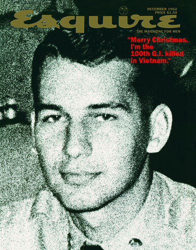
Equire cover, February 1968, showing right-wing politician Roy Cohn. Photographer: Carl Fischer.
Top: Mock-up for unpublished Esquire cover, 1962, using a snapshot of George Lois taken during the Korean War.
SH: How did you become interested in graphic design?
GL: When I was still in elementary school in the Bronx, I was more excited looking at a Cassandre poster than a Stuart Davis painting. Also I could draw very well, and I was very precocious about the history of art.
SH: What inspired you to go to art school?
GL: When I was twelve I had a terrific art teacher, Miss Ida Engel, who asked me if I had enough money to go on the subway. I ‘Yes, ma’am. Why?’ She said: ‘I want you to be a the High School of Music & Art by eleven o’clock to take the entry test.’ She gave me a portfolio, which she bought for three or four bucks – a lot of money, then. Inside were about 80 of my drawings that she had saved over the past three years. She insisted that I take the test. I was accepted.
SH: Did your father encourage you, too?
GL: No. In fact, my father was very concerned about me. Because I was drawing all the time, and it wasn’t too manly. Every day I would go out and get the newspapers for two cents apiece, bring them into my father’s flower store and draw every paper’s headlines three-dimensionally.
SH: And your interest in graphic design?
GL: There were teachers at the High School of Music & Art who came from the Bauhaus. I would design with that sensibility but always put words into my work. I really had a designer’s mentality. I remember doing a poster in my first year, on Switzerland. I got a photograph of the Swiss Alps, then took yellow paper and cut holes all over, making mountains out of gigantic slices of Swiss cheese. I was always looking for visual ideas.
SH: What was going on in advertising at that time that made you want to enter the field?
GL: Paul Rand was God to me then. Still is.
SH: Did you go to an art college?
GL: I went to Pratt Institute in Brooklyn. All during high school I worked in my father’s store day and night. After I graduated I continued going down to the flower market with him at four o’clock in the morning. Then on September fourth I told him ‘I’m starting college today’ and that I wasn’t going to take over his store. I’m sure he was shattered, but he didn’t show it to me.
SH: Was college as rewarding as high school?
GL: The first year was terrible but in the second year I took a class with Herschel Levit. He was a great teacher. He talked about music and dance and food, and we’d ooh and ahh over Rand’s work. Mr Levit would give an assignment and I’d come in with six finished ones while everybody in the class was struggling to get one done. However, I didn’t go to other classes except for the life drawing class. Finally, Levit came to me at the beginning of the second term and he insisted, ‘George, you’ve got to get out of here.’ And he gave me Reba Sochis’s phone number.
SH: Who was Reba Sochis?
GL: Reba had a design studio. She and Cipe Pineles were the first women art directors in the field, and she was the first women in town to run a studio with thirty guys working for her. She was a wonderful designer and a great typographer with a light touch. She had a policy that when you did comp lettering, you had to letter with a brush and you had to letter every word of copy, whether it was 72pt or 8pt. Boy, if you didn’t learn there …
SH: Did your political sympathies develop then?
GL: Reba and some of her friends were a big influence on me. I’m a humanist … with some Communist in it. I hate the unfairness of the system and the continuing injustices in America. I cared about the working class, about the working man. I’ve always had that thing in me, you know, fighting for ‘Hurricane’ Carter [Lois organised a campaign that helped get the former boxer’s murder conviction overturned], giving papers out in front of factories, and guys all cursing at me. Reba crystallised it for me, and many of her pals – Paul Robeson, W. E. B. Dubois [founder of the NAACP] and Alger Hiss – became my friends. I agrees with everything they [the Left] talked about – human rights, racial injustice and the First Amendment and the right-wing attack on our basic freedoms. McCarthyism was a terrible stain on American history, a terrible time for America …
SH: Given your political leanings, did you see a contradiction in being an advertising designer?
GL: You mean selling capitalist goods? No. It was always communicating, designing, convincing.
SH: From Reba Sochis’ studio you were drafted into the Army, served in Korea during the war and returned unharmed to New York at the age of 21. Then you went to work at CBS. Was this a detour on the road to advertising?
GL: In those days, advertising was basically a schlock industry. You had to work at a fashion agency to do anything of any quality, but they didn’t have ideas. They merely made everything look good. CBS was not quite an advertising jog, but it was a dream job for a graphic designer.
The FBI paid Bill Golden [my boss] a visit and told him I was a Communist, obviously trying to get me fired. Bill told me not to worry about it. CBS was a bastion of liberty in those days. They gave work to the artist Ben Shahn, whom the fbi hounded. Finally, Edward R. Murrow helped put the knife in Joe McCarthy.
SH: And you designed the official CBS typeface.
GL: Golden wanted me to re-draw Didot Bodoni. He didn’t want people to think we just used [an existing] typeface, he wanted it to be CBS’s own. There’s nothing more beautiful than Didot Bodoni. I blew it up in stats, re-drew it a little bit and gave it a little more style (what I thought was more style). I did six of them to show Bill where I was going – A, B, C, D, E, F. And Golden loved it and told me to do the final pen and ink lettering myself. I did one letter a week. They were fairly easy. It was the numbers that were hard! But they turned out beautifully.
SH: Was there a particular piece of advertising or promotion that you would call a watershed? Something that revealed the unique approach that would become your signature?
GL: One in particular was done when the ‘The 64,000 Dollar Question,’ [CBS’s most popular quiz show that was eventually investigated by Congress] was on the air. A contestant, a priest, was deciding whether he might or might not go for the 64,000 dollar question and we needed a special ad to promote the show. I did an ad that showed the priest’s picture and underneath I wrote, ‘Will he go for the 64,000 dollars?’ I didn’t use a logo, I didn’t put in the time the show would air. Nothing. The production guy asked: ‘where’s the logo? It’s got to have a goddamn logo.’ I said: ‘we’re running it as is.’ The next morning the shit hit the fan. Golden asked how I could do such a thing! I said: ‘Bill, it’s a terrific ad. You don’t need a logo and you don’t need a time. The whole world knows. It’s got balls.’
SH: So what makes your ads, then and now, different from others?
GL: I like to do things that change people’s minds.
SH: Is it the power of persuasion or the craft of salesmanship?
GL: It’s the power of a hungry mind and a hungry eye. Back then I was hungering to work on selling bread or cars, or an airline. I was hungering to get my face into changing the culture, my way.
SH: So you left CBS and joined the hardcore advertising industry.
GL: I was asked to be a head art director for the American Airlines account at the Lennen & Newell agency. I had a great beginning. Since American Airlines had new destination times to LA, I did an ad with a Brooklyn Dodgers hat on a guy’s head with his eyes looking west, and above it the headline read: ‘Thinking of going to LA?’ This was when the Dodgers were threatening to move from Brooklyn to LA. It was a killer ad.
SH: From there you went to Sudler & Hennessey, the agency where Herb Lubalin was creative director. What did you work on there?
GL: All their consumer stuff. I looked at the book on Lubalin a couple of months ago [Herb Lubalin: Art Director, Graphic Designer, and Typographer, American Showcase], and by mistake it includes a bunch of jobs that I did.
SH: What was the difference between your approach and Lubalin’s design?
GL: He tended to do beautiful type, typographic concepts, and he made type talk. His thinking was absolutely exciting and unique. On the other hand, I wanted to rip your throat out. I always tried to get a big idea into all my work.
SH: You left S&H for the hottest agency in America, Doyle Dane Bernbach.
GL: That’s when life really got interesting …
SH: But your first account did not sound like something that would spawn a creative revolution.
GL: My first assignment was the Kerid account. It was a new ear wax remover. The account guy had no information whatsoever. So what else is new? But it was easy enough to understand that when you put the stuff in your ear, the wax comes out. So I took a photograph of an ear with pencils and paper clips and stuff sticking out of it, a dynamic symbol of the strange and dangerous objects people used to clean out ear wax. I did that ad and a bunch of others, all hot stuff. I knocked them out and slapped them all over my walls, boom-boom-boom. No writer or anything, in one furious day. The next morning, Bernbach came to welcome me and he sees the stuff and he asks: ‘Who are you working with?’ I said: ‘I’m not working with anybody. I don’t have a writer.’ He said: ‘I’ll be your writer.’ I said, ‘Great.’ I found out afterwards he hadn’t been a writer for anybody in fifteen years.
SH: You are a designer and typographer, but the message and how to present that message have always been your first concern …
GL: Lou Dorfsman had given the CBS Radio account to Doyle Dane and requested that I do a full-page ad in the Times to announce that CBS was introducing news every-hour-on-the-hour. It was about the eighth station in town to do so, and was so behind the times that doing an ad bragging about it would have been a lousy strategy for CBS. So I wanted to do 24 small-space ads, two-column ads (which worked out to about a page), and I wanted to run them throughout the paper. ‘1 a.m.’, ‘2 a.m.’, ‘3 a.m.’, ‘4 a.m.’ and I did 24 of them, each with the logo, and ‘every hour on the hour.’ We would own the paper that day. It was an exciting visual way to make people remember it, and at the same time not crow over it and say: ‘Look what we finally did.’
SH: Terms such as ‘the creative revolution’ and the Big Idea suggest a shift in advertising in the 1960s from formulaic pitch to creative thinking. What actually happened?
GL: Well, it was a pretty dramatic. Bill Bernbach was the man who had an understanding of how copy and great graphic imagery work in harmony – how one and one becomes three. He gets all the credit in the world for that. Bernbach recognised the fact that the writer and art director had to work together as a team. It had to be two terrific talents or it didn’t work. Bernbach smelled it when, as a writer, he would watch Rand work. Starting with Paul, Bill recognised what he considered the genius and magic of the graphic art director. God knows, he was almost mystical about it.
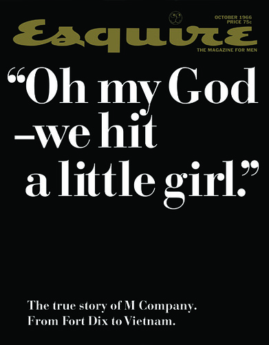
Esquire, October 1966. Quote from John Sack’s article following a US infantry company to Vietnam.
SH: What happened when you began your own agency, Papert Koenig Lois?
GL: We got a call from the Renault-Peugeot distributorship. They had a 300,000 dollar account, which was enough to pay our rent. A couple of weeks later, the Ladies’ Home Journal called us up and gave us their account to do their circulation ads.
SH: The Ladies’ Home Journal ads were very precocious at the time.
GL: The magazine came to us, and within two days I had called up Dr Benjamin Spock and got a picture of him when he was a baby. Under it we said: “What kind of a baby was Dr Spock?” Then another ad was a story about baby veal, and I had a head of a cow, a sweet young cow saying: “Please don’t read this month’s Ladies’ Home Journal.”
SH: Your agency’s offices were in the Seagram Building, and it was there that you developed ads for Seagram’s brand Wolfschmidt’s vodka. I’d say that this was the kind of advertising, witty, irreverent and a little bit racy, that typifies the Big Idea, method and style. Would you say that this put you on the map?
GL: Smirnoff was the leading brand. My idea was to position Wolfschmidt’s as a ‘tasteless’ vodka; since it left no after-taste you can drink it at lunch and not be found out. When I did those ads with the talking fruits and vegetables, everybody talked about them. Sales exploded.
SH: Another client was Xerox. It became such a generic name that it is part of our collective language, but it did not start out that way. What was your contribution to their image?
GL: Joe Wilson [the CEO] had thought about changing the name from Haloid Xerox to Haloid, but I convinced him that Xerox could be a memorable brand name. And I showed him a storyboard for a tv spot. He said: ‘Television? What are you talking about? There’s only 5,000 people we want to reach in America.’ But I told him that we have a chance now to make Xerox famous fast. I showed him the storyboard: a little girl goes to her father’s office, and he says: ‘Would you make two copies of this, please,’ and she toddles off to this funky music over to the Xerox 914. You’ve got to understand, in those days making photocopies was unheard of. The first time I saw it, I almost had an orgasm. She presses some buttons then lays her doll on the glass plate then she skips back and hands the copy to her father, who says: ‘which one is the original?’
SH: Sounds like a good concept to me.
GL: After I finished the presentation, Wilson fired me! He thought we were nuts to spend his budget on television. He wanted us to run trade ads, for Chrissakes. But the next morning I get a phone call from Joe Wilson. He says: ‘I changed my mind. Produce the commercial.’ So we run the commercial and he calls again and says: ‘Oh my God, my salesmen are so excited, everybody thought Xerox was an anti-freeze, now it’s a famous brand …’ Two days later we get a ‘cease-and-desist’ from the FCC [Federal Communications Commission, the US media regulator].
SH: This story just keeps getting more Byzantine. Why did you get a cease-and-desist?
GL: A. B. Dick, a leading office printing company (and I always thought, a company aptly named) complained that a little girl couldn’t possibly make a copy that easily. So I said, ‘I’ll call you back.’ An hour later I called the FCC and told them that I was going to re-shoot the commercial so they can witness the copies being made! They sent two guys in grey suits down, and I shoot exactly the same spot … except instead of shooting a little girl, I shoot a chimpanzee. A chimp comes up to the same father, who says, ‘Sam, would you make a copy of this?’ The chimp makes the copies (easier than the little girl did), toddles back, swings on a rope, gives him the copies. The father says, ‘Terrific, Sam, but which one is the original?’ We ran the little girl commercial at the beginning of the evening news show and we ran the chimp at the end – and all hell broke loose. I mean, stories, articles – everybody went nuts. It went from a 350,000 dollar account to a 9 million dollar account in two months. Xerox really became famous overnight.
SH: How does that happen? What is it about consumers that makes us so susceptible to advertising?
GL: What is an even crazier question than that is how do you know that you got the big idea that will change the world?
SH: Okay, how do you do it?
GL: You try to epitomise the uniqueness of the product by doing it in a way that’s incredibly memorable. The first rule is theatre. Attract attention by doing something absolutely fresh and dramatic. What most people in advertising don’t understand is, great advertising, in and of itself, becomes a benefit of the product.
SH: But does it have to be researched and market tested to make sure that the public will understand it?
GL: Of course not. For Braniff airlines I came up with the ‘When you’ve got it, flaunt it’ idea. I said to Harding Lawrence [the CEO]: ‘If you’re going to research this, forget it; it’s going to be a dog.’ He said: ‘Well, we’ve got to research it.’ So they researched it and I think 84 per cent of the people who saw the ads who fly Braniff said they would never fly it again. That’s how much [the test groups] hated the campaign. But Lawrence had balls, and he gave me his okay. I did spots with Salvador Dali telling [baseball player] Whitey Ford how to throw a curve ball, and Sonny Liston eyeballing Andy Warhol as he explained the significance of soup cans, and Mickey Spillane, of all people, explaining the power of words to the great poet Marianne Moore. Braniff’s business went up 80 per cent. You can’t research an idea like that. The only ideas that truly research well are mediocre, ‘acceptable’ ideas. In research, great ideas are always suspect.
Esquire cover showing Andy Warhol, May 1969. Photographer: Carl Fischer.

SH: To get those incongruous characters together anywhere, whether it’s a plane, a car or a park bench, is a wonderful idea. But explain to a layman like me what you wanted to convey.
GL: I was basically saying: ‘Why fly a dull-ass airline like American when you can fly an airline where some hot shit might happen?’ In research, everybody said: ‘That’s terrible, that’s ridiculous, that’s silly.’ But when you sit at home and watch it, it’s entertaining, it’s exciting, and you say: ‘Gee, next time I go to Dallas, put me on Braniff.’ You just know that people are going to go for it. It’s like reeling in fish.
SH: Do you understand psychology, or is this just intuitive on your part?
GL: It’s probably intuitive. I’m not sure about understanding human psychology. But I can think of everything I’ve ever done in my life, and I know exactly why I did it. For example, OTB [New York City’s Off-Track Betting] had had a terrific first year. Mayor [John V.] Lindsay asked me, ‘What do you think of OTB?’ I said I thought otb could double its money if its advertising could convince everybody who was ashamed to be seen in a betting parlour. (You don’t have to be a genius to know there’s an image problem.) So I developed the concept of the New York Bets: ‘You’re too heavy for the Mets? You’re too light for the Jets? You’re too short for the Nets? You’re just right for the NY Bets!’ I approached Broadway stars to be in full page Times ads, wearing NY Bets T-shirts. I got Carol Channing, Rodney Dangerfield … before you knew it, I had every entertainer who was coming to New York begging to appear in ads: Bob Hope, Frank Sinatra. We did about two dozen ads, and OTB doubled its take.
SH: The Greek tourist board came to you to save a potential tourist industry disaster following a comment by President Reagan that Americans should not fly to Greece after an air hijacking.
GL: There was a terrorist incident over Athens. A plane was going from Athens to Rome and was hijacked. So President Reagan came to life and announced that no American should go to the dangerous Athens airport. I’m sure he said it because Papandreou was the Premier of Greece, and Reagan hated him because he was a Socialist. So travel to Greece virtually stopped. The Greek government came to me begging me to come up with some magic that could save their tourist season. I got 39 celebrities to make testimonials, like Lloyd Bridges who said: ‘My great-great-great-great grandfather came to this country from England on the Mayflower, and now, finally, I’m going home … to Greece!’ Joe Namath [the football player] said, ‘My father came to this country from Hungary in 1906, and now finally I’m going home … to Greece!’ I was saying that everyone’s home is Greece, because Greece is the home of democracy. I shot them in one day in la and got them on the air. What the spots actually said was: ‘Fuck you, Reagan; I’m going to Greece.’ And they also said that before you die, you’ve got to visit the cradle of civilisation.
SH: Why is there so much bad advertising?
GL: I don’t think so-called creative people understand cause and effect.
SH: There’s so much advertising that gets a product name out there, and because it’s so insidious, it stays in your brain and you accept the brand.
GL: The only way it’s insidious is if they’re spending 20-40-50-60-80 million dollars. There are hundreds of brands that spend over 40 million dollars and nobody in America has any awareness of the advertising.
I don’t do campaigns where you spend zillions of dollars. I do campaigns where they don’t spend much money and I don’t have much time to make it famous, and I make it work, pronto.
SH: I know how you convince a client that your ad is good, but how do you prove it to yourself?
GL: I take civilians into a room and show them one of my commercials and ask, ‘What happened? What did you see?’ If they don’t explain the concept and show me that they ‘get it’, the spot sucks.
SH: I’ll watch something entertaining and never know what they’re selling.
GL: A lot of it is entertaining, and you don’t know what they’re talking about and you don’t remember the brand name and you don’t buy the product. Now, if they have 100 million dollars and they keep running it, sooner or later it might get under your skin. Nike wouldn’t be the brand they are if they didn’t spend a shit-load of money with Michael Jordan imagery, from day one. There’s a lot of advertising that has to be seen 20-30 times to be semi-understood. The way I judge my stuff is, you’ve got to see it one time, you’ve got to get it, and it’s got to grab you by the throat.
SH: Lets talk about MTV. Here’s this hip new network, now one of the most successful in the world. When you were asked early on to do their promotion campaign, was it a culture that you could appreciate?
GL: I thought rock’n’roll was garbage, I didn’t like any of it. I’m a Cole Porter, Giuseppe Verdi man. But I don’t have to love a product to sell the hell out of it. Some young guys came to see me. Their leader was Bob Pittman who was 27, and they had three accounts, the Movie Channel, Nickelodeon, and an unknown named MTV. They were going to pick two agencies and somehow split the work up. They asked me to pick two of the three. The Movie Channel was worth 6 million dollars, Nickelodeon was 3 million dollars, and MTV was a quarter-million dollars. I said: ‘I’ve got to have MTV. If that’s the only one I can take, I’ll take it. I think it’s a big programming idea that young people would eat up.’ Pittman said: ‘So what makes you think you can do it?’
SH: What was your idea?
GL: I said: ‘Do all you young punks remember, “I want my Maypo?”’ [a mid-1960s advertising campaign that Lois created for a hot cereal]. They all had vivid memories of it. I said: ‘Now you are all 25-26, and we’re going to say to the world: “I want my MTV.”’ I explained the commercial, to take the ‘M’ logo – always show it with crazy variations (one had a tongue sticking out). A lawyer in the room said I couldn’t do that because every time I did they would have to re-register the logo. I told the lawyer to kiss my ass. And then, I showed them the commercial where at the end a voice says, ‘If you don’t get MTV where you live, you pick up the phone and dial your local cable operator and say …’ Then I cut to Mick Jagger, and he bellows, ‘I want my MTV.’
SH: And the result?
GL: We bought four spots on a Thursday night, and waited to see what happened on Friday. The cable operator in San Francisco calls Pittman and says, ‘Get that commercial off the air! I’m getting thousands of phone calls. I had to shut the line. Oh, by the way, I’ll take it!’ We blitzed through America that way and six months later MTV hits the cover of Time Magazine as the greatest pop cultural revolution in the last quarter of a century. It became wildly successful, but we probably destroyed world culture.
SH: How much of your output is just you? How much of your output is you in collaboration?
GL: The idea, almost always, has got to come from me – the truly Big Idea. I’m never satisfied with somebody else’s idea, because I always feel that I didn’t push my own head. Once I feel I have all the input I need, I totally concentrate and nail the idea. If I have trouble coming up with what I consider to be a thrilling concept, it’s because I didn’t really understand all the input. But when I nail the idea, and I’m bursting with it, I love to work things out with a great writer. Boy, is that great fun.
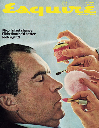
Esquire cover, May 1968. Candidate Richard Nixon. Photographer: Carl Fischer / stock photo.
Steven Heller, editor of the AIGA Journal, design writer, New York
First published in Eye no. 29 vol. 8, 1998
Eye is the world’s most beautiful and collectable graphic design journal, published quarterly for professional designers, students and anyone interested in critical, informed writing about graphic design and visual culture. It is available from all good design bookshops and online at the Eye shop, where you can buy subscriptions and single issues.