Autumn 2002
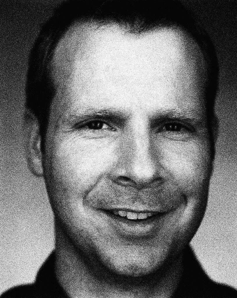
Reputations: J. Abbott Miller
'We could be more aware of the civility of design, of how it can be constructive in a poetic sense, not just like a sneeze of capitalist excess’
J. Abbott Miller was born in Indiana and studied at the Cooper Union School of Art. Before joining Pentagram as partner in 1999, he was director of Design / Writing / Research, a multidisciplinary studio founded in 1989 whose interest in ‘the public life of the written word’ took shape through magazines, exhibitions, symposia and books, notably the celebrated Design / Writing / Research (Princeton Architectural Press, 1996), co-authored with design historian Ellen Lupton, also Miller’s wife.
His clients have included The Museum of Modern Art, The Guggenheim Museum, Vitra, Princeton University and Architecture magazine. Miller’s publication design has received several awards: 2wice (which he also edits) was named ‘Magazine of the Year’ by the Society for Publication Designers; Dance Ink received five gold medals from the SPD and was nominated three times for a National Magazine Award.
Three-dimensional installations designed by Miller include ‘Geoffrey Beene Unbound’, a 30-year retrospective of the clothing designer; ‘John Bull and Uncle Sam: Four Centuries of British-American Relations’ at the Library of Congress, ‘On the Job: Design and the American Office’ and ‘World War II and the American Dream: How Wartime Building Changed a Nation’ both at the National Building Museum in Washington, D.C.; and ‘The ABC’s of Triangle, Square, Circle: The Bauhaus and Design Theory, from Pre-school to Post-Modernism’ at Cooper Union. Recent projects include the exhibition ‘Rock Style’ at the Rock and Roll Hall of Fame and Museum, identities for Wellesley College and the Whitney Museum and a touring show for Harley-Davidson.
The interview was held in London while Abbott Miller was on his way to a Pentagram partners’ meeting in Seville. Several further exchanges took place online until both parties hit immovable deadlines. Miller couldn’t resist emailing a coda, however: ‘One last thought in relation to writing, designing, editing: there is nothing like being an author, and no amount of design replaces that role.’
John L. Walters: Did you draw and paint as a boy?
J. Abbott Miller: I liked playing with these toys called Lincoln Logs – little logs you stacked to create log cabin-like structures, which I would then draw as if they were renderings. From there I got interested in letterforms and elaborate fonts – typefaces without knowing what a typeface was. When a fifth grade teacher asked us to present our vocabulary lists in different ways: I would represent letters with symbols, and develop my own Braille system. I focused intensely on my work and being good at it: it was the beginning of a solitary art student persona. It’s the same for a lot of people who end up in art school … the person who doesn’t go to lunch and stays in the art room and goes to the library … I never liked painting itself. I had no touch for it.
JW: How did you get into graphic design?
JM: I saw a poster in high school advertising a programme for Parsons. I figured that graphic design would be the ‘responsible choice’ because it was professional. But when I went back for my final year in high school after a summer in New York, looking at the museums and the galleries, I was pretty sure I wanted to be an artist, not a designer.
Rarely do portfolios come in to us where the student says ‘I want to be a graphic designer’. You look at the portfolio and you know – even if the person doesn’t know. You see how they think and what the work is like and you see design thinking.
JW: Do you think that the profession chooses the person?
JM: I think that the trait that comes with them is an analytical quality, a certain detachment from the objects that they produce. The art that I’m drawn to is more analytical – or has a sympathy with design thinking. I was always ambivalent about design. At Cooper Union I went back and forth – pivoting around these figures within the school community, many of whom were at intense odds with each other.
On the one hand there was this great film theory guy, P. Adams Sitney (a film theory aesthetics writer who’s now at Yale) and he was in the grand tradition, actually teaching us Kant, Hegel, and Heidegger on aesthetics. At the other extreme was Hans Haacke, a political artist who is very much not ‘art for art’s sake’ and more about politics and social reception. They had such contempt for each other, yet they were both so compelling. I would go from one side of the school and be praised for doing something beautiful and then I would go take the stuff into Hans’s class. They would just rip it to shreds.
JW: So you had to apply more rigour to your work?
JM: Yeah, it was the ‘no bullshit’ factor. What did people make of what you just put up on the wall? What’s your responsibility for that interpretation? The hard things that students should be confronted with. It was tough.
JW: Was this your first encounter with criticism? You sound like a model student.
JM: I was a model student! And I went into Hans’s class the first time because I had heard about its reputation for serious political critique. It wasn’t about medium in any way … you brought in whatever you were working on.
JW: Did this steer you towards graphic design?
JM: Through the whole curriculum you never had to say ‘I’m a designer’. You were able to wake up and say ‘I’m sick of design – I’m gonna do film.’
JW: And what was your take on the high / low divide?
JM: At high school I was interested in the ‘art-house’ fare of Un Chien Andalou and Cocteau; in college, it was on to more analytical stuff like Eisenstein, Vertov, Bresson, Stan Brakhage, and Godard. So I was aware of these layers of mass and avant-garde, but it was translated through one of the most accessible media possible. Eisenstein was radical form, born of a populist impulse. Later, Ellen [Lupton] and I wrote a catalogue essay on Andy Warhol, for a show curated by Donna de Salvo called ‘Success is a Job in New York: The Early Art of Andy Warhol.’ Our essay considered the overlaps between his design and illustration careers and his entrée to the art world. Donna had interviewed art directors and colleagues who had worked with Warhol: in one tape the CBS art director Lou Dorfsman expressed amazement that Warhol had leveraged a ‘design schtick’ into a such a lofty place. For Dorfsman, it was no different than having a good concept and enough talent to execute it. In some ways the model of the designer works better to understand Warhol.
It is strange to hear people from the ‘high’ discourse on art consider the ‘low’ of mass-market design and media. You don’t really ‘decide’ to be influenced by commercial culture, you live and breathe it, and its effects are more inevitable, all-encompassing. And straightforward physical or technical issues are not familiar to art historians, and are overlooked.
JW: When it comes to design projects and clients, how ‘low’ could you go?
JM: There really is no ‘too low’ for me! It’s more that I have a weakness for beauty and formal integrity that is sometimes irrelevant in the mass-market context. But I don’t see the pursuit of interesting and beautiful design as fundamentally at odds with the broadest possible marketplace. In that sense I am an optimist. I think we could all be more aware of the civility of design, of how design fosters meaning, interest, beauty. How design can be purposefully constructive in a poetic sense, not just like a sneeze of capitalist excess.
JW: Or are ‘beauty and formal integrity’ at odds with some mass market products? For example, could you work with a fast food chain or for a ‘reality’ TV show or for Hello!
JM: I think there are forces that mitigate the strength of good design, and that the machinations that produce fast-food restaurants and Hello! involve so many people and so much fear that this is why good design is harder to find in those places. There isn’t an inherent opposition between good design and the mass market, but you have to ask why it almost never happens.
The first job
JW: What did you do after you left Cooper?
JM: This charismatic guy Richard Saul Wurman gave a lecture at school. I really liked him, and he needed people to join him as he was moving his publishing company from LA to NYC. It appealed because I was sceptical about the classical design studio experience, which I felt would be under-nurturing, toiling away on things that didn’t interest me. By comparison, there’s this guy who’s making his own books. I stayed with him four or five years and I learnt a lot. These luminaries of publishing, corporate and media worlds would walk into his office. When they walked out he’d have a deal going. He pitched to Polaroid that they should do a history of the company and it became my project: sifting through an open archive, choosing the images and working with a writer. Making a design-driven book was very appealing.
JW: What happened next?
JM: While I was working for Richard I started to work for various NYC galleries: identities and advertising. This was a way to make the leap from getting a steady paycheck to clients of my own. I got a retainer for a year’s worth of work from the New Museum of Contemporary Art, and that was the final impetus to leave. Then I met the publisher of Dance Ink and started doing that.
JW: This was Patsy Tarr.
JM: Yes. The magazine was very quiet in its design. It had a modest budget but a very intense sense of the readership and the community it serves, which I kind of miss with 2wice, y’know.
JW: What do you mean by quiet?
JM: Dance Ink began more journalistically, concerned with the writing of dance criticism, but we evolved this persona that the photo shoots were a form of dance: it was about the relationship between photographer and subject. I was able to do more with it, using full bleed images and moving around the page. And there was the philanthropic motivation of creating a magazine that was a venue for performance.
JW: You say you miss that …
JM: I miss the intensity of knowing who we’re talking to. We fulfilled a unique position within the publishing and dance landscape that no-one else was doing. With 2wice [also published by Patsy Tarr] it’s harder to know our audience.
JW: 2wice seems to be moving back towards dance.
JM: Yes. Partly because it’s a unique form of documentation of an ephemeral art form. While we’re covering decorative arts and contemporary photography, those things are already visual. When we actually do a shoot with a choreographer and a company, I feel like, ‘Wow: that is the unique document.’ The new imagery comes into play in the performance. Something that didn’t exist before the shoot.
JW: To what extent can you art direct that?
JM: It’s more about choosing the connection between the photographer and the dancer, and the choreographer and the mood of it. I don’t micro-manage. The Merce Cunningham rooftop shoot we did in the ‘Picnic’ issue was a major undertaking. For the Mark Morris shoot I made the suit for him but I wasn’t at the shoot.
JW: Suit design! A new direction?
JM: Yeah, but that was so clearly about Mark’s personality and about the costume and the prop elements – the gingham stuff – that it already had the hallmarks of what I wanted it to be like.
JW: Is there a connection between this and the way you document contemporary art – much of which is no longer just a fixed visual image?
JM: It’s all about setting a stage; making a frame not neutral but an effective agent to draw out whatever’s being shown. There’s an overlap in staging an exhibition and putting artefacts on display for some kind of processional walk through a space and then taking a dance and putting it in a sequence of pages.
JW: So do you approach publication design differently now ?
JM: Yeah. I love that classic sequencing of spreads and of images. Dance Ink had a kind of a flow because a lot of it was arrested motion. With 2wice there are more static elements: the rhythm is different. So a lot of times I’ve been partitioning off something into a dance segment. Or staging an eruption in the middle of the issue. It’s not a through line all the way from front to back. 2wice is the sum of my interests and my publisher’s interests. It’s not for profit, it’s not constrained. The ‘Car’ issue of 2wice was totally different in its persona to the ‘Spring’ issue. We have that freedom.
The Scala Years
JW: How do you choose fonts for your projects?
JM: I am sometimes a very formalist designer, looking for metaphor and concept at every turn. In our early projects together, Ellen and I would squeeze every ounce of potential signification out of them. Now I’m more relaxed about stylistic issues. I have this period of my work I call ‘The Scala Years’. Ellen had done a show on Dutch design and she had introduced me to this font by Martin Majoor. When I first saw it I thought ‘big deal’, but when I started to work with it it spawned endless uses. The Dance Ink years were the Scala Years: books, catalogues. Then I went on to Gerard Unger’s Swift. When I started 2wice I wanted the logo to be stable but then I changed the body copy from Swift. Lately, the font choices have become more influenced by the spirit of the content.
There is typically a display voice and a text voice, like in the John Lennon show, where large, iconic numbers set in Burin Sans became like historical markers, but where the text face Avance became a more traditional reading font. I am a great admirer of typeface design, of the skill it requires, and of the subtlety it brings to the apprehension of content. A face like Avance is not something I would use frequently, but it was right for the Lennon show as a bookish font that had weight and integrity, but did not feel swallowed up by history. A typeface insinuates itself in the mix of signals, without being reducible to a specific ‘meaning’.
Designers are usually bombarded by the specific, the literal, and typefaces are this territory of abstraction that can be very satisfying. I am not a type fetishist: I used Shattered in the Harley-Davidson show for an exhibit about rock and roll: the leather coats worn by AC / DC and guitars played by ZZ Top and other 1970s rock stuff, seemed to call out for Shattered. I used it in ten foot high letters, severely cropped.
Nostalgia for Modernism
JW: There’s a nostalgia in your work for a lost era of American Modernism – picnics and smart cars.
JM: Yeah, I have a strong feeling for mid-century Modern. The most important design practitioners of the twentieth century were Charles and Ray Eames, and that nostalgia is there and that is me!
JW: There’s a tension between this pipe-smoking Modernism, with gleaming chrome in the kitchen and great chairs and Bernstein on the hi-fi …
JM: Yeah. Ha-ha
JW: … and then there’s the camp, slightly dangerous world of drag queens and Matthew Barney …
JM: Yeah, yeah …
JW: … this other world, like Pleasantville … two different eras leaking into each other …
JM: Well, I was really struck when I was working on the Barney book [Matthew Barney: The Cremaster Cycle, Guggenheim, 2002] how deeply influenced and referential the work is in twentieth century design aesthetics. In a weird way, having Ray and Charles Eames on one side and Matthew Barney on the other I feel somewhere right in between. It’s partly that gesamtkunstwerk quality there is in Barney is also there in the Eameses.
Barney works with an enormous crew – but it is an auteur model that is filtered through his aesthetic. His Cremaster 5 film that’s shot in Budapest features opulent Art Deco, almost going through a catalogue of twentieth-century style. He starts with a wall of storyboards, a visual narrative on a wall that gets created through sculpture and photography and film.
JW: Did you feel an affinity with his methods? You are also working with books and exhibitions.
JM: Yeah I did, and it’s obviously an interesting thing to witness how he produces this stuff because it’s very sympathetic to, and related to how designers and art directors put together their work.
JW: When you’re working on a project like that, is there part of you that wishes you had stayed with the idea of becoming an artist?
JM: Yeah. Of course you’re looking at it and dealing with the material and constantly feeling that the service role of design can be, perhaps should be, selfless. You get invested in these relationships and at the end of the day it still says Matthew Barney or Geoffrey Beene on the cover and you think: ‘Gee I’d like that! I wonder when I’m going to actually get to be the subject!’ In projects I’d worked on previously where I was the writer and the curator you feel much more of a fully fleshed out foothold into the content. It’s yours. It’s the difference between helping realise a body of work, versus producing a body of work that you are identified with. That’s a kind of designer’s issue, a dynamic that I play out with every project.
Yet I have such ambivalence about the position of the artist and I have such a stake in the importance of the designer that somehow it always feels like whatever I want to do, the object is probably going to be the same whether I call myself an artist or a designer. I’m a bit jaded about the institutional framework of art production and I would find it very difficult to suddenly say: ‘You know, I’m an artist, and I’m done being a designer,’ because I think that the role of the designer is so important and so interesting. There’s certainly more cultural capital in the position of the artist, but in terms of my personal identification with what an artist does, what a designer does and how I see the overlaps, how fluid they are, it feels foreign to suddenly say: ‘I think I’ll be an artist.’
JW: Yet you’re part of the support system that reinforces the cultural importance of the artist …
JM: I am! Right. And the issue of authorship is one place where that pendulum swings back more closely for a designer. Where the literal content is in your hands to shape. Different designers stake out different territories to allow themselves a more formidable role in the production of content. But the book is there to serve the artist and his or her career. There were certainly moments where the curator pulled back and said: ‘This is a book about Matthew.’ There were design decisions which she deemed over the top or encroaching too closely on his terrain.
JW: Yet there are some pretty extravagant elements in the design of that book.
JM: Yeah!
JW: Was that part of the brief? It seems that his personality demands an extravagant response.
JM: We’ve been working on the book on and off for two years, so the brief didn’t come to me as: ‘Do a book that feels like Matthew Barney.’ They just talked to a lot of designers. I thought the meeting went horribly, but then they came back said they wanted to work on the book.
I presented to Matthew the question that came to my mind from the material, which was: ‘Are we following the aesthetics of the Cremaster cycle or are we a step removed? Is this actually a reference book about the universe that he’s created?’ And that’s the direction we took. It wasn’t going to emulate the aesthetics of the Cremaster cycle, which were there to take if we wanted to in terms of the previous books he’s published about each film. Instead, we took the Enlightenment model of the rational reference volume. And that’s what that is – a spin on a hyperrational lens to view a deeply complex, irrational body of work.
JW: There are things like the die-cutting of the pages – that’s all you!
JM: That was one of those moments that you hold on to! If it’s right and it’s provocative and interesting then it’s a contribution to the work.
JW: You’ve got this visual and tactile representation of the cycle before you even open the book.
JM: Exactly.
That ‘Sunday painter’ thing
JW: The Brick / Book struck me as an odd one out in your work. At first I thought, ‘fantastic’, and then: ‘do I really want a J. Abbott Miller book with no content?’ Is this you ‘crossing over’ into fine art?
JM: Yes. It was specifically in that context in a gallery where I was asked to show work. My first thought was ‘Oh I’ll show my books’, but you don’t just put them around a gallery and say that they’re art – they’re not. So I created a book expressly for the purpose of exhibition.
JW: Was it a critique of that whole art world?
JM: Y’know what I like so much about the forum – the gallery context to show your work – is that the broadest spectrum of interpretations are possible. The object hasn’t pinned itself down to being a critique or celebration – it’s what it is. Partly it’s the pleasure of bringing what you bring to a kind of empty vessel – not empty – to something which is coded and purposeful but still allowing multiple interpretations. That’s the allure of so much that is not design, that is art: that slight suspension of context or function.
JW: I guess it’s a little world of your own making.
JM: Right, and part of what I resist in the artist-designer dichotomy is that ‘Sunday painter’ thing. There are so many great designers who at a certain point in their career decide that they’re really painters. They did fantastic work as designers and their paintings are terrible. It’s a real fear!
JW: Did you sell all the bricks?
JM: Oh no. I’ve got a lot of them left!
JW: Ultimately, isn’t 2wice more J. Abbott Miller than Brick / Book?
JM: I think in the sense that it opens out other content it’s more me. The brick book is hovering in this nether world of sculpture design, art design … it’s more a little segue, a little poetic segue. When I do turn to take a more central position in a project it’s going to be more deeply involved, it’s going to be less silent than the brick book.
Exhibition work
JW: What are the connections between your designs for books and catalogues and for exhibitions?
JM: It’s sort of like a Lawrence Weiner statement: ‘words, images, and artefacts arranged on a wall, in a space, or in a book.’
That’s a simplification, but that is what is pleasurable to me: moments when the book and the three-dimensional experience feel the same (as in the John Lennon exhibition), but are done differently. It’s part of my ongoing love of moving between 2D and 3D contexts.
JW: How did you tackle the Harley exhibition?
JM: The Harley-Davidson project was exactly one year in development from the first meeting to the first exhibition venue in Atlanta. I was involved from the very first planning phase about content, and was the creative director of the whole project from a visual standpoint, encompassing the tent structure (designed with FTL / Happold) and all architectural and graphic components. Harley is heading into its 100th anniversary, and the concept was to create a travelling festival / event with musical performances and exhibitions about the history of Harley, the culture of biking, and the design of this legendary motorcycle. The show will travel all over the world, to ten different sites (including Mexico City, Sydney and Tokyo), and then return to Harley in Milwaukee for their 100th anniversary year [2003].
We built the exhibits around the strengths of the pictorial archive and the three-dimensional artefacts. I had to assume a very different kind of visitor, entering a different kind of space. It is not a museum, but Harley wanted it to have some of the formality of a museum exhibition.
JW: You once talked about ‘channelling Fred Woodward’ in your Rolling Stone exhibition, which implies a certain ‘selflessness’ …
JM: ‘Selfless’ doesn’t count for much in our profession. When you are dealing with iconic subjects you try to make moves that are appropriate and distinctive without straying too far.
JW: Have you devised theories about organising the exhibits in time and space?
JM: One reason I like exhibition design so much, is because there are no codified rules. It is not mature enough to have conventions that are as established as those in print design. The practical issues of text size are really strongly related to the ethic I have about book and magazine typography. It’s just a different spatial issue of distance, and the fact that you are standing, not sitting. Your head is commanded to read from a certain distance and you are not so free to navigate as you are in book space.
Pentagram
JW: How does being a Pentagram partner differ from running your own studio?
JM: With my own studio, I would do a big project and say to myself: ‘Gee I guess that probably wasn’t very profitable.’ At Pentagram they show you how unprofitable it is. You start to realise how much you underwrite certain projects that you love.
JW: Is that why you moved, to impose a discipline …
JM: A little bit. And there is something a bit isolating about running your own studio: I rarely relied upon the advice or support of colleagues. And you start to get this bunker mentality. I felt very isolated at the time when Michael [Bierut] and Paula [Scher] asked me to have lunch with them I was sort of feeling very much like … ‘Gosh. So what do I do now? I keep perfecting and doing more and more’ … I could see the next four or five years, and it was very predictable, and Pentagram was a question mark. It seemed ultimately more interesting to pursue the question mark and invite in those other influences.
JW: Does that mean you now have clients that you wouldn’t have taken on before?
JM: No. In the almost three years that I’ve been there I think I’ve only had a couple of clients who are from totally new contacts, and who came to me through Pentagram. The bulk of them, 95 per cent of them, are clients from my old studio. So it’s been more a furtherance of all those interesting clients rather than suddenly shifting into a new context. Which is not to say that some clients don’t feel greatly comforted by Pentagram.
When I did the Whitney Museum identity, I had my own contacts there who knew me, but when it came to explaining to the board who was working on the identity it was easier for them to say: ‘The same people who did the Museum of Natural History.’
JW: And you’re changing the nature of Pentagram.
JM: You’re hoping that you add something …
JW: Well people may say ‘Pentagram’s OK now because they’ve got J. Abbott Miller!’
JM: That’s the same in all the offices, this sense of reinvention and reappraisal and keeping things evolving … and Lisa Strausfeld, who’s the newest partner, has a whole different orbit of projects and communities that she brings into that mix. There are many things that can be said in favour of the sole practitioner studio, but the way Pentagram works is quite incredible.
Clients, collaborators and family
JW: You have worked with some very original and creative clients … has this resulted in some life- or opinion-changing experiences?
JM: In working with other people as subjects, there is a real pleasure in working with people whose work you admire. I have designed a lot of books on dead men like Jerome Robbins, Ansel Adams, Antonin Artaud, Philippe Halsman, and Russel Wright. It’s nicer to work with living subjects, and to have a real exchange. This has happened with artists such as Hans Haacke, Barbara Bloom, Nam June Paik, Yoko Ono, John Kelly, Matthew Barney, and right now, Liz Diller and Rick Scofidio. You immerse yourself and develop a fast and deep expertise that you then act upon.
No matter how dynamic it can be, it does remain at the level of a service though. The paradigm has to change so I can become a more active agent. Each new project holds so much interest that you get completely wrapped up in it. Then you stand back and say, ‘you mean we did all that and all we get is a design credit!’ Of course you get the cash, too, but that’s very parenthetical. It is all about the projects and the opportunities, and for me and most designers I know – you’d rather have great work than lots of money.
It is fascinating to work with people on books about their work, because everyone realises the relative permanence of a book. It establishes the story unlike any other kind of document, and it also makes book making sometimes very emotional and volatile. Subjects become vulnerable as they become books. When you have the opportunity to meet, discuss, and test your assumptions against your subjects, you can get real, visceral reactions.
One of the best parts is entering the work spaces of these people, seeing how everyday work is conducted, the texture of their daily lives in their studios. Matthew Barney’s studio is like a very dense hive of fabrication, Nam June Paik’s studio was messy and Barbara Bloom works in a writerly studio filled with books and files.
The culture people build in their studios is indicative of their work. Is it conversational? Is it frantic? Is it dictatorial? Is it contemplative? I feel that I cultivated a great studio climate at Design / Writing / Research, which is an ideal that I strive for now. It’s harder as I get older (I am 39 now) to converse with my students as a peer, or to keep the relationships in the studio seeming as balanced as when you are only five or six years older than the people you work with.
My first collaborator was Ellen, and that relationship moved from working together, to getting married, to having children. The work we did together came out of an intense, shared educational context. Ellen is an identical twin, but in terms of our interests and education at Cooper Union, we were sort of intellectual twins. She is the most determined, talented, and hard-working person I know. Now our shared context is our family, but I hope we can work together again in the future.
John L. Walters, Eye editor, London
First published in Eye no. 45 vol. 12, 2002
Eye is the world’s most beautiful and collectable graphic design journal, published quarterly for professional designers, students and anyone interested in critical, informed writing about graphic design and visual culture. It is available from all good design bookshops and online at the Eye shop, where you can buy subscriptions and single issues.