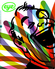
Autumn 2011
Reputations: John McConnell
‘By wanting to be intelligent, it usually gets simpler and simpler. The creative process is paring back all the time. If you can’t defend it, get rid of it.That’s what turns me on. How simple can you make it? Usually, “creativity” means showing off to your peer group, and creativity without intelligence is as dumb as it comes.’
Designer and art director John McConnell has been quietly and steadily leaving his graphic stamp on British life for nearly five decades, working for a diverse array of household names, including Clarks Shoes, Faber & Faber, Boots, Halfords, John Lewis and the British Museum. In many of his projects he has achieved the designer’s dream of working at board level, which has given him insights into the politics of business. Sometimes he works closely with in-house design teams; at other times he engages a ‘college’ of external design groups while acting as art director.
His own practice has always remained compact – even within Pentagram, where he was a partner from 1974 to 2005 – with usually just one assistant (often a freelance) and a secretary who fields his emails. McConnell claims never to touch a computer, apart from occasionally using Google.
McConnell (born 1939 in London) grew up near Maidstone where he looked set for a life of underachievement, having failed all his exams at school. When he was fourteen, a concerned carpentry teacher intervened, and helped him enrol in Maidstone School of Art, where he stayed for seven years – ‘longer than training to be a brain surgeon,’ he points out.
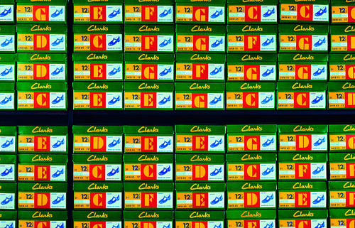
Clarks’ shoe boxes, when stacked and displayed in a shop, become part of the chain’s interior design.
Top: Portrait by Phil Sayer.
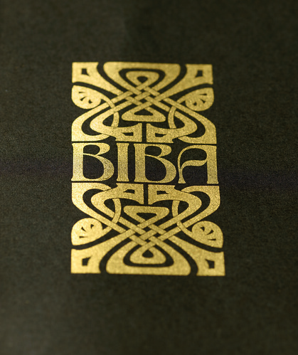
After a short, miserable spell in advertising, and six months dodging national service in the Republic of Ireland, McConnell returned to London and founded his own practice in Covent Garden. In 1963 he designed the logo for Biba, Barbara Hulanicki’s groundbreaking fashion boutique, and managed its identity as the business grew to include catalogues, diaries, cosmetics and other branded merchandise. The Biba work earned him a D&AD Silver in 1969.
Two years earlier, as a precaution against design work drying up, McConnell co-founded Face, a photosetting business inspired by a trip to the United States, where the new technology was better established. He used his design skills to promote the company, and also recruited talented contemporaries (such as John Gorham, who sublet studio space from him) to design posters and other promotional materials. McConnell’s work for Face developed his interest in the human face as a graphic element and his fondness for using vernacular design materials – which he calls ‘junk’ – taken from office catalogues, phone directories and other bits of found art and ephemera. He also used this approach, with titles set on an Olivetti typewriter, in his cover designs for a series of Penguin student textbooks in the early 1970s.
Cover from a Penguin Books series of academic titles aimed at students, early 1970s (pre-Pentagram). McConnell frequently used found objects, such as playing cards, and vernacular type and illustration elements, which he calls ‘junk’. The author names and titles were set using typewriter ‘to save money’, says McConnell.
In 1974 McConnell was invited to become the sixth member of Pentagram, the co-operative design partnership founded by Alan Fletcher, Colin Forbes, Theo Crosby, Mervyn Kurlansky and Kenneth Grange two years earlier. This enabled him to work with bigger clients while keeping his team small – behind Pentagram’s professional and increasingly international façade. In Profile (ed. Susan Yelavich, Phaidon, 2004), McConnell was quoted as describing Pentagram’s approach to working as ‘nineteen kitchen tables’.
Shoe manufacturer Clarks gave him the opportunity to rethink the chain’s retail interiors, as well as packaging and branding. In 1981 he initiated an extensive redesign programme for book publisher Faber & Faber, whose design had lacked leadership since the 1975 departure of celebrated art director Berthold Wolpe. McConnell wrought big changes in the publisher’s approach to series design, and later became a director of the company. He stayed at Faber until 1996.
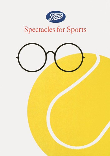
From 1984 to 2002, when McConnell was design director of Boots, he instituted what he calls a ‘school of designers’, hiring up to 30 different design practices to work with different divisions within the empire of what he calls ‘the nation’s chemist’. This grew rapidly to embrace baby food, electronics, cosmetics and confectionery.
Similar jobs, with a corresponding ‘design school’ methodology, followed on from Boots: Halfords (1994); and John Lewis (2000-10, see also ‘Trust in Modernism’, pp.62-69). McConnell also designed for the John Lewis Partnership’s upmarket Peter Jones store in Chelsea (2001).
Boots branding, 1980s. As design director of ‘the nation’s chemist’, from 1984-2002, McConnell commissioned many of the prominent design practices of that time to work on different Boots lines, as part of what he called his ‘college’. All art direction: John McConnell / Pentagram.
An elaborate rebranding project for Spain’s General de Confitiería led to its reincarnation as Joyco (1999), for which McConnell commissioned designer-illustrator Javier Mariscal to create cartoon characters as part of a multifaceted marketing campaign.
Not all McConnell’s clients are big retail brands. He has fashioned memorable marks for a diverse selection of companies including pharmaceuticals company Smith & Nephew (1979), radio station Classic FM (1992), the National Grid (newly privatised in 1990), the Japan Festival (2001), entrepreneur Fred Tow (1987), and the Unicorn theatre for children in London (2005).
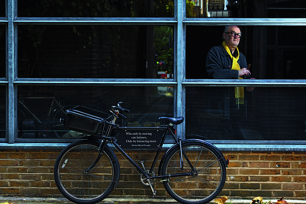
McConnell has been garlanded with awards including: the Prince Philip Designers’ Prize (2002); various D&AD Awards (Silver, Gold and a President’s Award in 1985); and an American Art Directors Club award in 1985. He was also made an RDI (Royal Designer for Industry) in 1987. He lives in Bayswater, London, and cycles to his studio each day on a delivery-style bike that displays lines from Michael Donaghy’s ‘Machines’, one of the poems selected by McConnell’s client the Forward Arts Foundation, which organises National Poetry Day. McConnell quips that the bicycle poetry demonstrates his ‘commitment to the client’.
John L. Walters: What do you wish you had known when you were starting out as a designer?
John McConnell: The problem is being able to convince the buyer of your solution on the basis that as a designer you are an applied artist. I’m there to act on someone else’s behalf, so I’d better understand them. When I talk to kids about it, I explain that politics are an enormous part of it.
JLW: Small ‘p’ politics?
JMcC: Getting on with people. Machiavelli had a lovely quote that says, basically: ‘He who invokes change is in for a rough ride.’ Because the innovator will make enemies of all those who did well under the old order, and get only lukewarm support from the people who might do well under the new. That always stuck in my mind.
JLW: How did you get started?
JMcC: I left art school and dodged military service and came back to London and got my first job working for the crummiest advertising agency in the world.
JLW: So the only way was up?
JMcC: Correct. I could have gone both ways. I could have given up.
They were famous for doing two-inch ads for rose bushes – that was their big client – and the guy in the studio I was working with had such a big chip on his shoulder. I used to bring in Graphis magazine, which I would read under the table. To see what Mr Bass had just knocked out.
I could see that my co-worker was going to dump that chip on my shoulder as quickly as he could. Reading Graphis was a way of protecting myself. I left that job pretty quickly.
JLW: Were you mainly working with type?
JMcC: It was pretty well all type.
I did one thing for a famous fashion client. I was asked to do an annual report for them. Then I fell foul of the biggest Achilles heel of all designers –which is that you forget that the solution is in the problem. If you as a designer make it your problem then you’re going to screw up.
I was determined that this annual report (forget about the client, I didn’t even think about him) would be better than Saul Bass could have done, so that when Paul Rand or Bass saw this annual report they would decide to give up. They would retire. So it was the worst thing you could imagine.
JLW: How did that go down?
JMcC: Well, they printed it. But I look back on it and it was the most unintelligent thing I’ve ever seen.
JLW: When did you realise what you’d done?
JMcC: It took me some time. In the end, ‘creativity’ fucks up. That insight has helped me tremendously because always wanting to understand the intelligent argument helps with the political issues. Young designers still have that problem.
JLW: You mentioned ‘creativity’ …
JMcC: I slide over that word quickly. I use it very rarely, and if I use it it’s usually disparagingly. Usually, ‘creativity’ mean showing off to your peer group, and creativity without intelligence is as dumb as it comes.
I remember working with Ecco, the Danish shoe manufacturers. They invested in a building in a field surrounded by cows, where they put designers to think about the world and the future, being ‘creative’. Which was just the most stupid idea you’ve ever heard of.
It’s been a slow process, and it ended up with me doing what I’m probably best known for, which is working for large corporations and therefore improving their commitment to the design process. And not doing it too badly, oddly enough.
That comes out of the business of understanding that as an applied artist you’re there to deliver the solution to a problem that your clients have, or perceive themselves to have.
Therefore, how do you get them to understand really what the problem is, and persuade them that your solution is a good solution? Or a workable solution? Not even good, just sensible.
That gets easier as the grey hairs come along. They listen a bit more.
[Alan] Fletcher always used to say that he only wanted design-literate clients. I used to argue with him, because, actually, I find them the worst. Give me a widget-maker any day – a straightforward, practical man with whom I can have a straightforward discussion, which is not terribly confused by other impressions, and peer group considerations.
JLW: Did that work for Fletcher? Or was it a holy grail?
JMcC: No, it was a holy grail … I shouldn’t say any more. I have another philosophy altogether.
Letterheads for friends
JLW: Who were your earliest clients?
JMcC: Everybody started their businesses by doing letterheads for friends, that’s how I came to do Biba.
Barbara Hulanicki, who owned Biba, was a fashion illustrator, and my wife was a fashion illustrator. Barbara decided she was going to sell fashion, so we did a letterhead. At the time I thought it was very ordinary beer. I do point out to everyone that if you do a device or commercial mark, it’s only as successful as the project is. Because if Biba had packed up a week later, no-one would remember it. Never seen again.
JLW: Can you tell me more about the politics of dealing with clients?
JMcC: Soon after I was invited to join Pentagram [in 1974], I was doing a manual on how to run a self-service petrol station for BP. I’d take my designs along to the assistant who then carefully rejected them all. I met the client at another do, and I said I’m sorry we’re not winning. He said, ‘I’ve never seen a thing.’ I’d not understood the politics at all.
Everyone has an agenda, and everyone’s agenda distorts the response, going up the scale and going down.
That’s why I got involved in working closer with clients. At Faber & Faber I was made a director.
JLW: When did your relationship with Faber begin?
JMcC: In 1981. Faber went through a period of massive growth. Matthew Evans was there, Robert McCrum was a very good editor. I did the mark, the panel. Faber had been one of the first publishers to take on the responsibility of designing the book rather than the printer, so it had a strong design tradition.
But I was very concerned to improve the visual language of Faber. I thought publishers should do a lot (as Penguin did) to make sure their products were seen. All the research says that people never go into a bookshop and ask for a publisher’s book. No-one says: ‘I’m going in to buy a Picador.’
But when you get in, and there are two or three books and you have to make a choice, then you pick the brand that represents what you believe in.
For example, I love music, but I’m no expert. If I went in to a record shop and there were three different recordings of the same piece I would choose the Deutsche Grammophon release because I would think it’s better.
JLW: What you did with the Faber panel is analogous to the DG cartouche …
JMcC: They look like they’re part of a family.
JLW: So how did you go about changing Faber?
JMcC: It’s not a pleasant process and it’s difficult, because it can become quite bitter. When you have an in-house department, you have permanent enemies, who are paid five days a week, seven hours a day, to snipe at you. You learn pretty early on, you either get rid of them, or make friends. You need someone on the inside.
JLW: A fifth columnist?
JMcC: No. A friend! You have to identify someone, and you go to the managing director and you say: ‘I want to improve this person’s status, and give them some more money.’ At Faber there was a lady called Shirley Tucker, who had been at the Royal College of Art and was actually very good, and had been taught by Berthold Wolpe.
JLW: Hadn’t Wolpe been a law unto himself?
JMcC: Yes, he was the law. So when he left [in 1975] it all collapsed. Then there was the design and production department, and you could see the editorial staff coming out in hives at the prospect of dealing with them. If you asked a visual question, you got a production answer. If you asked a production question, you got a visual answer. Slowly, we got them to move on.
A place on the board
JLW: Was Faber the first organisation where you were able to make such big changes?
JMcC: No, Clarks was the first. I’d been at Pentagram for a short while and Clarks wanted us to do something and it went to Alan Fletcher, and Alan said, ‘No way. I don’t want to do a shoe company.’ So, being the newcomer, I got it. And Clarks had a big in-house design department.
I found out that if you could make their lives better, you then had a friend and not an enemy. I had a friendship with the design department at Clarks for a long time. It must have gone on for about ten years. I ended up being a non-executive director of Clarks in America, with Robert Wallace as MD.
JLW: That place on the Faber board – did you ask for it? Or did they offer it?
JMcC: They invited me, it wasn’t premeditated on my part.
JLW: Was that unusual at the time?
JMcC: Very unusual. I’d built up a close relationship with Evans and McCrum, so I presume it was because of that close connection.
JLW: But eventually you resigned.
JMcC: It was one of the cases where I decided that I had too much power, and it was time for me to stand down. I’m not sure that was a very bright decision! But at the time I thought it was the thing to do.
JLW: Was it taking up too much of your time?
JMcC: No, it wasn’t that. It got easier and easier, because the more you do it, the quicker you get.
All designers want to be in a position of power, inevitably, because there’s a control freak in all of us. But if you have too big a voice … there’s an American term: you become ‘golden guts’.
And golden guts is no good if you don’t have someone who can blow a raspberry.
Then the famous Boots project arrived. They decided to move into ‘own-label’ products and the MD said: ‘We think we need “synergy”’, which means they wanted their products and packaging to look like they belonged together. They asked a number of design companies: “How would you go about it?”
One said, we’ll do it all for you. Another said, we’ll make an extensive rule book. And we said, you don’t want either of those things – you’re crippling the buyers’ ability to buy where they want. If you write a rule book, you have traffic wardens going round, not helping you, just stopping. What you need to do is manage the process. Buy in the design, any way you want to buy it. You set up a group of design suppliers who you wanted; and you got them to intuitively understand what the core values were and gave them individual projects.
JLW: It’s like the editorial process, commissioning different writers.
JMcC: Exactly like that.
JLW: How did you argue for that approach? You couldn’t have shown Boots anything to look at.
JMcC: They had to believe it. They bought the logic and went along with it. I went on to became great friends with the whole business.
I did the same thing for Halfords. More recently, I did the whole thing for John Lewis, until they decided that it would be cheaper to do it internally.
JLW: How did you set up the ‘school’ for Boots? How many designers did you bring in?
JMcC: There would have been up to about 30 people.
I had to arrive at what the core intelligence was about Boots that held the brand together. It came down to the simple idea which I got the board to understand (which is laughable now, because what they’re doing today is so unbelievably awful), I kept saying: ‘You are the nation’s chemist.’
Every bum has been sprayed by some of Boots’ products as a child. Every woman visits Boots three times a week or some phenomenal statistic. And just the idea of being the nation’s chemist is a powerful position, which gives excuses to do all sorts of things for which other retailers would give their back teeth.
We ran schools here [in the Pentagram building]. The first group, about ten of them, I gave them a project: ‘How do you describe the man in the white coat?’
I kept saying: ‘I want to see the man in the white coat. Then you can go off and do other things, but I want to make sure the man in the white coat is there.’
We got the tender, they all did a project and showed them to every other designer, so it became a working partnership, like they were part of the family.
JLW: Were you totally in charge of that?
JMcC: Yes. Oh, now and again the chief buyer would come in. We ran these workshops and after six months we would look back at what we were doing and each designer had to defend what they did over the period. And then I let the design groups meet the people in charge of individual sections so they could build up a relationship.
JLW: When you say we, how big was your team?
JMcC: Just me and a secretary. An assistant or two. The other partners in Pentagram were rather jealous.
JLW: Because your ‘Boots college’ didn’t include the other partners in Pentagram?
JMcC: Yes. But that would have been patently unfair to other designers, who would have seen it as ‘insider trading’. I found it very rewarding, when someone actually understands what you’ve said, and it comes out. I’m proud of the John Lewis packaging I see when I go in there – it still looks very good to me.
A lot of the people I worked with were ex-assistants. People like David Stewart [The Partners], Quentin Newark [Atelier Works], who would enjoy playing the same game.
JLW: When you bring these colleges of designers together, how do you avoid the dangers of ‘peer group pressure’? Or do you use that to your advantage?
JMcC: It’s curious, because the client would get very concerned when I said I was going to bring them all together. He was worried that there would be a row, or bitching. But it never was the case.
I was just doing it because I wanted to establish the collegiate feeling, and I wanted them to be part of the family, and therefore they would take on my responsibilities for me.
JLW: They weren’t all trying to impress one another?
JMcC: They’re all individuals, and maybe one individual would hog the limelight, but others would see what they were doing and comment. I hope they enjoyed it actually. No-one ever said, ‘Bugger off.’
JLW: Clarks, Boots and Faber were big organisations. What about the smaller projects?
JMcC: Politics are in any organisation. Don’t kid yourself. With a one-man band it can be the same.
JLW: There must be some jobs where the proportion of politics must be relatively low. For example, what about the Classic FM mark?
JMcC: Classic FM was less political because I didn’t have to sell it in. I would have loved to have gone on and managed it, but the commission was simply to do a mark.
The thing is, by wanting to be intelligent about it, it usually gets simpler and simpler. The creative process is paring back all the time. If you can’t defend it, get rid of it.
Which is what I do with all the in-house designers. There’s a group of them at the British Museum. I work with them a day a week. I say, ‘Why? Why? Can you defend that? Why?’
National Grid, 1989, launched in 1990.

Fred Tow, 1987. ‘Fred Tow is one of the world’s nuts,’ says McConnell. ‘He invented an inflatable aeroplane, a plane you could blow up. So I was thinking of the Lilo, that squidgy shape, and I realised that the shape could be made out of eighteenth-century calligraphic handwriting.’
Unicorn, 2005, the children’s theatre on the banks of the Thames.

The secondary message
JMcC: The creative process is to get to a point where the alcohol is distilled so far that you have a very high proportion of alcohol to … other stuff. That’s what turns me on. How simple can you make it?
JLW: Well, some of your logos are very distilled, like the Japan Festival mark. Compared, say, to Biba.
JMcC: Biba was fashion, in a period when boutiques were these terrible shops in the high street where there was one dying frock in the window.
And you didn’t go in because they were so expensive. Biba was a boutique where you could buy a dress for £3.
The Japan Festival went down very well, just the red dot from the Japanese flag and a classic ‘j’.
JLW: There’s a great feeling for type in what you do. To go back to your talk of ‘paring down’, where does the choice of type come into that distillation process?
JMcC: What a design does is tell a secondary message. There’s a primary message, which is usually the written word. The secondary message is the form that word takes. The decision-making process is to choose a typeface that confirms the message. Or it can deny that message.
JLW: You must have a big library of typefaces in your head.
JMcC: [Chuckles.] Yeah, I’ve been doing that for a long time. On the whole, I now avoid the thing of inventing your own alphabets. I managed to persuade the British Museum to drop all that invented type which they had for ages.
JLW: When did the British Museum project begin?
JMcC: It’s been going on for a few years, working with the in-house design team. It’s not a ‘rebrand’. It’s, ‘how can we make the products of the museum be more cohesive?’ At the moment they do all these individual activities. They concentrate so much on each activity that when you put them together with another activity [from a different division] they look like they’re fallen out [with one another].
And I say that’s ridiculous, because when you’ve got an institution that has a very limited amount of money the business of fighting yourself is a ridiculous concept. It would be more sensible if we made sure that each piece looks like a brother or a sister of another.
As a kid you would go into a toyshop and there would be tin soldiers, or animals, and there would be rows of them in a glass cabinet. And you’d get your money out and they would give you one. But I didn’t want one, I wanted the whole lot! It was the simple idea of repetition, the tin soldier syndrome. It’s what I love about printing, too.
Gold printed Biba logo on catalogue cover. The wordmark was made from one of the photo-lettering alphabets available at Face, of which McConnell was director.
The solution is in the problem
JLW: How do you deal with computers?
JMcC: I bring people in to do that. I’m dyslexic, and the computer talks to you in words. I thought a spell-check might be the answer, but the word you put in has to be roughly right. I’m not knocking computers, because you can do things that once would have taken weeks, such as: ‘I fancy that in Baskerville.’ But the solution ain’t in there.
JLW: At the beginning of our conversation, you said the mistake designers make is not realising that the solution is in the problem. How did you come to decide that? Was there a moment of revelation, or did it come through hard graft?
JMcC: Graft. I didn’t know when I did Biba – that was just kids enjoying it all. I’d just started out, my second or third year running my little office in Covent Garden. That was just playing. So the idea of getting cooler and cooler was hard graft.
JLW: Is problem-solving still a useful way to describe what designers do? Architects and film directors don’t talk about their work in that way, for example.
JMcC: I feel very clear about that, it is problem-solving. I may overuse the term a bit, because I know it’s not smart at the moment. In fact, if you look at the architecture we’re living in, it’s actually architects solving their own problems, not their clients’ problems. Using clients as an opportunity to produce … what’s the term the architects use?
JLW: A signature building …?
JMcC: … a ‘signature building’, which means their problem is it’s their signature.
The solution is in the problem. If you can’t see the solution it’s because you don’t know what the problem is. Bob Gill said that the best jobs he’d ever done, he’d designed before he left the meeting. And that was because the brief was so clear that the solution presented itself.
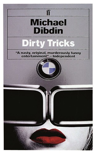
Thriller cover on foil board. ‘My response to the foil-blocked “airport novel”, ’ says McConnell.
John L. Walters, Eye editor, London
First published in Eye no. 81 vol. 20 2011
Eye is the world’s most beautiful and collectable graphic design journal, published quarterly for professional designers, students and anyone interested in critical, informed writing about graphic design and visual culture. It is available from all good design bookshops and online at the Eye shop, where you can buy subscriptions and single issues.