
Summer 2021
Reputations: Mario Eskenazi
Mario Eskenazi
various designers
Raul Goñi
Gemma Villegas
Dani Rubio
Marc Ferrer Vives
Diego Feijóo
‘Here in Europe everything was more formal, more rigid, and American design was freer, fresher. I tried to be a mix of the two.’
Interview by Sarah Snaith

Mario Eskenazi (b. 1945) was born in Buenos Aires, Argentina to an architect father who encouraged him to draw. He grew up in Río Cuarto, a small city in Córdoba, and studied architecture at the National University of Córdoba. After military service he returned to Córdoba and in 1968 worked as a graphic designer at the university’s radio and its TV station, Canal 10. He left for Europe in 1971 and from 1972-74 worked at an architectural practice on the Spanish island of Gran Canaria while freelancing as a graphic designer. He moved to Barcelona in 1974, where he worked in the studios of América Sánchez and Carlos Rolando, and the following year he became an art director at Lineas de Comunicación, where he designed the identity of Banca Catalana. He also began teaching graphic design at Eina, the art school in Barcelona, where he was a member of the faculty until 2000. He is now a trustee of the college.
Eskenazi established his own studio in 1976, working mainly for publishers such as Ediciones Paidós until in 1980 he started working with sanitary towel brand Evax (Procter & Gamble), a client relationship that has continued to this day. In 1988 Eskenazi collaborated with graphic designers Josep Maria Mir and Claret Serrahima to found Summa, a partnership that could work with more corporate clients such as Port Vell and Mossos d’Esquadra. While keeping his own studio running in parallel, he worked with Summa until 1996.
He designed the identity of Banc Sabadell (Banco Sabadell in Spanish) in 1995, the year before the bank began its expansion in Spain; Eskenazi has continued to work with its different brands, including Solbank, and his studio continues as Sabadell’s identity consultancy. Clients from this time include Barcelona City Council, for the design of the city’s cleaning services in 1997. Other civic projects include Eskenazi’s designs for TMB (Transports Metropolitans de Barcelona), from 2008-15; and Barcelona pel Medi Ambient (Barcelona for the Environment / Barcelona City Council), an identity that lasted twelve years; and the Santa Mònica art centre.
In 2015 he started working with Damm Brewery. In addition to his more corporate and civic clients, Eskenazi has worked with many local restaurants, including Mordisco, Cuines Santa Caterina and Roca Moo, an enthusiasm that led him to design an exhibition about renowned chef Ferran Adrià and his equally lauded restaurant el Bulli. He became a member of AGI in 1997, and was awarded Spain’s National Design Award in 2000.
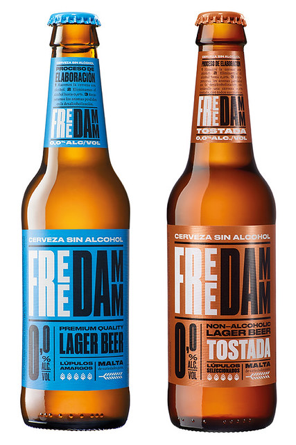
Identity design for Free Damm Tostada and Free Damm, an alcohol-free beer by Barcelona-based brewers Cervezas Damm, 2017-19. Designers: Eskenazi and Marc Ferrer Vives.
Top. Mario Eskenazi pictured in Santa Caterina Market in the old quarter of Barcelona. The public space was redeveloped in 2005 by architects Enric Miralles and Benedetta Tagliabue (EMBT). ‘This is one of my favourite places, I go there to buy food,’ says Eskenazi. And it’s very close to my studio.’ Portrait: Adriana Eskenazi / Elena Claverol.
Sarah Snaith People know your work in Barcelona, but can we start with the time before Spain, in Argentina?
Mario Eskenazi My time in Argentina was more educational than professional. I was lucky enough to study in a good political period (after Perón), with a state university recognised throughout Latin America (1970s), and then to work learning in a television channel. Let’s say it was a time of training and of receiving stimuli.
Identity design for Barcelona pel Medi Ambient (Barcelona for the Environment), 2008-15. Starting with two ideas – that a clean environment could be represented by a clean sky, and Barcelona by the letter ‘B’ – Eskenazi designed a logotype that can be applied to a variety of vehicles and containers. Designers: Eskenazi and Diego Feijóo.

You lived twenty or so years in Córdoba …
Until I was 23. The other day I read the obituary that Seymour Chwast wrote for Milton Glaser, and I was amused to discover I have something in common with both of them: I, too, am the son of immigrant Jews.
Where are your parents from?
My father was Turkish, he was born in Smyrna and my mother was born in Argentina, but her parents were from Russia and Romania. I am an immigrant, a wandering Jew (laughs).
Can you tell me about your path from architecture to graphic design?
My father had his studio at home, and I grew up drawing in his studio, looking at architecture magazines, looking at the advertisements. I remember the logos from the ads: Chevrolet, Westinghouse. In my teens I got into comics. When it was time to go to university, I told my father I wanted to draw comics. He said that comics are great, but that I had to do a university degree.
At that time there were no graphic design courses, right?
The word design wasn’t even known, so I said, ‘If I am going to study, I will study architecture, and at least I’ll be able to draw.’ In the faculty library I discovered Idea and Graphis magazines and said to myself, ‘This is what I want to do,’ but I didn’t know how. When I came back from military service, my best friend was going out with one of the only two graphic designers in Córdoba, who worked at a University television channel.
Channel 10?
Exactly. It was a university TV station, state-owned. These two men were gods to me. I worked there for no pay. I went there every morning to learn. Later, my friend married one of them and they went to live in Venezuela. I stayed on working there. That’s where I learned things. We’d come in at eight or nine in the morning, and they would show all the films that came from The National Film Board of Canada – films by Norman McLaren and other directors – to stimulate us in our work, and we watched the BBC. Córdoba was a small city. There were no materials, but we were nourished by magazines: McCall’s, Elle, Vogue. If we wanted typography, we cut it out of the magazines, pasted it up and a photographer from the channel would make proofs.
Did institutes such as the Di Tella Institute exist in the country?
Sure, but it was all in Buenos Aires. Our design reference points, apart from Milton Glaser, Push Pin Studios, etc. were González Ruiz, Ronald Shakespear, Juan Carlos Distéfano, Rómulo Macció. We watched everything that was being done in Buenos Aires. Then, as I was finishing college in 1971, there was a military coup. They privatised the channel and the design went to shit. That’s when I said, ‘I’ve had it here.’ My dream was Europe, culture, freedom. It was the era of Fellini, Antonioni, Free Cinema, uncensored films. I was dreaming of Europe, of making a new start.
Did you go to Spain because of the language or the culture?
No, I admired English design and my idols were Fletcher, Forbes and Gill. My dream was to go there and work with them, but I had no money, so I thought: ‘I’ll start in Spain, as they speak the same language, save some money and go to London.’
I arrived in Madrid, in Spain in 1971 and design here was really poor. I called the advertising agencies – they offered me freelance work, but I had nowhere to do it. Just as I was running out of money, I got a job in the Canary Islands with architects who were looking for a Latin-American architect. (We had a good reputation at the time.) So I went there to save money for London. It was a party. At the end of my second year I said to myself, ‘Mario, if you don’t leave this place, you’re going to spend your whole life on this island.’
Doing a career you liked … but not graphic design.
The funny thing is that in those two years, I built or designed more square metres than my father did in his entire life. But what I really wanted to do was graphic design, and my friends said: ‘Go to Barcelona.’
I still had London in my head, so I went there to visit the BBC and Pentagram, where Theo Crosby gave me a guided tour. I looked down and there were 30 guys my age pasting letters, and I thought, ‘If I ask for a job here, I’ll be pasting letters my whole life.’ So I decided to go back to Barcelona, sell the car and go to New York. I returned to Barcelona, fell in love and here I am still (laughs).
How did you start your own studio?
In 1974, a friend put me in touch with an agency [Lineas de Comunicación] that was looking for someone to do branding for a new bank, the Industrial Bank of Catalonia.
Great client.
Yes, I’m lucky! They hired me, then that bank merged with another bank, Banca Catalana, the bank belonging to Jordi Pujol, who was the leader of Catalonia for years. When I’d done that job, the agency hired me as an art director.
You are seriously lucky!
Six months later, the agency director [Norberto León] said to me ‘Flaco’ [‘mate’ in Argentinian slang], the agency isn’t going very well. I propose that you take over the studio; I will sell it to you and I guarantee you’ll get work. I started well, he gave me work, so I was doing well.
Another Argentinian designer I had worked with, Carlos Rolando, told me he had a large agency as a client, but that there was another agency that wanted to work with him and he couldn’t work with both. He said: ‘Why don’t we work with the other one, together in your studio?’ After six months, I told him I didn’t like running a studio like this, or doing advertising. He told me, ‘We’ll sell this studio and you come to mine as a designer,’ so I went to work with him.
That didn’t work out. One day I was designing some packaging for champagne, and he asked me how I was doing. I showed him and he said, ‘I would put this other typeface on it,’ and I said, ‘I don’t see it that way, Carlos.’ And he said, ‘Yes, but people who come here are looking for me.’
So I quit and there I was in my underpants, without a studio – with nothing. I began working from home, on a small table and little by little I climbed back up until I set up another studio, in 1976.
Back then, almost three-quarters of your work was books, editorial, signage and identity. You always had an interest in logos, but how did you get started with books?
My dream was to design books. It was the coolest thing, but making books in Spain doesn’t earn you a living. I liked identities, and I was good at them. After Banca Catalana, I had become known for doing identities, and people began to commission me. I started doing packaging with Evax, and people started commissioning me to do packaging work.
More money in packaging, right?
Absolutely. I had a designer friend who always used to say, ‘We are like Robin Hood: we take money from the rich to give to the poor!’ At that time I had two assistants and I used to spend the whole day making books and getting them to do Evax or whatever logo we were working on. I used to propose the idea to them and they would then develop it. And there I was with the books.
So by the early 1980s you had your studio with assistants, making books and packaging.
Exactly, and some identity work.
And then what happened?
I don’t want to blow my own trumpet, but I took a very rigorous approach to design – it was as if I was translating English design, but made in Spain. All the people who have worked in my studio had to be graduates of Eina, otherwise I would not take them on. I always considered the studio to be a kind of postgraduate degree. I wanted ‘little green heads’, virgins, so I could teach them myself (laughs). Not so they’d copy me, but so they’d learn, because what was always lacking here was thinking.
I understand that you have a lot of principios [design principles] in your work. Can you explain?
Yes, here in Spain design was art. And it used to drive me mad. I still have books from the 1970s. I didn’t study design, I learned it from books and magazines, and the guys I worked with at the TV station taught me well. Look at my bookshelves. I was such a fanatic that I travelled to London three times a year to buy books and magazines you couldn’t get here.
So you had your eyes on everyone’s design …
For me the world was England, Holland and the US. I continued with my studio, the publishing company, Ediciones Paidós – I was with them until the editor, Enric Folch, died. He was a charming man, we chatted and there began a relationship of more than twenty years. I am lucky in that I work with friends. I don’t always know them beforehand, but with work, a very warm and good relationship develops.
You work with people you really like, never with people you don’t like …
I can’t work with someone I can’t go to have a coffee with, and I have to believe in their products. With Paidós, I feel as if it is mine because, if I were an editor, I would edit these books. And I liked the attitude of the marketing people at Evax back then … there was a marketing director who told me: ‘Mario, don’t be shy. Suggest anything you like. We might rein you in but it’s up to you to suggest the craziest stuff that you want.’
How did Summa start?
At the end of the 1980s, my colleagues Josep Maria Mir and Claret Serrahima – the three of us were teachers at Eina and sometimes we’d eat together – said: ‘Mario, multinationals are coming to Spain. Interbrand, Wolff Olins have come and they’ve taken all the big jobs.’ We, as small studios, didn’t have access to them. They said: ‘Why don’t we get together and set up a big studio? We all have quite a lot of prestige.’ So we launched Summa. I didn’t want to close my studio, so I worked part-time with Summa, as we all did. However I never wanted to have a large studio. I like to be in control of everything.
And you also like to do the work.
I don’t like to delegate. So that’s why I’m not rich (laughs).
Maybe happier.
At least happy with what I do.
So what happened in the 1990s?
Everything is going along as normal, I’m continuing with Paidós, and packaging, the bank [Banc Sabadell] is getting big and I start designing signage for the bank …
Was signage a new direction?
Yes, I had never done any before. Later, an important event was held in Barcelona … the Business Forum. They created two really big buildings for this event. One was by Herzog & de Meuron and the other by Josep Lluís Mateo, the architect who designed the bank’s offices. They organised a contest for signage, and I submitted a piece of writing. I explained my plan in writing, briefly, in the same way that I speak – I am very specific. The president of the jury called me and said, ‘Can’t it be longer?’ I replied ‘No, this is what needs to be done,’ and I won it! It was my first big signage project.
Architecture again!
Yes, I had that in my favour. As I am an architect, and I know that architecture is space, what I aim to do with signage is not interfere with space. The signage should be seen, but the space should be as the architect envisaged.
In each type of work there is a language, you know how to speak with architects.
Yes. We are now in the 2000s.
We still have twenty years to go, Mario (laughs).
Yes, but you see I keep my clients for a long time.
That says something, the fact that you work with your clients for many years. You told me that you like to feel comfortable, to establish a friendship in some way …
And they trust me and I believe in them. We have to say very little to one another to work together. In 2005, a man I didn’t know called me. He was the deputy director of the TMB [Transports Metropolitans de Barcelona], which is the metropolitan transport company for Barcelona. He asked to meet, came here to the studio. We chatted and he told me that he had a problem with the TMB identity. It had become very big, with a logo, but so big that they could no longer use that logo. And summer was coming – it was the end of July, and I said to him, ‘In August I’ll think of something and we’ll see each other in September.’ We didn’t discuss budget or anything. And in the summer, in Cadaqués, I came up with the idea. It was very easy – it was also an alphabet – because I was thinking about what TMB had to do. TMB is Barcelona’s transport authority. How do you create the identity of a transport service, without it looking like Bilbao? Here there are a lot of ‘B’s.
If you look at it on the map, Barcelona is a grid with a diagonal in the streets. So based on the grid and the diagonal, I invented an alphabet. It was stencil but with a diagonal cut. When they put the signs on the streets or they put in the paths for pedestrians or disabled people, everything is in stencil, everything is cut.
When the gentleman came back, I told him about the idea. He loved it and that’s when I started working with TMB.
But it is a super-important client, because the identity of a transport system is, more or less, the identity of the entire city. All the streets.
I worked for TMB for ten years, from 2005 to 2015, and we even did the buses. Thanks to the Barcelona buses, they invited me to submit to the Seoul buses contest. However five years ago the government changed, they chucked it away, put in a new one and took everything out, there is nothing left.
And do you like what’s there now?
It is a horror – they have returned to the old. In the 2000s things were cool. In 1999, the city council invited me to a contest to make the identity for Barcelona’s cleaning department, to go on the trucks. I took part in the contest and I won. They are ten-year contracts. They hire trucks, containers – all the cleaning paraphernalia lasts ten years. And when ten years are up, as all technology changes, you have to redo everything. After ten years, there was a new contest and I won it again. The 2000s for me were cleaning, TMB and the bank.
At what point did your design principles develop and are they still evolving? Also, since you have taught for more than twenty years, I would like to understand your approach to education, and to hear a little more about your assistants.
With all the work that I have done, I consider my assistants to be as involved as I am in the work. Over the years there’s been Diego Feijóo, Guillem Cardona, Dani Rubio, Gemma Villegas, Ricardo Alavedra, Marc Ferrer Vives and Dani Guix. My first assistant was Pablo Martín (see Eye 95). And at the beginning of Summa, Fernando Gutiérrez (see Eye 36) worked with us in running the studio. With Fernando and Jose Ma. Mir (around 1990), we designed the identity of the Mossos d’Equadra, the local police. [The identity was in use until 2021.]
On your website credits there is always someone else’s name next to yours …
Alan Fletcher always said how important the work of each one of the team was, and that stuck with me. The guys in the studio are making their future, which is why their names should appear. I cannot sign work with just my name. Ever since I studied architecture at university, what has interested me is the why – the thing in depth, not what was fashionable. What I studied in architecture is useful for design. Just as I have long-term clients, I like my work to be long-lasting.
Timeless and in some way timely.
Exactly. It should be current, but it shouldn’t lose value. When I do the identity of a company, I can’t do a thing that’s going to die after three years. I feel proud of what I did for Evax.
The sanitary towel packaging …
Evax branding goes right through the packaging. That was very clear to the marketing director who was there at the time. He knew that his brand was transmitted through packaging. I’ve been doing it for 40 years and it’s still the same. We adapt things, but the essence is the same.
I’ve been with Banc Sabadell for 25 years. With the bank, every five, six years, we do a mini-identity retouch, something small. Today, it looks as current as it did 25 years ago. The unity in my work can be seen in the concept that lies behind each piece – not in the form, not in the tricks. I feel free to use any form.
This connects to my ideological changes over time. At one point I was from the ‘idea’ school – you had to have an idea. Then in the 1980s, I realised that that wasn’t valid. It can be a thousand things at once. What I need is the concept, not the idea.
The concept has more volume.
Exactly. There are people who ask me what it is like to be a designer. I tell them, it is very superficial, but you have to understand the essence. I am a cross between a psychoanalyst and a plastic surgeon. I find the essence of things and show it in the best possible way.
I like to really understand who the client is, what they do and then show it. I don’t avoid the beautiful, of course, but I try to make it logical.
How do you do this? Lots of client meetings?
The fewer meetings the better. I told you about the luck I’ve had getting my clients.
… (laughs) at dinners, in cars …
Eighty percent of my clients don’t even give me a brief.
Is that better, because with a briefing, they have an idea in their head?
It is very mechanical when there is a briefing. It is very one plus one equals two. And all the briefings were the same, whether they were for a sanitary towel or for a bank.
I know what I am talking about. It must be due to the fact I have had a lot of psychoanalysis in my life, like all good Argentinians. And I quickly grasp the essence, I understand what clients are telling me. I study them too. I study their history a bit.
And with your clients of many years there is trust.
The president of Banc Sabadell used to come to the studio by himself, at six or seven in the evening, to see how things were going. He’d say: ‘Mario, if tomorrow we buy such and such a bank, what would the identity be like? Or what colour would we use?’ And when there was an important merger, he would come and hand me the briefs himself.
This way of working, this method, puts a lot of pressure on you yourself – there is no ‘design by committee’ (as we say in English). You don’t have to go through a meeting with ten people with different ideas, but if the client is in your studio at night, what do you do? It’s like, ‘I have to have ideas in the moment.’
Yes, ideas or paths. I know where to go. Alan Fletcher also said that the more experience you have, the more ideas you come up with. I have never stopped reading or learning. I’ve been like that since university. I tell students: ‘You are just starting, you’ll never finish learning.’
Another thing that was a shock for me, was social media. Everything is the same.
Yes, it is a bit flat.
Monotonous.
It is also very difficult to understand what things exist and what is only a mockup. Is it a real project? Or just a digital image?
And all of a sudden you see someone who is good.
But you have to use social networks, because now that’s what’s used the most, maybe more than a website … but you don’t want to spend all your time looking at things online.
Well, I’m not trying to be different – I’m trying to be myself. Trying to remove myself from influences.
Not long after I arrived in Barcelona, for a while I worked with Carlos Rolando, an Argentinian designer, and one of the few good designers here. He used to get Communication Arts in the 1970s. I’d say, ‘Oh, Carlos, look how great this is here – look at that.’ And he said to me, ‘Don’t believe what you see in the magazines. What you see in the magazines you find in specialised places, it is not what you see on the street.’ (Of course he was not referring to the work of Vignelli, or Rudolph de Harak, or Chermayeff & Geismar. He was referring to the exclusive works we saw, magazines such as Avant Garde or Eros …)
But that left an impression on me, and I became obsessed with doing good jobs that can be seen on the street. I fulfilled it with my cleaning trucks, with the buses, with the bank that you see everywhere. I like ‘elitist’ design, because I can experiment, but I also like my design to be on the street, for it to be seen. In my principles there were two pillars: the American and the European, and I was trying to mix the two: Josef Müller-Brockmann for the formal part, the pattern, and Paul Rand for ideas. Here in Europe everything was more formal, more rigid, and American design was freer, fresher. I tried to be a mix of the two. For me, English design had that, too. I was fanatical about it because I saw both things: ideas and forms.
And you’re doing this in Spain …
Yes, I used to feel like a freak here.
But your style changed things in Spain.
With my classes, yes. When I started teaching, it was very formal: shapes, structures. I taught in the final year, so I spent some time trying to make them forget some things they had learned and the rest of the year teaching them how to think graphically. I am proud of my students: Pablo Martín, Diego Feijóo, Dani Rubio. They are in the AGI now.
I’m going to tell you about another concern of mine: the obsession that it has to be perfect. I remember the words of a bullfighter from the 1940s or 50s called Manolete, who used to say: ‘Only I know when I fight well.’
That goes hand in hand with a motto of mine – that when I work, I give it my all.
But also the idea is not to be at the mercy of anyone or anything, of not being at the mercy of trendiness.
For me it is fundamental.
The bullfighter analogy is interesting, because it relates to the body. In my previous career I was a dancer and when you dance well, you understand in your body that you did well. It’s okay, applause and all that, but they don’t know what you were doing last month. You have this memory in your body. It’s interesting that you have that same idea in design.
Ivan Chermayeff once said: ‘Design is not important. Architecture is important, art is important, poetry is important. Design is a very well paid hobby.’ That helped to make me modest. Designers can be really conceited. He meant that art (music, cinema, literature, etc.) can change someone’s life, make them see or feel things, while design is functional. He was demystifying design, not detracting from it.
Maybe design is more subtle, something that exists in people’s lives, but not in your face?
One day in the 1990s I was in Cadaqués, a town in the north of Catalonia, a beautiful little town by the sea, near the border with France, and an American friend asked me, ‘Are you going to Barcelona? Can you take a friend?’ I said ‘Yes of course, why not?’
And I travel with her to Barcelona, we chat, very nice, cool. I get along with everyone. I didn’t see her again until one day she calls me and tells me that she has a friend, a lady with a lot of money, who had two restaurants that she wanted to turn into a group, and make a newspaper, and she was looking for a designer. ‘I recommended you,’ she told me. From then until 2010, I must have done fifteen restaurants, some of the most famous ones in Barcelona [for the Tragaluz group owned by Rosa Esteva and her son Tomás Tarruella].
Just from giving someone a lift to Barcelona …
I have a lot of luck.
Things come to you through generosity …
I don’t do a hard sell to get work.
Colour-coded monthly bus guides for the TMB, 2013, based on four modules used to create a pattern that, like the broader TMB identity, depicts the map of central Barcelona. Designers: Eskenazi and Dani Rubio.

Sarah Snaith (1934-2020) design writer, editor, Buenos Aires
Read the full version in Eye no. 101 vol. 26, 2021
Eye is the world’s most beautiful and collectable graphic design journal, published for professional designers, students and anyone interested in critical, informed writing about graphic design and visual culture. It is available from all good design bookshops and online at the Eye shop, where you can buy subscriptions and single issues.