Autumn 2008
Reputations: Phil Baines
‘I could never subscribe to a particular way of doing things – I was always more pick ’n’ mix. I’d want to take what was good and alter it a little, or, if I thought the ideology was stupid, drop the ideology.’
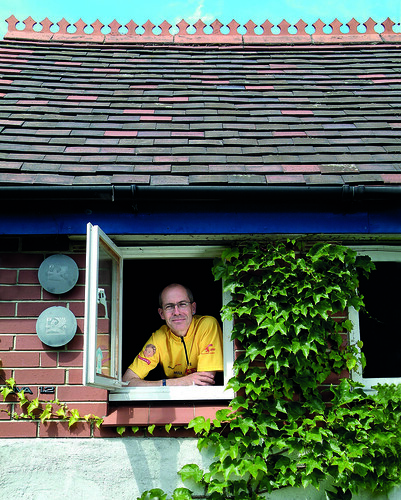
Phil Baines was born in 1958 in Kendal, Cumbria, and studied for the Roman Catholic priesthood at Ushaw College, Durham. He abandoned his studies at the start of his fourth year, and in 1981 enrolled on a foundation course at Cumbria College of Art & Design. The following year he moved to London, to study graphic design at St Martin’s School of Art (1982-85), where he met contemporaries such as Andrew Altmann and David Ellis (later to form Why Not Associates) and his future wife, Jackie Warner.
Baines’s work of this period was heavily biased toward experimental typography that took inspiration from medieval manuscripts and the writings of Marshall McLuhan and George Steiner – he has often noted that his influences came from written rather than visual sources. Letterpress exerted a particular attraction due to its do-it-yourself aspect: the entire process could be handled from concept to production without outside involvement. After two further years of study at the Royal College of Art, Baines graduated during a pre-recession boom period for graphic design. His work was featured heavily in Typography Now: The Next Wave (edited by Rick Poynor and Edward Booth-Clibborn), and he contributed two typefaces to Fuse, and guest-edited its fourth issue.
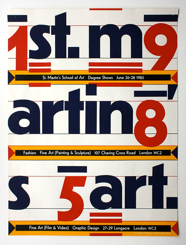
Degree show poster, St Martin’s School of Art, 1985. The four numerals are positioned according to a one-to-nine, left-to-right grid, the remaining letters being placed in the gaps between the numbers. The bars above the numbers refer to Roman inscriptional practice; the triple underline at the start of each word to type mark-up. The poster communicates irrespective of whether the viewer notices the underlying patterns. Printed silkscreen and using only Jakob Erbar’s eponymous 1922 face. The smaller copy was proofed from metal type and the larger characters were traced by hand.
Top: Portrait by Anthony Oliver.
In 1991 he returned to St Martin’s (by then merged with the nearby Central School), as part-time senior lecturer in typography, and has remained there since, becoming a professor in 2006. Central Saint Martins has been a recurring client of his design work, many of his ideas-in-progress being tested on the college’s promotional material and, in the case of the still-incomplete Toulon typeface, its signage. The bulk of Baines’s work, however, has been for arts organisations and galleries, an oeuvre best exemplified by his books for Matt’s Gallery in London, which show his continuing obsession with experimentation that is grown from structures or patterns within the content rather than artificially grafted on to it. The DIY ethic extends to his chapel-like studio, which he built to his own design in his back garden and reproduces on his stationery.
From 1995 he began taking on ex-students as assistant designers. One of these was Catherine Dixon, whose PhD studies on type classification he was then supervising, and the two colleagues now steer Central Saint Martins’ approach to typography teaching at degree level, and curate the college’s Central Lettering Record, a ‘photographic teaching archive’ inherited from Nicolas Biddulph and Nicolete Gray (see Eye no. 54 vol. 14). Though Baines’s name may be more widely known than hers, research undertaken with Dixon often underpins his designs.
Baines is a long-time contributor to this magazine (see ‘A design to sign roads by’, Eye no. 34 vol. 9), and he has written three books: Type & Typography (with Andrew Haslam, 2002); Signs: Lettering in the Environment (with Dixon, 2003); and Penguin by Design: A Cover Story 1935-2005 (2005).
A certain ‘take it or leave it’ aspect underlines both Baines’s character and his work; a quiet glee can be detected in the quirks of his designs, which provoke discomfort in those who would prefer things kept more doggedly tidy. Pedantry is forced to give way or change tack in response to the given material, with the result that his work can appear eccentric until engaged with or read.
Christopher Wilson: You’ve written that you ‘take an intellectual pleasure in the numbers game, whether grids, columns, folds, letters or pages’. [1] Do you find design more difficult when there’s no structure to get to grips with?
Phil Baines: Yes – I can’t just put things on a page. I find it very difficult to do that. Within the context of a book there are the other pages and elements that need to interrelate, so structure becomes important in unifying the thing. When I do posters there’s less reliance on it, and it’s more an organic arrangement of the words. I find those easier now than I used to.
Poster for ‘Yak’ 2, 1994. From a set of five posters published, for fun and self-promotion, by Why Not Associates. The posters were designed by Baines, Jonathan Barnbrook and Why Not on the theme of their own influences.
CW: Does this need for structure stem from a lack of confidence in the given material?
PB: It did in the beginning. As a student I found space difficult to use – I’d instinctively want to fill it up. I started working in letterpress, and my main interest was in text as texture; that dense look of old manuscripts. I learned about space by filling it up, then removing elements. This is perhaps a different way to other people, who might start with the space and add elements to it. When you look at my letterpress work over a long period, you can sense in the sparser pieces that something has been removed.
CW: There’s the question of what your ‘intellectual pleasure’ amounts to. Are you concerned whether the recipient can see …
PB: No!
CW: It’s purely you amusing yourself?
PB: Generally.
CW: And you think that’s graphic design?
PB: In terms of working on the job, it’s me enjoying myself. But that’s a process to achieve a given end. It doesn’t matter whether the viewer understands the process that I’ve been through, as long as the design works at the end of the day. The process might just be a way of attracting their attention, the reading being secondary. Or vice versa. But for me the ‘intellectual pleasure’ is part of the way in.
CW: As a student you produced letterpress postcards that show a particularly distinctive typographic method. Type attributes in different areas of the sheet are predetermined, and whichever characters happen to flow through those areas take on the predetermined attributes of the area. I’ve never seen this anywhere else, so it seems disappointing that you’ve never applied it in commissioned work.
PB: It seemed almost too subjective to use there. The postcards were written and designed concurrently – I spent a lot of time on getting the words exactly taut. There was a model, which came partly from manuscripts and partly from Marshall McLuhan’s descriptions of how manuscripts worked. But sometimes I’d just have a visual idea of what I wanted to try out in letterpress this month, and the words would be written to throw up the arrangement. Sometimes the words came first, and drove the layout. But there didn’t seem to be graphic design projects where this was necessary.
CW: Do you think that’s a pity?
PB: Because the postcards were so personal, it didn’t bother me. It was a body of work that responded to a particular situation; then there was a graphic design body of work that responded in a different way to a different situation. There was a run of austere posters for the Goethe-Institut, which were important because they try to tease out in typography some of the essence of the artworks. But commissioned work always either had fewer words to deal with, or the words needed to flow in a more linear fashion.
CW: In lectures you talk a lot about your three years at St Martin’s, but very little about the following two at the Royal College of Art. I get the impression that you walked in, asked where the letterpress room was, then ignored everyone and carried on.
PB: It was kind of like that [laughs]. A letterpress technician at St Martin’s predicted to me that ‘RCA won’t change you anything like St Martin’s has changed you. You’ll just develop what you’ve already started’. Which in many ways was true. But we had Gert Dumbar there, so it was an exciting and happy time. When he started he thought we’d be a factory of little Gerts, but we all had our own agendas, and by the second year he realised that. When he was in the building you felt everything was all right, and there was a good atmosphere. I worked on the 1986 degree show catalogue [2], and did freelance work – much of it of a fairly straight nature – right through the course. At the end of my time there, Richard Hollis and I designed The new spirit for the Crafts Council. These were key things in how to take things forward: how to do ‘graphic design’.
Paschal candle, self-published, 200, showing Vere Dignum typeface, Linotype, 2003. Baines’s series of designs for Paschal candles began in 1986 and continues to the present.

CW: Many people first encountered your work when it was featured in Typography Now, which lumps you together with David Carson, Barry Deck, Jeff Keedy and Michigan’s Cranbrook School. [3] Did you see these people as your peers?
PB: The book was almost accidental. Edward Booth-Clibborn was asked to present some new graphic design at Type ’90 in Oxford. He didn’t want to talk, so he invited me, Why Not Associates and the Thunderjockeys to talk instead. On the previous evening we had a meal, and the book came out of that. We just named designers we liked and who were up-and-coming but hadn’t had much exposure. That was the only link between them. But it was odd, because you had people from Cranbrook who’d all read Saussure, and all that Deconstructivist stuff. We’d get asked about Deconstructivism, and we hadn’t a clue what the hell it was [laughs]. It meant absolutely nothing to us. Still doesn’t, to me.
CW: Deconstructivism aside, was there an affinity between the European and American work?
PB: I think there’s a big difference: on this side of the Atlantic we were more interested in doing odd things with existing typefaces, whereas they had relatively straight layouts with odd typefaces. Perhaps the Americans were able to get themselves on tools to alter fonts more quickly than we were in Europe. But yes, it was odd being lumped with all of that. Rick Poynor’s introduction flagged it up as some great movement, when really it was just a load of new work from all over the place.
CW: And did you empathise with the American designers’ interest in ‘vernacular’?
PB: To a degree, but I was always quite happy with drawing on graphic design history. When I looked outside of that, Deconstructivism and ‘vernacular’ weren’t what I was looking at. I was looking further back, to things like manuscripts.
CW: Their interpretation of vernacular seemed to mean whatever naïve or ‘undesigned’ lettering you happen to encounter in your immediate environment.
PB: Yes. Whereas I knew about vernacular through an interest in architecture and building, where it means a very specific thing: a non-taught tradition, which, once you have building regulations, ceases to exist, because you lose handmade exploration and local variations. I didn’t necessarily see everything they were calling ‘vernacular’ as vernacular because of that.
Englishness and pragmatism
CW: Your 1994 ‘Yak’ 2 poster cites your influences as ‘Boys’ Own and a sense of England’. I’ve assumed this to refer to England as a place, rather than its graphic heritage. Is that accurate?
PB: It’s both. At that time I hadn’t travelled much, and had never had much inclination to. Some people I was at college with had to go to far-flung places every year to gain inspiration for their work, and to me it seemed unnecessary. I was brought up with a love of this country, and of travelling around it and exploring things on a local level.
But it was also the graphic heritage. I was very frustrated with our cultural studies education at both St Martin’s and the RCA, which depended entirely on Russian Constructivism and the Bauhaus. It ignored anything postwar and anything that happened in Britain between the wars, and it didn’t even really talk about the Arts and Crafts movement, which had helped influence the Deutsche Werkbund and eventually the Bauhaus. There seemed to be a lot of interesting things that we were not told about. This became part of the ‘sense of England’, along with people whose work I got to like around the time I left St Martin’s: Richard Hollis, David King and that generation of freelancers who were working for arts organisations. While they did have influences from outside, they seemed to be tempered …
CW: Tempered by what you perceived as an ‘Englishness’?
PB: Or a pragmatism.
CW: So how did that translate itself into your work?
PB: On foundation I’d been really taken with the Bauhaus, and by Neville Brody, Malcolm Garrett and Peter Saville doing work which drew on that period. But I’d also begun to see it as a straitjacket. I couldn’t see why there needed to be so many rules surrounding it. I could never subscribe to a particular way of doing things – I was always more pick’n’mix. I’d want to take what was good and alter it a little, or, if I thought the ideology was stupid, drop the ideology.
CW: Kurt Schwitters spent his final years (1945-48) in the area where you grew up, and his Tate retrospective took place while you were at the RCA. What effect did his work have on you?
PB: I already knew Schwitters’ work a bit – there’d been an exhibition at Abbot Hall in Kendal, because of his time in the Lake District. I was familiar with the late work, wherein he was still doing little collages, but using Ribble bus tickets and receipts from Ambleside butchers, and it was lovely to see that link.
CW: Is it true that some of your relatives knew him?
PB: My grandfather was a doctor in Ambleside – not Schwitters’ doctor, but I believe he treated him once. My mother can vaguely remember him being around, and certainly being talked about. She would have been ten or eleven by the time he died. Ambleside was an odd place in the war. You had the RCA camped up at Charlotte Mason College – my grandparents put various students up in the attic; Schwitters was there; there was a prisoner of war camp over in Coniston, and well behaved PoWs used to help the milkman on his round!
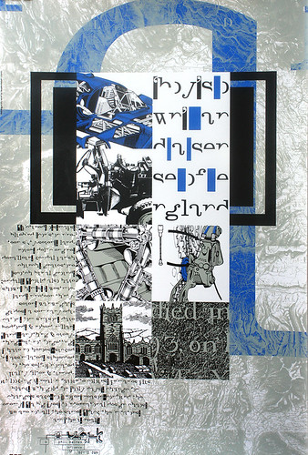
CW: You place much importance on ‘pedantry’. But the ‘Can You … ?’ poster includes a quote on nature, from an old Schwitters catalogue: ‘all that through its own force develops, forms and moves’. [4] Do you try to reconcile these two opposed ideas when working?
PB: There’s a lot of ‘make it up as you go along’ in the work, even though I am pedantic. The ‘Can You … ?’ poster itself is only pink because Andy Altmann had just had a dig at me for only being able to use black and red, and gold on holidays. Or holy days. There are quite a few daft little things. It just enlivens the day as you’re working. I’m pedantic about definitions: this is lettering; that is type. But that doesn’t mean excluding arbitrariness or doing things just because they look good.
Arbitrariness isn’t the same as nature, which grows along specific predetermined lines. Some of this arbitrariness is still organic. There’s a set of rules, and here is a new situation for which a new rule is needed. Then you carry on. There is a certain organic-ness to that.
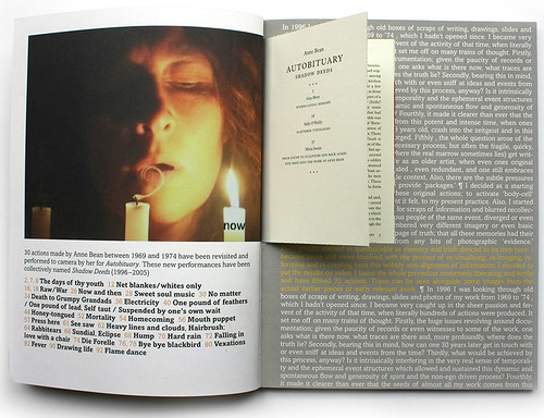
Spread from Anne Bean’s Autobituary, Matt’s Gallery, 2006.
CW: In a lecture in 1995, you said it would be worthwhile to restrict oneself to using typefaces from only the preceding 25 years. Is the idea that by doing this, some kind of new typographic spirit is proliferated?
PB: Having worked on Rookledge’s International Handbook of Type Designers I was aware of what had been designed since the appearance of PostScript and the Mac. I became conscious that I’d used only a narrow range of faces I’d grown up with via letterpress. This was a way of forcing myself to look at some new things – the rule was that they should be designed in my lifetime.
CW: That explains why this approach was right for you. Why should anyone else take it up?
PB: Well, it was also a period when some of the older designers were going on about how good the old typefaces were, and bemoaning what was happening now. I was trying to say: actually, there’s an awful lot of good stuff happening at the minute, and if you’d just try to stand back from and look at it, you might be able to appreciate it, instead of looking backwards all the time.
CW: I’m pushing you into a trap here …
PB: Thanks!
CW: But shortly before the lecture I just mentioned, you said at ‘Fuse94’: ‘I do not believe, like Jeff Keedy does, that “You cannot do new typography with old”.’ There seems to be a contradiction between this argument and the one you’ve just proposed.
PB: The Keedy quote is nonsense – of course you can create new designs with old types.
CW: It doesn’t square, though, with what you just said.
PB: No, it doesn’t, but there we are [laughs]. It goes back to that earlier thing about the difference between American and European work, where a lot of ours was new design but using old faces, and was exploring things through layout, whereas the Americans tended to explore things in typeface.
Books within books
CW: You’ve been lucky in finding a client – Robin Klassnik, the director of Matt’s Gallery – who works in the same one-man-band way as yourself. How does the collaboration work?
PB: The briefing on any publication is a three-way thing between Robin, myself and the artist. Sometimes they already have a sense of the shape and size of the book. At the first meeting we go over those ideas, and I say very little, which used to unnerve Robin. I don’t want to say what I’m thinking about until I’ve actually done something. I work everything up to a reasonable stage, then we’ll meet again and move everything around. So although many elements of the look will be my specific contribution, the sequencing is collaborative. Anne Bean’s Autobituary [5], with its book-within-a-book and all the perforations, was very involved, and went through three major sequence changes before Anne was happy. She spent a couple of days with me, just moving pages around. But she also responded to the way I’d handled her own quotes in the design. I’d made them very prominent because I liked the writing. That gave her the confidence to write more, which altered the book. A similar thing happened with Richard Layzell, who edited his Enhanced Performance text [6] to allow for greater use of the pictures in certain sections. He became part of the design process, which was quite satisfying.
CW: You’ve collaborated with Catherine Dixon on many projects: design, writing, lectures, teaching.
PB: I’d always done bits of writing, but without any academic training. I learned about formal methods through being a supervisor on Catherine’s PhD. Then we got to know each other more, and I’d give her bits of my writing to read, to get my own back. That’s how we discovered we could write together. There’s typographic history that Catherine knows far better, and production stuff that I know better. We leave each other to those areas, and in that sense have become complementary. With the Signs book, and later, we’d often sit down together and write: one would dictate and the other would type. Run out of words? Swap places. I can put things more pithily, but she can structure the argument better: it’s joint work.
CW: What do you teach?
PB: There are different things in the mix. We teach a lot of history, some of which is in reaction to what I wasn’t taught. We’re consciously trying to carry forward the work that Nick Biddulph and Nicolete Gray put into the Central course. Then there’s the other Central tradition, which is about lettering rather than typography, which has come in because of our work with the Central Lettering Record and is partly inspired by Alan Bartram’s books. We’re trying to draw on several aspects of the tradition, and things that we’re conscious of as not being covered elsewhere, which then become another selling point for the course. You do spread yourself a little thin in covering so many things.
CW: Most graphic designers want to be regarded by their contemporaries, but I often get the impression that you’re as concerned with becoming a future ‘ghost of Central past’ as you are with what your peers think of you.
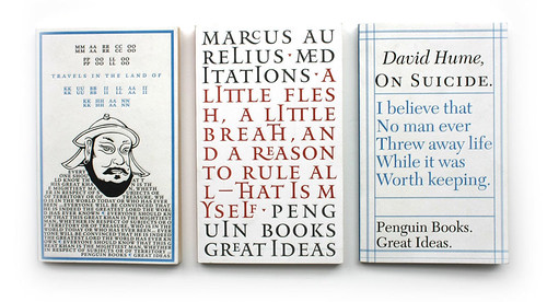
PB: That might be true. But I am conscious of what people think of me now. I lead a double life, and am conscious that people think that all I do is teach, whereas what’s important to me is balancing the teaching and designing. Working on things like Penguin’s Great Ideas helps, because it reminds people that I do design things [laughs]. Much of my work is for small arts organisations, so people will know me within a certain contemporary art orbit, but not beyond that. At the CSM launch for my Penguin by Design book I realised that if there was a time to [laughs embarrassedly] be nominated for a professorship, that was it, and I should push a few people to make the nomination.
CW: You have a great love of pomp and ceremony.
PB: Definitely. I used to love ceremonies in seminary – all that formality and display. I grew up with it from being an altar boy at a very early age, and it seemed entirely reasonable and good. I loved serving at funerals when the priest wore black. It was awesome – so final and correct. They don’t do it any more; it’s all liberal and caring now [laughs].
CW: Do you still believe letterpress is the best way to learn typography?
PB: I don’t know about ‘best’; I just take it for granted that it’s a very good way. There are a lot of good people who haven’t been brought up that way, but I’d be loath to lose it from our teaching situation.
CW: There’s an argument that it may soon become pointless to teach handwriting to children, as they may not ever write with pen and paper. Does a similar argument apply to letterpress, given that there are many exclusively digital kinds of manipulation?
PB: The restrictions of spacing, the body and how type goes together become so blatantly obvious with letterpress that it helps to explain structures and the way type is constructed. If you’re interested in type design it’s really good, whatever the elasticity of the invisible em square. We always get our first-year students to draw letters with two pencils taped together. It’s incredible nowadays how many kids have not been taught how to hold a pencil properly – to the extent that they can’t draw. Not just letters; they can’t draw, at all, because they can’t handle a pencil. Staggering.
CW: Does print-based typography have a future?
PB: I’m sure it has – people still love real things in their hands.
CW: Do they? Downloadable music is a case in which people have accepted the removal of the designed object and are happy to buy things which have no physical presence. And people are now more accustomed to reading from screens.
PB: I take it for granted that other people will still want physical objects because I do. I haven’t yet had great cause to be pessimistic; maybe I should. You’ve depressed me now.
CW: If it came to pass within your working lifetime that books weren’t around as they are now, would you be happy to continue as a screen-based, typographically biased designer?
PB: I think so. I’ve not had much direct experience of designing for the Web. I found it interesting working on publiclettering.org.uk because the content and writing were ours, but they changed in response to what our Web designers were doing. So I’d like to think I could adapt. But I may be kidding myself …
Notes
1. ‘Catholic’: Typography at ‘The Central’, St Martin’s & Central Saint Martins, 1983-92 (Central Saint Martins, 1992).
2. With Andrew Altmann, David Ellis, Simon Martin and Hannah Tofts.
3. Typography Now: The Next Wave, edited by Rick Poynor and Edward Booth-Clibborn and selected by Poynor and Why Not Associates (Booth-Clibborn Editions, 1991). See letter from Rick Poynor, below.
4. In Kurt Schwitters: Creator of Merz, by M. E. Burkett (Abbot Hall Art Gallery, 1979).
5. Anne Bean, Autobituary: Shadow Deeds (Matt’s Gallery, 2006).
6. Richard Layzell, Enhanced Performance (firstsite, 1998).
Great Ideas book covers, Penguin, 2004-2008. Penguin’s Great Ideas series was art-directed by Jim Stoddart and commissioned by David Pearson, a former Baines student. Each cover is printed in two colours, black plus a second colour, which varies with each series. The designs are deeply embossed into rough paper stock. The result has been one of Penguin’s most unexpected successes of recent years (see Eye no. 54 vol. 14).
Christopher Wilson, designer, writer, Oberphones, Sheffield
First published in Eye no. 69 vol. 18, 2008
Eye is the world’s most beautiful and collectable graphic design journal, published quarterly for professional designers, students and anyone interested in critical, informed writing about graphic design and visual culture. It is available from all good design bookshops and online at the Eye shop, where you can buy subscriptions and single issues.

