
Spring 2006
Reputations: Richard Hollis
‘The ideal situation is where you sit with the client and design with them. If anything is emphasised, it’s what they want to emphasise. I prefer collaborative effort to doing what I want. It’s diametrically opposite to being an artist.’
Designer, teacher and author Richard Hollis was born in London in 1934. His early design education was sporadic: he started an Examination in Arts and Crafts course at Chelsea School of Art in 1952, completing it at Wimbledon after two years of national service. He abandoned Wimbledon’s ‘very traditional’ commercial art course in 1957, and began silkscreening wallpapers and posters from a tiny Holborn flat, while working as a photo-engraver’s messenger and attending night classes at nearby Central School of Arts and Crafts.
Hollis became fascinated by Swiss Modernism while the movement was still fresh and largely unknown in Britain; many of his typographic habits defy the dogma of the style’s later period. Influenced by concrete poetry, Hollis tends to break lines ‘for sense’ rather than neurotic neatness, and he has often made dynamic juxtapositions of unjustified and centred texts on the same plane.
After teaching first lithography and then design at London College of Printing and Chelsea School of Art in the early 1960s, Hollis co-founded, with construction designer Norman Potter, a new School of Design at West of England College of Art. Among the students were i-D’s Terry Jones, who summarised Hollis’s influence in a Reputations interview (Eye no. 30, vol. 8): ‘I’d never heard of Gestalt until Richard arrived.’ Hollis taught for extended periods at the Central School until 1978, at times alongside one of his early typography heroes, Anthony Froshaug.
Though Hollis denies that there were particular commissions he hoped to get, his client list reflects his larger concerns, including CND, New Middle East and New Society magazines, and the left-wing Pluto Press. But the majority of his work has been arts-related. His catalogues and mailouts for the Whitechapel Art Gallery (1970-72 and 1978-85) draw on his hands-on knowledge of lithography, exploiting print processes and paste-up to the full. In 1972 he designed John Berger’s (in)famous Ways of Seeing, integrating text and images in a continuous narrative stream, a method Hollis has returned to several times since. In 1974 he married illustrator-author Posy Simmonds; suspiciously Hollisian bits of typesetting occasionally appear in her cartoon strips.
In many circles, Hollis is still better known as a writer. Graphic Design – a Concise History (1994) is typical of his writing in that historical overview is rooted in extensive design experience. The book also demonstrates Hollis’s skill in dismantling work element by element – see his analyses of posters by Kauffer and Tschichold. Swiss Graphic Design (2006) examines the movement in terms of its known and unknown protagonists, backed up by Hollis’s first-hand knowledge of the design and social context of the time.
I have worked with Hollis at various times since 1999, and it has become obvious why he has, to some extent, slipped unnoticed through the history he has played a large part in mapping: three-day arguments over line-endings might result in perfection but not publicity. While there are some recognisable traits in Hollis’s work, he has always responded to the needs of the project in hand, with the result that he is difficult to categorise. His writings may have rescued other noteworthy designers from obscurity but Hollis himself has been overlooked in this process. It is also very difficult to get him to talk about himself and his work in isolation – a fact that echoes his belief in what he terms the ‘social process’ between client, designer and recipient, with the designer cast as means, not end.
Christopher Wilson: You dkropped out of Wimbledon School of Art in 1957, feeling that you weren’t learning enough. What made you think that the Central School would be any better?
Richard Hollis: The Central was much more sophisticated, but I only went there two evenings a week: one to do painting with William Turnbull, and another to do typography with George Daulby, a very helpful teacher. They weren’t ‘courses’; you just went along. It was the only place in England where you could learn modern typography. Herbert Spencer and Edward Wright had taught there. But the library was what educated me, because it had books I’d never seen before, like the Bauhaus books and Paul Rand’s Thoughts on Design.
CW: Did your lack of qualifications give you problems later?
RH: Not at all. It’s what the person’s like – and what the work’s like – that determines whether they get work. And chance.
CW: How did you choose between art and design?
RH: By 1958 I was interested in mathematical painting, so I thought: ‘I’ll stop off in Zurich and see what’s going on.’ I’d got the address of Richard Paul Lohse, who was a mathematical painter and graphic designer. Everything clicked: you could do both. I went on making geometrical paintings and three-dimensional constructions for some time, but realised I wasn’t very inventive, and I became more interested in graphics.
CW: You frequently talk of design as a ‘social service’; when did you start thinking about it in this way?
RH: I remember copying a statement, which I’ve since been unable to find, that the aim of one of the Swiss designers was to ‘create a supranational anonymous form-language for the spirit of our time’. There was the idea of an international style which was going to be value-free: its form wouldn’t affect the content. Even when doing posters for CND, you wouldn’t use drawings, only photographs, and you’d probably only use Akzidenz Grotesk, which had just become available here.
CW: This was your interpretation of the quote?
RH: Yes, but it was also probably just a pretext for adopting the Swiss style for its aesthetic character.
CW: Many Swiss designers wouldn’t have admitted that they were attracted to the form.
RH: The less able ones were very formalist. Hans Neuburg used to imitate forms which Lohse was using in his paintings. Lohse took forms from his own paintings and just applied them – sometimes without any connection to the content.
CW: In the 1950s you made collaged postcards, which you sometimes show in design lectures. Did they influence your design work?
RH: You put what you want to say into the graphic, so it’s similar, but they didn’t really influence one’s ordinary design work. It was really a way of getting someone interested in you: they were equivalent to love letters, because they’d taken a long time and were very crafted. They were hermetic – other people wouldn’t understand the references.
Albion Broadsheet no. 3. I, Eye, self-published travel journal about visit to Cuba, 1962. Text, design and photographs by Richard Hollis.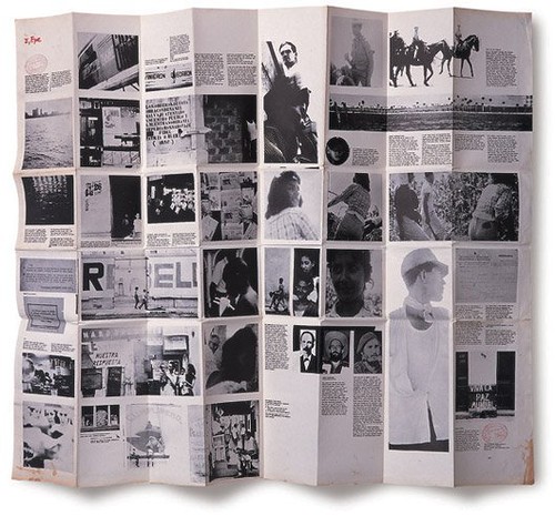
CW: Was I, Eye an extension of the postcard collages?
RH: That’s interesting. It had collage elements within it. I’d read that in Latin America people printed poems and sold them on the streets. That was the idea: write, produce and print it yourself. It was sold for a penny. Better Books on Charing Cross Road didn’t like the idea, because if you have something which is cluttering up your space but sells for a penny [laughs], how do you work out your profit?
It was before PMT cameras, and before you could do very much yourself. I printed the photographs, then gave them to a process house to produce screen negatives, which I then assembled, using a glass-topped table with an Anglepoise lamp underneath it. All quite crude. But you weren’t giving instructions any more. You were photographer, writer and all of the pre-print, taking words and images halfway to the state of their being printed. Nobody would have published it, so you were your own publisher.
CW: How did you feel about it appearing in Rick Poynor’s ‘Communicate’ exhibition?
RH: Fine, because Poynor was interested in people who made self-generated graphics, like Fuel and Tomato.
CW: Is there a historical line that continues through you to them?
RH: I don’t think so, really. The intention is similar, but theirs was more ‘graphic’, more related to work they did to earn a living. And there’s a certain preciousness about them.
CW: When did you first become aware of Anthony Froshaug?
RH: Around 1954 – he did very good cards for St George’s Gallery, off Piccadilly. I must have been aware of what was good typography, because I was on the mailing list.
CW: You’d subscribed purely on the grounds of the design?
RH: Yes. In the winter of 1959-60 I visited Constructivist artists in Paris, such as Jean Gorin and Georges Vantongerloo, then went on to Ulm where I met Froshaug. He was legendary, partly because of his work in Herbert Spencer’s Design in Business Printing. I was keen to meet him, although I was more interested in other things going on at Ulm. His work had a poetic, improvised quality before he went there, but as soon as Max Bill criticised him he just ranged everything left and that was that.
CW: You later taught with him at the Central, and you have mentioned before that you had to act as interpreter for him in front of the students.
RH: He’d drop a phrase like ‘Cartesian coordinates’ into a sentence, and I’d have to stand by, saying ‘What he means is …’
CW: It sounds like a double act.
RH: It was! I was still in awe of him. Ultimately I found him repellent, but initially he was very attractive in his passionate concern for every tiny piece of spacing.
A new Bauhaus in Bristol
CW: You taught alongside Froshaug’s friend Norman Potter from 1964.
RH: I’d been working at Galeries Lafayette in Paris, and Potter wrote to me: ‘I think we could start a new Bauhaus in Bristol. You could apply to be head of graphic design and I’ll be head of interior design.’
CW: He was aware that you knew about Modernist design on the continent, and presumably not many others here did at that point?
RH: That’s right. We started these rather radical courses. Potter invented a new category, ‘Construction’. I said, ‘You can’t give a degree in “Construction” – it doesn’t exist.’ He said, ‘Well, I can’t give one in “Interior Design” – that doesn’t exist.’ We did everything our way. We initially used traditional paper sizes instead of A sizes, because they were much more practical and fitted with Le Corbusier’s Modulor system, which then related to seat heights – we’d got it all worked out. We had rather distinguished visitors – Potter had architects like Conran and James Stirling; I brought Froshaug, Wright, Germano Facetti and Paul Schuitema. Potter was a nightmare to work with, but he had very highly developed programmes for teaching. We both used to prepare client questionnaires for each job.
CW: In what way was Potter a nightmare?
RH: He wasn’t practical at all. The way he and his acolytes lived was intellectually austere, but manic. He had a boat on the south coast, and used to take students into the Channel when it was very rough, to test their mettle!
CW: Would a person’s ‘mettle’ in such a situation have any bearing on their graphic ability?
RH: No. I once visited another acolyte, who’d moved into a new flat. One end of his desk was attached to the wall. There was a single leg, fixed to the desk surface with a cross-shaped joint. He said: ‘You see, this part of the cross points out of the window, toward nature. And this points to the fireplace – the other element. This points to the bookshelves, the intellectual life.’ I’ve forgotten where the other one pointed.
CW: I’m sure I could hazard a guess.
RH: This was deadly serious. Potter once directed the installation of an exhibition at the college from the top of a ladder. One tutor, Ken Campbell, shouted: ‘Nobody’s going to see this exhibition from up there.’ Norman looked down: ‘God will.’ He had this idea about the essence of something being more important than how it was actually seen. And if you didn’t hold with what were really just beliefs you were regarded as a trimmer. I’m sure he regarded me that way.
CW: Having set up your new Bauhaus, why did you leave after only two years?
RH: Most art schools then were run by people who came out of the war and got grants for art school, which was an ‘easy’ option. There was always this dead weight of people with whom one had the most astonishing arguments. If they designed a book jacket, they’d then make a mount for it with a bevelled edge, like a watercolour painting. I tried to explain that you didn’t look through a window at it. But this was attacking their values.
A substitute for description
CW: Was Ways of Seeing the first time you integrated images into the text column?
RH: Yes. The influence was Chris Marker’s book Commentaires, which has stills set within the text. I was a fan of Marker’s films, independently of Germano [Facetti stars in Marker’s La Jetée]. As you read you knew exactly what was being talked about. It was a substitute for description: instead of talking about something, you show the objective visual evidence. That’s how I wanted to do Ways of Seeing, rather than have images by the side or text followed by a page of images. Only recently I noticed that this is exactly what John Heartfield did in Deutschland, Deutschland uber Alles in 1929, although Ways of Seeing looks more like Marker.
CW: And this relates to the ‘supranational form-language’?
RH: Indirectly. It’s anti-authoritarian: ‘These are the facts; we’re not interpreting them.’ Obviously you can use facts in different ways, so it’s rather naive.
CW: Images are placed next to where they’re discussed – there’s no searching around. Is there never a value in forcing the reader to work a little?
RH: That’s like saying that you should get out and push your car, because then you’d realise the amount of energy expended on making it move.
CW: No, it’s more like getting out and walking for the sake of exercise.
RH: It is an argument. In working to find the answers, the reader might learn something else along the way.
CW: In your integrated approach, only function and syntax take part: things fall where they fall and that’s that.
RH: And so much the better – the designer has plenty of other things to think about. The important thing is to make everything accessible. Unless there’s a serious reason for giving an emphasis to one thing rather than another, I don’t see any point. The trouble is [laughs] you’re making me think quite hard about whether this is true. Something like The Guardian, which is tremendously heavily designed and laid out, might be much better if it was arranged more objectively, with everything the same size.
CW: So you have never wanted to display an image huge because you felt like it, or because it worked but you couldn’t say why?
RH: It wouldn’t interest me – the ideal situation is where you sit with the client and design with them. If anything is emphasised, it’s what they want to emphasise. So often you’re left with no guidance as to what to give prominence to. I much prefer collaborative effort to doing what I want to do. It’s diametrically opposite to being an artist. Artists are free to put things into any form they like, which may or may not be comprehensible in the way they hope. For me, working with the person whose message it is is the most comfortable.
CW: Designers who prefer more space might argue: ‘I’m the expert; why should I let someone who is quite possibly visually illiterate tell me how to do my job?’
RH: It’s more like a consultation with a doctor, who has the knowledge and expertise, and the patient, who explains what the symptoms are, and later says whether the prescribed treatment is working. The client certainly shouldn’t express any expertise in design – they should only express an understanding of what they want to get across. In conversation the designer can sometimes help them understand what they’re saying. It’s a mutual engagement to effect a response from anyone who looks at the material being produced. The more distant from the client you are, the worse it is. This is why client questionnaires are so good: ‘what are you trying to say?’
CW: In some cases, marketing teams are now determining how things should look before the designer is involved. And when the layout is done, the results are taken away and discussed without the designer present. What do you feel about that?
RH: This is where it’s gradually changed. Marketing people have an idée fixe about what they think is marketable, and that’s so often proved to be completely wrong. They don’t understand that other people have expertise. One really needs a long-term relationship with a client before they trust the designer. Competitive tendering is one thing which has destroyed the notion of a long-term relationship: people switch advertising agencies all the time.
CW: I’ve seen cases in in-house departments where marketing staff pull up a chair behind the designer and say: ‘Move that type a little to the left … now let’s see it in green …’
RH: I’d tell them to fuck off.
CW: But where is the borderline here? You advocate design as a social process, but with the current technology the client-designer relationship can devolve into a situation where the designer is merely required to move elements around.
RH: This is true, but it’s partly because designers have taken over many tasks which used to be the printer’s.
Old-fashioned English publishing
CW: You became production director at Faber and Faber in 1976, and this was the only time you were head of a design department. How did you imagine it would work?
RH: It was old-fashioned English publishing design. Berthold Wolpe did a lot of the jackets, but they looked outdated compared with Penguin’s.
CW: So you walked in carrying the torch of Gestalt?
RH: [Mock-gravely] Indeed. The week before starting there, [architect] Jon Corpe designed me a prefabricated office, including wall panelling, and I paid for it. We installed it at the weekend, so when the staff came in on the Monday, they said, ‘The new guy’s arrived – but this wasn’t here …’ I was trying to make the point that ‘now it’s not going to be the same.’
Of course, it didn’t work. There were fourteen of what Faber called ‘book controllers’: would-be designers who went along copying what had been done twenty years earlier. Literally. They copied out old specifications. In Tschichold’s day, Penguin produced the same number of books per year, at much higher quality, with two designers. Something was plainly the matter, as I pointed out. Of course, this was dangerous.
CW: You were there for a matter of months?
RH: Yes, until the day that I was due to become a director. I was asked to talk to them all about offset. I got everyone together, and circulated books I’d designed, to show this new technology. What I didn’t realise was [laughs] the leftist material I was circulating – particularly a book denouncing Lord of the Flies, a Faber bestseller. ‘Christ, if we’ve got this fellow, who’s going to become a director, we’ll be unionised!’ Eventually I had to clear my desk.
CW: And remove it, too, presumably.
RH: No – everything had to be built-in. This was always Potter’s idea. He didn’t believe in furniture. The chairs were the only moveable thing!
Block
CW: The Whitechapel was one of your most significant clients. Why did you choose Block as its typeface?
RH: It came out around the same time as the Whitechapel was built, and somehow Block followed the forms of the building, such as its semi-circular arch. And Block has wobbly edges, and when everything was set photographically, it didn’t matter if it was absolutely sharp. You could blow it up without it looking out of focus. I drew non-lining figures for it. It was enlarged from a tiny reproduction in a book, and was all pasted up letter by letter from a single print.
CW: Block may date from the same period as the gallery, but it’s obviously not of the same culture.
RH: It is in a way. Charles Harrison Townsend, who designed the Whitechapel, was very much of the immediately pre-Art Nouveau school, and I think Block has that character.
I made it a rule that none of the printing ink colours would be pure black. The ‘black’ was often mainly blue or red, tinted warm or cold, not neutral. I got the idea of using red and green to make black from a Milton Glaser poster, Big Nudes. It dawned on me that one could exploit this for halftones as well. We also tried never to print on white paper.
CW: Having decided on such rules for one client, would you then have intentionally avoided them for others?
RH: No, although the printing for other clients was more commercialised. The Whitechapel stuff was printed in Clerkenwell, where I knew the people on the press. I could be there when it was printed and even when they mixed the colour, which made a lot of difference. I could make my duotones exactly as I wanted.
CW: Eventually you were superseded there by Peter Saville. What did you think of his studio’s solution?
RH: The logo, which was specially drawn, became very spidery, yet the gallery is the opposite of that. My idea was to make the name The Whitechapel, because people thought of it like that. Saville dropped the definite article, just as the Tate did later. The newsletter became an A5 stitched booklet, which must have cost infinitely more. Having said this, Mark Francis from the Whitechapel went up to the Fruitmarket Gallery, and Saville did brilliant work for them.
CW: Saville’s logo concept was that, because the outside of the building had been retained and the interior modernised, the same would apply to the letterforms. The external serifs remain and the internal ones were removed.
RH: Oh God, I can imagine them selling that! Unless you write that underneath the logo, it seems ridiculous. It didn’t relate to what Colquhoun and Miller did architecturally. They used a lot of elements of Viennese design from the 1900s with black and square glass, I suppose to be ‘period’.
CW: You carry a lot of idiosyncracies from one client to the next: big indents, multiple alignments on a single plane and the extracting of many colours out of few prints being just three examples. You can tell ‘It’s a Hollis’, can’t you?
RH: That’s bad. Hitchcock said ‘self-plagiarism is style’, but you can carry it a bit far. Because of typefaces you’re happy with, and certain ways of putting things together, it does become a sort of style. It’s not conscious. The atmosphere of the client influences the way you treat something. The Crafts Council work is crisp and open in a different way to the Whitechapel. The Crafts Council actually had a technical aspect. Slightly hi-tech and late Modernist. Spare and mechanical.
Naturally pedagogic
CW: Graphic Design – A Concise History wasn’t published until 1994, yet the acknowledgment says the book originated in the 1960s.
RH: I’d been commissioned to write a general graphic design book, part of which was historical. But my life was in such chaos back then that I abandoned it. Then in the late 1980s Philip Thompson [co-author of Art Without Boundaries] had been writing the concise history for Thames and Hudson, but he’d given up after a bad report. What they’d said was right: he was only interested in the visual side of artists’ design. So I said I’d write it. Thompson had collected some wonderful material, some of which I was able to use, but I started again, with a very different synopsis. But I’d otherwise never have written it.
I went through design annuals, listing common elements in old designs. You’d take every element – say, cloud shapes – and put a mark against every time it was repeated. You could build a very good idea of the visual language of any given time, and see what had been exactly the same 40 years earlier.
CW: Did you select work mainly on the basis of its later influence?
RH: It came down to whether something changed at the time a piece of work was produced, and whether the work was part of that change. It was instinctive – there was very little that was rational about it. But you could see that there were movements or tendencies, so you tried to find things that illustrated that tendency.
CW: How did you decide whom to leave out?
RH: I didn’t – as people say, they were ‘below my radar’. There are very good designers whom I left out. The worrying thing is that you only find out about designers whose work has already been promoted, so the canon is built in a rather depressing way.
CW: The book is divided into national tendencies. Is it healthy for countries to have their own graphic customs?
RH: I think they reflect how relationships really are. The Swiss style didn’t go to Germany – only to the smallest degree. It was more influential in America.
CW: How did you feel about writing the updated chapter on the 1990s for the 2001 edition?
RH: Very difficult, because you have no hindsight as to how these people have fitted into history. Their work – and often the content – was also very outside of my own aesthetic interests: Nike and so on. I could see what other people might find interesting about it, but it was difficult to write. I couldn’t ‘see’ it.
CW: Because it wasn’t history yet?
RH: That’s right. And design had become very self-regarding. Those who made a definite personal style, such as Keedy or Carson, started out with a little idea that was quite interesting but somehow led to a whole school of followers.
CW: Doesn’t that always happen?
RH: The Swiss style was applicable to a whole range of situations. You couldn’t apply the Keedy style to a brochure about nuts and bolts; it was very limited. It talked about itself, about graphics, not the content, and it was that that rather got up my nose. Carson was slightly different – he was more like Brody, in that his content was style culture anyway.
CW: Your latest book is Swiss Graphic Design. How does it compare with Concise History?
RH: It’s much more detailed, and has more statements by the designers. Most of the work shown in Concise History is well known, whereas a lot of this work has never been reproduced before. There are some outstanding designers who have been forgotten. Hermann Eidenbenz, for example, deserves a book of his own.
CW: Did you have an agenda to unearth forgotten designers?
RH: No, but I’m naturally pedagogic; I’d like people to understand that there are systems behind this work. Swiss design has been to some extent misunderstood as ‘just a style’, but it’s how it came from, where it came from that matters.
CW: The concept of Swiss design as dynamic asymmetry and Akzidenz Grotesk is a cliché; your book reveals just how little of it was like that.
RH: [Typographer] Paul Barnes, looking through the material, said: ‘What is amazing is that the stuff from before the First World War is more interesting, and what people imitate is not terribly interesting work.’ It was much more free before the war.
CW: When I read the rough draft, I was surprised by the way it began. You describe how it felt to arrive at Zurich’s main station in the midst of Müller-Brockmann’s panoramic advertising display for Turmac cigarettes. That seemed to make the book more subjective, but also more real in that it states that you were there.
RH: It’s also that I’ve known many of the people, which wasn’t true of Concise History. It’s partly a snobbery: I knew these people and their work, so I could pass on this information. In practice I couldn’t return to that first-person style later, which I’d have liked to.
The three graphic languages
CW: If you were starting out now, would you still choose to be a designer?
RH: I’d do something else. Not because of feelings about design, but because the world and technology have changed so completely. I started out with the idea of not doing anything in particular, or of ‘total’ design. With theatre design for Kidderminster Rep I could lay out the programme, design and paint the sets, and have a walk-on part – that integrated activity really interested me. There were so many funny little jobs around in [mockney accent] ‘the old days’. The BBC showed trailer cards, and anyone who was at the Central could make 9 x 12-inch cards with foil blocking or Letraset, and then see them on television that evening, which was wonderfully direct. My generation used many more different media. I wasn’t typecast when I was younger, but have been in the last few years.
Another problem is that what’s on the screen isn’t what’s on the paper. Backing-up pages, making sequences, or just folding things – the initial design process has suffered. Processes were so much slower.
CW: And you miss that?
RH: Very much. It’s the pleasure in slowly crafting together something which only you could do. A whole play would go by on the radio while you did one side of a news-sheet, because of all the pasting-up and nicking-over of line-endings. The speed of it on a computer is unappealing. You make much worse decisions because you can make them quickly.
CW: Finally, given that you’ve criticised Eye’s design in the past [see Dot Dot Dot no. 1, Spring 2000], how would you like them to lay out this article?
RH: [Laughs] Only so the captions are near the pictures. I can never find things when they group the captions as a long list. I’ve criticised Neue Grafik for the same reason. Max Bill deviated from it when he laid out his article there [no. 2, July 1959], because he could see it was unclear. And there it was complicated by having several languages. I suspect that that’s also how it started in Eye: they’ve never forgotten that it used to be trilingual. But it’s not any more, except for the three graphic languages: good, bad and frightful.
First published in Eye no. 59 vol. 15, Spring 2006.
Eye is the world’s most beautiful and collectable graphic design journal, published quarterly for professional designers, students and anyone interested in critical, informed writing about graphic design and visual culture. It is available from all good design bookshops and online at the Eye shop, where you can buy subscriptions, back issues and single copies of the latest issue.