Summer 2011
Reputations: Robin Kinross
‘It’s to do with meaning, which forces its way up like a root growing under a pavement – it breaks the paving stones. Many people would like these neat stones in a nice grid, but unfortunately there is this tree with all its pressures and necessities and you have to follow it.’
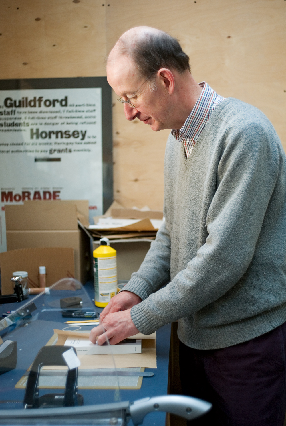
Robin Kinross occupies a unique place in design publishing. After a narrow escape from academia he became a writer and then, with no great plan in mind, a full-time publisher, an activity that gives complete expression to his practical, material and reflective concerns. There is no one in British design quite like him but, perhaps because of his restrained and self-questioning personality, he has never received the wider recognition his achievement deserves. He is not someone Design Week would be likely to phone for a quote, or that D&AD would buttonhole for a jury. Kinross would be the last person to press his case in these temples of professional design, though his body of work, for those who read him and follow the output of his Hyphen Press (hyphenpress.co.uk), exudes a quiet, corrective authority. Situated between design practice, non-academic critical writing and the university, this self-avowed ‘Froshaugian’ sets high standards of scholarly inquiry and presentation in design and typographic studies.
I first met Kinross in 1988 at Blueprint, where he was writing about MetaDesign, Richard Hollis, postwar British graphic design and other subjects in articles that stood out for their seriousness of purpose, assurance of tone and depth of historical knowledge. He also contributed to Information Design Journal, Designer (published by the Society of Industrial Artists and Designers) and the Journal of Design History. As he explains in our interview, this was the period when he was most committed to writing. He became a wary and sometimes critical contributor to Eye, publishing notable pieces about Edward Wright (‘Letters in the city’, Eye no. 10 vol. 3) and Karel Martens (‘Let the object speak’, Eye no. 11 vol. 3) – both key figures for him.
Born in 1949, he studied as an undergraduate at the University of Reading (1971-75) on what came to be known as the Typography & Graphic Communication course. He went on to complete an MPhil about Otto Neurath and Isotype (1979). At Reading, too, he met the late Paul Stiff, a figure who shared many of his historical interests and social and intellectual values. ‘No one else approximates his range or reach into the world in which designing happens, its history and politics,’ Stiff wrote last year. Kinross has remained close to Reading’s network of typographers, writers and researchers, supporting the department’s projects and publishing work by his colleagues. In 2005, Hyphen Press became the publisher of Typography Papers, founded and edited by Stiff.
Kinross started Hyphen in 1980 to put Norman Potter’s What Is a Designer back into print; it was not until 1992, with the publication of Modern Typography, that he joined Potter as the press’s second author. Today, Hyphen occupies an airy, double-height office packed with books and boxes in a building in Kentish Town, London, shared with artists, film-makers, designers, a landscape architect and a novelist. There is a workshop with metal and woodworking machinery, and a communal kitchen. Kinross owns the freehold and is a director of the company, Workplace Co-operative 115, that holds the lease. The venture embodies a practical, idealistic, almost utopian vision, and the occupants have full control over the running of the building.
Hyphen Press’s list has grown steadily at the rate of two to four publications a year. The books are distinguished by the immense care of their editing, design, picture-editing and production. Kinross favours readerly typefaces, painstaking Dutch or Belgian printing and durable Dutch binding. The Hyphen Press website, too, exhibits a quality that puts the online presence of many much larger publishing ventures to shame, and its journal has become the main platform for Kinross’s occasional writing. Following his instincts and interests, he has diversified, publishing a book about the composer Morton Feldman, a collection of Peter Campbell’s essays about art from the London Review of Books, and two novels written in the 1930s by the scientist E. C. Large. In 2008, he released the first in a series of Hyphen Press Music CDs, featuring The Bach Players, a group that shares his own ways of working. Hyphen remains a fully independent publisher entirely defined by the singular tastes and editorial enthusiasms of its founder.
Rick Poynor: In Unjustified Texts, you write that at school in the 1960s you were a jazz fan. What else inspired you in those early years?
Robin Kinross: In the beginnings you see the seeds of everything that follows, however naïve and rudimentary they are. My father had left school at sixteen unexpectedly because his father had gone bankrupt. It was a family disaster. So my father was a self-made man. I was sent to Rugby, the most bizarre and repressive and distorting kind of atmosphere you could possibly devise. That really formed me in some ways, because I became mentally disassociated from the school, and developed a life-long hatred of the English social class system.
I discovered politics. It was 1964, the first Labour government since 1951, and it was that moment in British culture of the Beatles and the opening up of many things. I think I was the only one in the whole school who liked jazz. I can remember playing Kind of Blue [Miles Davis]. I had the album and I liked the cover very much. I subscribed to Jazz Journal. The designer was Cal Swann, who much later on I met, and every month you could see advertisements for Blue Note Records. Jazz is the music of dissent and individuality. Even though it’s stupid to make simple correlations, there is some correlation between a certain kind of dissenting, anti-authoritarian politics and modern design. The two things go together.
The same with Penguin Books, with the Germano Facetti covers – all of that culture. I also read those Len Deighton novels, and the covers designed by Raymond Hawkey were an important part of them. I still have a copy of Len Deighton’s Action Cook Book, which came out around then. I also saw some of the Godard films – I remember seeing Breathless at school.
The school had a press in the art department and that’s where I discovered setting type.
RP: At university, though, you began by studying English rather than design.
RK: I have to go back a little bit. There was one rather crucial thing. When I was sixteen I was diagnosed as having a hole in the heart and I had a huge operation. I was out of school for a year. I always think that set me free mentally, because I became totally disenchanted with the school. I was lying in the Middlesex Hospital for quite a few months in a public ward. I met people I wouldn’t have met. That was a very liberating time. Probably I should have left Rugby then and I wanted to, but I was persuaded to go back and take A-levels. I did physics, chemistry and maths. I think it was pressure from my parents, probably.
I did finish these science A-levels, but by then I’d decided I wanted to read English. I left school and got a job in the London University Library, putting books back on the shelves, and during that year I also quickly got an English A-level. I then went to the North West London Polytechnic. I really resisted the idea of any kind of Oxbridge-like university. But I began to be unhappy with simply reading literature and I dropped out of that course. Eventually I got myself to the University of Reading to do typography, because I thought that would be more practical.
RP: What made you think that Reading was the place for you, given that its typography course wasn’t that well established in the early 1970s?
RK: I don’t know. I think I was pretty desperate. Now I would say it turned out to be a good instinct – this was a good place. I was somehow fascinated by typography and I sensed that this was the place where you could really immerse yourself in it. I had an interview with Michael Twyman, who was running the Typography Unit. It had only just started. Reading was quite peculiar, but it had these elements that you couldn’t find anywhere else: very strong in history but also there were printing presses. So it was down to earth. I did an awful lot of typesetting there. We had lessons on all the composition systems: Intertype, Linotype, Monotype. I was absolutely happy. I’d never had any such enjoyment, such complete immersion in a subject.
RP: Your work has a strong political point of view. What kinds of writing and thinking influenced the values you later brought to your own writing?
RK: I would never claim to be a coherent political thinker or actor. I’m not that. But I could identify certain themes or points of development. I’ve never joined any political party. For whatever reason, for better or worse, I’m interested in ideas. I had at least two great models who influenced me. One was the literary critic F. R. Leavis, when I was doing literature, and the other was the Marxist historian Perry Anderson at New Left Review – I have all the copies from 1971 on.
The ideas I found, which will always stay with me and which I will always hold to, are some kind of basic Marxist principles. Marxism is a scare word to a lot of people. All I mean with it is an interest and belief in historical explanation, maybe nothing more than that. If you look at something, you have to see it in its context, then suddenly you can understand it, because there’s a context, there are pressures, there are limits on something. It comes out of a certain place and a certain time.
I happened to get this from Marxism. I think you can also find it from really quite ordinary and very good British historians. They wouldn’t make any great claims about theory.
RP: You mentioned your need for practical activity. It sounds as though you found out who you were, or wanted to become, by going to Reading.
RK: That’s right. That’s what happened. I can relate it a little bit back to what I called Marxism. There was always this idea of theory and practice. Theory on its own is no good. You must have a practical embodiment. So I think I always wanted to stick with this idea. One element on its own wasn’t enough. You had to do the two in parallel.
I just want to mention, because he’s in my mind, someone I met at Reading, Paul Stiff. We were the same age. He came later on but he had a similarly confused, meandering path. He did sociology at Essex but only for one year. He did all kinds of things. There’s a whole lot of us who had quite peculiar, confused paths to typography, because it’s not there as a known subject or a known activity.
RP: Did you have any ambition to write at this stage or did that emerge later?
RK: It was never an ambition. Every week in English at Rugby we read The Listener, the BBC magazine which published radio talks – we had an enlightened teacher. In that class I discovered I could write. Who knows where it comes from? I’ve never wanted to be a writer as such. I enjoy it very much and I stick to the idea that it’s useful writing. It’s nothing more than that.
I still do a lot of writing, but it’s emails and blurbs and catalogues, all that stuff. I have some ambitions to write slightly longer things, but I never wanted to put writing as the main activity. I had the idea that it would be healthier if it were feeding into other things.
RP: Nevertheless, you did emerge as a committed and regular writer. You have said that by the end of the 1980s you thought of yourself as a journalist, such was the volume of writing you were doing.
RK: Everyone has these periods when they want to push one thing quite hard – I think it was that. I did the undergraduate degree and was persuaded to stay on and do research and did the MPhil and by mistake started teaching. I never really intended to. But because one of the teachers left in a hurry and I was hanging around – I hadn’t finished my MPhil – they said, “Can you start tomorrow?” Then, after I left Reading, I taught at Ravensbourne for a couple of years, one day a week. By then I realised I wanted not to teach.
There’s only one kind of teaching I enjoy, which is teaching postgraduates who are doing research. It’s like a kind of editing. Also, I’d been doing some book design in an unhappy way. It was usually passed on to me by somebody else who didn’t have enough time to do that job. I think all the time I was weaving my way into finding out what I could do. So for a period, writing became my main activity and I enjoyed it. But after a while I began to get slightly sick of it and sick of myself for repeating myself. I think that’s one of the troubles with journalism. You become a word machine, unless you are very, very blessed. You repeat yourself and you become sick of these repetitions.
RP: In your selection of subjects and the designers you have written about – Anthony Froshaug, Richard Hollis, Karel Martens – there is a strong feeling of a personal value system, of reasons why you have chosen to talk about this work.
RK: I think it is true to say that I have never worked anything out. So I can’t come up with any pat, simple answers. In the three people you’ve named, I can see threads there. They embody virtues of questioning themselves, modesty, doubt – that’s a favourite word of Karel’s. When I saw Karel’s work I thought it was like he is tapping into the deep thread Froshaug has.
It’s to do with meaning. That’s such a slogan, but it’s the best word I can find for it. The familiar opposition is meaning and style. Meaning forces its way up and it’s like a root growing under a pavement. When it’s coming up, it breaks the paving stones. Many people would like these neat paving stones in a nice grid, but unfortunately there is this tree with all its pressures and necessities, and this is the tree of meaning and you have to follow it. So it breaks the pattern.
Froshaug’s term was “isomorphism”, where the form corresponds to or enacts the meaning, or the two mirror each other, or become embedded in each other. I think I could argue that with all of these designers that’s the thread that unites them. They all have a reputation as being Modernists, but they’re meaning-driven Modernists.
The person who really articulated a lot of this was Norman Potter and I suppose that was what drew me to his book What Is a Designer. Potter and Froshaug were great friends and allies. That programme, if it is a programme, is enough for a whole working life.
If I have one design model, that’s Froshaug. I was in awe of him as a designer and a thinker and I imitated him when I saw his work. It was a revelation, but also I had that feeling of knowing it already. Now I’ve got quite a bit of distance from it, but I still think there are absolutely fundamental lessons there, which I still use every day, of how to place things, the importance of space, of marks, of meaning, all of those things. So I’m a Froshaugian, I’m happy to admit.
RP: To what extent do you see yourself now as a graphic designer and how has your approach to typographic design evolved over the years in response to the designers you admire?
RK: I sometimes say that I’m an editorial designer. I think that’s what I always have been, given the chance. I would never trust a designer who did not want to incorporate the editorial function into the process – and that usually means working closely with editors, sharing the credit equally with them, and forgetting your ego.
In recent years I’ve done a lot of designing for a music group, The Bach Players. The group is a collective, working without a conductor. It happens to be run by my wife, Nicolette Moonen, and she has a strong editorial role in what we do.
We set up the label Hyphen Press Music to publish the group’s CDs, and so opened up a pleasant new can of publishing worms. So I do all the design and typesetting for the CDs, and also the posters and concert programmes.
I could mention a few Dutch designers who have been important to me in showing how you can do centred typography in an unstuffy but very dignified way, for example, Harry Sierman or Alje Olthof. I think the slightly more classless Dutch society allows this, as the English class-ridden one doesn’t.
Another important presence for me was Alexander Verberne – I got to know him personally. He was like Froshaug in many respects. Like Karel Martens he wore T-shirts and Chinese jackets, and was always on a level with you. His work was meaning-driven, but usually classical in form.
I realised a centred, classical approach does work more easily for classical (actually baroque) music. With the posters and programmes I’m playing the role of the local printer, making things quickly in small runs, to be distributed locally. It feels like the thing Froshaug was doing when he worked as a printer in Cornwall.
RP: You have always seemed to make a distinction between typography and graphic design. But typography is an aspect of graphic design and there are few graphic design projects that don’t also involve some element of typography. So why do you make this distinction? And if the “graphic” is to be avoided now, then what is it, for you, that makes it suspect?
RK: I think it really is historical, in that what I believed in was the work of my teachers and that generation. It had its moment. At a wild guess it ended when Richard Hollis stopped doing the Whitechapel Gallery work [see Reputations interview with Hollis in Eye no. 59 vol. 15]. It was around then, because I can remember the shock.
I can explain it in various ways: in terms of taste, or even maybe in terms of the social place of what was being done, and in terms of my own history. The older generation were still going but they’d lost their impetus. Who do you look up to? Who do you look to for this activity? As a writer, writing about these things, your subject’s gone.
RP: What was the crucial thing, then, that Hollis’s work, for example, embodied for you and did right as communication?
RK: One thing is that Hollis’s work is proper graphic design. It’s not typography. Maybe in the end I wouldn’t really make a distinction, but I think that one of the things I could say is that the text in any piece is the most fragile and sensitive element. It’s not the only one.
Let’s say you have a photograph. How you treat that photograph is a sensitive matter. If you crop it in a certain place, that can cause hurt and damage. You have to respect the image and certainly you have to respect the words. If you break them in a certain place, that’s an absolutely critical issue, or if you break them somewhere else, you get a subliminal meaning that you probably don’t want. Or maybe you do want it. In the work of these people I’ve mentioned, that’s where the meaning comes into play, where it really lives. For them, it is of prime importance in different ways.
RP: In 1994, you published Fellow Readers, taking issue with the thinking and theoretical claims of postmodernist designers. What were your reasons for doing this?
RK: I just thought that the theory being written had mistakes in it. It’s something I used to talk about with Paul [Stiff] a lot. There isn’t really any sense of standards in graphic design history or theory. A lot of stuff is said and it’s not really checked or argued with – it’s poured out.
It’s not like the discussion in history of, say, the English Civil War, where there is endless rigorous checking: what does that mean? Did that happen? Is that true? So all those standards of professional history don’t appear in graphic design history.
I have a lot of respect for magazine writing – I joined it as well – and it can be very good. It’s not that I’m in any kind of ivory tower. I want to break down those barriers.
The same with Paul, actually. Paul was very critical of most of his colleagues for not being good enough in writing simply in terms of skill. It’s this common ground, or middle ground, or cross-barrier ground that’s the interesting stuff. That’s where it happens, I think.
It’s partly why I became a publisher. I realised that I couldn’t write serious stuff, and be happy with it, for anyone else. That’s the honest truth. The book that I wrote, Modern Typography, was actually written for Trefoil, and I might not have written it otherwise, but I fell out with them. Maybe now that I’m established I could persuade a publisher that this is how I would like it, but at that time I tried with a whole string of existing publishers and university presses, and I couldn’t.
RP: The great meticulousness required by your work with Hyphen Press and the chance to unite practice and reflection has clearly suited you.
RK: Yes, though when I look back, I see a series of opportunities and chances taken. To me, it doesn’t look very coherent. I had started as a publisher in 1980, still at Reading, by re-issuing Norman Potter’s book What Is a Designer in a new edition. Then with my own book, Potter persuaded me: “You have to publish this book yourself.”
As a publisher, one book isn’t a serious effort and one author is generally a bad scene because it means vanity publishing. So two authors, even if one of them was me, was a better thing. Norman was very pleased because he felt that someone else had come on board. I could see that my book was selling and it sold out after a couple of years.
Then there was an annus mirabilis in 1996 when three books came out: Karel Martens’ Printed Matter / Drukwerk; Fred Smeijers’ Counterpunch, which was much longer to develop; and Jost Hochuli’s Designing Books: Practice and Theory, which sold fairly quickly in the UK.
In each case, I’d met these people. It’s a bit like falling in love. You recognise something and you decide you want to do something together. That was the case with Fred. I just had an instinct that we could do something – that I could help him. The same with Jost.
And with Karel, he had asked me to be a writer on that book and Heineken was paying for it. At a certain point, I could see it was going to be an interesting book. I said to the man at Heineken, “You could pay me with books. I’ll take a thousand, or less than a thousand, and I’ll sell those.” That was how it happened. It wasn’t a perfectionist plan of “This is what I want to do.” It was more just step by step, and that story carries on.
RP: The books published by Hyphen tend to come out of close and sometimes long-term relationships. The projects you take on are defined by your own interests and tastes. How often do people you don’t know approach you with a project or a proposal and what’s your policy in those cases?
RK: Well, there’s one book – I haven’t actually signed the contract, but I’m pretty sure I’ll publish it – and that’s someone who just wrote to me out of the blue. At the moment there’s a notice on the website saying, more or less, “Don’t bother to send us anything because you are wasting your time.” This person wrote a very nice email saying, “I know you’ll say no but here it is anyway.” It seems to me a very interesting project, so I think I’ll say yes to it. However, that’s a bit unusual.
I would like Hyphen’s list to expand a little bit – it has already, actually. But you are right, there is a border of taste which I don’t want to cross.
RP: Which other projects have arrived out of the blue?
RK: The other thing is a couple of books that I got involved with through Joseph Kohlmaier. This is the book Morton Feldman Says, which has just gone out of print, and a book that’s just about to appear, Mensch und Raum by Otto Friedrich Bollnow, which we are calling Human Space.
Joseph shares a studio with Fraser Muggeridge and Fraser is on the network of people that I know – he was a Reading student. Joseph is essentially a designer, though now he is teaching architectural theory as well. He’s obviously someone with the publishing urge himself and he came to see me with his partner, Stefan Kraus. They said they’d started this project to publish a book and could I help them with advice. My advice was: don’t do it unless you want to give the rest of your life to publishing.
RP: The Feldman book took your list in a new direction. What appealed to you about the project?
RK: I know Feldman’s work a little bit and I knew something about the New York avant-garde scene in the 1950s and 1960s. Feldman has this hardcore fan club and I’m not part of that, but I had been to one concert and I could have a discussion knowing what Joseph was talking about. In the end, what appealed to me was that this is a book of conversation and Feldman was a wonderful talker. He has this Brooklyn Jewish liveliness in conversation. You get that: it’s on the page. So, whatever he is talking about, you turn the pages because it’s great stuff.
Joseph is a volcano of ideas for books, all interesting and worthwhile projects, all different from each other. The Bollnow book is the only one we are going to fulfil because the others were simply too big, too ambitious, would have required a little research team, and I don’t want to get involved with that. It has to be manageable.
But the lesson I could draw from this is that you do need more than one person to bring in ideas and really do publishing properly. While Joseph has ideas, he is busy with the rest of his work. During this time, Joseph and his wife produced two children, they moved house, he got a teaching job, and so on. His life took another turn, so it wasn’t that he was going to join me as a partner. But in theory that would have been a direction we could have gone in.
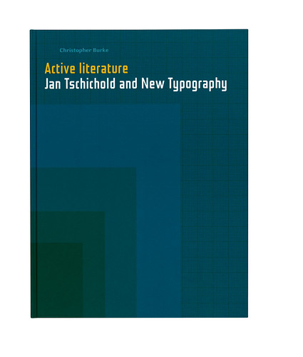
RP: Your use of images as a publisher has developed over the past twenty years. The Neurath and Tschichold books are highly visual productions with a lot of images. But in a letter to Eye in 1994 [no. 12 vol. 3], you criticised the “doll’s house effect of reduction”. You seemed at that point to regard reproduction of design work as inherently dubious.
RK: With the two recent books you’ve mentioned, Chris Burke’s the main figure there. He has a kind of hunger for gathering images. He’s a real archive historian. He comes back with bounty. That’s the sense you have. I think one should just recognise that and work with it, allow it to happen. That’s what I did.
All of those questions and doubts – I would still stick to them. For example, I still have this fundamental idea that the image will never be the same as the real thing, and in graphic design you are always showing reproductions of things that you might actually pick up. So that’s the basic doubt that I will always have. Then it’s a question of what are good ways of tackling this? Some are better than others. What are the good ways?
There’s one thing I have practised and can defend, which is to show realistic photographs of objects. We got a rather upset review of Chris’s Tschichold book. Some of the pictures show things with tears in them: damaged goods. It had just never occurred to me that this was a problem.
I can see there might be a more sophisticated objection, that if you show something with a tear in it you are very definitely showing one copy. It’s not a generalised image, the book as it was to begin with. Rather it’s the book that ended up in somebody’s archive and was torn or had a coffee stain on it. But those coffee stains and tears are a matter of expediency and pragmatism because those are the books that either Chris or I, or somebody we know, had and could photograph.
I also enjoy the sense of the war-torn, dirty reality. It tells a truth: that these are artefacts. They’ve had a life and this is the point where we saw them in their lives.
There’s one thing I would never do, which is to add shadows artificially. For me, that contravenes what is acceptable. That’s where the doll’s house effect happens. OK, it’s reduction, but also enhancement. I’m against all fetishisation.
Rick Poynor, writer, Eye founder, London
First published in Eye no. 80 vol. 20
Eye is the world’s most beautiful and collectable graphic design journal, published quarterly for professional designers, students and anyone interested in critical, informed writing about graphic design and visual culture. It is available from all good design bookshops and online at the Eye shop, where you can buy subscriptions and single issues.