
Summer 1993
Reputations: Roman Cieslewicz
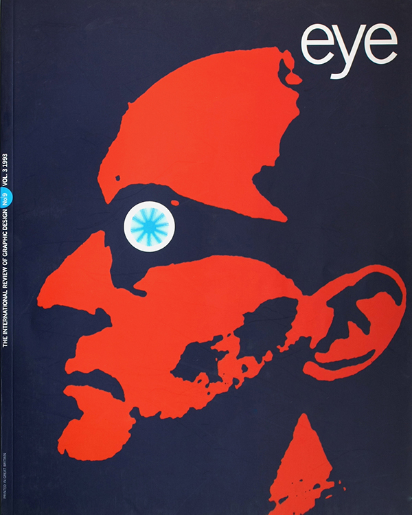
‘Posters are dying out. They need strong themes, which at present they lack. As a form of communication, they belong to another age’
Roman Cieslewicz was born in Lwow, Poland in 1930. He graduated from the Academy of Fine Arts, Cracow in 1955, moved to France in 1963 and became a French citizen in 1971. He has worked for several press and publishing houses, including Elle, Vogue and Opus, and various cultural organisations, such as the Festival d’Automne and the Pompidou Centre. A professional militant, Cieslewicz avoids the groups that are active and influential in France: the admen, the Swiss school, the ‘politicos’. Yet it was he who introduced the Polish poster to the country, unleashing all those influences which continue even now to determine French poster design, particularly in the political, social and cultural fields.
Though his approach is comparable with that of the Polish school, Cieslewicz has created his own technique and language, which he applies to posters, publications, photomontages and illustration. His graphic ideas are expressed in a haunting and incisive style. His output is prolific, his approach disturbingly free, with accidental elements permitted to challenge the typographical order. Since 1975, Cieslewicz has taught at the Ecole Supérieure des Arts Graphiques in Paris. He has exhibited widely and is a member of the Alliance Graphique Internationale. He lives and works in Malakoff, in suburban Paris.
Margo Rouard-Snowman: You have been a graphic designer for 40 years. Where did you train and who influenced you?
Roman Cieslewicz: I don’t think anyone influenced me. But my training with George Karolak at the Academy of Fine Arts in Cracow was important – I took his classes for four years and it was everything to me. Karolak was a graphic artist of the same generation as Henryk Tomaszewski and he shared the same philosophy. He was one of the few who resisted socialist realism, and he was shunned by the establishment because he refused to modify his projects in line with its demands. Despite this, he produced superb posters for the theatre of Cracow. In his graphic composition course he taught us how to assemble the essential elements of a good poster. His method of teaching was absolutely free, but his kind of freedom was frowned on and subjected to all kinds of control. I also studied typography with Professor Gardowski, and took classes in illustration and painting.
Tadeusz Kantor taught at the school and his weekly two-hour classes in scenography provided us with information and news from the west – a lifeline to the outside. In this cultural desert, with its zero information level, my only refuge was the Cracow library, where I would go to look at the magazine produced by the Blok group, a revolutionary association of poets, typographers and montagists, which provided a window to the Polish avant-garde. I would also often meet there a very committed designer, montagist and friend of John Heartfield – Mieczyslaw Berman.
Berman was a Pole, living in Warsaw, and he gave me a job in his studio. He was true communist. He fled anti-semitic Poland during the war and spent five years in the Soviet army. In the Soviet Union he was influenced by the satirical montagist Zytomirski and by Alexander Rodchenko, whose work was then still unpublished. Through a combination of satire and humour in the face of serious situations, Berman managed to resist the official socialist-realist art.
My studies were therefore much influenced by Karolak, Kantor, Gardowski, Berman and the Blok group. They gave me my first clear perspective on proportion, and an apprenticeship in the art of compositional imbalance – balancing elements without necessarily centring them.
M R-S: In addition to your commissioned work, you also undertake personal work of your own. What is your relation to painting?
RC: I’ve always liked images that have an impact on the street, but I’m a graphic artist – I’ve never pretended to be painter. I don’t like ‘image images’. What I find attractive are the icons of the street, current affairs, news items. I also like those nineteenth-century engravings with their long-winded, anecdotal texts, and torn posters, for example. The war taught us a lasting lesson: whatever the current graphic trends, it seems that serious situations give rise to an incredible number of posters.
M R-S: To what extent did your family background determine your choice of career?
RC: My parents were simple people whose main contribution was to give me plenty of encouragement to work. My father was a craftsman who made fireplaces, often reconstructions of old pieces he had drawn. As a child I was constantly drawing round forms. The circle was of immense importance to me, which was probably to do with the bread rolls my mother sent me to buy every morning. I still remember the wonderful signs at the baker’s. At six years old I was already taking great pleasure in the signs of the street.
M R-S: How did you begin your professional career?
RC: After graduating in 1955 I was taken on by a propaganda agency in Warsaw. Wag produced posters for political, social and cultural events nationwide – popular festivals, safety notices, circus announcements, theatre shows. Every national campaign required posters, but most of the time the pretext was illogical and unreasonable. Some twenty graphic designers produced around 100 posters a year, which were offset printed, in four colours, on 90 or 100 gsm paper. After Wag, in 1960-61, I worked for a magazine called You and Me, a Polish version of Elle. It had 64 pages and a print run of 10,000, and was a huge popular success. I devised its format, based on western publications. Its editor chose themes that were fresh – a break from the 1920s. There was even space for both Steinberg and Malakowski.
M R-S: Given your success, what made you decide to leave Poland?
RC: I wanted to leave Poland to see how my posters would stand up to the neon light of the west. I dreamed of Paris, but went first to Italy because of Eugenio Carmi, the art director of Italsider, a large iron and steel manufacturer in Genoa. I met Carmi when he came to Warsaw for an exhibition of Italian painters, and he invited me to Genoa, giving me a commission for five photomontages for the entrance hall of the manufacturing plant. The montages were each three metres by two and consisted of small elements photographed individually, then enlarged and assembled in the desired format.
On a later visit to Paris I met Peter Knapp, the photographer and art director of Elle. He had seen and liked You and Me, and commissioned me to design photomontages for various columns, including the horoscope page. Soon after this, he asked me to work on the layout of the magazine. Cropping photographs and pasting up text hardly seemed creative to me, but I was dazzled by this journalistic machine: 200 people working to produce 250 pages that would end up in the bin the next day.
During my time at Elle, where I later became art director, I met many people who gave me work. The publishers La Hune, Christian Bourgois (10 / 18 collections), Maimé Arnodin, Hélène Lazareff, Edmonde Charles Roux, among others – major figures in the press and publishing world at the time.
M R-S: What are your favourite design techniques?
RC: I use all manner of techniques: photography, painting and watercolour, but not drawing. I have a constant source of inspiration: circular forms. I’ve often used the offset screen, which I discovered at Elle, to focus on a detail of a photographic enlargement. The flexibility and round form of the screen dots make it possible to bring out each gesture of the subject. Also, because I couldn’t afford silk-screen printing equipment, I used felt pens to fill out the areas between the screens. I effectively made the screen dots by hand. A lack of equipment and the need to visualise my ideas immediately resulted in a repetitive reproduction of mechanical techniques. I find the many imperfections of the hand-made version very pleasing.
My favourite colours are black and red. I don’t like blue and I adore lemon yellow, which, coupled with black, has a striking effect.
For all my projects, I make sketches at a scale 1:10, that is 8 x 12cm, or 4 x 6cm for posters that are 40 x 60cm. First, I compose the format. I start with the four corners, draw one vertical, at an angle, then the outside edges. Next I position the various elements, framing more tightly and sometimes cropping as I go. I find that this classical technique of composition suits me well. My professional decisions, my responses to commissions, are dominated by impatience; the pencil expresses my ideas more quickly than any mechanical tool could.
M R-S: Typography is important to your projects. What are your preferences in this area?
RC: When I’m designing a poster, I think of the visual mass of the type and not of the details. Even if I’m designing 1:1 I always imagine how it would look big. I’m against the idea of reducing a poster to the size of a matchbox, because I’m convinced that each image functions in relation to the space around it, to the distance between it and the reader.
My favourite type forms reflect the same idea. There are the woodcut letters you used to see on notices at the police station, and the typefaces produced by the Viennese printer Bertold, including one which, curiously enough, is called Blok. I really like that typeface: it’s bold, with magnificent proportions for short words, and it creates a good impact. I also use Milton Glaser’s Milton typeface, which is related to Cassandre’s Bifur, but modernised and stripped of all the lines which coarsened the letters. For standard book texts, I often use Rockwell.
M R-S: What about the computer?
RC: You can imagine anything you like and put it on computer, but it will never have the perfection of the hand-drawn image or the freedom which I value so much. I don’t like the square, aggressive teeth of the computer screen unless you deliberately incorporate this in a composed image. New images for me grow out of fortuitous accidents made by hand. Though I’ve enjoyed using Paintbox, I can’t see the computer contributing much to my work. I prefer the Polaroid because it is straightforward, ephemeral, instantaneous. It expresses a bare truth stripped of superfluous elements.
M R-S: You have been in France since 1963. What do you think of French graphic design?
RC: France has no strong typographic tradition – it has always refused to be influenced by the unmannered English school and has rejected the Viennese and German schools in favour of Italian aestheticism and gallantry. I say gallantry because it is the image that dominates at the expense of the sign and the type. In the 1960s, Swiss typography, in particular Helvetica, overcame the French taste for ‘tutti frutti’ and frills. After the war, and again now, American influence is strong, particularly in the press.
In short, French typography has found it difficult to match the mood of the country. On the whole, it still has problems in reconciling text and image. And French graphic designers are sick because they haven’t got enough work. I also can’t stand the lack of recognition for graphic designers as a profession.
M R-S: Do you think the poster is dying out?
RC: I think it is. It’s no longer the means of expression it used to be, partly because of competition from television and partly because of the blandness of the subjects – household appliances and food do not inspire great design. Posters need strong themes, which at present they lack. As a form of communication, they belong to another age.
M R-S: What are the links between your poster designs and your photomontages?
RC: My personal work runs parallel to my commercial work and is an indispensable supplement to it. I see myself not as an artist, but as a graphic designer who makes use of all available media, whether illustration, logos, posters, journals. The visual laws vary, but the means of expression are the same. The photomontages are part of a vital ‘cleansing’ process for me. Though they are generally uncommissioned, they turn up sooner or later in my printed work.
M R-S: Why are your recent illustrations, particularly in the press, much more stripped down or minimalist than some of your posters?
RC: I am primarily a poster designer who has adapted his work for the press because of a lack of appropriate commissions. Poster designers who talk too much end up saying nothing. But the relationship with magazine readers is more intimate; you aren’t separated by a distance of 150 metres. The economy of means and minimalist presentation are a result of the format and the distance from the reader. And in developing my work over 40 years, I’ve become more tight-fisted.
M R-S: What made you go back to doing photomontages?
RC: Kamikaze’s use of black and white in 1975-76 inspired me to return to photomontages (not collages, as people sometimes call them). The montage gives a richer result than straight graphics. An image is bare if it is not supported by a word. It is a form of expression that I find appropriate to our times, perfectly adapted to contemporary mass media.
M R-S: Your images have certain distinct themes.
RC: The circle is an obsession which has translated into my work. There are also themes such as hands, eyes, jaws, legs, which are determined by the commissions. But beyond that I play a game to see where I can go without getting caught up in a system. Contrary to what some people think, I do not disfigure women. I am frank with them. There’s no censure involved.
M R-S: What do you see as the elements of a good poster design?
RC: An image, a word. And the regular to-and-fro between them. The idea is contained in the image, and it is the relationship between the image and the text which gives it force.
M R-S: You are now teaching at a school of graphic arts in Paris. What recommendations would you give to students?
RC: My students in the third year at the Ecole Supérieure des Arts Graphiques have to work to become graphic designers. They develop their creative skills within a framework of research and production directed towards a given theme. They create a visual message which is functional and effective with regard to the given problem, and hone their critical sensibility by proposing solutions to the problem through every stage of the process, from beginning to end. They experiment with forms, techniques, processes and materials.
M R-S: What goals do you have for your own work?
RC: To have more commissions for posters. To be able to comment on current affairs, on news items in the newspapers I like. To design, and to keep on designing and pursuing my attempts to ‘steer the eye’.
Roman Cieslewicz died in 1996.
Margo Rouard-Snowman, design writer and exhibition organiser, London / Paris
First published in Eye no. 9 vol. 3, 1993
Eye is the world’s most beautiful and collectable graphic design journal, published for professional designers, students and anyone interested in critical, informed writing about graphic design and visual culture. It is available from all good design bookshops and online at the Eye shop, where you can buy subscriptions and single issues.