Autumn 2012
Robin Nicholas
‘I don’t see myself as a typeface designer. Hermann Zapf is a typeface designer. What I have done is to develop typefaces: pulling component parts of various typefaces that seem to work well and amalgamate those into a new design.’
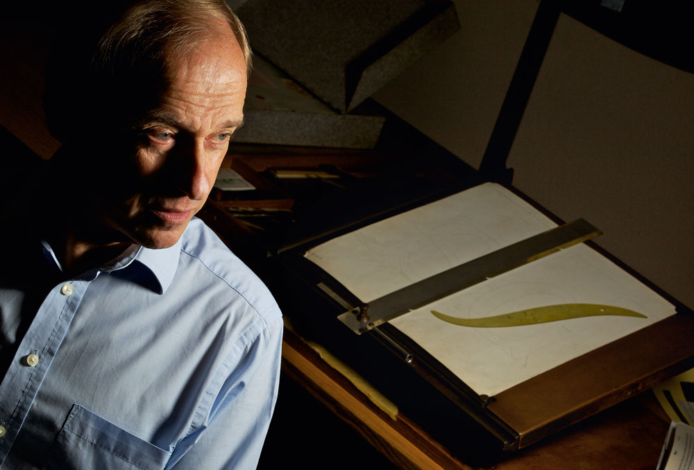
Robin Nicholas was born in Westerham, Kent, in 1947. In 1965 he went to train in the Type Drawing Office (TDO) of Monotype, at that time still primarily an engineering company making hot metal typesetting machines. He has been with the company ever since, witnessing the revolutions brought about by phototypesetting and digital technology, and the company’s bankruptcy in the 1990s. For ten years Nicholas was manager of the Type Drawing Office. Until his retirement this year he was head of typography for Monotype in the UK.
As a type designer, he is most famous for the ubiquitous typeface Arial (1982), originally developed from Monotype Grotesque as a bitmap font for IBM laser printers, and later adopted by Microsoft as one of its core fonts. He is also responsible for Nimrod (1980), for ten years the text face of the Guardian and also used for Eddie Shah’s shortlived daily Today; Plantin Headline (2002); Felbridge and Fairbank MT (both 2003); Clarion (2004); and Bembo Book (2005). He has also supervised revivals of a number of faces, including Centaur (1994), Bulmer (1995), Bell (1998) and Fournier (1998), and custom fonts for BA, Barclays, the Swedish airline SAS and the car maker Opel.
Eye’s Simon Esterson and John L. Walters spoke to him at Monotype’s offices at Salfords, which now occupy a small part of the industrial estate built on the old Monotype site.
Early days in the drawing office
Eye: What was Monotype like when you joined?
Robin Nicholas: I started in 1965 and the Salfords site had about 2000+ people, obviously most of those engaged on the manufacturing side. It was still a combination of hot metal and phototypesetting machines.
Eye: I was an apprentice for a year as an engineering draughtsman. The company I was working for went out of business and Monotype were advertising for drawing staff. I came for the interview and it looked interesting.
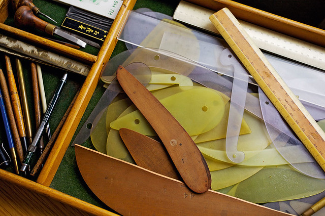
RN: When I started I was one of six who were in a separate little room where we went through a basic training programme. One of the things that was impressed on us was that you had to be able to create the letters freehand. The ships’ curves that we used were always just looked upon as a means of finishing the drawing. So that initial training was based around creating good freehand drawings and learning to make them accurate.
Drawing instruments (in use ca. 1900-80) in the Monotype archive.
Top: portrait of Robin Nicholas in his office at Salfords, by Phil Sayer.
It was always known as the Type Drawing Office – TDO. At that time the drawing office was split into two sections, one of which dealt with customer’s orders – it was nearly all small orders for additional characters for typefaces. It could be language extensions, special symbols or perhaps mathematical symbols and logos.
The other section was involved in drawing new typefaces. One thing to bear in mind is that, in hot metal, a new typeface might mean adding additional sizes to existing typefaces because the proportions changed. So a lot of the work that was going on was extending the size range of typefaces but it did involve creating new sets of drawings. Also, there was quite a lot of work on non-Latins going on when I started.
They would sort of ease you in. You’d get relatively easy jobs – maybe adding new accents to an existing typeface.
Eye: If a customer wanted a specially accented character that wasn’t already in a font, how long would it take to give them a matrix for it?
RN: If the request was for just one or two characters it would take between two and three weeks. It was a fairly prompt service. I generally worked alone because they were small orders. But sometimes the job might be split. I was sitting next to a woman who had been with the company for donkey’s years and she was always there to help me. Her name was Daisy Wilson. In fact if you look at old drawings, you might find the name Newman, which was her maiden name when she started in the 1920s.
Technology and tolerance
The drawing office was on the top floor of the three-storey building. The floor below was the pattern production department and that’s where the charted measurements of the copper patterns were recorded. (The copper patterns were made elsewhere and then measured on that floor.) The other part of the L-shaped building was the matrix production side where the punches were cut.
The head of type was John Goulding, who had taken over the role that Stanley Morison (see ‘Stanley Morison: Changing the times’) had. He was based here rather than London and was the interface between the works and the sales and marketing group in London. He collated requests from the various markets, but there was also a typographical committee who would plan what would get done.
Morison had his battles with our works manager. There were people in the company that didn’t think that we needed lots of new typefaces. I think that it was the era of Morison and Beatrice Warde (see ‘Beatrice Warde: Manners and type’) that made the management understand that type was something that could help the whole business.
By the time I joined the company it had become a committee and I don’t think that there was anyone who was really driving the design side of things.
John Dreyfus was the consultant but I don’t think that he had the force of personality. Nevertheless, he was working with people like Giovanni Mardersteig and Adrian Frutiger on typefaces such as Apollo. So perhaps he was, in his own quieter way, a Morison. But he was trying to keep that creative side going. The changes of technology tended to push aside the development of new typefaces.
Eye: Did you get to meet typographers and designers from outside the company?
RN: Not really. In the early days, I understand, Eric Gill was taken around the drawing office on one or two occasions but it wasn’t considered the done thing.
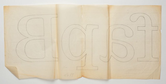
Early sketches for Nimrod
Eye: Were you involved in the other processes or did you very much keep to your department?
RN: After I had been on the drawing board for about a year, I spent some time in the charting department. There were charts that recorded the measurements at each given stage of production, so when a punch was cut it was measured to a punch chart and the final matrix was measured to a matrix chart.
The tolerances were quite tight – for a base-lining character it was two-tenths of one-thousandth of an inch. So I spent some time punch-cutting and then went to the justifying and proving departments, where the punches were measured and examined.
Eye: What was the approach to hot metal at this time? Was change in the air?
RN: It’s difficult to answer because I was quite junior but from what I understood at the time, there were people in the company [at a high level] who thought that hot metal would go on forever and that phototype [in the 1960s and 70s] was a fad that wouldn’t catch on.
The hot metal machines were very engineering-heavy. Precision engineering was required in the making of the moulds as well as in the production of matrices. There were about 200 people involved in the manufacturing of matrices when I came, so there was a lot at stake. When I first came into the drawing office, the majority of the work was still hot metal but there was an active programme of converting typefaces for phototypesetting. There was a scramble to get the typeface library into new formats.
Eye: You had a new machine with no typefaces to put on it.
RN: That’s right. I think in those early days of phototypesetting a lot of the typefaces didn’t get the care and attention that they should have done. It was a case of getting them available as quickly as possible.
From phototype to lasersetting
The Monotype film setter, which in many ways was a converted composition caster, gave very good image quality from the beginning because of the way it worked. It had a stationary image over a light source, instead of a metal source like a hot metal caster, but the down side is that it was comparatively slow. Other manufacturers were coming along with rotating discs and flashing strobe lighting, which were much faster, so Monotype was under pressure to improve the speed of the filmsetting machine and then build other machines – which the company did.
I did get involved with a machine called the Monotype-600 phototypesetter [launched in 1969] that did have rotating discs and relied on very short exposure to get a clear image of the character. The problem was trying to get the mechanics of this perfect so that all these characters lined up perfectly. Sometimes by the end of the day you would get proofs that were perfect and then by the next morning they had gone down the sink again. They were very difficult machines to work with.
There was quite a lot of investment in moving from hot metal to phototypesetting and in certain markets it wasn’t a practical solution. In India, for example, they pretty much made the jump from hot metal to digital type.
The advent of digital type was a blessing, although it had its ups and downs. That was the next big phase: converting the library from analogue to digital.
It began in the 1980s with the realisation that we could sell digital type to companies that manufactured laser printers and other devices. The first big client was IBM, and we sold a series of low-resolution bitmap fonts for IBM machines. The first contracts were for the IBM 3800 laser printer, which was a huge thing that was used by a lot of aircraft companies. There were smaller companies that used it as well.
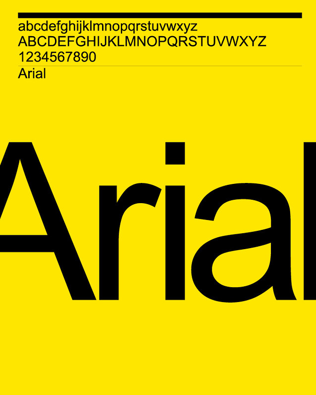
They were looking for a set of core fonts. That’s where Arial started, as a bitmap font. And because the early Lasercomp fonts were high-resolution bitmap fonts we were able to use that as a starting point and sample down that data and then hand edit it to give us 240dpi or 300dpi fonts. [Monotype introduced the Lasercomp, a digital laser phototypesetter, in 1976.]
Arial, 1988. A sans serif family based on 1982 bitmap fonts made for use on laser printers. Designed by Robin Nicholas and Patricia Saunders.
Eye: And that was the bridgehead idea, that you could supply different fonts to all the new PC manufacturers and laser printers.
RN: And the realisation that you could ask a cent royalty for each one and if they were selling in their millions you could make quite a bit of money out of them.
Eye: Do you think that Monotype realised that the future was in the archive and the intellectual property?
RN: No, I think that it was much later when that realisation came around. When the company went into receivership in the early 1990s it was split up. The part that was responsible for developing for the Lasercomp and newspaper systems continued to exist under a new name, but the type group was hived off as a separate group setting up a business outside of providing type for its own machines.
Nimrod: built for speed
Eye: How did you come to make typefaces?
RN: Having worked on the special character section and then in the matrix factory, I then went back onto the new typeface side of the drawing office. Initially I was working with a senior person working on non-Latin types such as Kannada, the Indian script. I was very much working with someone under instruction. The first project I was given responsibility for was a Cyrillic addition to the typeface Placard – a condensed sans. I think that was the first time that I was given some freedom.
Eye: What was the first typeface that you did where there was no precedent?
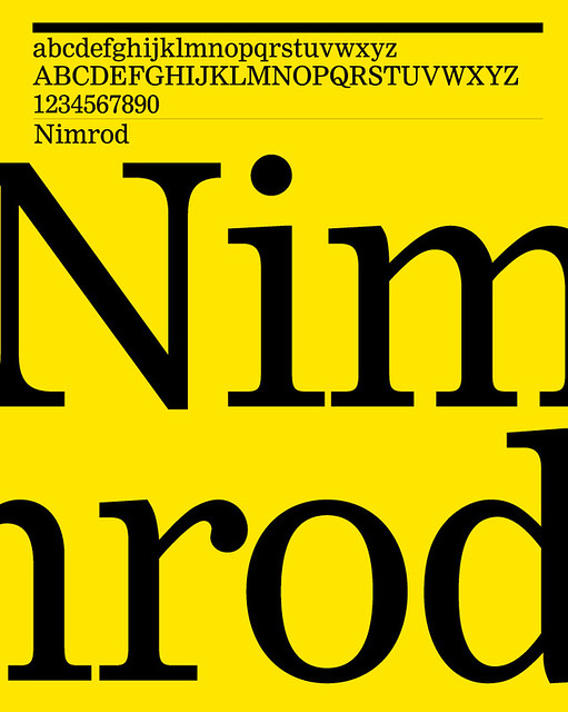
RN: The first would have been Nimrod. We realised that the Lasercomp was going to go into new areas of the market. Monotype was not really in the high-speed typesetting end – like newspapers. But when the Lasercomp came in we realised that it was a high-speed machine that could be suited to that environment. So we looked at our typeface library and realised that there weren’t that many newspaper typefaces. It seemed to me that it was a good opportunity to develop a new newspaper typeface, specifically for digital type. At that time, we were having dealings with the Financial Times. One of the creative directors was Victor Clark, and he had some ideas about a typeface for digital use so he created some artwork and sent it to us. I started to draw some characters, then I got them digitised. We were able to show John Dreyfus some proofs and he liked it, so it picked up from there. What Victor was concerned with were the fractions that were used in the tables – he was looking for a solution to that sort of problem.
Incidentally, the FT never used Nimrod! I think that we made special fractions for them, but I can’t remember which typeface they used in the end. In fact I think they used a typeface called Clarion, which is really a derivative of Nimrod. Ron Carpenter worked on it with me.
It was taking Nimrod back towards the more ionic side because ionics had been very popular in the newspaper world. Linotype had several ionics that were used quite extensively. I think it was because Nimrod had connotations of Plantin, with the ‘S’s without big serifs, or at least without the top beak. It was too radical for some newspapers so that’s why we made Clarion, which took the proportions of Nimrod but took it a little bit back towards the ionic style.
Nimrod, 1980. A serif typeface designed at the beginning of the digital era for use in newspapers at text sizes. Designed by Robin Nicholas and Ron Carpenter.
Eye: Did Nimrod find a use elsewhere?
RN: Yes, it was first used by the Leicester Mercury. Type sales followed machine sales, so if we were talking to a newspaper about Lasercomps we would say: ‘Here are the typefaces that we have available and that we would recommend.’
Eye: What was it like seeing the first examples of your own typeface come back?
RN: It was quite exciting. There was a newspaper, Today, that was launched in 1986 by Eddie Shah, and they used Nimrod. I was telling my mum (I don’t think that my parents really understood what I did) and said to her: ‘You should go and buy this new newspaper because it’s using my typeface.’ A few days later I asked her if she had bought it and she said: ‘It’s very nice. I like your typeface – it doesn’t come off on your hands!’ So somehow I had managed to design a permanent typeface.
Eye: Did Nimrod give you a taste for being a type designer?
RN: No, I don’t think it did, actually. By that time I was involved with developing the library into digital type. By the early 1980s we had gone through the process of digitising most of what could be digitised easily, but we got into an era then of looking at typefaces that perhaps hadn’t made it into phototypesetting that we might develop for digital type.
Eye: Which typefaces?
RN: Some that spring to mind are things like Bulmer, Joanna and Bell. There was quite a range. I don’t think that it was a conscious decision not to do them. Phototypesetting came and went fairly quickly and most of what was done was based on customer requirements. It was to do with replacing the fonts that they had previously been using in hot metal. And then Lasercomp came along and digital came along and it was a matter of the same thing, really. You know, get your Times New Roman, and get your Gill converted as quickly as possible. But once we had got through that stage we started looking at how we might bring some of the other typefaces into the digital era. I wouldn’t call it a ‘programme’ as such but it was a matter of doing it when we got the opportunity.
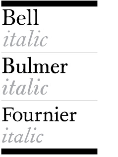
Bell, 1988. Digital revival of the 1931 Monotype hot metal face. Drawn by Patricia Saunders.
Bulmer, 1994. New version of the hot metal typeface. Drawn by Ron Carpenter.
Fournier, 1986. Digital revival of the 1924 Monotype hot metal face. Drawn by Ron Carpenter.
For instance, Cambridge University Press and Oxford University Press had been early adopters of the Lasercomp, and they were using typefaces that weren’t as popular with mainstream customers so they may have prompted us to look at some new typefaces. I got caught up more in that rather than thinking ‘I want to design another typeface.’ It still seemed there was a lot to do with the existing library.
Some of those typefaces take on a cult status – things like Fournier. So when you learn more about their history it would seem criminal to just let them drift away and not be made for modern technology. We revived some things with varying degrees of success. Also, a lot of those typefaces that were just digitised from existing artwork didn’t have the attention that they should have had. So, in latter years, some of them have been reworked, and others need to be revisited.
Eye: What would be top of your revisit list?
RN: I think that most of our typefaces could do with a redesign! It’s one of those things where, I suppose, what happened is that as we went through reviving typefaces you get to the less and less popular ones and yet they’re getting the most attention. Dante, for instance, which Ron Carpenter redrew, is a really nice typeface but it probably had far more attention paid to it than its history deserved. But I think that making a nice version of it has helped to establish it with a lot of people. It has sold pretty well as a digital typeface.
Eye: So the most popular ones get done quickly, because there’s a market for them, but the later, less popular ones get more attention because technology has improved. Yes and we’re not under the pressure to get x number of typefaces available for new machines. The situation is different now because we’re not governed by machine use at all.
Philosophy of type
I don’t see myself as a typeface designer. Hermann Zapf is a typeface designer. What I have done is to develop typefaces – pulling component parts of typefaces that seem to work well and amalgamate those into a new design.
Eye: So what is the difference between you and Zapf?
RN: Zapf is a superb calligrapher, and what he’s done has come out of that innate ability to draw letters freehand. But also things like Optima were groundbreaking typefaces in design terms.
Eye: Which other people interest you?
RN: People who have fresh ideas about type, really. Adrian Frutiger also. I can see in Frutiger some of the type manufacture side in terms of producing regimented families of typefaces. But Frutiger was another groundbreaking typeface.
Eye: More so than Univers?
RN: Yes, because Univers and Helvetica just grew off the back of other grotesques that were already around, and formalised them. That’s why I say I can see the type manufacturer a bit in Univers – ‘Let’s make a big coherent family out of this little grotesque typeface.’
I see my design work to be evolving a design out of something that already exists. You can argue that anything that’s shaped like the letter ‘A’ is derivative. It just depends on how you view these things. I’ve never seen myself as a creative designer, i.e., coming up with something quite fresh. I’ve always liked to focus more on creating a typeface that solves certain problems.
Eye: When you’re working alongside fellow type designers here, do you think the younger ones have a different viewpoint?
RN: They do have a different viewpoint. I worked quite closely with Sebastian Lester and I think he is a designer. His typefaces, particularly his Neo Sans typefaces, they were fresh. There probably were some precedents that weren’t too dissimilar but he has a way of looking at type design that’s quite original. His approach was different to mine. But it’s a good combination, because our customers have an expectation of Monotype, particularly from a functionality point of view and the way that the typefaces are engineered, and I’m comfortable on that side.
In the early days it was a matter of getting a typeface to work well on a specific output device and that’s gone in recent years because we don’t know what the output device is going to be. It’s becoming more homogenised as the quality of screens is improving regularly now.
There are still criteria that apply if you’re reading type on a small screen, there are things that a type needs to do. Whereas if it’s being used in an advert in a glossy magazine it can have more character. Too much character in a typeface that’s being used on a small iPad is not a desirable thing, so you still need to be aware of context. But at the end of the day you can’t control use.
The digital revolution
I’ve never had a problem that anyone can go and design their own typeface. I think there has been an awful lot of rubbish put on to the market over the years but I accept also that I’ve got pretty traditionalist ideas about what makes good type, and others have different views. I thought that most of the stuff that came out of [the digital foundry] T26 in the early days was pretty awful.
One of the darkest times, looking at Monotype’s history, was in the early 1990s, when we started ‘Type designers of the world’. People could send typefaces in without, really, proper vetting and we’d sell it as a collection of modern designers’ work. There were some badly made typefaces, and we immediately started to get complaints – not about the designs but because they didn’t work properly.
Eye: Are there any younger type designers in particular whose work you admire?
RN: I think there are good typefaces coming on to the market. Jeremy Tankard is good but he’s hardly young any more. I’m not really that up to date, to be honest … Jonathan Hoefler’s work [Hoefler & Frere-Jones] is of a high standard and he produces pretty traditional type.
Typefaces age. Rockwell looks so old-fashioned to me. As soon as I see it I’m back in the 1930s again. Things like Helvetica transcend an era. Gill manages it as well, Scandinavian and so on. But other typefaces are distinctly stuck in an era. Take ITC Souvenir, that’s a 1970s typeface. It’s going to be a long time before it’s anything other than a 70s typeface.
Eye: How do you feel about seeing your own type in use?
RN: By and large I like to see it. There are exceptions. No one likes to see their typefaces badly used. I could do with seeing a little less of Arial. I don’t really see Arial as my typeface. It was a product of its time. It was a way of filling a company need. But it’s good to see typefaces being well used. Arial can look quite nice. Most typefaces can if they’re used in the right way.
Simon Esterson, art director, Eye
John L. Walters, editor, Eye
First published in Eye no. 84 vol. 21, 2012
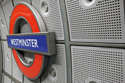
Johnston, 2000-08. Reworking and extension of the Banks & Miles New Johnston typeface developed by Eiichi Kono in the 1980s.
Eye is the world’s most beautiful and collectable graphic design journal, published quarterly for professional designers, students and anyone interested in critical, informed writing about graphic design and visual culture. It is available from all good design bookshops and online at the Eye shop, where you can buy subscriptions, back issues and single copies of the latest issue. You can see what Eye 84 looks like at Eye before You Buy on Vimeo.

