
Spring 2014
Sans serifs in suburbia
Sainsbury’s brought 1960s Modernism to the kitchen cupboard
The concept of the supermarket came to Britain in the 1960s from the United States. Shoppers could now roam the aisles picking products by themselves. Before long, the shelves became a battleground between food manufacturers’ heavily promoted brands – with their easily recognisable packaging and vernacular graphic identities – and the supermarkets’ ‘own-brand’ versions of the same foods: less familiar, but sold more cheaply.
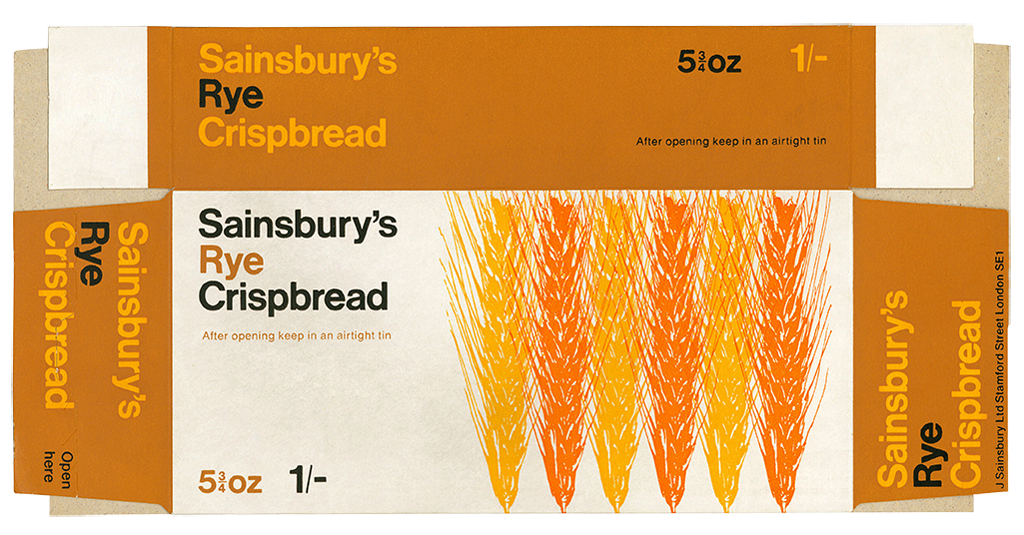
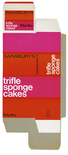
Sainsbury’s positioned themselves as the Modernist retailer. The bold, simple design approach of their products followed the company’s philosophy: clean, contemporary architecture for their stores and Swiss-style graphics for their own packaging – sans serifs in suburbia.
These uncompromising designs were the result of two people working directly together: chief executive John Sainsbury and Peter Dixon, who ran the company’s in-house design studio between 1964 and his retirement in 1992. ‘I approved every design for own label,’ said Sainsbury in Own Label (Fuel), a book about the graphics. Today, the studio’s archives are held at the Museum of London: packaging flats curated with the same care as Roman artefacts.
Trifle Sponge Cakes, 1971.
Top: Rye crispbread, 1968.
Simon Esterson, Eye art director, London
First published in Eye no. 87 vol. 22 2014

Eye is the world’s most beautiful and collectable graphic design journal, published quarterly for professional designers, students and anyone interested in critical, informed writing about graphic design and visual culture. It is available from all good design bookshops and online at the Eye shop, where you can buy subscriptions, back issues and single copies of the latest issue. You can see what Eye 87 looks like at Eye before You Buy on Vimeo.