
Summer 2009
Schism and reunification
Where there was once discord, there is now harmony, as design zealously embraces the made image. Adrian Shaughnessy analyses ‘this new hybrid – type-based yet infused with fluid and expressive qualities’
There was a time when graphic design and illustration used to sleep in the same bed. Look through any design annual from the 1970s and early 80s – Graphis, D&AD, the New York Art Directors – and much of the work on show has drawn imagery as its main ingredient. During the fizzy, go-go 1980s, however, something happened to the relationship between design and illustration. Design was promoted to the front line of commercial life: professionalised and strategised, it took ownership of identity and branding within the corporate world. Not long afterwards designers discovered that cheap technology and reduced repro costs allowed them to use photography where once they might have relied on illustration; they also discovered that new digital tools enabled them to make their own images, collages and visual effects. Illustration, on the other hand, clung onto the notion of autonomy of expression and refused to learn the language of strategy and branding. It was banished to the sofa.
Since then the craft has had numerous upswings and mini-revivals. Demand for illustration courses is booming, and the best practitioners continue to do remarkable work. Yet perhaps the most interesting development in illustration is the way that a new generation of graphic designers has rediscovered the model of the designer-illustrator. Pick up any design magazine from anywhere in the world and it will be full of a new sort of hybrid graphic design – typographically based, yet infused with the fluid and expressive qualities of illustration. Look closely, however, and you’ll see that the people doing this work nearly always call themselves graphic designers.
This visually rich strand of graphic expression is a reversal of the stance adopted by many graphic designers in the 1990s; a stance that had its most austere expression in the work of groups such as 8vo. In their monograph 8vo: On the Outside, (see Eye 59), the 8vo partners state their philosophy of purist graphic design: ‘ … we believed that typography, the key building block of printed communication, could be the core ingredient of a graphic solution (unsupported by illustration or photography) …’ The current crop of designer-illustrators have a more stylistic and temperamental affinity with the pre-digital era, when to be a graphic designer usually involved the ability to draw, or at least an ability to commission illustration and a readiness to incorporate it into visual communication. No group exemplified this better than Push Pin during the New York studio’s 1960s pomp.
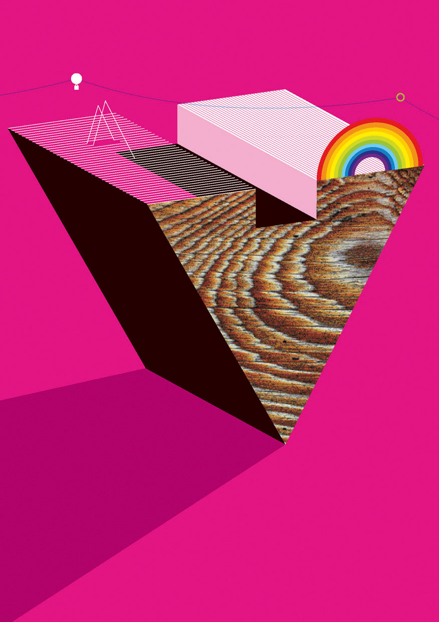
The Push Pin style was also a rejection, this time of the fashionable International style. Milton Glaser and Seymour Chwast effortlessly combined typographically sophisticated layouts with Zeitgeist-defining illustration. Looking at the work of the current designer-illustrators – influential figures such as MM / Paris, Michael C. Place (working under the studio name Build), Kim Hiorthøy, Marian Bantjes (see Reputations, pp.14-23) and Julian House (working both as a senior designer at Intro, and running his own record label, Ghost Box, see Eye 63) – we see the same confident melding of typography and imagery. However, unlike the work of Push Pin, with its knowledgeable referencing of Art Nouveau and Art Deco, and the more pragmatic examples found in the 1970s design annuals, this new blend of graphic design and illustration tends to be more abstract – fewer winged logos and more amorphous vapour trails – and it is usually a product of the computer rather than the pencil. Yet it is undeniably a digital equivalent of the Push Pin model, and even earlier manifestations such as Abram Games.
Flair and expressiveness
Having recently finished a three-year stint editing the illustration magazine Varoom, and having looked repeatedly at the nexus between illustrators and designers, I have come to the conclusion that three factors appear to be driving this latest fusion of the two wings of visual communication.
The first is the image-making possibilities afforded by the digital tools that are now ubiquitous within design. When I ran my design studio (between 1988 and 2003) I boasted that we hardly ever commissioned illustration. This was partly a reaction against the vapid Matisse-lite scribblings that seemed to festoon every bank or insurance company leaflet at the time, but it was also to do with the exhilarating realisation of what could be done by visually astute designers with scanners, vectors and the cut-out tool in Photoshop, something that is second nature to the current generation of design-school graduates.
The second reason is the over-strategised, over-purposed state of modern commercial graphic design. For free spirits attracted to the richly seductive design of past decades, current professional practice, with its enslavement to branding theory and marketplace absolutism, can often be a dispiriting place. Illustration at its best seems far less constrained by commercial dogma and the suppression of a personal signature. As the American designer Ed Fella (quoted in Varoom 01, 2006) noted, ‘Whereas graphic design is more anonymous, all illustration is sold for its particular and individual style.’
The third reason for a rise in designer-illustrators can be attributed to the supremacy of typography – and photography – in branding, advertising and visual communication of all kinds. For most brand owners, illustration is too imprecise and too resistant to strategisation to be trusted with delivering marketing messages. This is why many tutors on illustration courses routinely urge their students to learn typography and thus avoid being pushed further down the food chain.
The designer-illustrators have responded to this by blending typographic skills with the ability to create illustrative effects, resulting in a new seductive messaging that combines the directness of typography with the sensory appeal of illustration, pattern and form-making. The imaginative and ornamental lettering of Marian Bantjes, Alex Trochut, Non-Format, Si Scott, Grandpeople and Yulia Brodskaya can be found in advertising, newspapers, magazines, book jackets, physical environments and in various digital settings.
The same flair and expressiveness can be seen in the visual output of MM / Paris, Michael C. Place, and in the digital radicalism of Universal Everything. Yet few define themselves as illustrators. Instead they function like graphic designers and respond to client briefs with problem-solving rigour while simultaneously using the emotional heft of illustration. In Peter Grundy’s work, the problem-solving intent of graphic design and the narrative potential of illustration are yoked to create informative and narrative-rich imagery well suited to information-based communication demands. It is no accident that Grundy gets commissions from both Shell (see page 63) and The Guardian.
Where preceision meets abstraction
At its simplest level, the re-emergence of the designer-illustrator means that the words Graphic Design and Illustration appear side by side more frequently than they once did on the websites and business cards of designers and illustrators. But it has also coincided with a much bigger change within the visual communication landscape. We are seeing the forging of a new expanded definition of illustration. Today, illustration is now any sort of made image – and by ‘made’ I mean an image that has been created, manipulated, melded or fashioned. It can be virtual or physical; it can be interactive or static; it can be made by a human being or by a computer laden with smart software; it can be model-making; it can be found in three-dimensional environments; it can even be made randomly by processing software. The consequence of all this is that illustration is beginning to catch up with fine art, which long since species-jumped out of the canvas into a new frame-free zone where anything goes. It is hardly surprising that designers – and illustrators – are embracing this new freedom with zeal.
Of course, not all the work produced by design’s remarriage to illustration produces meaningful work. Much of what we see falls into the honey-trap of mere prettification and space-filling; often pleasant but rarely engaging. Yet what tends to snag the eye in the visual communication firmament is the work that fuses the precision of graphic design with the floating-world abstraction of the illustrator
Design historians will look back on the first decade of the twenty-first century and see that it was normal for designers to eschew the 1990s fixation with pure typography and photography in favour of marks, splodges, scribbles and letterforms spouting quasi-organic tendrils. They just might struggle to know what to call the people who were doing this work, but they will identify a significant moment in graphic design’s evolution that is hyperlinked to the craft’s radical origins in the avant garde art movements of the early decades of the twentieth century.
Designers featured in this article include: Dust; Alex Trochut; IWANT; Karlssonwilker; Build; Universal Everything; Airside; and Grandpeople.
First published in Eye no. 72 vol. 18.
Eye is the world’s most beautiful and collectable graphic design journal, published quarterly for professional designers, students and anyone interested in critical, informed writing about graphic design and visual culture. It is available from all good design bookshops and online at the Eye shop, where you can buy subscriptions, back issues and single copies of the latest issue. You can also browse visual samples of recent issues at Eye before You Buy.