Spring 1995
Seize the sans serif
Raw, vigorous, experimental and often funny, Ark magazine helped to transform British graphics
Between the mid-1950s and early 1960s, British culture was propelled into the post-modern era by a group of young visual revolutionaries who transformed the face of British art, fashion, film, television, advertising, newspapers and magazines. Many of those responsible for setting the pendulum of the image-obsessed ‘Swinging Sixties’ in motion were alumni of London’s Royal College of Art, whose School of Graphic Design and journal Ark merit close scrutiny by historians of post-modern culture.
Established in 1948 as part of the incoming rector Robin Darwin’s radical reorganisation of the college, the School of Graphic Design developed a distinctive character which distanced it from contemporary rivals, the most notable of which was Jesse Collins’ Department of Graphic Design at the Central School of Arts and Crafts. While Collins’ department was staffed by charismatic, progressive, Modernist designer / teachers such as Herbert Spencer, Anthony Froshaug and Edward Wright and corresponded fairly closely to the continental model of graphic design training, the RCA school was characterised by the presence of a more traditional type of English graphic artist – Edward Bawden, John Lewis, John Brinkley, Reynolds Stone, Edwin La Dell and the school’s professor, Richard Guyatt. The Central School welcomed avant-garde experimentation, but the RCA during the late 1940s and early 1950s virtually ignored foreign developments, preferring to emphasise the arts of steel and woodblock gravure, fine typography and bookbinding which characterised the limited editions published by the college’s The Lion and the Unicorn Press.
The largest department in the RCA, the School of Graphic Design (the original title of ‘Publicity Design’ was abandoned after an article in the Times abhorring its vulgarity) played a vital role in fulfilling Darwin’s intention of re-establishing the college at the pinnacle of the pyramid of British art and design education. The key to the RCA’s new identity was ‘Englishness,’ an image epitomised by the rector himself, an Old Etonian descendant of Sir Charles Darwin, and by the physical and psychological remodelling of the RCA in the mould of a Cambridge University college, complete with a senior common room with a high (or ‘painters’) table, a wealthy and influential council and a spate of new ceremonies and ‘traditions,’ including a graduation ceremony featuring a liveried beadle and guardsmen wearing busbies who provided bugle fanfares at suitable moments.
Though Darwin’s gentrification programme seemed absurd to some of his more cynical contemporaries, a steely logic underlay his reforms. The RCA has been an object of some derision among the tiny pre-war British design community thanks to its perceived tendency to produce teachers rather than practitioners. Darwin insisted that all his professors should be practising designers and his reforms provided the means for the captains of British industry to meet and, hopefully, employ budding RCA design talent. Moreover, the traditional institutional image was perfectly in keeping with the general mood of a population wearied by war and austerity, deeply suspicious of alien ideologies and longing for reassuring images of the national identity they had fought to defend.
Ark, the journal of the Royal College of Art, was established in 1950 on the initiative of Jack Stafford, a student in the RCA School of Woods, Metals and Plastics. In the first issue the editor stated that the purpose of his magazine would be to explore ‘the elusive but necessary relationships between the arts and the social context,’ an object of enquiry which remained relatively constant throughout Ark’s 25-year history and which makes it an invaluable archive for the historian of British graphic design today.
Ark was produced in the style of contemporary ‘little magazines’ such as John Lehmann’s Penguin New Writing. It assumed a literary tone characteristic of an era when rationing, paper shortages and restrictions on inessential imports ensured that visual material was in short supply and reading was one of the few forms of entertainment. Appearing three times a year and costing half-a-crown an issue, the magazine was available by subscription or over the counter at art booksellers such as London’s Zwemmer’s or Better Books. Ark aimed to be self-financing, with an initial print run of 2000, peaking at 3000 by 1963. It relied on advertising revenue charitably supplied by companies with strong links with the RCA such as the Orient Shipping Line, Murphy’s Radios, Gilbey’s Gin and Schweppes, and by the late 1950s advertising agencies such as Crawfords or Colman, Prentis and Varley eager to attract student graphic talent. Although the high turnover of editorial staff resulted in an almost total lack of stylistic unity or thematic continuity, Ark was far more professionally produced than virtually any other British student magazine (with the possible exception of Cambridge University’s Granta).
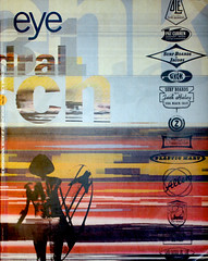
Ark provides a fascinating insight into the changing enthusiasms of post-war generations of British art and design students. The earliest recognisable trend, much in evidence throughout the initial issues, is a craze for Victorian-style popular culture, an interest intimately linked to the RCA’s involvement in the 1951 Festival of Britain and to the design of the Lion and the Unicorn Pavilion. RCA professors R. D. Russell and Robert Goodden, who were originally commissioned to design the pavilion, decided to collaborate with Guyatt and the staff of the School of Graphic Design on the interior of the prefabricated building. In line with the tendency for contemporary British graphic designers to focus on exhibition display work, the staff and students laboured to fulfil a brief which asked them to represent the very essence of British culture, to incorporate, in Guyatt’s words, ‘the leonine tradition and the whimsy of the Unicorn.’ The RCA team, like other graphic designers working on festival commissions, chose to represent ‘Englishness’ through archaic Victorian typefaces such as Egytian Expanded, Doric Italic and Throne and Figgins Shaded, enthused about by Robert Harling and James Shand in their journal Typography in the 1930s. Agreeing with Charles Hasler, chairman of the festival’s Typographic Panel, that ‘nothing could be more British in feeling than the display types created by the early nineteenth-century typefounders,’ the team set out a neo-Victorian display which emphasised the traditionalism and eccentricity of British culture. The Lion and the Unicorn Pavilion, replete with a host of reassuring images of country life, tweed jackets, briar pipes and handmade brogues, could have convinced any foreign visitor that post-war British graphic design remained untouched by Modernism.
The cover of Ark 4 (spring 1952), designed by RCA-trained graphic artist and tutor David Gentleman, perfectly reflected the spirit of the time, and for the next three years the magazine was characterised by articles on popular cultural themes such as the decoration of Thames sailing barges, tattooing, sea shanties, Victorian china dolls and puppet theatres. Ark was eventually dragged away from its nostalgic obsessions by two unconventional and assertive art editors, Len Deighton and Raymond Hawkey. Arriving at the RCA from Saint Martin’s College of Art with experience in the RAF’s film unit and a background in commercial photography, Deighton was appalled by the archaic attitudes and snobbish anti-commercialism of the RCA. ‘The war had created a real cultural revolution in a way some middle-class people wanted to forget,’ he recalls. ‘I was a working-class guy with a family and I needed to get a job. I didn’t want to hear about genteel Victorian book illustration as a way of earning a living.’ Unwilling to undertake the required studio exercises in illustrating the classic works of nineteenth-century literature in styles that had been popular 50 years earlier, Deighton developed a personal idiom heavily influenced by commercially successful contemporary Americans such as Ben Shahn and David Stone Martin, while concentrating increasingly on a ‘vulgar’ activity regarded with the greatest suspicion – photography. As art editor of Ark 10 (spring 1954), he gave the magazine its first US-oriented pop article (on comic books) and, by the end of the year, was the first RCA graphics student to make the journey to New York – a pilgrimage that would become de rigueur by the time he published his first best-seller, The Ipcress File, in 1962.
Though Deighton’s colleague Raymond Hawkey was skilled in the traditional graphic arts favoured by Guyatt and Bawden, exposure to post-war issues of New York Art Directors annual of advertising art, and in particular to the photography of Richard Avedon, Irving Penn and Horst P. Horst and the art direction of Alexey Brodovitch and Alexander Liberman, convinced him of the fallacy of the RCA’s anti-photographic stance. After experimenting with photographic layouts as art editor of Ark 5 (summer 1952), Hawkey was employed by Condé Nast and was soon appointed art director of British Vogue. Between 1959 and 1964 he played a major role in modern British newspaper design as art director of the Daily Express, before going on to redesign a series of British newspapers beginning with the Observer in the mid-1960s.
Ark’s stylistic transformation received an additional boost from a group of Central School graduates who entered the RCA from 1953 onwards. Alan Fletcher, perhaps the most talented of this new breed, was amazed to discover that, in contrast to the Central, the staff of the RCA School of Graphic Design kept the sans serif type under lock and key, considering it ‘too modern’ for everyday use. As art director of Ark 13 (spring 1955), he reacted strongly against the institutional status quo by designing an aggressively modern cover and frontispiece and including and article by his previous mentor, Herbert Spencer, on the developments in continental typography Spencer had been featuring in his influential journal Typographica.
By early 1956 a major revolution was under way as a generation of young graphic designers, including June Fraser, Douglas Merritt, Alan Bartram, David Collins and Gordon Moore, used their art editorships of Ark to express their rejection of traditional ‘Englishness.’ This new sensibility was epitomised by Ark 18, 19 and 20 (autumn 1956 to summer 1957), edited by Roger Coleman. A close friend of Lawrence Alloway, who had been a leading light in the ICA’s Independent Group between 1952 and 1954, Coleman proceeded to transform Ark into a lively, trendsetting journal by publishing articles on contemporary Hollywood, television design, pop music, fashion and Abstract Expressionism.
All of these subjects were American in orientation and in a ‘Letter from America,’ Fletcher reported back to Ark 19 on the contrast between the drab British visual scene and the vibrant world of New York graphics in which ‘a few enterprising firms see no reason why cheap prices should be matched by cheap design.’ Studying as a Yale / RCA exchange student at Yale’s School of Architecture and Graphic Design, Fletcher was being instructed by Paul Rand, Leo Lionni, Saul Bass and Lou Dorfsman and was experiencing the lucrative, high-powered world of American art direction at first hand working on full-colour commissions for Fortune magazine. By 1958 he had returned to London as consultant European art editor for Time-Life before helping to form the Fletcher, Forbes, Gill Partnership in 1962, a year which also saw the foundation of the British Designers and Art Directors Association. Coleman’s Ark, anticipating the arrival of a new British graphic design, abandoned the old text-dominated album format and, almost bankrupting the magazine in the process (it had to be saved by a speedy ‘whip-round’ of London advertising agencies), adopted an A4 format which enabled future art editors Moore, Bartram, Collins and David Varley to experiment with typefaces, layouts, papers and overlays with an exuberance that paved the way for Oz, It and other underground magazines of the coming decade.
In an attempt to catch up with the new Zeitgeist, Guyatt recruited Edward Wright from the Central School. Wright, who had run an influential experimental typography workshop at Central during the early 1950s in which he had encouraged Dadaist manipulations of type and sound, greatly influenced the content and layout of Ark between 1957 and 1960. Sometimes his influence was direct, as in art editor David Gillespie’s cover for Ark 23 (autumn 1958), but was usually subtler. For art editors such as Denis Postle and Terry Green, Wright’s teaching, with its emphasis on chance, randomness, anti-structure and intuition, offered a graphics-based outlet for avant-garde inclinations which had previously been channelled into jazz or tachiste painting. Postle’s cover for Ark 24 (autumn 1959), with its Fontana-inspired, day-glo, punctured ‘punk’ front and self-consciously ugly and ironic obligatory advertisement for the Orient Line, echoed the Situationist-inspired content. Ark 25 (spring 1960), designed by Green and Mike Kidd, drove the more conventional tutors to distraction with its combination of ‘permissive’ sexuality (in the form of Brigitte Bardot) and the deliberate typographical errors which anticipate the digital Dadaist spirit of 1990s magazines such as Ray Gun. By 1959 a course in film and television design, run by George Haslam, was established within the School of Graphic Design, attracting a succession of Ark art editors, including Gillespie, Postle, Green, Kidd and their contemporary Ridley Scott, all of whom went on to make films, design sets or produce advertisements for Thames and Granada television.
Though Ark attempted to resume a more intellectual stance under the editorships of Ken Baynes and Stephen Cohn (winter 1960 to summer 1961), the tone was at odds with a new breed of art editor / photographer in tune with the pop beat of ‘Swinging London.’ The content of Ark had always relied heavily on the informal exchange of ideas between students at the RCA’s Painting School and School of Graphic Design. By 1962 the presence in the Painting School of David Hockney, Derek Boshier, Peter Phillips, R. B. Kitaj and Patrick Caulfield resulted in the development of a distinct style of Pop Art-influenced graphic design. Ark 32 (summer 1962) provided a vital link between an older generation of RCA-trained artists and these ‘Young Contemporaries’ in the form of an article by the painter Richard Smith on the new RCA Pop Art. The magazine’s content was complemented by art editor Brian Haynes’ pop-graphic layouts – including a cornflake box-inspired section in which readers were invited to cut out and make their own political leader from a selection that included Fidel Castro, John F. Kennedy, Harold Macmillan and Nikita Khrushchev, a random collection of American logos and a ‘free pull-out’ kit of images for a do-it-yourself Pop painting.
In pioneering the pop-graphic aesthetic which would characterise a myriad of British LP covers by the mid-1960s, Haynes recalls that the original aim was ‘first to have a bit of fun, and secondly to try not to do what we did last year, to get a new style,’ an approach which displays all the obvious strengths and weaknesses of post-modern graphic design. Praising Haynes’ work in the catalogue to the 1963 ‘Graphics RCA’ exhibition, Mark Boxer, then newly appointed editor of the Sunday Times colour supplement, pointed out that the ‘pop graphic movement may be instant nostalgia, but this is the very guts of visual magazines.’ Reyner Banham, in a review of the same exhibition in the New Statesman, disagreed, claiming that the lack of serious thought behind the new pop graphics was a grave shortcoming and threatened the credibility of Ark itself. While the content and layout of the magazine in the late 1950s had been witty, ironic, subversive and intellectually engaging, the latest issues seemed to Banham to be obsessed simply with rapid stylistic turnover and a vapid technical slickness facilitated by the introduction of high-speed web-offset printing technology, contriving ‘to give the impression that the RCA is madly with-it, never misses a trick and is preoccupied with fashion.’
This was an astute comment, since Ark’s obsession with pop styling had caused its art editors to ignore the most significant contemporary developments in typography. By 1963 Town and Queen, both heavily influenced by Willy Fleckhaus’ Twen, were making Ark’s layouts seem imitative, while the new Sunday colour supplements, already employing RCA graduates such as Moore, Haynes and Romek Marber, seemed to contain more features on RCA artists and designers than the college’s own magazine. Though Ark’s editors and art editors managed to keep their fingers on the pulse of pop culture for a few more years (the similarities between layouts by Roy Giles and Stephen Hiett for Ark 36, summer 1964, and those of The Face during Neville Brody’s heyday in the mid-1980s are striking), Ark’s historical moment had passed. It suffered a slow decline in quality and circulation until finally giving up the ghost in 1976.
By the mid-1960s, as Ark’s editorials were becoming bogged down in the familiar debate between Modernist advocates of social responsibility and advertising-oriented pop stylists, an earlier generation of RCA graphic design students who had cut their professional teeth on the magazine were busy shaping the future of the British visual landscape. Commenting on the changes in cultural atmosphere which the issues of that era reflect, the artist and former Ark contributor Robyn Denny recalls that whereas the late 1950s was ‘a time for busting out, for thinking differently and radically,’ by the mid-1960s, ‘students were getting much more conscious of image, identity and presentation … the edge was missing.’ This graphic edge was Ark’s real cultural contribution, for at its brief best it was ‘raw, vigorous, experimental, often crude and often very funny, sparky and bright.’
Alex Seago’s book on the Royal College and Ark magazine, entitled Burning the Box of Beautiful Things: The Development of a Postmodern Sensibility, is published by Oxford University Press in spring 1995 at £16.95.
Alex Seago, design historian, London
First published in Eye no. 16 vol. 4, 1995
Eye is the world’s most beautiful and collectable graphic design journal, published quarterly for professional designers, students and anyone interested in critical, informed writing about graphic design and visual culture. It is available from all good design bookshops and online at the Eye shop, where you can buy subscriptions and single issues.