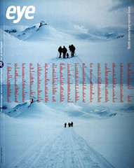
Winter 2000
Self-propelled, self-made
Big books give KesselsKramer and Fuel an instant air of authority.
Self-propelled
KesselsKramer was founded in 1996 by Erik Kessels and Johan Kramer. Kramer was originally a copywriter while Kessels was an art director. In the space of five years their agency has grown from a team of two to approximately 25. Three years after its start it was named by Campaign magazine as one of the twelve best agencies in the world.
The success of KesselsKramer doesn’t rest on their ability to blur the lines between promotion and self-promotion. It lies in their ability to get away with it. The imagination and wit they have brought to their work for the Hans Brinker Budget Hotel, Ben mobile phones, Bol.com and Channel 5 oozes charm. But what is remarkable about the agency is their extensive use of the book format.
With designers Thonik ® they have created 50 imaginary publications to sell themselves as a brand consultancy and eulogise past campaigns. And they also envisage publishing projects such as their Do books, which are a freewheeling manifesto of ideas. The turnover of work and their talent for self-publicity make old masters like Jeff Koons and Andy Warhol seem like cloistered nuns. Their complete lack of preciousness about their work is revealed in the sheer volume of product they have put out. And as much as anything else, their hyperactivity is also a reflection of KesselsKramer’s speed of thought.
It’s their obsessive interrogation of the concept of branding, sometimes incisive, occasionally daft, which builds into their work a degree of self-reflection. In their fake book on Brand Reincarnation they suggest: “the most important part of branding in the future is change. That will be the only constant factor. Change. Allow yourself to change.” The way KesselsKramer immerse themselves in the flux of digital era communications is a factor in how we perceive their self-promotion. They may be incorrigible self-publicists. But they are not self-important.
(J. O’R.)
Self-made
The blurb on the back of Fuel’s new book asserts “Fuel 3000 is a history of the future that questions its own authority.” It also says that the book is an “anatomy of contemporary obsessions.” (Fuel Three Thousand by Miles Murray Sorrell (Fuel). Text by Shannan Peckham. Lawrence King, 2000.) But perhaps, after ten years of practice, Fuel Three Thousand is a design group’s mid-life crisis. Businessmen or Artists?
The portraits of the Fuel members suggests that this is a design group who are as hard as nails. As Shannan Peckham claims at one point: “This is work dressed as play, a pack of wolves in sheep’s clothing.” Designers, lock up your chickens. Likewise, the “default” typography throughout the book signals we have entered the hardcore world of undesign, where ugly is the new classy. Sometimes this attitude delivers the goods. The aphorism: “memory is the retrieval of something that has been buried long enough to be recognisable again” turns the office stationary of the Post-It note into an affective artefact of time.
But if Fuel Three Thousand declares itself a book about memory and history, it is really a book about Fuel’s self-image and self-identity. While KesselsKramer and Experimental Jetset make no distinction between self expression and commercial work, Fuel appear to have a collective identity crisis. Four spreads towards the end of the book use the device – used memorably by artist Christian Boltanski – of captioning a series of portraits of different people with the name of one of the three partners: Peter Miles, Damon Murray, Stephen Sorrell. The following page is an image of three piles of leather-bound books in an opulent library. (Just why do books remain the sign of seriousness?) In their desire to stake out the philosophical uplands, Fuel have abandoned the disposability of copy: instead we are presented with the tenuousness of bad poetry. The text is ultimately patronising both in the indulgence it demands from the reader, and in its lecturing tone. Whatever its intention, making readers feel stupid is not in the self-promotion handbook.
Fuel Three Thousand may have been intended as a meditation on time and a bit of upmarket self-promotion. But its fascination is as a case study in anxiety. One of the most effective images pictures a gleaming camera with a mirrored surface (made by Andrew Stafford) opposite the split phrase: “The mirror is an eye that doesn’t see the things it looks at.” Funny. But what Fuel see when they look in the mirror can only be guessed at. (J. O’R.)
John O’Reilly, writer, London.
First published in Eye no. 38 vol. 10 2000
Eye is the world’s most beautiful and collectable graphic design journal, published quarterly for professional designers, students and anyone interested in critical, informed writing about graphic design and visual culture. It is available from all good design bookshops and online at the Eye shop, where you can buy subscriptions and single issues.

