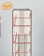
Autumn 2010
Slow print
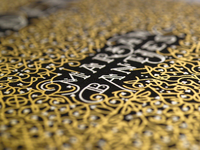
Allow plenty of time to read Marian Bantjes’ highly personal book debut.
There are plenty of people who would be happy to buy a monograph about the work of Marian Bantjes. In the first six or seven years of her relatively late-blooming career as a designer-illustrator-typographer (see Reputations, Eye 72) she has made enough original work for several lifetimes: collaborations with illustrious designers; editorial illustrations; pro bono posters; a celebrated typeface; lettering for famous brands.
I Wonder is not a monograph but, in Bantjes’ words, ‘a book of ideas’, a generous collection of essays lovingly typeset, illustrated, laid out and produced in a manner that resists a quick glance, a skim read or any easy generalisation or summary. This is ‘slow print’, in which Bantjes’ mind-bogglingly detailed type and lettering forces the reader to spend time with this elaborate yet welcoming book.
In addition to Bantjes’ own custom fonts, hand-lettering and titles made from leaves, pasta, granola, etc, there are typefaces by Henrik Kubel (who also lent advice to Bantjes), Xavier Dupré, Peter Bilak, Alejandro Paul and many other stars of type design.
The roots of such a publication may lie in the expressive graphics of the 1990s and in the experimental, postmodern constructions of type and image (and type as image) that were thought to have lost impetus by the end of the twentieth century.
The graphic design firmament is still full of ‘authored’ work in which the designer has little to say, or where the writing doesn’t match the typographic ambitions – you often feel that the content is a first draft, neglected while the author gets on with the more important business of styling it up. I Wonder is undeniably obsessively stylish but its contents are by turn informed, witty and, in the case of the chapters about ‘Memory’, movingly personal. There is also a ‘love letter’ encrypted in a pattern-making code font (mb-cipher) for the essay on ‘Secrets’.
Many of these essays began life on the blog Speak Up, so in some respects have already been drafted and road-tested on her reading public. Bantjes explains that while she had ‘considered them nearly finished, I realised that when I imagined them in print, they were not nearly ready […] There’s no doubt in my mind that the Web and the printed page are two different places that afford different styles in writing and presentation.’
Yet there is a level of personal disclosure (not to mention some trenchant cursing) that you don’t necessarily associate with such elaborately decorated manuscripts. Two chapters deal with memory and the aftermath of her mother’s death in 2006. One is about sorting out family photograph albums – does one choose the faded colour prints or the more ‘true’ negatives? – while the other portrays ‘Mum’s Brains’, a notepad in which June Bantjes documented recipes, messages, pets and people.
But though Bantjes considers the voice of her book to be ‘older, wiser and a little less gum-cracking than before’, there is a bracing mix of tomboy fun and gentle warmth that springs from each gilded page.
First published in Eye no. 77 vol. 20.
Eye is the world’s most beautiful and collectable graphic design journal, published quarterly for professional designers, students and anyone interested in critical, informed writing about graphic design and visual culture. It is available from all good design bookshops and online at the Eye shop, where you can buy subscriptions, back issues and single copies of the latest issue. You can also browse visual samples of recent issues at Eye before You Buy.