Autumn 1997
Sound, code, image
Postwar composers, such as Cage, Cardew and Crumb, have left an exuberant legacy of seductive graphic scores that still puzzle and fascinate the artists and musicians of today.
Score-writing is a powerful form of visual communication that reaches across the barriers of language, space and time, writes John L. Walters. The mark-making of western musical notation has an intrinsic aesthetic appeal generated by elements that are simpler – more primeval perhaps – than the Roman alphabet: a rhythmic procession of thick and thin lines, open and closed ellipses, Arabic numerals, commands and ornaments scattered along a rigid grid. A score assumes shared knowledge, a body of skilled expertise – it is a diagram, a recipe, a route-map and an exhortation to perform.
Yet something in the design of a score reaches beyond the private codes of a trained musician. Whether composers write conventionally functional scores, play visual tricks (the staves of a ballad twisted into a heart shape or the face of a loved one traced in black and white piano notation) or scatter circles and wavy lines across their score paper, they are translating non-visual ideas into visual codes. The craft involved in preparing scores requires a link between ear, eye and hand.
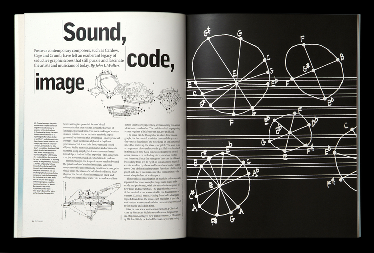
The stave can be thought of as a two-dimensional graph, the horizontal x-axis for time and the y-axis – the vertical location of the note-head on the horizontal lines that make up the stave – for pitch. The score is an arrangement of several staves in parallel, synchronised in time: each note has a time co-ordinate plus several other parameters, including pitch, duration, timbre and intensity. Since the passage of time can be followed by reading from left to right, so simultaneous musical events are directly above and beneath each other in the score. One of the most important functions of this coded graph is to keep musicians silent at certain times – the musical equivalent of white space.
The graphical organisation of music in this way made it possible for more complex, large-scale music to be made and performed, with the attendant emergence of new roles and hierarchies. The graphic effectiveness of the musical score was central to the development of western Classical music. Playing from individual parts copied down from the score, each musician is part of a vast system whose aural architecture can be appreciated as the music unfolds in time.
Give or take a few written instructions, a Classical score by Mozart or Mahler uses the same language as, say, Stephen Montague’s new piano concerto, a film score by Michael Gibbs or Rachel Portman, say, or the string arrangements Jocelyn Pook wrote for The Stranglers’ anniversary gig at the Albert Hall. As an international language of signs, conventional notation is hard to beat. Yet for a couple of decades, from the 1950s to the early 1970s, composers questioned every convention to produce an extravagant body of exuberant, ornate and sometimes totally baffling “graphic scores”.
Cage infects the art schools
The first rumblings of the graphic explosion that was to peak in the 1960s were in early twentieth-century scores that incorporated percussion. Non-pitched instruments require only single-line staves, so Edgard Varèse’s Ionisation (1931), scored for percussion, looks as graphically stark and brutal as the music sounds. This century’s fascination for non-pitched noise – continued in alternative music to the present day – was predicted by the Futurist activist Luigi Russolo, whose written music for his “intonarumori” noise instruments (1916) has similarities with experimental scores of the 1960s.
John Cage was known initially as a “percussion composer”, who gained a reputation in the 1930s for his modern dance scores. His simplest pieces combine graphic directness (he had worked for architect Erno Goldfinger) with a decorative charm that may be inspired by Erik Satie, whose hand-written scores contained decorative illustrations and an imaginative, eccentric use of lettering and white space. Cage’s need for a low-cost percussion unit that would fit into a small performance space led to his invention of the “prepared piano”, where the strings are damped or otherwise modified by the addition of metal screws, erasers and small objects carefully listed on the opening page of the score. With this system, written music takes a leap into the dark. It is impossible to read a prepared piano work such as Sonatas and Interludes (1946-48) and deduce the sound: when the piece is played on a correctly prepared instrument it produces an extraordinary sequence of percussive sounds, vaguely oriental and quite beautiful.
Here, the written music is a series of instructions for a sequence of events in time. Later scores by Cage, or others spurred on by his example, take this idea to the point where there is little correlation between what one sees and hears. The “score” to Ligeti’s Poème Symphonique (1962), intended as a Fluxus event, is merely a command to wind up 100 metronomes and set them going.
By the 1950s graphic scores were becoming one of the dominant forces in “serious” music, with radical, visually stunning work by Earle Brown, La Monte Young, Christian Wolff and the energetic British composer Cornelius Cardew, who absorbed much by assisting (at different times) both Cage and Karlheinz Stockhausen. Earle Brown’s December 1952 is one of the more celebrated graphic scores – an ambiguous, Mondrian-like construction that has resulted in quite different performances. Yet the visual aesthetic of this work evokes an imagined music in the observer’s mind, an invisible music perhaps more ascetic, beautiful and formally Modern than any earthly ensemble could produce with real instruments.
For a time, graphic notation was the Big Idea of mainstream contemporary music: in 1959 at Darmstadt (the great annual meeting place of the European avant-garde) Stockhausen lectured on “Musik und Graphik”, where he spoke of the “emancipation of the graphic from the music element”. Conversely, the late 1950s and 1960s saw an emerging interest in sound and performance from visual artists: Jean Tinguely’s jangling “metaméchanique” sculptures; Bruce Lacey’s events and films; and the Happenings of Allan Kaprow, who had studied with Cage at an impressionable age. Composers collaborated with visual artists, or exploited their own graphic skills: Toru Takemitsu worked with a graphic designer for Le Son-Calligraphie no. 1 (31 bars for string quartet) in 1958, as did Cathy Berberian for Stripsody (1966); Louis Andriessen collaborated with Dick Elffers on a Kleur Partituur [colour score] in 1967. Tom Phillips produced work that could be performed, or exhibited, or both. Some scores began to look more like poetry: Stockhausen’s From The Seven Days (1968) is a slim booklet of written instructions. The entire score for Intensity, for ensemble, comprises the words:
play single sounds / with such dedication / until you feel the warmth / that radiates from you
play on and sustain it / as long as you can
This blurring of boundaries between visual, written and musical languages had many long-term effects in the postmodern culture of later decades, from the British art-school influence on Anglo-American pop and rock to the performance art of the 1970s and 1980s. Experimental composers, such as Philip Glass and Michael Nyman, who rejected graphic excesses for more functional notation (together with the Modernist aesthetic) still found a warmer reception performing in art galleries and contemporary dance venues than in conventional concert halls and music colleges. For a time, composer-lecturers such as Gavin Bryars, Michael Parsons and Nyman found employment in visual art departments. Parsons has written that “a close study of the visual arts can bring renewed awareness of the medium of sound and of the autonomous character of its formal and relational properties”. The audible legacy of the art school experimentalists (whose most famous recruit is Brian Eno) can be heard in installations and CDs by soundsmiths with no traditional musical training – people who can sculpt recorded sound in much the same way that visual artists work with materials.
The big image
Graphic scores raise some thorny issues: does the composer have a duty to specify every note, dynamic, articulation and then demand an equivalent degree of accuracy and fidelity in the resulting performance? Should the composer delegate certain roles to specialists (conductors, drummers, say) who bring new knowledge and traditions to bear upon the work? Should they merely set musical actions in progress and sit back to hear the result? These questions address issues of autocratic power versus democratic organisation and individual creative expression: the political stirrings of the 1960s were not lost on contemporary composers, who wrestled with such implications in the music they made. Cornelius Cardew wrote: “Graphic notation is a perfectly justifiable expansion of normal notation in cases where the composer has an imprecise conception . . . his conception maybe quite precise as to its overall characteristics but imprecise as to the minutiae. For example, if a composer wants a string orchestra to sound like a shower of sparks, he can interrupt his five-line staves and scatter a host of dots in the relevant spaces, give a rough estimate of the proportion of plucked notes to harmonics, and let the players get on with it.”
The most prolific era for graphic scores was celebrated by the now out-of-print Notations (1969) edited by Cage and Alison Knowles, which showed manuscripts by Louis Andriessen, Franco Donatoni, Ton de Leeuw, Dick Higgins, Anestis Logothetis, Frederic Rzewski and James Tenney alongside minimal, text-based scraps by Mauricio Kagel, Allan Kaprow and Yoko Ono, conventional sketch scores by Leonard Bernstein and Gunther Schuller and a decorated lyric sheet for ‘The Word’ by The Beatles. Notations, which also contains composers’ responses to a questionnaire about the subject matter, is a typographical curiosity: the text was edited and set using chance operations, so that letter size, weight and font change in mid-word.
Perhaps the greatest graphic score to emerge from this time was Cardew’s Treatise (1963-67) a monumental work that continues to inspire musicians – improvisers, electronic soundsmiths, even DJs – to turn his inscrutable marks into sound. Treatise is beautifully made, baffling and 193 pages long. “The whole piece is a critique of notation,” says John Tilbury, a colleague of Cardew’s in the legendary group AMM. “The most profound aspect of the piece . . . is the way it makes people think. It’s a very precise score, but sometimes precision in notation results in an imprecise sound.”
Roberto Gerhard wrote: “Notation’s ambiguities are its saving grace. Fundamentally, notation is a serviceable device for coping with imponderables. Precision is never of the essence in creative work. Subliminal man (the real creative boss) gets along famously with material of such low definition that any self-respecting computer would have to reject it as unprogrammable.”
Composer John Woolrich comments: “There is no clear dividing line between standard notation and graphic scores – there are always things in notation that are indeterminate – you might specify the notes, but not the instrument or the acoustic, for example.
“Unless you’re Brian Ferneyhough (and you think you can notate everything), notation is to do with hints rather than absolute instruction. You are trying to convey the big image.”
Treatise, which is purely graphic, containing no clues or explanations for the performer(s), may have marked the end of an era. In the 1970s the graphic score activity subsided and Cardew made several dramatic, politically inspired repudiations of the notion, and began writing simple, Maoist songs “for the workers”. Cage moved further into the visual realm, discovering a new vocation in fine art print-making, while his scores became more graphically simple. And many composers rejected graphic scores along with other youthful excesses such as taking drugs or wearing flowered shirts.
Phonographic design
Yet the visual excitement remains seductive for later generations of composers and performers, some of whom are prepared to interpret the work with far more enthusiasm and creativity than their counterparts of the previous generation. The Brood, a loose ensemble based around Susan Stenger’s Band of Susans, Scanner and Sonic Boom, with members of Wire, Elastica and the Scapegoats, recently performed scores by Cage, Wolff and Phil Niblock at London’s South Bank. “We rehearsed quite a lot to sort out the language,” said the Scapegoats’ Terry Edwards. “It helped a lot that Susan had worked with the composers in the past.”
Neil Ardley’s Charade for the Bard (1974) used a simple graphic language for a practical purpose – to organise a piece for jazz improvisers at very short notice. John White’s machine pieces (including the notorious Drinking and Hooting Machine (1969), which requires the musicians to drink each other under the table) are still published and performed while George Crumb’s graphic, spacious Ancient Voices of Children (1970) has acquired the status of a contemporary classic. The work’s large-format score looks and sounds equally rich, strange and beautiful.
“The look of the score is not irrelevant,” says Howard Skempton, whose hand-drawn scores are famous for their stripped-down elegance. “A score has a life of its own: its look has a lot to do with the power of the piece. When I look at a Classical score (Mozart, Beethoven and so on) you can’t actually see at a glance why it works. If you look at a Modernist postwar score by Boulez or Ligeti, say, you get a much clearer idea of what it sounds like. Graphic scores turn this around.
“It might have something to do with the Constructivist aesthetic of the 1950s – the scores by Bussotti and Stockhausen look stunning in their own right. And when I look at Morton Feldman pieces from that time I get the sort of pleasure I get from looking at a painting – I can get a feel of the piece . . . it’s only one small step from that to playing around with notation. Bussotti is the one who made the tail wag the dog.”
“I don’t think graphic scoring is a dead issue,” says composer Christopher Fox. “There’s much to be done there, but it’s deeply unfashionable among musical establishment . . . as new music got more ‘professional’, London ensembles just wanted to have dots they could play and get done with in a three-hour rehearsal.” Christopher Fox participated in many performances of graphic notation outside London with like-minded friends who were interested in playing Cardew and Wolff. “By the end,” he says, “Stevie Wishart couldn’t see any reason for having anything on the music stand.”
Practical matters
The orchestral score, graphical or otherwise, is a remarkably efficient way of organising and producing a large quantity and variety of musical events in a short time. This fact is not lost on Hollywood producers and music supervisors, who still prefer to commission a film score that can be completed in days rather than months. Film and pop scores are rarely published and sometimes discarded, much to the chagrin of film music record companies attempting to re-record classic film soundtracks.
In the 1960s, Kenneth Payne, a music educator and composer, developed Tonescript, a graphical system of colours, squiggles and shapes that would help listeners understand pieces from the Classical repertoire. A descriptive score that relates to an electronic piece has to make up some new rules. The “diffusion score” to Trevor Wishart’s Vox 5 (1979-86) is really a conductor’s part for the sound engineer who mans the mixing desk and multi-speaker sound system through which the tape is diffused. But this is not a score in the Classical sense. As in most kinds of tape-based work, any need for a conventional score has been eclipsed by the recording.
Recent music by Tom Phillips brings some of the issues of graphic notation full circle. Six of Hearts (1991), commissioned for Woolrich’s Composers Ensemble, comprises six songs framed by thick staves. Further comments caution musicians against using electronics (in VI) or request that they play a “favourite operatic aria . . . transposed to D maj or min” (II). “Most graphic scores I know that are any good are very precise,” says Phillips. “They don’t leave you any more freedom than conventional pieces.”
For many composers the time for graphic scores has come and gone. In several different respects, new technology has overshadowed traditional methods. Score-writing programs such as Sibelius and Finale are popular with publishers, professional composers and students alike: the output looks much like professional engraving – a revelation to some older composers. And in many areas of commercial, functional and creative music, the definitive original work is not the score, but the recording: a tape or a sound file saved to disk. The printed output of a computer editing system (such as ProTools) makes an immediate graphic impression of signal amplitude against time – on screen, the dynamics of a recording (whether Stravinsky or Prince) have a clear outline that helps the mastering engineer find his way through a long piece.
Geoff Smith, an academically trained composer (and an authority on John Cage) sees written scores as no more than a means to an end – that can be discarded once the music has been committed to tape. In the recording studio, written music may have no more significance than a track sheet or cue sheet used by non-musicians. At a recent exhibition of graphic scores at the Workfortheeyetodo gallery in London, a contemporary dance “score” by Bruce Gilbert was a sketch, a blueprint for the recording process with comments, shapes and shadings that organised the composer’s creative thoughts within a timeline specified by the choreographer. As a score, it spoke in a hybrid language of Gilbert’s making.
Graphic scores have increasing importance in education. Tom Deveson, advisory teacher for music at Southwark Education in London, says: “Graphic scores manage the trick of being free, and fun, yet precise. A class of kids of mixed abilities soon agree what a red line or a green squiggle means, and by the end of the lesson they have made a piece out of it. Children love to sort out the rules and then follow them conscientiously.”
“Cardew said something interesting,” recalls composer Howard Skempton. “Graphic scores are designed for people who have avoided a musical education but somehow acquired a visual education.”
Fading manuscripts
Frank Zappa warned against the fetishisation of musical scores by pointing out that “you don’t eat the recipe”. In some senses, the postwar avant-garde’s obsession with graphic notation is a critical commentary on the redundant conventions of European art music. Yet, although such graphic excesses may have little lasting impact on “serious” music itself – Cardew repudiated such “squiggly lines” as bourgeois nonsense before his death in 1981 – they enrich the culture, and continue to reverberate in electronic studios, where a few scribbles can be more expressive, or accurate, than conventional note-heads, sharps and flats. The functional use of graphic scores as an aid to understanding (in education or entertainment) or as a way of communication between people without formal musical training (DJs and engineers, for example) is still in its infancy.
Graphic scores have an aesthetic immediacy that music can never have – the instant visuality of a well-drawn manuscript liberates the composition from the tyranny of time. In the digital domain, music has acquired some visual attributes. At one extreme we have the short, retriggered samples from which much commercial music is constructed; at the other, the on-screen analysis provided by a sound editing program such as ProTools, which can zoom out from the dynamic shape of a symphony, a pop album or a drum’n’bass opus to turn 80 minutes of music into a single image.
Like the “Eye music” of sixteenth-century Italian Mannerists, many graphic scores are now relics of a vanished era, fading manuscripts with little meaning to present-day musicians. But the seductive complexity of work by Cardew and Bussotti continues to fascinate both musicians and non-musicians, and recent work by Phillips and Skempton shows the resilience of such ideas. Each score is a chest of treasures that can be unlocked by performers and interpreters not yet born, a code or puzzle to be solved in time.
John L. Walters, composer, Unknown Public editor and co-founder.
First published in Eye no. 26 vol. 7, 1997
Eye is the world’s most beautiful and collectable graphic design journal, published quarterly for professional designers, students and anyone interested in critical, informed writing about graphic design and visual culture. It is available from all good design bookshops and online at the Eye shop, where you can buy subscriptions, back issues and single copies of the latest issue. You can also browse visual samples of recent issues at Eye before You Buy.