
Autumn 2012
Stanley Morison: Changing the Times
In 1929 Monotype’s typographical adviser, Stanley Morison, published an article critical of the design of The Times. He was invited to submit ideas, and this led to a redesign of the paper in 1932, for which he developed Times New Roman. Here he recounts the process.
This is an edited extract of an essay by Stanley Morison first published in the book Printing The Times, 1785-1953: Some Account of the Means of Production and Changes of Dress of the Newspaper. London: Printing House Square, 1953.
Newspapers differ widely from other printed matter and from each other, The Times widely from them all. It is the essence of its nature to be used for reading, re-reading, and for reference. Without the revisions of 1909-22 The Times would appear to the present generation as an enlarged parish magazine.
No more successful solution of the problem of type was possible in 1909 or 1929. The question of how to design a newspaper sharply raises the fundamental question of the relation between a newspaper such as ours and such a civilisation as ours – too serious and far-reaching a matter to be debated at the tail of an essay on the typography of one newspaper. But at least it is clear that it is a protection against fanaticism and fashion for The Times to place itself outside the stream of typographical experiment and novelty which is so absolutely vital to advertising and other exploitations of the invention of printing.
[…]
Printing House Square had two alternatives: to continue with its early Victorian face, or to adopt a new face designed in view of the newspaper’s individual needs.
[…]
The problem at this time was one of balancing the factors of legibility and economy in the Editor’s sense and mechanical efficiency in the Manager’s; while making every effort to increase the pleasure with which the reader turned to the paper, and the ease with which he read its pages. The whole problem was to reconstitute the columns of The Times in their complete range from news and opinion to entertainment and finance; also the classified advertisements, personal and institutional, for which a bold type was, in many departments, required, as for instance, for the proper names in the Birth, Marriage and Death announcements. In other words, a specific design was required in 5¼, 7 or 7½, and 9-point sizes organised to fulfil the need of a single newspaper. The problem was simpler than it would have been if the customs and needs of other newspapers had had to be considered.
By the spring of 1931 the design for the text type was completed and sample characters in 9-point cut by the Monotype Corporation at their works in Salfords, Surrey. These proving satisfactory, the completion of the roman fount was arranged for, with a rationalistic italic that owed nothing to the tradition of the sixteenth or seventeenth centuries. It has, indeed, more in common with the eighteenth century. The experiments having justified themselves, it was decided to take in hand the designing of a completely new set of headline founts of capitals in several weights and widths, together with a range of numerals and fractions for use in the City pages. It is unnecessary, in view of their exhibition in current numbers of The Times, to list here the varieties of headline letters derived from the capitals of the parent roman, i.e., that made for 9-point, the largest size used for the composition of leading articles and other important matters. […] The enterprise had assumed greater dimensions than had been forecast, though previous calculations left no doubt that a thorough revision, if decided upon, might spare little of the material in contemporary use. The success of the new roman made it clear that the re-designing of every typographical constituent of The Times was fitting and desirable.
[…]
On October 3, 1932, The Times was completely re-dressed in a set of types ranging as to text from 5½ to 9-point designed for use in its own columns to serve its special purposes. In the same week the Literary Supplement, the Educational Supplement, the Trade and Engineering Supplement and the Weekly Edition were entirely redesigned, preserving the new family likeness with the parent paper. All the machines that were equipped with the rotary wood-letter for the news-bills, then permitted, were supplied with new sets of letters also designed in the office. The complete range of the note-paper and memorandum forms was redesigned; the labels were not forgotten.
The designing of a new body type for use in a newspaper is not an easy matter. The preparation of such a design for mechanical composition involves a multitude of calculations forming the basis of the patterns that are used for the manufacture of the punches from which the matrices, in turn employed on the casting machines, are driven. It is the punch, therefore, that governs the impression finally made on the sheet that comes before the reader. Above 14,750 punches, including those corrected (a large number), were cut by the Monotype Corporation for the installation in Printing House Square. Many of these punches needed to be duplicated for the Linotype and Intertype installations.
Their cutting was a triumph for the mechanism invented by Linn Boyd Benton of Milwaukee. In 1885 he adapted the pantograph principle to the mechanical cutting of the punches used for striking the matrices from which the type is cast. This invention lies at the basis of all mechanical composition, which requires at some stage the pouring of metal into a single matrix or line of matrices. The provision of matrices in quantity requires the provision of punches that reproduce exactly the pattern laid down. By means of the punch-cutting machine the Monotype and Linotype systems provide themselves with punches cut in a fraction of the time required by the hand-engraver. The total number of punches required for the production of the first issue of The Times in the new style was one far beyond the capacity of all the hand-engravers of the world, combined. Many were cut twice owing to imperfection, errors, or second thought, in design. The varieties of design in the founts, text and headline, used in the paper of that date, amounted to 38. It will be seen, therefore, that the enterprise, so far, was of some magnitude.
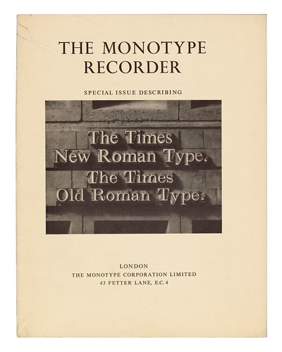
A special issue of The Monotype Recorder promoting the recently unveiled Times New Roman, 1933. This cover photograph, probably conceived by Beatrice Warde, is the likely cause of the misconception that there was a typeface called ‘Times Old Roman’ prior to October 1932. Before that year’s redesign The Times had used a version of Monotype Modern, which was adapted from a typeface created by the Edinburgh foundry Miller & Richards.
But the most important difference in design between The Times of October 1 and October 3, 1932, does not lie in the new roman title, or in the new roman body type. It lies in the headlines. […] The 1909-22 revision of the headings was overdue because the paper had for some time accepted advertisements using such large display founts that the news became a mere incidental mucilage binding one display to another. A relation, not easily defined but very real, exists between the types in the advertising and the types in the headings. In other words, the important news items must not be headed with a type below a certain size; in fact, not below a size which would be regarded as conspicuously large by the regular reader of a generation ago.
The only contrast occurred, as has been said, in the bill page when there was some attempt to introduce a contrast at the heads of columns by alternating the heavy and narrow with light and wide settings. It was upon this basis that a range of new headlines was planned. It consisted of six designs, light, heavy and extra-heavy, all in narrow and wide dimensions of letter, and all in a range which ran, in some cases, from 7-point to 48-point.
But, it is important to observe, the new ‘light wide titling’ (as it is called, or No. 329 in the Monotype list), when compared with the old, will be found appreciably heavier. The other new founts are heavier still. Throughout the paper there is, in fact, a contrast between the ‘colour’ of the text and the ‘colour’ of the headlining that, if it has any precedent in the trade, recalls the Sunday newspapers of the eighteen-forties. But the design of the headlines has nothing in common with those of the old News of the World. The headlines of The Times are, in every case, heavier versions of the capitals belonging to the text founts. Thus, the whole range of founts, text and headline, used on October 3, 1932, bears a family likeness which guarantees harmony but, owing to the variation in width and weight, avoids monotony.
The gain to the whole paper, including the classified advertisements, is considerable. No subscriber to any newspaper reads his choice consecutively ‘from cover to cover.’ He selects, and he selects on the invitation of the headline, not merely at the top of the column but of every item in every position. It follows that the greatest gain in point of readability of the new style over the old lies in the boldness of the headlines given to the small dispatches themselves composed in a text type bolder than had been used in the previous ‘dress.’
[…]
That the body and headline founts of 1932 are well designed for the specific purposes of The Times is proved by the fact that no change has been made in them since they were adopted. That the parent design is not without merits of general application is proved by the fact that the text fount first used twenty-one years ago in The Times is now to be seen in newspapers, books, magazines, &c., printed in Britain, the Commonwealth, on the Continent of Europe and in the United States. It is no exaggeration to say that, having come of age, ‘The Times New Roman’ has established itself as a major contribution to the typography of the world.
[…]
The major typographical achievement since 1932 was due to the now familiar incentive: space needed to be exploited to the uttermost. A cutting of the 4¾-point of The Times New Roman design, nicknamed ‘Claritas,’ was brought into commission on June 18, 1951, and is still to be seen. It was employed for the front page, for the back-page estate advertisements, for the Stock Exchange prices, and for certain news items such as ecclesiastical and university intelligence and sports results. The size was at once recognised as a triumph of type-founding. So small a size had not hitherto been part of the typographical stock of the trade. A legible 4¾-point size apt for mechanical composition at speed is a permanent contribution to the art. And this must be claimed, even when, as is the case, the comfort of older readers of the paper requires that, as soon as possible, the larger size (5¼-point) is restored. A start has been made. The cutting of this ‘Claritas’ size remains as the final absolute test of the principles upon which The Times New Roman had originally been engraved twenty years before. As its adoption for the classified pages of the Manchester Guardian and the Evening News (London) proves, the ‘Claritas’ size, somewhat rounder than the 7, 7½ and 9-point used for the main text of The Times, is a design that proves the technical capacity of British industrial typography to be the highest in the world. Thus, after twenty-one years of use of the new roman it had designed for itself The Times had made no change but that of size.
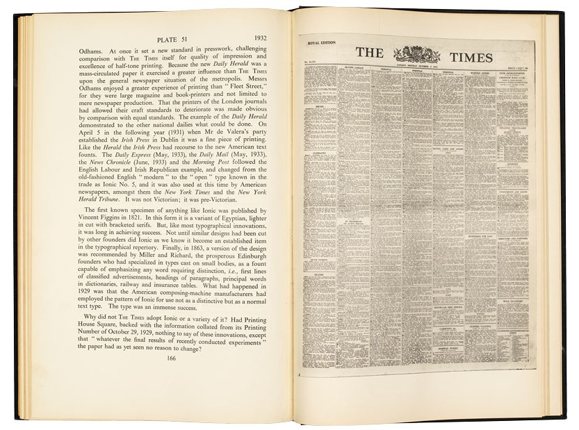
Top: Printing The Times, 1785-1953, published by The Times in 1953. On the right is a reproduction of the front page of The Times from Monday 3 October 1932, the day that the newspaper switched to using Times New Roman. Note that the front page features no news – only classified advertisements.
First published in Eye no. 84 vol. 21 2012
Eye is the world’s most beautiful and collectable graphic design journal, published quarterly for professional designers, students and anyone interested in critical, informed writing about graphic design and visual culture. It is available from all good design bookshops and online at the Eye shop, where you can buy subscriptions, back issues and single copies of the latest issue. You can see what Eye 84 looks like at Eye before You Buy on Vimeo.