Autumn 2008
Strikethrough
The act of erasure, or striking out, can add new, unintended meanings to the images and information that lie below

Following the Islamic Revolution in 1979, the Shah of Iran fled the country over which he had ruled for almost 40 years. He may have been a favourite of Washington but his leadership had been closer in character to Stalin’s Kremlin. Secret imprisonment and extensive torture networks had secured his hold on the country, while courtiers pampered his ego with an excessive ‘cult of personality’. Before the revolution, the Shah’s portrait graced every public building and opened every cinema programme. Once the ancien régime had been swept away, his image could be thrown onto the scrapheap of history. On the country’s banknotes, the regal watermark was overwritten with calligraphic letters identifying this ‘new’ note as the product of the Islamic Republic of Iran, and the face of a man who had once crowned himself king of kings was overprinted with a beautiful arabesque design. Thin tendrils form a precise cage over his head and shoulders. Their abstract rhythms meet the prohibition on the creation of images of living creatures observed by devout Muslims. Overprinted by local printers in Tehran, the bills represent the change of ideologies from the Shah’s narcissism to Ayatollah Khomeini’s iconophobia. But overprinting is more than an act of obliteration: the fact that a new image is laid over the old is central to its power.
As an effect, overprinting has drawn the attention of many designers in recent years. Karel Martens’ later work may well be a determining influence here. As his long career as a book designer for Dutch publishers made very clear, Martens turned the material qualities of print – paper textures and print effects – into meaning-making devices in their own right. One cannot help thinking that the appeal of a technique that seems to stress the nature of materials is that it allows designers to go against the grain of the digital age. Unlike the dematerialisation effected by the screen, overprinting stresses the textures of paper and ink.
An example of Karl Martens’s strikethrough work as seen in Printed Matter / Drukwerk (2nd edition, Hyphen Press, 2011).
Top: 1000-rial banknote, Iran, 1979. The decorative overprinting of the Shah’s image conformed to a religious prohibition and symbolised the change of ideologies.

A good example is Daniel Eatock’s contribution to a 2007 exhibition of posters mounted concurrently by Jérôme Saint-Loubert Bié in two galleries in Paris. The designs – by thirteen designers – were to function as both advertisement and exhibit. Saint-Loubert Bié’s project aimed to combine deconstruction with compression: the usual paraphernalia of gallery promotion was to be seen in a new light. Eatock’s response was to combine the designs of all the exhibitors in a single composite image. A dense coat of ink resulted, with only occasional letters and shapes surfacing from the gloom (see link on right). The poster is an enigma that at once invites and refuses reading.
Writing over history
To overprint is not, as both Eatock’s poster and the Iranian banknote demonstrate, to remove. It both obscures and adds. This idea was made clear by philosopher Jacques Derrida in his concept of writing ‘sous rature’ (under erasure). This was Heidegger’s term for striking a line through a word rather than rubbing it out, so that both the word and its negation are visible to the reader. For Derrida, all writing is marked by a kind of lack; for written words invariably signify the absence of the thing they describe. Words and things are not one and the same. Yet at the same time words are necessary to describe those things. This characteristic of representation, however, becomes apparent when a graphic device is employed. To score through a word or to overprint an image is to represent it sous rature. The removal of the Shah of Iran is made apparent by the coincidence of his image and its crossing out.
History is littered with many such gestures. Some have a terrible poignancy. David King, designer and writer on the uses and abuses of photography in the Soviet Union, has a copy of Ten Years of Uzbekistan (1934), designed by the Constructivists Alexander Rodchenko and Vavara Stepanova, a lavish celebration of ‘achievement’ produced at a time of starvation. In 1984 King found another, far more disturbing copy of the book in Rodchenko’s own studio, in which the portraits of minor Soviet leaders had been obscured with black ink. This was no one-off: when former high-ranking communists were ‘revealed’ as traitors, it was incumbent on Soviet citizens to destroy their images in the books on their shelves. To possess a depiction of Leon Trotsky, whose books were banned in 1935, or any other purged by Stalin could be taken as a sign of illicit political sympathies. Rodchenko was, it seems, acting according to the brutal rules of Soviet life and death. But he did not cut the pages from his book, nor did he blacken out entire pages. Often, the thick ink does not quite erase the person: the body still remains and, in some instances, traces of the face seem to leak through. This gesture is troubling. It seems to point to knowledge of the fate of the individual. Although effaced, these figures cannot just be written out of history.
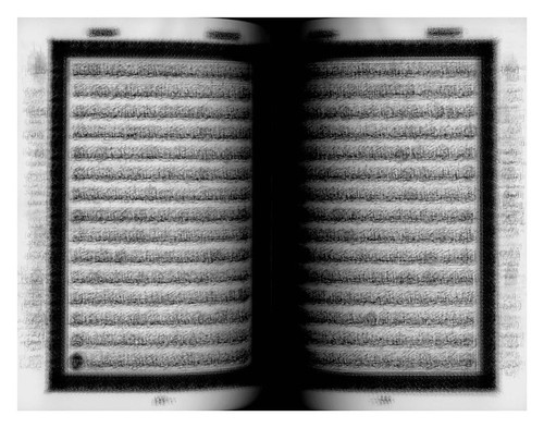
Every…Page of the Holy Quran, 2004, Lambda digital C-print mounted on aluminum, 136 x 170cm. In adopting the technique of overprinting, Idris Khan’s images challenge conventional notions of the photographic ‘instant.’
Putting images and words sous rature would seem to be the privilege of power. After all, history, as the saying goes, is written by victors. But this is not always the case. Putting a word or image sous rature can also be a minor act of protest. When Valerie Plame Wilson, a former CIA agent, attempted to publish her memoirs, she was obliged, by the terms of her contract, to submit the book for official vetting. When the manuscript of Fair Game – widely viewed as an act of retribution by an author who felt that her career at the agency had been unfairly cut short by political machinations – came back from the CIA Publications Review Board, many passages had been blacked out. Taking the view that the material being cut (or, in CIA jargon, ‘redacted’) was already in the public domain, Plame and her editor at Simon and Schuster decided to reproduce these masked passages in the book (published in 2007). ‘We felt,’ wrote the publisher, ‘that the redactions required by the CIA went beyond any reasonable requirements of national security.’ Despite, or perhaps because of, these forced edits, keen-eyed readers seemed to enjoy the detective work that reading the book now entailed.
Joseph Weisberg’s novel An Ordinary Spy, published a couple of months later (Bloomsbury, 2007), uses the same device. Black lines obscure the names and locations of key characters in the text. But this time, nothing is censored: the author simply wanted to produce the frisson of illicit knowledge. Overprinting here operates as a visual code for authenticity: Weisberg’s novel takes on the appearance of a document when it is, of course, a work of fiction.
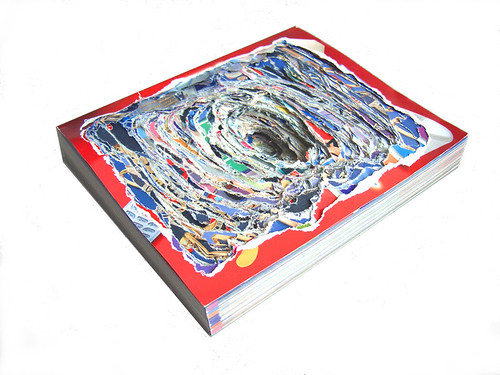
Weisberg’s use of words printed sous rature seems to point to the poetics of overprinting. The technique has been employed by many artists and designers with this aim. In recent years British artist Leo Fitzmaurice has created an aesthetic of what might be called ‘visible absence’. The printed material that clutters our world – the posters, flyers, packaging and catalogues that call for our attention – forms his raw material. In a series of works called You Tried to Tell Me but I Wouldn’t Listen, he inked over the surface of film posters acquired from a video rental shop. With circular shapes left untouched, vivid colours and mysterious textures emerge from what seems like a void, visions of a strange kind of cosmos formed from the images of Hollywood ‘stars’. In this case ‘overprinting’ (though actually produced by hand) draws attention to what remains. Other related artworks produce their poetic effects by a technique of removal. In Craterform, Fitzmaurice subjects an Argos catalogue, the chief selling tool of a British retailer, to a cataclysmic or even eschatological event. The glossy volume seems to have been struck by a meteorite. In this way, the most mundane of commercial objects has been deprived of its purpose to become a sublime product of the forces of ‘nature’.
Last year Fitzmaurice created an installation at the Yorkshire Sculpture Park entitled Sometimes the Things You Touch Come True. By neatly excising all the textual information from supermarket ‘own-brand’ packaging, he created a collection of small-scale architectural models. Laid out as a miniature modernist city (and supplied with the background buzz of radio transmissions to create the impression of an aural landscape), it invites the viewer to reflect on the meaning of absence. Commercial packaging becomes, by inversion, a new world in which the detritus of advertising has been stripped away (somehow making Fitzmaurice the kin of the mayor of São Paulo who banned all outdoor advertising in the Brazilian city in 2006). A shanty town, formed by Fitzmaurice with the textual residues left over from his brand-free utopia, is clearly a substandard space. Unlike all the attempts to expose the penetration of commercial imagery into the fabric of our lives by exaggerating it (the basic technique of ‘subvertising’), Fitzmaurice reveals by removing. These hybrid package-buildings are visible absences.
Craterform, 2005, a defaced Argos catalogue (from the British high street retailer). Leo Fitzmaurice’s work is characterised by ‘visible absence.’
Over and over and over
Idris Khan, a British photographer whose work has made a rapid entry into galleries and museums around the world in the past few years, employs a language that seems to be the precise opposite of erasure: nothing is effaced in his work. Overlaying celebrated sets and sequences of photographs such as Bernd and Hilla Becher’s collections of industrial water towers and gas cylinders and Eadweard Muybridge’s late-nineteenth-century time and motion studies, he synthesises – by blowing up and overprinting – many images into one. In this way, Khan turns hard-edged certainty into soft, spectral images that release uncanny effects absent from his original sources: Muybridge’s Everyman figure comes to seem like Lazarus rising.
Khan’s artworks have stimulated considerable discussion among critics and theorists of photography who have been drawn to the way that he turns the flash of the ‘decisive moment’ into a pulsing, breathing duration. He has not only subjected classic photographs to his technique: books and music scores have drawn his attention too. When Khan lays stave over stave, Chopin’s Nocturnes for the Piano become a frenzied buzz of notes, while Beethoven’s Sonatas appear as brooding blocks in which both the overlaid notation and the white spaces between the staves come to seem as meaningful as the dark constellation of notes. By giving the piece the title Struggling to Hear … After Ludwig van Beethoven’s Sonatas (2005), Khan invokes the composer’s descent into deafness. Notes – laid graphically over one another – produce empty channels fringed by visual buzzing, a strange but compelling visual metaphor for Beethoven’s hearing loss. Here, the technique of sous rature – based on the dynamics of presence and absence – resonates with human tragedy.
One work brings us back to the Iranian banknote. In 2004 Khan reproduced the pages of the Koran as a single image. In an age when representations of Islam and its prophet attract controversy, to rework the words in the most sacred of texts seems like a provocation. In Every … Page of the Holy Quran (2004), the sacred text overwrites itself until it becomes a stippled cloud and the gutter between the pages a black void. Does this action drain the most important of texts – to the faithful – of meaning? Apparently not. Khan has drawn encouraging comments from Muslims. The gap between things and the words that are used to represent them does not exist in a culture that treats its religious inscriptions as the breath of the Prophet. Khan’s image of the Koran requires faith to be read. Its words are not overwritten in the manner of a censor or an iconoclast: they are intensified.
First published in Eye no. 69 vol. 18 2008
Eye is the world’s most beautiful and collectable graphic design journal, published quarterly for professional designers, students and anyone interested in critical, informed writing about graphic design and visual culture. It is available from all good design bookshops and online at the Eye shop, where you can buy subscriptions and single issues.