
Summer 1999
The designer as architect
When Donald Wall made this book about Italian architect Paolo Soleri, he uncannily projected a vision of 1990s typography in its most radical form. By Rick Poynor

When future design historians go looking for precursors to the “new” typography of the 1990s, architecture critic Donald Wall’s extraordinary monograph about the architect Paolo Soleri, published by Praeger in 1971, will require some careful attention. Just to list a few of the book’s most striking typographic features is to recall the mannerisms of some of contemporary design’s more celebrated figures: text blocks that run into the gutter; words reversed out of columns of type, obliterating the text; words that shoot off the edge of the text area and continue mid-letter on the next line; overlapping messages that merge in dense overlays with Soleri’s photos and drawings; a giant Helvetica sentence that rolls on like a juggernaut for nineteen pages; a duplicated passage cancelled with the instruction “VOID THIS PAGE”.
Below and top: Spread and cover of Visionary Cities: the Arcology of Paolo Soleri.
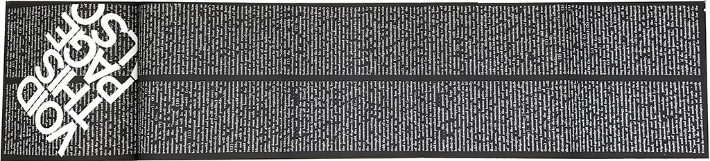
It is routine in the late 1990s for designers to stress the “process” of making their designs. The idea owes much to 1960s artists such as Fluxus, who emphasised the impermanence of performance and used a range of strategies, such as written instructions, to ensure the fluid character of the “work”. An even more specific debt to Fluxus typography and to concrete poetry can be seen in Visionary Cities’ encrusted jigsaw assemblages of words. This marathon feat of rub-down lettering exposes the process of its own making as a structural and theoretical principle. Here is a book that appears to have been freeze-framed in a state of becoming.
Spread from Visionary Cities: the Arcology of Paolo Soleri.

Where Visionary Cities differs markedly from so much recent experimentation is in the way that its manipulations are inseparable from its written content. Wall, a former professor of architectural theory, design and history at Catholic University, Washington DC, gave typographic shape to his own critical ideas, and the book is fully aware of the uniqueness of the project. Recalling El Lissitzky’s famous maxim that “The new book demands the new writer”, the dustjacket blurb describes Wall as “among the first of a new breed of authors”. It continues: “He has the ability to manipulate graphically the writing process so that not only are content and format complementary and mutually elaborative, but each makes the other more convincing, as literature is given visual existence.”
Dustjacket of Visionary Cities: the Arcology of Paolo Soleri.

The “arcology” of the book’s title is a neologism coined by Soleri to describe a fusion of architecture and ecology, in which the built and the living interact in organic harmony. Shortly before its publication, Soleri – born in Turin in 1919 – began work on Arcosanti, an experimental town in the Arizona desert that will house 7,000 people when complete; its construction continues to this day. Visionary Cities is conceived architecturally – some spreads unfold to nearly two metres wide when fully extended – and it requires new routines from readers, who are led (or coerced) into alternative spatial and physical relationships with the page. The textual space of the book is also reconceived.
At one point an essay is interrupted in mid-sentence by a series of shorter texts; it resumes, without announcement, many pages later. Such devices mean that the book can only be read in a non-linear way. It must be deciphered in fragments. It makes its points through repetition and remodulation of what it has already said.
Spread from Visionary Cities: the Arcology of Paolo Soleri.

Visionary Cities, like Soleri’s vision of “chronological destiny”, is often grandiose. Its predominantly black pages are daunting and the architecture itself is not well shown. It confronts the reader with a spectacle so relentless and estranging that it could easily have proved insurmountable to some. No book that cultivates indeterminacy to this degree could be called a masterpiece, but it is certainly a landmark in its synthesis of critical commentary and design.
With thanks to Mirko Ilic.
Rick Poynor, writer, Eye founder, London
First published in Eye no. 32 vol. 8, 1999
Eye is the world’s most beautiful and collectable graphic design journal, published quarterly for professional designers, students and anyone interested in critical, informed writing about graphic design and visual culture. It is available from all good design bookshops and online at the Eye shop, where you can buy subscriptions and back issues.
