
Summer 2009
The orderly chaos of James Joyce
The blank canvas of a monthly flyer gave this graphic designer the opportunity to become a full time illustrator

James Joyce is an illustrator whose work is rooted in the practice of graphic design. His images are colourful, hard-edged, ‘positive’ (to use his favourite word), subtly amusing and seemingly ubiquitous. In the three years since he set up shop, his work has been widely used in club flyers, newspapers (the New York Times), magazines (Wallpaper*, Blackpool), advertising, websites, galleries (Kemistry), T-shirts – and now a tea-towel for Eye. After a decade of working as a designer who did a bit of illustration, he has reshaped himself as an illustrator with a designer’s mind.
Joyce studied design at Kingston. ‘Graphic design appealed to me because it was a different way of being creative,’ he says. Drawing was ‘a means to get to an idea rather than the thing itself.’
After five years at the Conran Design Group, he moved to Exposure, which gave him a chance to work with a different breed of client – more youth- and style-oriented. It was Exposure’s ‘Soul Provider’ poster for Nike, where he drew directly on to a sneaker, that gave him a highly visible opportunity to use his illustrative skills in a straight design context. Rather than get an illustrator, he says, his colleagues would say ‘get James to do it’.
But after rising within the hierarchy of Exposure, Joyce became restless. Jobs like ‘Soul Provider’ didn’t come along every day, or even every month. ‘I was getting disillusioned with the whole thing of design,’ he says. ‘There are so many channels you have to go through. As you got more senior in the company, you had to be more hands-off. I like the “doing” – getting my hands dirty.’
An opportunity for temporary escape from the daily grind emerged when he, Leo Wilton and a handful of DJs (including Creative Review’s Gavin Lucas), started ‘It’s bigger than’, a club night in Hackney, and Joyce did the publicity. Over the subsequent three years Joyce produced a series of 36 collectable club flyers. By the time the club had run its course, Joyce had left Exposure, and was making a living as a full time illustrator.
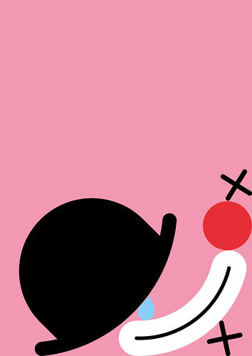
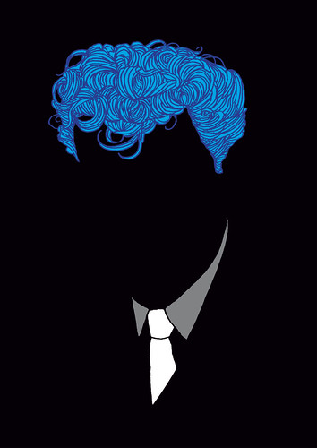
The flyers gave Joyce a monthly ‘blank canvas’ on which he could develop and refine the elements that still define his mature style: flat, coloured shapes arranged like an obsessive collection; sound equipment – decks, mixers and tape recorders – dismantled and reassembled as simple shapes; and visual puns, pushed beyond cliché, such as the light bulb with a filament that says ‘yes’.
Circles and squares
Variations on these have returned in Joyce’s most recent work, such as the environmentally themed window displays for Howies, and the ‘tape recorder’ T-shirt for Aids charity Red: ‘It’s broken down to its simplest parts, all circles and squares.’
Another Joyce technique, almost a game he plays with his materials, is extreme reduction. After separating all the elements of a drawing in Illustrator (or a scan in Photoshop) he repeatedly removes elements – outlines, features – to see how far he can go before the subject is no longer recognisable. You can see this in the literally faceless flyers for Gerry’s Joint and in a new commission, still unfinished, in which an iconic sneaker is reduced to a handful of graphic shapes in different colours. This recalls earlier Joyce prints such as Clown (2006), in which the subject’s eyes, nose and mouth have fallen to the foot of the frame like the plastic components of a mashed up Mr Potato Head, or the collapsing interiors of Imaginary Forces’ titles for the Mad Men TV series.
The ‘jumbled object’ concept appears to work at every scale, and for both real and virtual outcomes: see his Howies window displays and the series of email headers for Faber & Faber. Joyce’s work lends itself easily to online and animated work, such as his music video for Swedish electro act Revl9n.
His business comes from a mixed portfolio of clients – art directors, agencies, individual designers – plus gallery and online sales and commissions through agents Breed (UK) and Art Department (US). The self-initiated work remains a vital part of his career. ‘On my website, the majority of the stuff I show is not commercial,’ says Joyce. ‘The reason that brands are attracted to you is because of your personal work, not because of the work you’ve done for other brands!’
This work may exemplify the ‘reunification’ we discuss in ‘The graphic designer as illustrator’ (pp.32-43), if from a different angle. He notes that ‘illustration is more intertwined with design’ now than it was when he first left college. ‘My history is graphic design and a lot of that thinking comes through in the illustration,’ says Joyce. ‘I couldn’t call myself purely a graphic designer and I wouldn’t call myself purely an illustrator, either.’
Joyce’s approach seems exactly right for the times, a concise, visual statement that leaves enough unsaid for the viewer to complete the visual phrase. Where other illustrators might settle for stylish blankness, Joyce uses the techniques and processes of illustration and design to produce work that provokes thought and pleasure.
First published in Eye no. 72 vol. 18.
Eye is the world’s most beautiful and collectable graphic design journal, published quarterly for professional designers, students and anyone interested in critical, informed writing about graphic design and visual culture. It is available from all good design bookshops and online at the Eye shop, where you can buy subscriptions, back issues and single copies of the latest issue. You can also browse visual samples of recent issues at Eye before You Buy.