Winter 2005
The rules of the game
For George Hardie, illustration is a problem-solving process: collecting looking and drawing with exactitude
At a dinner party some years ago a fellow guest asked George Hardie what he did for a living. The acclaimed English illustrator, professor of graphic design, NTA Studios co-founder, and the creator of iconic rock ’n’ roll images, including the cover of Pink Floyd’s Dark Side of the Moon, replied, ‘I’m an illustrator, designer and teacher.’ Unsatisfied, his tablemate pressed, ‘no, what do you really do?’ Hardie is an unflaggingly polite, but most of all, modest, English gentleman. So, after a lengthy pause he responded: ‘I notice things and I get things noticed,’ a fairly unassuming assessment of a four-decade-old career as, he semi-ironically claims, a ‘jobbing illustrator’.
Hardie does all the things that a professional illustrator should: he solves problems; he draws with exactitude; he makes images that delight because they are challenging. Hardie’s consciously self-deprecating titles nod to a career spent working for clients of all kinds, one shaped mostly around, as he says, ‘wanting to do good work. I never saw it as a career thing. But then, I was very lucky – things just fell in my lap.’ But in image after image he achieves something beyond just professionalism: he doesn’t just solve a problem or create a compelling image, rather he draws visual ideas that force viewers to ‘wear a new pair of spectacles’, and open up to a new visual experience of even the most familiar terrain.
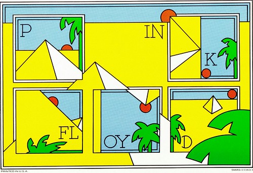
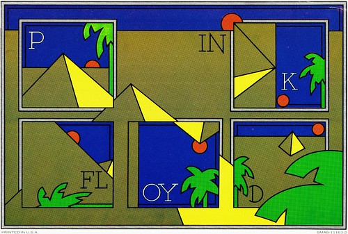
‘Day’ and ‘night’ sticker inserts for Pink Floyd’s 1973 album Dark Side of the Moon, cobining Hardie’s typography with a reworking of the album’s prism / pyramid theme.
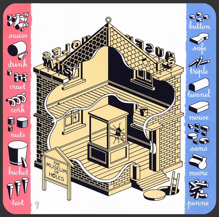
Top: George Hardie, Museum of Holes, 2002.
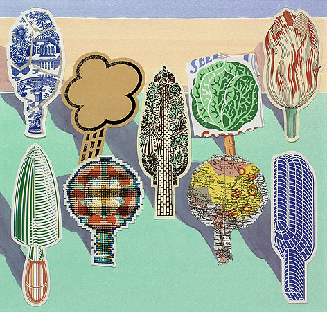
The spectacle-inducing images are simultaneously closely observed drawings of objects in the world and collections of thoughts about those objects or ideas. In, for example, ‘The History of English Gardening’ (1987), a single illustration published as an invitation to a local garden show, Hardie delivers a visual history of the garden in a series of images shaped as trees planted in a grove. The layered images reveal a digressive history: there is blue china (Hardie digs up blue china in his own garden in Westbourne: ‘There is a famous poem called something like “The Day in Victorian Times in England When Everyone Went Into Their Gardens and Broke Their Dinner Plates”. I think people just chucked their broken china out of the back door.’); then there’s the weather; a trowel; a tulip (for ‘Tulip Fever’); a knot garden, a map of China (where many English plants came from) and finally a greenhouse symbolising Kew Gardens. It’s a startling visual list, executed so that every part of the form reflects the content and is reliant on nothing other than visual associations to tell a rather complex story.
Seeing and understanding this kind of illustration is immediately followed by two distinct actions: noticing and gathering. First, you notice that, indeed, a trowel does resemble a tree, perhaps even a tree it helped plant. Once you notice that, you begin to see what else resembles a tree. And this game continues to varying degrees of grouping, noticing and seeing until you’ve assembled collections of like things in your mind, collections that Hardie himself, perhaps, has cultivated. Suddenly Hardie has you wearing his spectacles.
Hardie grew up in a culture of spectacles. Born in 1944, he was raised near the city of Chichester, not far from where he lives now, the son of a Navy man and the grandson of Martin Hardie, an authority on English watercolours and the Keeper of Prints at the Victoria and Albert Museum, 70 miles away in London. Because his maternal grandfather was a manufacturer in Barcelona, Hardie developed a relationship with the city that he would continue as an adult, finding prodigious work, flea markets, and even an exhibition there. His artistic influences and fascinations reflect some of his grandfather’s interests, and include the work of painters and printmakers like Edward Bawden, Eric Ravilious and Paul Nash. Like Hardie, each of these artists used consummate draftsmanship and intricate compositions to convey richly imagined visions of their physical or psychological conditions. Hardie was educated first at St Martins School of Art, and then under Bob Gill at the Royal College of Art, finishing in 1970 with a Masters in Design.
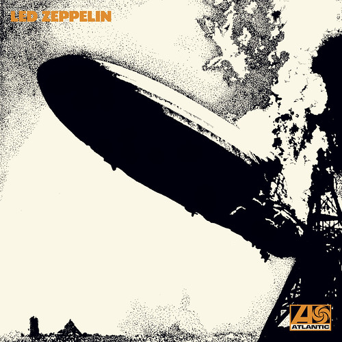
Hardie’s original artwork for the infamous Led Zeppelin debut album (1969), a heartily stippled cover rendered on tracing paper.
After graduation Hardie immediately joined the design firm Nicholas Thirkell Associates, which doubled as Macmillan Publishing’s design department, creating scores of book jackets each year. Macmillan at the time was breaking off departments into subsidiary companies, so it underwrote Nick Thirkell to set up a studio and took a percentage of its profits. Hardie was joined by Bob Lawrie, Malcolm Harrison and Bush Hollyhead as designers, and later, out of necessity, illustrators.
Having studied with the rigorously conceptual Gill, Hardie was already predisposed towards making images that expressed articulate ideas. ‘Illustration,’ he says, ‘is decoration, information, or passing ideas. In conceptual illustration, it’s passing on your own ideas and opinions.’ After seven years’ training as a conceptual graphic designer, Hardie was able to make the leap to illustration. He continues to see illustration and graphic design as just different points on a single graphic continuum: both involve word and image, both must be communicative, and both are for hire. Finding a style in which to render his ideas, though, was more difficult: ‘In my search for ways of drawing that would carry ideas and still look good, I began by using pastiche and parody, but these are really just ways of not drawing. All four designers started out making illustrations in that manner; it became an NTA style. Later I remembered my early lessons in geometrical and mechanical drawing (an alternative for those who were not up to Latin) and particularly the isometric and axonometric projections. These provided a system for drawing pretty much anything, and gave me a tight set of rules to obey or subvert. The systems automatically involve figure and ground. How objects relate to the edge and frame has become a personal obsession.’ His clean lines and exacting geometry, along with a conceptual-oriented mode of thought became Hardie’s style, balancing Lawrie and Harrison’s then cartoon imagery on the one hand and Hollyhead’s more three-dimensionally rendered, surreal imagery on the other. Hardie’s geometries jibe perfectly with someone obsessed with looking and classifying: his neutral visual style allows viewers to focus on the idea or object under examination rather than the artist’s hand.
When Thirkell left the studio in 1973 to spend time in India, the remaining four illustrators bought out their contract to Macmillan and continued on their own as NTA Studios. The four shared a studio in Covent Garden, worked on projects together and apart, and provided the comradeship and criticism they missed from their art school days. The studio moved to Smithfield in 1978 (Lawrie leaving to work eventually in his own animation studio and Geoff Halpin and Ian Wright renting desk space). Hardie left London in 1982 and NTA went on hiatus in 1992 as he and Hollyhead found it easier to work from home and Harrison began pursuing a music career in earnest. Of course, the 1970s also found Hardie engaging in extremely visible work through his long collaboration with Hipgnosis. His entrée to the music industry had actually come in 1969 while he was still at the Royal College of Art. A photographer friend, Stephen Goldblatt, commissioned him to create the lettering for a Jeff Beck record. Goldblatt then suggested Hardie to Led Zeppelin’s management as a cover artist. Guitarist Jimmy Page rejected all of his initial ideas and instead showed him the infamous photograph of a zeppelin aflame. Hardie then produced a facsimile on tracing paper with his best stippling technique. He was paid £60. Years later Hardie found the original art in a drawer with a note attached reading ‘George’s pension fund’. He fell in with Hipgnosis, however, through one of its founders, Storm Thorgerson, an acquaintance from the RCA. Thorgerson and his partners, Aubrey ‘Po’ Powell and Peter Chistopherson, hired him on a freelance basis for lettering and graphic design, and then later ideas and illustration, for over a decade, including projects for Pink Floyd, Wings, Black Sabbath and Led Zeppelin.
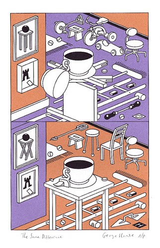
The Same Difference, a 2001 Christmas print for Pentagram, and a classic visual game-as-game image.
As dizzying as that time might seem, Hardie took it all in at a healthy remove. In conversation he’ll tell a few old rock ’n’ roll stories with an indulgent chuckle, but he’s clearly most interested in the success of an image. ‘I think it’s very important to distinguish the client from the job,’ he says ‘We talk about a lot of these covers because of the success of the band. That’s the difference between me and Hipgnosis: I was always doing other things. While all of that famous stuff was going on I could get very excited about doing a set of detective book covers for Penguin, but those jackets will never reach the status of those record covers – they really are just jobbing illustrations. And I had problems with music. I never had a record player in all that time. It got very funny because Po and Storm would have to describe to me the kind of music, which they could only do in terms of other bands, which of course wasn’t very helpful. I wasn’t star-struck by the bands. When they were good they were the best possible clients. When they were bad, they were the worst possible clients. As a young man, I quickly learned that the way to try and make a job unique was to make it something I wanted to do, not just something that would make the money or meet the requirements. That sounds glib, because projects still have to function. But if the clients only get what they want, they are getting a really bad deal. Whereas if they get what will do their job and what I want to make, it gets much more interesting.’
In most cases, he does indeed get what he wants, precisely because what he’s interested in most is simply keeping himself interested. He is disinclined to dwell on personalities, power, or accomplishments; conversations with Hardie return again and again to the ideas inherent in looking, collecting and drawing. His heart lies in the process of his work. Hardie lives well, enjoying food, objects, conversation, gardening both for their own qualities and because they fuel his work. When telling a story about digging up some blue china or a restaurant in Barcelona, Hardie seems dedicated to living and working with elegant relish.
The work part of that equation has appeared in a variety of publications and projects. Besides the various magazine work (much of which has vanished in the last decade, along with much of the illustration market), annual reports, signage, graphics, he has pursued his long-standing interest in teaching through his professorship at the University of Brighton, where he leads two interdisciplinary Masters courses and relishes the debates on narrative, sequence and memory; the meaning of objects; collecting and classifying as a design tool; symbolism and allusion; maps; self-publishing and batch production; and word as, and with, image. Teaching at Brighton for twenty years has been as much of an influence on his work as his years with NTA.
Hardie’s most constant source of work, however, has been the patronage of other designers, including not only Hipgnosis, but also Pentagram, The Partners, and most notably, Trickett & Webb, a now defunct design and architecture firm that until recently produced an annual thematically illustrated calendar – one page per artist. Each of Hardie’s contributions is a gem. For the oxymoron edition of 2002, entitled I can’t stand sitting down, Hardie chose the phrase ‘full of holes’ and contributed an image of a Museum of Holes. The principle is that the museum is shown through a hole and it shows other holes. And within the museum Hardie tells an oblique little tale about what might be missing as a result of the holes. Something has clearly been stolen from the vitrine, and perhaps the thief made an escape through a manhole. Surrounding this bit of single image storytelling is a list of holes: a hole in a bucket; ‘Sans’ – the holes from Gill Sans; there’s the bit left out of penne; a Henry Moore hole; a cork twist, and so on.
The Museum of Holes is typical of Hardie. His imagery was dictated by the implicit rules of a phrase, so it needed to be full of holes. But it also needed to be a collection. And it needed to tell a story. The push and pull of these three requirements is crucial to generating an image. Hardie sees the duties of an illustrator as navigating what he calls ‘a complex of rules: rules of function which might come from a client; rules of reproduction; rules imposed by the audience and context; and rules governed by deadline. Any definition of “jobbing” must include the word “deadline”. There are rules, some of them negative, based on the illustrator’s body of work, tastes and abilities; rules of purpose might relate to the illustrator’s work as a continuum; rules concerning not being able to draw something; rules concerned with not wanting to draw something; rules about avoiding one’s own clichés; rules about colours and edges and shadows and words and corners; rules about making the game supplied by the client, context and illustrator even more difficult by imposing just one extra rule.’
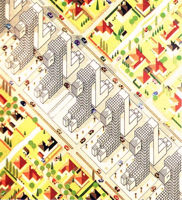
Homage to Le Corbusier for the Sunday Times Magazine’s ‘Sacred Cows’ series, 1978.
Rules also facilitate games, of which Hardie is an aficionado. Many of his drawings, including The History of English Gardening, are visual puzzles, and he is a great reader, with a special interest in detective novels, having consumed some 50 Agatha Christie books before declaring himself full. Reading these novels, like, say, gardening, is pleasure for its own sake – the pleasure of engaging with and navigating an interconnected group of ideas and conventions. Detective novels, like Hardie’s drawings, are both rule-based and hyper-functional, the presumption being that whatever builds the plot of the book has a direct payoff in its eventual resolution. And, for Hardie, ‘it’s essential that my images have some kind of function. I can’t get out of it by saying they’re surrealist dreams. Anything you make has to function as some kind of gift for the audience, so they have to get some kind of reward. I think the model of detective story writing is interesting. There’s a great list of things you’re not allowed to do in detective stories: the villain isn’t allowed to be Asian; you’re not allowed to have twins; the culprit is not allowed to be a character you haven’t met in the book. If you mislead your audience so that they feel cheated, that’s very naughty. These are great rules. Some of my favourite detective stories tell you who did the murder in the title, like Agatha Christie’s The Murder of Roger Ackroyd, and another called The Murder of My Aunt. It’s their murders. They did it. So when you get to the last page and is all is revealed, it says so on the front cover. I love those. I love playing with or adding rules. All of this helps me create images.’
The Same Difference, a 2001 print commissioned by Pentagram as a Christmas gift, is the visual equivalent of telling the audience the murderer in the title. It’s a variation of a ‘spot the difference’ picture, only very few things are the same, and rather than one picture subtly altered, these are two entirely different pictures composed out of some of the same elements. They are the same for being different. In the top frame, an empty teacup hangs off a full one, and the two are precariously perched atop a pile of lumber. Various objects are strewn about the floor and a couple of pictures are framed on the wall. In the next frame, the colour scheme is reversed, one teacup remains, the lumber has formed a high table, the pictures have slightly changed and objects once stationary have moved, been altered, and in some cases formed other objects. Like so many Hardie images, The Same Difference offers the pleasure of looking and also sheer wonder. How did these objects arrange themselves in each frame? What is the story here? How does it function? The Same Difference also fulfils one of Hardie’s other favourite concerns: making an image that can withstand repeated viewings, revealing something new each time. Or, as he puts it, ‘I would make great lavatory wall art.’ Each time you look another bit of orderly chaos reveals itself to you.
And in so much as a web of rules governs the creation of this and so many other Hardie images, the image itself reflects a vision of the world as a complex of interconnected shapes, forms, objects, and, yes, rules. Hardie seems constantly to be telling us that the world is both knowable (see how everything resembles everything else? See how things can be interchangeable and still fit?) and deeply mysterious, because he never tells us why. He seems also to imply that resemblances and interchangeability can go on until infinity. This tension between the solidity of his drawings and ideas, and the questions they evoke, make his work compelling and drive it towards meaning.
In the early 1990s Hardie’s own sense of meaning and artistic structure came into stark relief, he says, when ‘a student asked me “what are you going to do next?”, and I cynically responded “well, I’ll wait for the phone call that tells me what to do.” It was at that point that I began making books, since I figured I ought to know what’s next. I was being glibly ironic anyway. But it was too glib. I don’t think of myself as a hack who’ll do anything. On the other hand I’m keen to try anything.’ This exchange resulted in Hardie wanting to exert a bit more control over his activities, which resulted in a retrospective exhibition and 32-page book called Also Available in Other Colours: the Illustrations of George Hardie: A Book of Scraps (1993).
The edition which is cheekily labelled ‘limited to 1000 copies all signed and numbered 1/1000’ and is formatted like a printer’s specimen catalogue, contains dozens of Hardie’s drawings from what was then 25 years of work. Each is stripped of its context and laid on the page as though a specimen for sale. Here are trees, rulers, fences, heads, letterforms, patterns and all manner of household objects, mono-coloured and laid bare as though for sale at a discount rate. Having drawn collections for so long, he simply collected these drawings. De-contextualising the work was a way to make a monograph without sacrificing any of Hardie’s quiet dignity – neither flashy nor self-aggrandising, it’s a tribute to the themes of his work: collecting, noticing, gathering. It is also a tragicomic commentary on the business of illustration, where a client might indeed ask for something ‘just like’ that other drawing. (And, Hardie reports, some irony-impaired clients have done exactly that.) To Hardie’s delight, Also Available in Other Colours is a book that somehow feels useful, as though one could examine the binoculars on one page or the chess piece on another and divine something important about the object itself. The book ends with a collection portrait of Hardie: an isometric portrait, a fingerprint, three different letter forms for ‘G’, an old signature and a simplified cartoon portrait. It is fitting that in Hardie’s pictorial world even identity is a collection.
Other self-published books followed – less illustration-based and more like the realisation of Hardie’s pictorial ideas in book form. Denouement (1996) is a book that gathers ten denouements torn from ten perfect detective novels by authors including Raymond Chandler, Dashiell Hammett and Christie. It is a book that begins and ends and climaxes at every point in its non-narrative. Another book, Colour Atlas (1997), is exactly that: samples of paints named after places (e.g. London Gray) are placed on their namesakes in an atlas, creating a supra-visual map within the book. Most recently, Hardie has produced Manual, an ode to the hand. This is a serendipitous collection of images and objects that resemble hands or relate to hand ideas and phrases, including sign language, gloves in odd shapes, and memento mori. As usual, Hardie plays with or subverts visual / verbal clichés: there is picture of a tiny Japanese milk jug as big as a pinch (and so noted with a fingerprint) that was in fact ‘pinched’ by a friend in Japan; an octopus in the glare of headlights casts a hand shadow behind it instead of vice versa.
The books are a reminder of what’s possible for Hardie. He has no interest in being anything other than a ‘graphic artist’: ‘I am aware that there are a lot of fantastic things that one can do that are still graphics. I’m not interested in being thought of as an artist – I still very much like the language of graphics. And making things, really.’ What all of these projects come round to, though, is Hardie’s constant activity of seeing and categorising. Hardie is not searching for a profound meaning in his activities, and neither is he making any of the moves towards broader career significance. Instead, as he puts it, ‘What I’m saying is, “I’ve noticed this, have you? Or, now you’ll notice this from now on.” Artists I really admire, they’ve done that. You suddenly see their work everywhere. Or you look at the world through their eyes. So I suppose that’s the highest aim I would try for.’
Hardie’s condensed history lesson: the History of English Gardening. This image, a rejected Sunday Times Magazine cover, was later used for The Garden Show, 1994.
First published in Eye no. 58 vol. 15, 2005
Eye is the world’s most beautiful and collectable graphic design journal, published quarterly for professional designers, students and anyone interested in critical, informed writing about graphic design and visual culture. It is available from all good design bookshops and online at the Eye shop, where you can buy subscriptions, back issues and single copies of the latest issue.

