Autumn 1995
The tenth pioneer
Cipe Pineles was a design innovator. Why, when the history came to be written, was she left out?
Traditional accounts of design history have some obvious blindspots when it comes to the careers of women designers. Written from a predominantly male perspective, they tend to ignore the interactions of the personal and the professional, the private and the public, which play such a decisive role in the shaping of women’s working lives. They are equally indifferent to the variety of career paths taken by women, the nature of collaboration between colleagues and the social and political roles played by women professionals.
The career of the American designer Cipe Pineles presents us with a much needed opportunity to explore new ways of writing design history. As an illustrator, design teacher and art director working primarily in women’s magazines, she was an exemplary professional, an intriguing individual, and a valuable role model. Yet despite her many achievements, Pineles has never entirely received her due.
The most recent historical study of individual American designers, R. Roger Remington and Barbara J. Hodik’s Nine Pioneers in American Graphic Design (1989), profiled nine male designers who worked in and around New York between the late 1920s and early 1970s, and who ‘have helped shape graphic design as a profession and have made a distinctive and innovative contribution’. Pineles’ career fits the criteria for inclusion, yet though both her husbands – William Golden and Will Burtin – are among the chosen nine, she has been overlooked. Should Pineles have been the tenth pioneer?
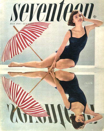
Cover of Seventeen, July 1949. Reflection in the pool – with a twist. Photography by Francesco Scavullo.
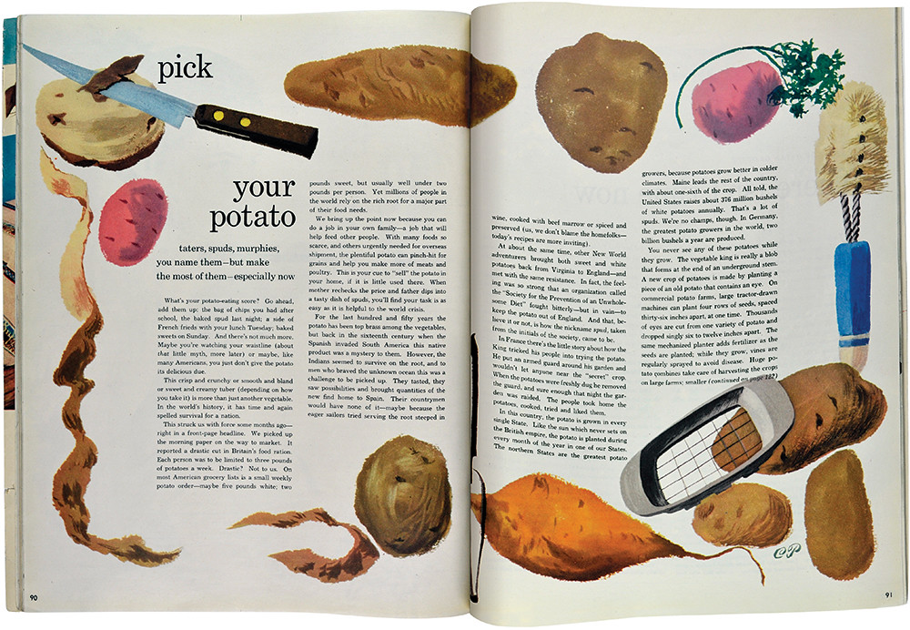
Top: One of many food paintings by Pineles, sometimes based on her own recipe book. Here she used a first sketch which was fresher than a subsequent ‘finished’ painting.
Defined by her husbands
Born to Jewish parents in Poland in 1908, Pineles came to the US in 1923 at the age of 15. Three years later she enrolled as a commercial art student at the Pratt Institute, followed by a year of painting supported by a Tiffany Foundation scholarship, during which time she looked for design work. In a biographical summary sent to Dr Robert Leslie, director of the Composing Room, in 1970, she described the frequent professional rejections she suffered when it was discovered she was a woman. Employers were reluctant to put her in the artists’ ‘bullpen’, where she might inhibit the crude jokes of the bulls. She finally got a job with Contempora, Ltd, a group of European immigrant designers who tackled everything from world fairs to coffeepots, mostly the latter. During her time there, Pineles designed promotional materials, patterns to upgrade cotton fabrics for fashion use and store displays.
The publisher Condé Nast, whose wife worked briefly at Contempora, met Pineles at a party there, saw her work and recommended her to his art director, M. F. Agha. As there was no room for her in the designer’s communal space, Pineles was put in a corner of Agha’s office, where she was privy to fascinating discussions. Under Agha’s tutelage she learned about typography, photography, and magazine organisation and composition. She was art director of Glamour from 1941 until 194, when she joined her husband William Golden – whom she had helped get a start in the New York design community through a job with Agha on House & Garden – in Paris for five months. After spending a further year freelancing as an illustrator back in the US, Pineles was given the job of art director on the relatively new Seventeen. She left three years later to join Charm, where she remained for nine years. Following a brief tenure as art director of Mademoiselle in 1959, in the footsteps of Bradbury Thompson, she left the magazine world at about the same time as Golden unexpectedly died.
Two years later she married an old friend, the designer Will Burtin, known for his art direction (Fortune, Scope) and exhibition design. Working within Burtin’s design consultancy, Pineles took on a variety of projects. She was responsible for the visual identity of the new Lincoln Center and its many publications in the 1970s. She started to teach at Parsons School of design in the 1960s and developed a publications and promotion programme for the school during the 1970s and 1980s. She continued to teach at Parsons until she was in her late 70s.
Pineles accumulated numerous art direction and publication design awards. Yet though Agha had been proposing her for ten years, the New York Art Directors Club refused to offer her membership until they wanted Golden, who pointed out that they were hardly a professional club if they had ignored his fully qualified wife. Both became members in 1948, with Pineles the first woman member. She was also the first woman to be admitted to the club’s Hall of Fame in 1975. (Fifteen years would pass before the next woman was admitted; there are now five in all.) Pineles died in 1991, at the end of a 60-year-long career.
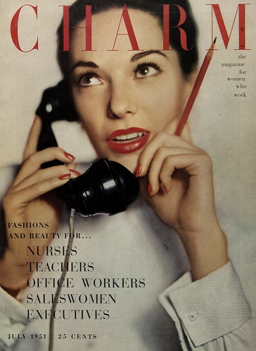
Connecting with Charm’s new audience, 19 million working women. Covers featured single women, though not usually ‘at work’; cover lines established the theme, July 1951.
Taking women seriously
Both Seventeen and Charm were groundbreaking women’s magazines. Editor Helen Valentine virtually invented the teenage market through Seventeen in the 1940s and went on to identify a new working women’s interest group with Charm in the 1950s. The magazines took their female audiences seriously, acknowledged the challenges they faced, addressed their problems with information and pertinent advice, and attempted to represent the totality of their lives through feature articles, fiction and art. It was Pineles’ task to organise and communicate this agenda visually.
The third member of the team was promotion director Estelle Ellis. A large part of the success of the two magazines came from the vision and hard work of the three women and their close personal and professional relationship. With about a 30-year age spa (with Pineles in the middle), the three were in daily professional contact for 12 years, while at the same time entertaining each other’s families, celebrating holidays and vacationing on Fire Island together. Their strength, energy and inspiration grew from the mutual respect, support, love and expertise they shared. Each of the three had live-in help (much more common and less expensive in those days) and a supportive husband. Only Pineles’ husband was equally prominent.
I would call these women proto-feminists. Though Simone de Beauvoir had published The Second Sex by 1950, it was 13 years before Betty Friedan’s The Feminine Mystique sparked the women’s liberation movements in the US. Pineles, Valentine and Ellis were not actively political. ‘At first, I was against women’s lib,’ Pineles told U&lc magazine in 1978. ‘I felt it was diverting us from the real issues of that time. Perhaps I felt that way because I didn’t know I needed to be liberated. I had a husband who introduced me with pleasure as a working wife and took pride in my work.’ But however unacknowledged, these women did share and communicate to their readers a social and political agenda we would now call feminist. They were professional working women who promoted the idea that girls and women have intelligence, strength and character, and should be respected as important contributors to society. Seventeen and Charm celebrated women’s achievements and brought them information that would make their lives easier and richer. It must be said that the magazines also communicated much of the standard contemporary construction of the feminine – they were, after all, successful commercial products within a booming post-war capitalist economy.
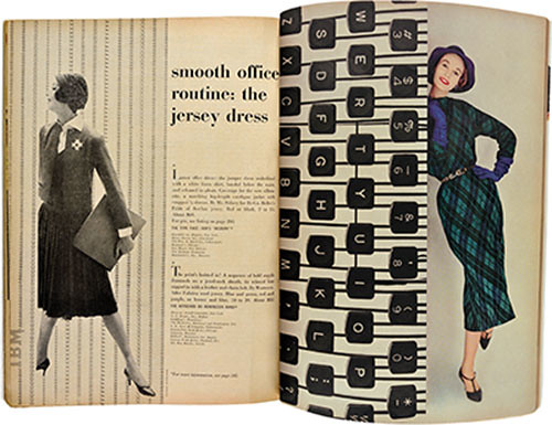
Fashion spread from Charm with office machinery and typing patterns representing work, September 1957. Photography by Carmen Schiavone.
Seventeen and up
As the first women’s magazine to treat teenage girls as serious and intelligent young adults, Seventeen carried out elaborate market research on its audience and their mothers which gave rise to changes in manufacturing and retailing. Until the success of Seventeen showed that teenagers were a significant and special market, there were no clothes designed for them; they were expected to buy and wear the same styles as their mothers. The research also vindicated Valentine’s editorial vision of an audience eager for serious fiction and articles on contemporary social issues, community service, education, advances in science and technology and career opportunities, as well as the more standard topics covered by women’s magazines – fashion, beauty and relationships.
Seventeen built up a circulation of one million in its first 18 months. When Pineles became its art director in 1947 it was about three-and-a-half years old. Its format had been devised in consultation with Agha, who was known to Valentine from her days at Vogue. The design followed the more classical tradition of layout and typography that Agha represents, as opposed to Brodovitch’s bolder approach at Harper’s Bazaar. The book-like typography of the fiction allowed the artwork to dominate, while the editorial and fashion pages were more playful, showing early tendencies towards American figurative typography. This was the golden age of magazine design, when art directors had 30 pages of uninterrupted editorial well in which to develop their ideas.
The perfect art director
Pineles is credited with the innovation of using fine artists to illustrate fiction. When she arrived at Seventeen she wrote to American art museums and New York galleries asking who were the best contemporary artists and it was from these recommendations and her personal contacts that she began her programme. As part of Valentine’s mission to educate teenage girls, Pineles moved Seventeen out of the idealised, sentimental Jon Whitcomb school of illustration, bringing modern art to the attention of the young mainstream and allowing fine artists access to the commercial world. Many of her choices were drawn from specific ethnic or political backgrounds – Ben Shahn was active in the political left; Jacob Lawrence was part of the Harlem Renaissance; Reginald Marsh and John Sloan were known for their social realism; Richard Lindner was a recent German immigrant; Dong Kingman was a Chinese-American.
An illustrator herself, Pineles was the perfect art director – she left her artists alone. She asked them to read the whole story and choose what they wanted to illustrate, her only direction being that the work should be good enough to hang in a gallery. For visual variety she also introduced conceptual approaches using collage, photography and the newly developing informational illustration and design, an interest of the Goldens’ neighbour and close friend, Will Burtin. Some young artists ‘discovered’ by the magazine became well known, including Richard Anuszkiewicz and Seymour Chwast.
Somewhat earlier Golden had begun to commission fine artists for corporate CBS work, and Pineles and Golden used many of the same artists and numbered them amongst their friends. They even used each other’s work: her illustrations and his photographs. The conflation of the personal and professional was continued in the inclusion in the magazine of Pineles’ own illustrations, often from her personal painted recipe book. She also used her own objects, furniture and home – a large country mansion in the French Second Empire style – as props and locations for photographs. Once you know what to look for, you can see bits of Pineles’ life and interests throughout Seventeen and Charm.
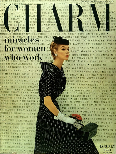
Typography-dominated cover introduces a theme played out over fourteen pages inside, January 1954. Photography by William Helburn.
Charm and the double shift
Following the success of Seventeen, Valentine was invited in 1950 by the publishers Street and Smith, for whom she had worked on Mademoiselle, to effect a turnaround at Charm. Charm had been started nine years earlier as a fashion magazine aimed at women who were working between leaving school and getting married; over the years it had lost its readership. Valentine’s idea, based on social statistics, was that while women had entered the workforce on a temporary basis during the Second World War, the post-war era had given rise to a new, permanent class of working women, the majority of whom were married and therefore represented double consuming potential. Figures for 1951 put the number of working women in America at 19 million. Valentine believed that her audience – an interest group not an age group – needed a magazine that would help them fit their jobs into their lives. The cover of Charm carried the subtitle ‘the magazine for women who work’ – 12 years before Ms. And 26 years before there would be a magazine named Working Woman.
Valentine brought Pineles and Ellis with her to Charm. The first issue contained five stories about members of staff, showing them to be part of the defined audience. The content of subsequent issues included articles about work, money, education, career opportunities, men’s reactions to working wives and women employees, profiles of women working in different professions and arts reviews, as well as housekeeping advice for time- and energy-strapped readers, and fashion for work and after hours. Decades before it became known as ‘the double shift’, Charm recognised that working women held down two jobs.
Initially the design of Charm bore a resemblance to Seventeen, but over the years it changed with the times. Pineles continued to use fine artists as illustrators for both fiction and features, including Doris Lee, Robert Osborne, Tomi Ungerer, R. O. Blechman and her close friends Lucille Corcos and Edgar Levy. While not as consistently playful as other designers, she did use objects combined with letterforms and as substitutes for them to create visual puns and experimented with a variety of headline faces (a legacy from her days with Agha).
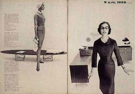
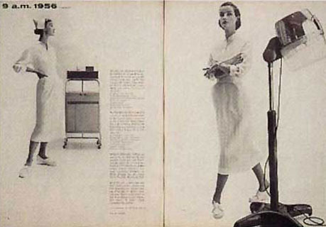
The new editorial vision was revealed in the presentation of fashion. The clothes were for women who worked, so they were shown in the context of work – in the office, in the city, commuting, during lunch-hour shopping – as practical answers to everyday problems. As Pineles put it in Print in 1955, ‘We try to make the prosaic attractive without using the tired cliches of false glamour. You might say we are trying to convey the attractiveness of reality, as opposed to the glitter of a never-never land.’
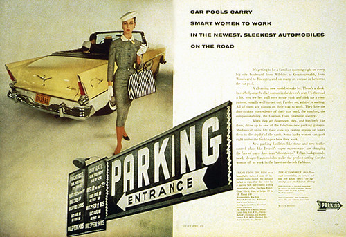
The greatest elaboration of the agenda was a highly successful series called ‘She works in [city name]’, the result of a concerted research and promotion effort by Elli. Week-long celebrations of working women in 19 cities across the country were organised over a period of four years. In each location, city fathers, chambers of commerce, stores, corporations and women’s groups were brought together to show how much women contributed to the economic life of the metropolis. The April 1956 issue in Detroit included a profile of a textile designer and an article about local working conditions. The city was used as a backdrop for the fashion pages and the overall design was governed by the city theme, playing on its connection with the automotive industry.
Two spreads from the same fashion feature in Charm, January 1954, using modern office furniture and equipment to suggest the working environment, January 1956. Photography by William Helburn.
Resisting stereotypes
Within the confines of mass marketing, Valentine, Pineles and Ellis were resisting, if not subverting, the standard construction of women. Between advertisements that limited the roles assigned to girls and women, the editorial pages showed something different: a way of seeing oneself involved in the wider world and in possession of knowledge and money. Valentine, Pineles and Ellis were models of the new working woman: serious, committed, inventive and hard working, with families and all the stresses they create. They built a magazine that spoke to them and that made sense of a lifestyle that was new to America.
Given Pineles’ record of activity and achievement, could she not have been a tenth pioneer? When I asked Remington and Hodik why Pineles had been excluded, Hodik wrote that, ‘at the time we began our research, we felt that her contributions were not of the “pioneering” magnitude of those of the other “pioneerings” we covered. While we realised that she was certainly a pioneer for women in the profession, we chose not to include her for that reason solely.’
To me, it seems that Pineles perfectly fulfils the criteria for inclusion put forward by the authors in their preface: she accomplished her major work in New York during the prescribed time period; she helped shape the graphic design profession in its formative years through her work as an art director and mentor; her distinctive and innovative contributions were in the use of fine artists as illustrators for the mass market audience, in the more realistic visual presentation of women’s lives and options, and in the visual education of women; her story has not been adequately told (only two profiles have appeared, both in Print, in 1955 and 1985, and one interview in U&lc in 1978). Pineles was more than a token first woman art director; she was an innovator in art direction. She created the role of the modern woman designer in America and she had no (female) peers.
Design – a male history
Remington and Hodik’s insistence on ‘pioneering’ magnitude’ is typical of traditional, patriarchal art and design history, which tends to use a narrow definition of design practice based on how men practise, and privileges formal and stylistic innovation over broader social, cultural or political achievements. Or could it be that the authors were uncomfortable about putting Pineles in the company of her two husbands, her mentor (Agha), a strong competitor (Brodovitch) and her stylistic soul-brother (Thompson)? Might the devaluation of Pineles’ work be an application of the ‘nature versus culture’ dichotomy (women are cooks but men are chefs), whereby within the field of women’s magazines, male art directors are perceived not as part of the audience and therefore as innovators while a female art director is seen as being ‘naturally’ close to the material and is therefore credited with less creativity?
What was it like for Cipe Pineles to be questioned by Remington and Hodik about the achievements of her two designer husbands but not about her own work? On tape she is always gracious, though she sometimes turns the discussion to herself. As feminist art and design historians have pointed out, for centuries talented and creative women, connected by blood or marriage to creative men, have been denied a historical place based on their own accomplishments for a variety of reasons to do with male power to define what is of value and to control access and information. Pineles was as professionally active and recognised as her two husbands, and practised for longer than either. Was it too strange for the authors to contemplate a book of ten pioneers with three married to each other? Was this a case of the private and personal seeming to overwhelm the public and professional, thereby muddling the critical and historical evaluation?
It is certainly more difficult to write about individuals whose stories are entwined. Issues of influence and dependence arise, together with the attitude that influence and dependence are bad, especially if the female is in the more powerful position (Pineles was further along in her career than Golden when they met and she helped him with some early, critical contacts). For the authors of Nine Pioneers in American Graphic Design, it appears that the private life (of the woman) diminished regard for or distracted attention from her professional achievements. But intertwined stories can be written and may be even more interesting and closer to reality than isolated individual narratives. Designers do not live alone, nor do they work alone. Design history will have to begin to acknowledge and do better with this fact.
A second fashion story, from Charm, April 1956, uses an atmospheric urban backdrop of cars, a garage and vernacular signage. Photography by William Helburn.
Martha Scotford, Professor, North Carolina State University
First published in Eye no. 18 vol. 5 1995
Eye is the world’s most beautiful and collectable graphic design journal, published quarterly for professional designers, students and anyone interested in critical, informed writing about graphic design and visual culture. It is available from all good design bookshops and online at the Eye shop, where you can buy subscriptions and single issues.

