
Summer 1991
Typo Photo
London’s most progressive designers are working with a small group of photographers highly sympathetic to their aims
The relationship between graphic designers and photographers is always delicate: mutually dependent yet separately creative, there are often uneasy undercurrents running between them. Will the photographer run with the right image? How will the designer use it?
There are, however, a handful of London-based photographers who seem to have broken some of these traditional barriers. Highly attuned to graphic design, they produce images which are often quasi-abstract and colour-enhanced and sometimes mesh so closely with the design that it is difficult to decide where one begins and the other ends.
It might sound as though such images could only be produced by a designer treating the photographer purely as a technician, dictating the result. In practice, the designers who work closely with these photographers tend to allow them more than usual freedom. Often, designer and photographer will work together right up to the point of the picture being taken.
From Richard J. Burbridge, whose intense, personal approach to his work is more like that of a fine artist, to Trevor Key’s down-to-earth craftsmanship, none of these photographers is the same. What links them is the depth of thought behind their work. It is perhaps this, rather than the immediate allure of their images, which makes the same handful of sympathetic designers return to them again and again.
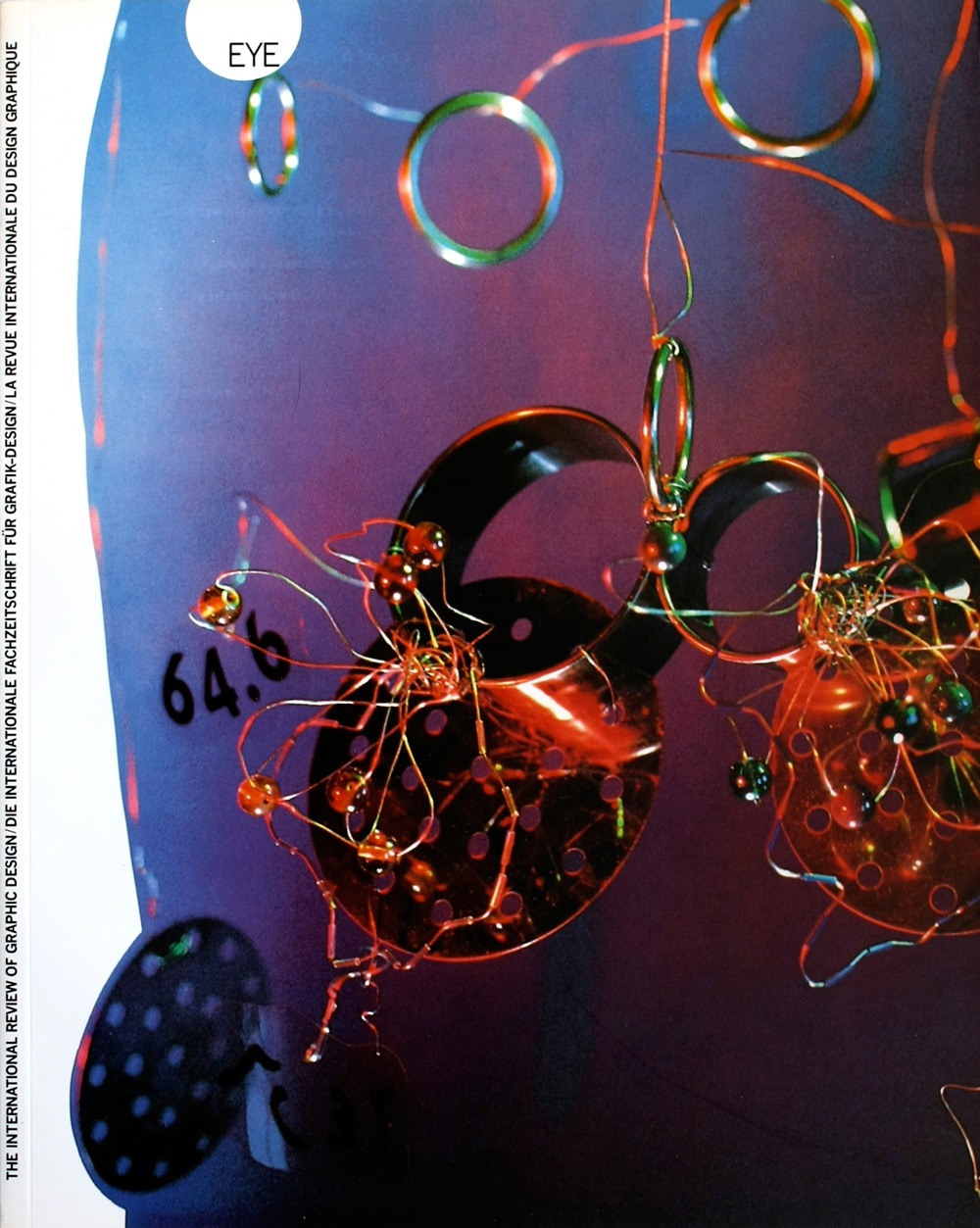
Richard J Burbridge
For someone who only set up on his own last year, Richard J. Burbridge has an intense sense of purpose about his work. Obsessively perfectionist, he works into the early hours of the morning reshooting and re-colouring his still lifes. These weirdly beautiful compositions are of the most mundane of objects; a crumpled sheet of plastic, a smear of hair gel, or detritus from the light industries which surround his East London studio. Although not truly abstract, Burbridge’s images can look fascinatingly bizarre because of their lack of external visual references. ‘I think that the picture’s ability to present things on a different scale is one of my major tools,’ he says. ‘I can make the palm of my hand look like a crater’, he adds, alluding to an illustration for the London Design Museum’s magazine, Issue. For the same publication, commissioned by the designers Cartlidge Levene, he photographed a sheet of melting plastic. ‘The nature of the plastic was quite exquisite and I got really excited by it. But it’s not just photographing a pattern, it has to have some direction, some structure. That’s the difference between the ones that work and the ones that don’t.’
Burbridge’s choice of subject matter, though sometimes odd, is never arbitrary; the ideas for his illustrative images stem directly from the brief. This, he admits, is a result of working as an art director at Condé Nast – a period during which he took no pictures at all – before becoming assistant to the photographer Alastair Thain.
Burbridge appreciates his clients’ open-mindedness, but he thinks that designers often do not demand enough from photographic images. ‘Without wanting to sound arrogant, I think it doesn’t take much to convince a design group,’ he says. ‘A lot of them don’t understand why I go on and on printing, or changing, or re-photographing.’
Trevor Key
‘These were the first attempts to get the colours to really sing a bit,’ says Trevor Key, pointing to pictures which appeared in a catalogue of furniture designers’ work from 1988. The colours have an almost luminous richness and Key went on to develop the technique until he perfected a method of colour enhancement to produce images which he calls ‘Dichromats’. Highly intense and breathtakingly pure in colour, many of these images were created in conjunction with designer Peter Saville to illustrate record sleeves for the band New Order.
Key has worked with Saville for more than ten years; he also works regularly with Phoa Kia Boon of the group Williams and Phoa, and says that he enjoys working with designers because of their enthusiasm for new ideas and techniques. It is an attitude which he believes is not usually found in advertising agencies, which tend to ask for more of the same. For Key, this is anathema: perfecting one technique is not enough, and he appreciates the creative stimulation of working in partnership with designer / art directors who help him to push his work in new directions. ‘For certain clients, for instance Peter Saville and Phoa Kia Boon,’ he says, ‘I do work which I think is very modern – perhaps beyond its time.’
Despite this modernity of his work, Key’s training in the traditional craft of still life photography is very apparent. Sometimes closely cropped and partially out of focus, his images nevertheless seem to sum up their objects. ‘It’s a question of looking for the essence of a thing,’ he says. ‘I don’t mean that in a metaphysical way or anything,’ he adds quickly. ‘It also has to make a strong composition. If it works, it’s because you’ve got both.’
Robert Shackleton
‘Why do I like working with designers? I suppose it’s trust, really,’ says Robert Shackleton. ‘You know the photographs you shoot are going to be used in the right setting. I am a photographer, but I see things in a broader way – I see things in their setting.’
In fact Shackleton trained as a graphic designer himself, before turning to photography. Now, as well as taking stills he also shoots pop promos, and has a strong interest in interiors, a combination which leads him to suggest that he would be better described as an image-maker rather than a photographer.
Certainly his collaborations with designer Siobhan Keaney, with whom he has worked for many years, seem to be better described as ‘image making’ in that they are, for British design, an usually homogeneous mixture of photography and typography.
But Shackleton is not precious. Even his still-lives are shot at speed: ‘I like first ideas; I like to get things done quickly – if you keep going over the same thing you can get very bland images.’ Inevitably, working with little formal preparation can result in the occasional mistake, but as Shackleton says: ‘You have to be open to things going wrong. You can’t perform all the time.’
Seeing his pictures as part of a greater whole, Shackleton consciously tries to create images which will work with the design, even if, on one level, they are in sharp contrast to it. ‘It is important to me that what I do is right for the job,’ he says. ‘It is important that people get something out of it. It would be no good if the people who picked up a brochure opened it and thought, “What is this rubbish?”’
Julia Thrift, design journalist, London
First published in Eye no. 4 vol. 1 1991
Eye is the world’s most beautiful and collectable graphic design journal, published for professional designers, students and anyone interested in critical, informed writing about graphic design and visual culture. It is available from all good design bookshops and online at the Eye shop, where you can buy subscriptions and single issues.