Winter 2006
Visions of Joanna
For the first edition of ‘An Essay on Typography’, Eric Gill used his new serif font in the manner of a scribe

It took me a while to find this book. Not that it is hard to buy a copy – it has hardly been out of print since 1931. But to find this book, this particular copy, was tough. The content, Eric Gill’s ‘An Essay on Typography’, is well known: Gill reflects on the relationship between hand and machine, the spiritual and the industrial. But it is the form of this copy, its extreme simplicity, its unique ordinariness, that makes it an inspiration.
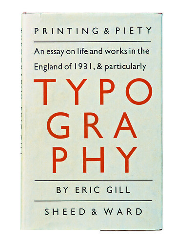
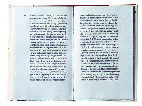
In many ways this is a complete work: Gill was author, typographer, type designer and, with René Hague, printer. The text pages are the first use of Gill’s new serif type Joanna; the dust jacket is beautifully set in Gill Sans (1927). The relationship between these types, maybe unintentionally, prefigures the sans/serif families of the early 1990s onwards – Martin Majoor, designer of Scala and Nexus, called Joanna ‘a sort of Gill Sans Avec’. In 1931 Gill had only designed the roman Joanna – the italic came later and he never designed small capitals for it – so there is a restrained unity to the typographic voicing. He expressed the text like a scribe rather than a compositor, ‘writing’ lines rather than filling a measure. When the text didn’t fit, he would begin a word in one size and complete it in another. Some of the results look wildly original in type, although to a scribe they would probably appear quite normal. The result is a kind of semi-justified setting, with more or less even lines and optically even word spacing. It is extremely clear, and very similar to a manuscript.
Below: Front cover of the first edition. Gill’s narrative jacket design has no respect for editorial conventions such as hyphenation or a modest namecheck for the printer.
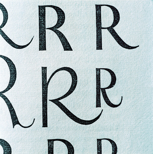
Top: Illustration showing various tail forms for ‘R’, with annotation numbers contained within the letters themselves. In the second edition the numbers were filled in.
Gill’s approach to paragraphing is sober and minimal, and again has roots in the scriptorium. He uses pilcrows (paragraph marks) to express paragraphs, and a pilcrow on a new line to indicate changes of thought. He designed two sets of capitals for the original Joanna, one at ascender height and the other slightly shorter than normal; the big caps were used only for the initial letter of a paragraph, and the midi-caps for the beginning of sentences within paragraphs. This gave a fresh emphasis to the typographic voice, closer to the spoken word, with breaths, pauses and changes of inflection. The conventions of typesetting that we work with today are much less expressive.
The grey paper is watermarked with the Hague & Gill monogram; the printing sharp and somehow engaged with the paper. The foundry Joanna has a different feel to photo- or digital Joanna – close-set, quite dark and forthright, where digital Joanna is slightly thin and superficial. The title page is radically consistent – narrative, and set in the same weight and form as the text. The marginal proportions are straight from the scriptorium, too, emphasised by folios on the first line acting as points between which the text columns are strung, like sheets of paper hung up to dry.
The marginal proportions and typography have a sober, almost religious feel.
The format of 7.5 x 5 inches, similar to today’s standard paperback B-format, was slimmed down for the second edition in 1936, thereby tightening the margins and removing much of the monastic atmosphere. Parts of the text were re-set with the newly available italics; running heads were added and the folios crept back into line. The contractions were replaced by full words, so the text became more conven-tionally unjustified in appearance. Later editions used this as a model.
The fifth edition (which was my first encounter with Gill’s essay), published by Lund Humphries in 1988, is a mere shadow of the original, with some of the worst features of machine production brought together in one place – as if to make Gill’s point. The poor setting of Christopher Skelton’s otherwise excellent introduction, in justified Linotron 202 Joanna, underlines by contrast both the strength of Gill’s typographic argument and the particular qualities of the type in which it was originally presented.
Mark Thomson, art director, HarperCollins London
First published in Eye no. 62 vol. 16 2006
Eye is the world’s most beautiful and collectable graphic design journal, published quarterly for professional designers, students and anyone interested in critical, informed writing about graphic design and visual culture. It is available from all good design bookshops and online at the Eye shop, where you can buy subscriptions and single issues.

