Winter 1998
Writing on the wall: The posters of James Victore
With a visual polemic of angry scrawls that stop pedestrians in their tracks, this committed New Yorker tackles Shakespeare, safe sex and racism in personal (frequently self-financed) projects that hammer home graphic design’s potential to make a difference
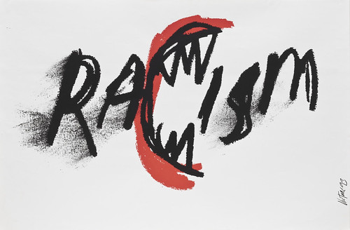
A New York street poster has to grab viewers by the throat and knock them on their asses. Otherwise it’s as useless as yesterday’s newspaper and as forgettable as most theatre, movie, fashion, and cabaret posters posted daily. In the competition for city scaffolds, longevity is measured by days, sometimes hours. A memorable poster must not only stand out above the crowd, it must leave the viewer with a mental ‘cookie’ that prompts Pavlovian recognition – a tough order, given the multitude of stylish bills posted these days. Yet one of the most startling posters in recent memory did leave a potent after-burn. This violently rendered scrawl of the word Racism not only stands out among trendy designs, but also is a strident commentary on a troublesome theme. The poster is the word itself with a menacing metamorphosed ‘C’ shaped like a mouth with fangs, outlined in red and poised to consume the other letters in the word. Created by New York designer James Victore it is a symbol of racial hatred that forces the viewer to feel the violence that the word conjures.
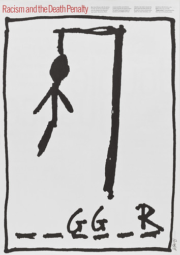
Borrowing from the children’s game Hangman, Racism and the Death Penalty, 1993, addresses what Victore sees as the underlying reason for the return to state-sanctioned execution in the US.
Top: With a few expressive lines, Victore’s RaCism, 1993, expresses the atavistic rage of this irrational emotion.
During the summer of 1993 Victore, like millions of other New Yorkers, was disquieted by race riots that erupted between Chassidic Jews and their African-American neighbours in Crown Heights, Brooklyn. The intensity of this atavistic behaviour was shocking, but so was the voyeurism of the television news viewers. Victore believed that the nightly press coverage had caused people to misconstrue the essence of racism. The physical spectacle was the main attraction – not the deep-seated issues leading up to the hostility. Victore felt that the only upside of such a tragedy should be the public’s heightened awareness of what causes racism in the first place, but this was not the case. ‘I was troubled that the word was so over-used that it no longer meant anything any more,’ he explains. ‘In the press, everybody was talking about “racism-racism-racism”. But nobody really knew what it meant. So I had this idea to show the word eating its young, and created a poster as simply as I could.’
Rarely is a poster more effective than live TV coverage, but Victore’s Racism added a critical dimension to the event. Were Victore never to create another polemic after this, he could be content that he had made a big contribution to contemporary visual iconography. But this was not the first nor would it be the last of his visual commentaries. Although it is a standard against which his future work will be fairly or unfairly judged, it is just one of many memorable images he has created in little over a decade since becoming a graphic designer.
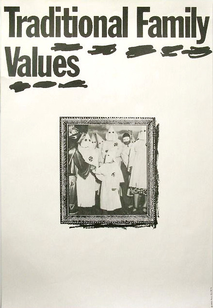
Traditional Family Values, 1992, created as a street poster, reminds viewers of the power of language and image.
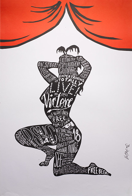
Live, 1996, was a poster announcing Victore’s lecture at Plattsburgh State University, the college he was asked to leave when a student.
Not all Victore’s work is as monumental as this. He also designs book jackets, record covers, catalogues, theatre posters, advertisements and animation for a limited number of commercial clients. Most of the work is rendered in his distinctive hand scrawl. But to appreciate Victore’s output, the polemical posters, often produced at his own expense and donated to the appropriate advocacy groups, must be seen as the focal point of his oeuvre to date. He has received some of the most prestigious poster biennial prizes – from Colorado to Brno – for work that has attacked a range of issues from the death penalty to safe sex.
Victore was born in 1962 and raised a ‘military brat’. His father, a career airman, settled the family on an airforce base in Plattsburgh, New York, where Victore’s mother took a civilian job in the reference department of the local college library. Aware of her son’s art interests, she plied him with Graphis annuals and Print magazines from the library. ‘I got a great design history education,’ he recalls. ‘That’s where I first saw stuff by Push Pin Studio, Bob Gill, Ivan Chermayeff, and Roger Excoffon.’ Plattsburgh did not offer many career possibilities apart from being a burger jockey at McDonald’s, which Victore did during his freshman year of Plattsburgh State College. Fortunately, he had the opportunity to work as an apprentice at a two-man design studio specialising in menus and flyers for local businesses. ‘This was a big influence for me to get out’, says Victore, quipping about ‘seeing the tunnel at the end of the light’. So, afte he was asked to leave the college, he applied to art schools in Boston, Rhode Island, Chicago, and New York. ‘The only place that I really wanted to go,’ he continues, ‘was the School of Visual Arts because I had seen their fantastic posters.’
While he attended SVA, Victore worked at a ski shop on West 57th Street and spent his free time (and much of his class periods, too) ‘hanging out’ at the Paul Bacon Studio. Bacon was a record sleeve and book jacket designer who in the 1960s had invented the ‘best-seller jacket’ notable for a large title underscored by a small symbolic illustration. ‘Bacon basically taught me everything about graphic design,’ Victore explains. ‘I learnt more just by looking over his shoulder and watching him work, listening to him on the phone, running his business – even making his mistakes – than by going to school.’ But this ad hoc education was not complete until he stumbled upon the work of Henryk Tomaszewski, the renowned Polish poster artist who created expressive minimalist gems of narrative abstraction from the 1950s through the 1970s. Victore recalls: ‘Cassandre used to say “a good design enters through the eyes and explodes in the brain.” That’s exactly what this stuff did. It spoke to me in volumes. It was graphic design, but it was much more akin to art and expression than graphic design, which at the time for me meant something made by T-squares and French curves, which I abhorred. Seeing that this stuff existed – maybe not in the States, but it existed – just gave me the freedom to be able to do that too.’ (Years later Victore became a major collector of Tomaszewski’s work and was curator of an exhibition at SVA).
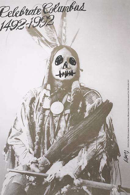
Celebrate Columbus 1492-1992, 1992, was produced as a comment upon the 500-year celebration of the discovery of America. Victore says it was inspired by the government ‘policy of genocide’ towards native Americans.
Victore’s early professional work was not, however, very expressive. At 24 he was freelancing for virtually every publisher in New York designing Baconesque covers and jackets – big titles, big author by-lines, and small bland illustrations. ‘All of a sudden, after seeing the Tomaszewski stuff,’ he says, ‘I realised that I had my own sense of placement, my own sense of design, my own sense of humour, and I wanted to apply this to my commercial work.’ The almost immediate seismic shift in his method shocked his regular clients who expected fairly tight conventional design. Instead Victore began to draw letterforms (even if they were available as typefaces), simplify images, and most importantly he depended almost entirely on concepts rather than decoration and ornament.
The response was underwhelming. ‘I was living on kill fees,’ he recalls. ‘My workload plummeted because nobody was interested in it. Though it was an extremely important experimental time, it took a long time for me to create anything that I really thought was not just me playing and having fun, but me playing, having fun and communicating.’
His new style attracted few takers until he was hired as a freelance to do book jackets for art director Joseph Montebello at Harper and Row. These were economical solutions involving simple objects, like a feather taped to a white background and photographed as a still life. ‘I got fast and good at coming up with ideas quickly,’ Victore says about the various visual puns and gags that he created from found and manufactured objects. Although he had become rather prolific, he nonetheless admits giving this work up after a short time ‘because the only assignments I got were books that had funny subject matter, and that was not what I was really looking for’. For the next three years he went from the sublime to the absurd – working on commission for a greetings-card company conceiving ideas for Christmas, Chanukah, Father’s Day, Mother’s Day and Valentine’s Day cards. ‘They actually published some pretty funky stuff, some pretty fun, simple ideas,’ he says with a hint of pride. Finally, he was hired by Elektra Records and overnight the bulk of his work was music – he designed almost 100 CD covers a year. While these were a good way to pay the bills, he nevertheless wanted to work on even more meaningful content.
While the music work ‘floated the studio’, in 1992 Victore designed and produced his first polemical poster, Celebrate Columbus or what he calls the ‘Dead Indian’ to commemorate the five-hundredth anniversary of the discovery of America by Christopher Columbus. ‘My reason for doing the poster,’ he explains, ‘was because at the time everybody in media was saying that from one man’s accidental discovery we are such a great nation.’ Victore suspected that the hoopla around the celebration, which was being criticised by Native American and other human rights groups, demanded further scrutiny and he wanted to add his voice to ‘what I like to call the “pox-infested blanket story”, the genocide of indigenous peoples by the American government. I wasn’t trying to throw a stone through anybody’s window. I just wanted to inject the notion that there’s always another side, which at that time was getting lost. The whole revisionist, nationalistic view was getting stronger and stronger. I wanted to offer a small counterpoint.’
Using his rent money Victore printed 3,000 two-colour posters that showed a vintage photograph of a Native American warrior whose noble visage he defaced in black marker pen to look like a skull. With a couple of volunteers, he illegally pasted about 2,000 copies on walls and scaffolds around New York. He also obtained the addresses of Native American groups in the United States and Canada and mailed them tubes containing twenty posters each. In New York the police tore down as many posters as they could so as not to mar the celebration, yet enough remained intact on Columbus Day to have something of an impact. ‘I witnessed few people actually looking and reading,’ he acknowledges. And although it was a small return, he was encouraged.
At the time Victore veered somewhat from commercial work towards an indie sensibility. It is axiomatic that new ideas rarely emerge from tried and true venues, so Victore hooked up with kindred renegades. He had met two bartender / actors who had founded The Shakespeare Project, dedicated to performing Shakespeare in public spaces. The money involved was negligible, but Victore was given a free hand with the posters, which he designed without a hint of pastiche. Instead, as with Tomaszewski’s theatre posters, Victore rendered everything from image to type by hand to give a mood of immediacy and serendipity. At the same time that he did posters for Macbeth, Twelfth Night, The Taming of the Shrew, and Romeo and Juliet, he produced Racism and had them posted together around town. Racism made an indelible impact on some, but Victore claims that the poster had much more recognition in professional competitions and design annuals (to which he submitted) than on the street. Nevertheless, he was not deterred.
The first two posters were done on his own, but accepting the adage about strength in numbers, Victore helped found a small alternative graphics collective along the lines of the Atelier Populair, the graphics arm of the 1968 French student uprising. Victore and five other young New York designers joined to fund, conceive and produce critical street graphics. Traditional Family Values was the first project done under the auspices of the group (although entirely his own concept) and was his third poster. Designed to coincide with the Republican National Convention, it was an attack on rightwing US Senator Jesse Helms’s call for a return to so-called family values as a euphemism for his stance on gay issues and abortion. The image was an appropriated 1950s-era framed photograph of a real family of Ku Klux Klan members – Mom, Dad, the kids, and the Imperial Dragon – which down South, when it was taken, was as natural as depriving ‘niggers’ of their rights, but in the 1990s served as a dark satirical commentary on these new objects of prejudice, not just in the South but across the US.
The Baby Bottle (a.k.a. Teach Your Children Well), 1992, argues that racist values are fed to children from an early age.
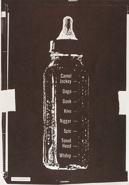
The second group project, The Baby Bottle, showing a typical bottle with measuring markings down the side that read, ‘Whitey’, ‘Towel Head’, ‘Kike’, ‘Gook’ and other bigoted aspersions towards race and ethnicity, was not done for a special occasion but rather as a metaphoric reminder in the tradition of cautionary and instructive schoolroom posters. As Victore notes, the message was ‘not to hand down to our children prejudice and hatred through casual remarks’. Using a baby bottle was an apt symbol to suggest the matter-of-fact feeding of healthy and unhealthy ideas to children who accept any and all nourishment. The poster, however, did not have the splash the group had hoped for. Nor did it grab the proverbial hearts and minds.
Victore regretfully admits that although the group was able to get more posters onto the street, ‘the collaborative aspect didn’t work as well as I had hoped. It was too easy to work together, because somebody had an idea, and everybody else said “Yes.”’ Without more of an internal dialectic, the group dynamic was less about pushing and shoving each other to better solutions than consensus. So it was disbanded.
By this time Victore realised that producing his own posters at his own expense was also counterproductive. He mailed hundreds out (and many of them were hanging in offices all over town) but he decided that the most effective way to achieve saturation was to convince an appropriate group to sponsor the work. Of course, balancing the artist’s want with the sponsor’s needs is tricky, even when the work is done for free, and Victore quickly learned that pro bono is not the holiest of marriages. He complains that ‘Groups of this kind don’t (for lack of a better term) understand the tool of the poster and the power that it could have potentially.’ But after a few failed relationships he found the perfect client for one of his sharpest posters in the venerated NAACP (National Association for the Advancement of Colored People), which was trying to shed its moderate Civil Rights image and regain its activist aura.
The NAACP had produced a documentary film called Double Justice, about the racism inherent in the death penalty and asked Victore to design its promotional mailer. Instead of using film stills he decided to do a large rendering of a child’s stick-figure hangman game, where players guess letters that comprise a word, and for every wrong guess a body part is hung from a scaffold – at once the most innocent of children’s games and a terrifying symbol when presented in the context of racism. The word that Victore used was ‘nigger’ and the poster shows three letters – g,g,r. ‘I got the idea for the hangman game when I was in the elevator leaving the meeting,’ Victore recalls. ‘I ran to my bartender, who was the guy from the Shakespeare Project, and said, “What do you think?” He said, “James, it’s brilliant. They’ll never take it.” But they took it.’ The elegantly simple poster was mailed to a list of the NAACP Legal Defense Fund lawyers who help people on Death Row.
With the video included it was also sent to schoolteachers. ‘The last thing that I had heard from them (which was a while ago now) was that they got a call from [former US Supreme Court] Justice Blackmun’s office to obtain copies,’ says Victore. ‘So it was in Justice Blackmun’s office just before he reversed his opinion on the death penalty.’
The Death Penalty Mocks Justice, 1995, produced for the NAACP, offers another critique of how racism influences social policy.
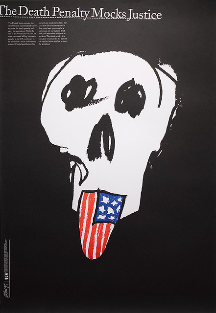
The hangman poster (entitled Racism and the Death Penalty) was the first of two posters for the NAACP that confront a racially biased capital punishment. The second, The Death Penalty Mocks Justice, is a white-on-black image of a skull with a stuck out tongue in the form of an American flag. Here Victore resorted to known clichés (something that he has managed to avoid in his other work) but he argues that in this instance it is the most effective means for getting the point across. ‘I could have come up with something more intellectual or some offbeat imagery, but the problem I think for the people I was speaking to was that it would have been too coy or too design-ey. This was also for the NAACP and it was going to go to lobbyists and lawyers and teachers, and without being trite or belittling, I wanted to speak in really simple forms, and get an idea across in a gestalt manner, whether it’s through your heart or your intellect or whatever.’
Use A Condom, 1998, created as exhibition posters for the DDD Gallery in Osaka, Japan, argues for birth control. Victore says the bunnies have met with favourable response, while the flies have been deemed ‘revolting’.
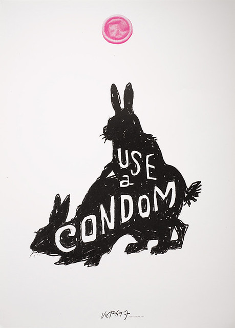
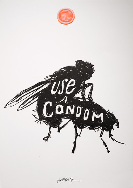
Nevertheless, posters that really make a difference are rare indeed, and even less profitable. So Victore exploits whatever opportunities come his way to facilitate making these images. Since his posters have earned awards and frequently appear in design annuals he has been offered a number of one-man shows and has been invited to appear in various group exhibitions. When asked to make a poster announcing a show, he often takes the opportunity (and the free printing) to make an additional graphic commentary. On one occasion, for a group exhibit of paired posters by 33 international designers at the DDD (DNP Duo Dojima) Gallery in Osaka, Japan, he produced a pair of quirky posters on the theme of safe sex: “It was an idea that I’d been playing with for a while,” Victore says about the posters each showing a pair of fornicating animals: one is house flies, the other bunnies (what he calls the ‘Bugs and Bunnies’ series). ‘I wanted to make them look like fake Victorian postcards with old type and silhouetted images. My problem now is that I love these images, and I want to get them produced and used for some real purpose.’ He approached Condomania, a New York boutique specialising in condoms, to use them for their advertising. ‘They liked them,’ he relates, ‘but only the bunnies. They didn’t like the flies. But the way I see it, there’s two ideas behind using condoms. One of them is procreation, the other is to not spread disease. For whatever reason, that doesn’t get through. But I really love those images, and think they would just be stunning, especially in the springtime, all over New York.’
Images, Politics and Cross-Pollination, 1997, alludes to a familiar image for a poster announcing a symposium on political art.
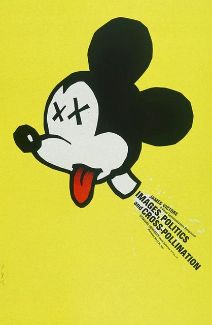
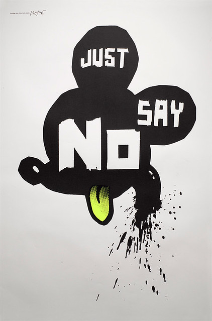
Victore has a litany of pet peeves, and many of them revolve around New York (which he called home for over a decade until late this year when he moved an hour north to the bucolic Beacon, New York). Over the past few years New York City has become inundated with ‘official’ signs (dos and don’ts) bolted on lampposts addressing the basic etiquette of living with thousands of other people. Victore did one entitled Use Mass Transit, a bold gothic headline jammed together with childlike drawings of cars and trucks. Two recent posters, Images, Politics and Cross-Pollination, originally done for a lecture announcement, and Just Say No, showing the severed head of Mickey Mouse. These address Victore’s belief that New York is ‘being tourist-ed to death. New Yorkers are becoming just like the great silver-back gorillas who will now come down and will eat out of your hand.’ Victore believes that the ‘Disneyfication’ of New York (the widespread colonisation of Times Square and other city venues of Walt Disney Corporation hotels, theatres and retail malls) is one of the city’s root evils. In the midst of New York’s official celebration of Disney’s civic improvements, this poster is a reminder that it is all part of a branding scheme.
As a response to Disney Corporation’s ‘colonisation’ of New York City, Victore printed Just Say No, 1998, but is waiting for the right time to hang it.
Despite his consistent output, Victore is not exclusively a polemicist. ‘I’ve created this false front,’ he admits, ‘I’ve created this character who people think is only interested in these wild critical images. This is a disservice to my commercial work and I don’t get jobs because people see me in a certain way.’ Does he protest too much? Maybe. In fact, Victore does hold ambivalent feelings about polemical posters. ‘Of course,’ he insists, ‘I enjoy doing the social / political stuff,’ and he believes some people do engage in the poster medium. But others disregard it as just another form of graffiti, something that mars the otherwise beautiful streetscape, ‘and so they shut their metaphorical shutters.’ He continues to apply the same conceptual acuity to more commercial assignments, but has a corresponding need to make commentary. Therefore, advertising is the next medium that Victore wants to invade. ‘The public is so conditioned and so used to seeing images through common advertising that when you give them alternative messages in that medium they’ll accept them,’ he says confidently. ‘I’m thoroughly interested in the medium of advertising to get messages across. And if that means I should do branding or create logos, then that’s what I want to do.’
First published in Eye no. 30 vol 8, 1998
Eye is the world’s most beautiful and collectable graphic design journal, published quarterly for professional designers, students and anyone interested in critical, informed writing about graphic design and visual culture. It is available from all good design bookshops and online at the Eye shop, where you can buy subscriptions and single issues.