Summer 2002
A new ‘flag’?
Hold the front page! Rem Koolhaas devises a ‘bar code’ for Europe. Critique by Rick Poynor
It’s not often that graphic design makes it into the daily papers, let alone on to the front page. And on the rare occasions it does receive this much attention, it is always for the same reason. A new symbol has been announced – a telecommunications company logo, a multinational’s expensive new identity, an airline’s tail-fin livery – and suddenly everyone is an expert commentator with a (usually scathing) opinion to offer.
The latest hoo-ha concerned a proposed new ‘flag’ for the European Union. The union already has a flag, dating from 1986: twelve stars arranged in a circle on a blue background. The stars symbolise unity and harmony rather than individual countries, since there are now fifteen member states. It’s not in any way remarkable, but it has the virtue of being reasonably memorable.
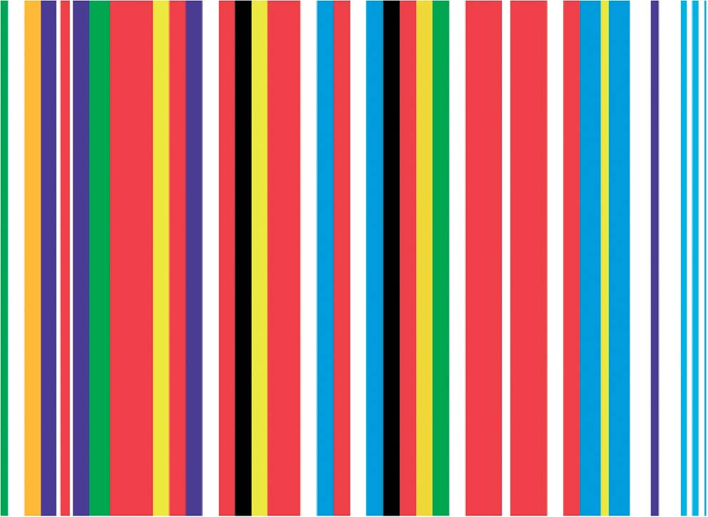
According to The Independent and the BBC’s website (8 May), this will soon be replaced by a new design from Rem Koolhaas, an architect whose ‘ultra-fashionable’ status makes journalists fizz with excitement – and so it was here. The Koolhaas studio’s design remixes the member states’ flags into vertical colour bars, which are then elongated and squeezed together to form a series of 48 stripes. This had been initiated, we learnt, by European Commission president Romano Prodi.
There was no getting around it, the flag looked like a bar code, albeit one that was high on drugs. It was also likened to a television testcard and a deck chair pattern and some pointed out the difficulty children would have drawing it accurately. In artistic and graphic terms, there is nothing new about it. Op Art abounds with similar images. The Pet Shop Boys released an album with a colour-stripe cover as long ago as 1988. John Warwicker of Tomato produced a series of colour-bar mix-downs of his personal travels. The most remarkable thing about the design is how little design it contains; its aesthetic form is determined by the simplest of structural systems. It does raise the question, though, of how future EU members would be accommodated. Would the stripes just become thinner and thinner, increasing the flag’s optical vibration to even more uncomfortable levels? And what would happen in black and white? It really would look like a bar code then.
The bar code association was, in any case, far from accidental. The image was first presented in October 2001 in an EU document titled Brussels, Capital of Europe, the fruit of several months’ deliberation on how to communicate the idea of Europe by a committee of Euro-intellectuals, chaired by Umberto Eco, and including Koolhaas. In the report, the stripes are explicitly referred to as a ‘bar code’ and many other images also express Europe’s identity in graphic ways. One map consists of company logos; another purports to depict ‘Cool Europe’ (you may be surprised to learn that the late Queen Mother was cool). An uncaptioned image shows the candy-striped bar code stamped on the back of a man’s neck – it looks suspiciously like Koolhaas. No one who actually consulted the report could take these ironies entirely seriously.
Within days, Koolhaas himself, professing to be honoured by the coverage, had written to The Independent to point out that the paper’s front-page story was wrong. The bar code was not in fact intended as a new flag; it was just one of a number of proposals to represent European diversity. It was already too late, though. The ‘new flag’ was by now grist to an army of Web-log sceptics. In another reflex familiar on these occasions, The Guardian asked several British designers – Atelier Works, North, Identica and The Partners – to devise their own versions. Atelier’s Quentin Newark had some smart things to say, but some of these offerings were so far wide of the mark that they made the bar code look inspired. Anyone for interlocking ‘E’s? (Identica). Or Europe visualised as the world’s welcoming doormat? (The Partners).
Media preoccupation with the non-flag was all the stranger in view of the turn political events had taken in Europe, as the far right showed signs of electoral resurgence in France and the Netherlands, and the continent’s future became the subject of anguished editorials. In Newsweek’s view, these developments foretold ‘The collapse of Europe’s political center’, while The Economist wondered ‘How sick is Europe?’ Multicultural diversity, some people appeared to believe, was a problem and well meaning graphic symbolism of any description now seemed a touch premature.
Rick Poynor, writer, founding editor of Eye, London
First published in Eye no. 44 vol. 11
Eye is the world’s most beautiful and collectable graphic design journal, published quarterly for professional designers, students and anyone interested in critical, informed writing about graphic design and visual culture. It is available from all good design bookshops and online at the Eye shop, where you can buy subscriptions and single issues.