Summer 2009
Cult of the squiggly
Over-abundant embellishment is spiralling out of control. Time to get out the shears, cries Steven Heller.

Beware! Vines and tendrils have recently strangled designed surfaces and objects without mercy. Yet unlike almost all our other earthly woes, it has nothing to do with global warming – unless graphic designers are instinctively compensating for the depletion of polar ice caps and degradation of the rainforest ecosystem by planting ornamental graphic vegetation on things. More likely, it is a reaction to the perpetual dominance of sterile Modernism. You could argue that lush forests of typographic embellishment are responses to a basic aesthetic need for – and under-abundance of – decoration in our basic design diet.
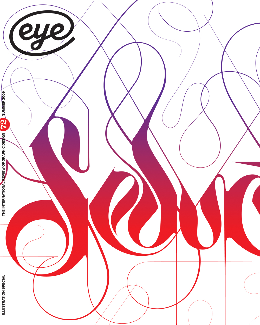
The cult of the squiggly, as we’ll call this manifestation, was seeded by a few innovative form-givers, including Marian Bantjes (see Reputations, Eye 72), whose mastery of craft is unworldly, and Seb Lester (seblester.co.uk), whose swirling lettering spirals joyously off the page. But now the trend is everywhere, like the fast-growing climbing vine kudzu, multiplying and spreading in nonsensical uses to a terrifying degree. Think of Jack’s beanstalk run amok, and the bloodthirsty plant, Audrey, from Little Shop Of Horrors having mated with the nightmarish Invasion Of The Body Snatchers pods. We have reached a point now where the time has come to prune the invasive squigglies. But this is not the first time we’ve had to do so.
In the 1908 essay ‘Ornament and Crime’, Austrian architect Adolf Loos proclaimed ‘the evolution of culture marches with the elimination of ornament from useful objects.’ Design was then, like now, in an ornamental quagmire. Eleven years after the initial blooming of Art Nouveau (for example Jugendstil, Vienna Secession, Stile Liberty), which began in 1896, forests of twisted stems and tendrils – what historians call floriated madness – covered everything from posters and typography to furniture and buildings. Loos’ preference for ‘smooth and precious surfaces’ derived from his belief that functional objects swathed in ornament were guaranteed instantaneous obsolescence. Loos believed that superfluous design was downright immoral.
Obsolescence was, therefore, a mortal sin. Yet barely twenty years later, just prior to the Great Depression, the strategy known as ‘forced obsolescence’ or what the innovative American adman Earnest Elmo Calkins referred to as ‘styling the goods’ was being celebrated for having to some degree brought the United States economy back from stagnation to vibrancy – in large part by adding ornament (in this case Art Deco) on to products and structures like some sort of camouflage-cum-stimulant.
Visual austerity might be seen as a denial of aesthetic pleasure, a puritanical notion. For who would argue that an ornamented Persian miniature, with its complex graphic layering, or The Book of Kells, with the interlocking patterns and filigree that fill its pages, are not among the most beautiful (and in a sense, most functional) of graphic artefacts? How could baroque and rococo motifs in print or on edifices be pilloried as crimes against the eye or society, despite what they have come to symbolise?
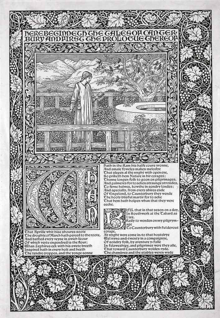
William Morris, the late nineteenth-century designer, printer, author, social critic and founder of the Arts and Crafts movement, exalted ornamentation as a high form of expression. His design for the Kelmscott Press edition of Chaucer’s work, which marked the pinnacle of his career as a craftsman, reintroduced the medieval or Gothic approach from its lavish ornamental borders to its decorative capitals and frames. But The Kelmscott Chaucer did more than simply revive an antique style. It was the realisation of Morris’s belief that a combination of modern printing techniques and traditional arts and crafts could counteract the corrosive impact of industrialisation. Ornament was not merely a veil to hide ugly industrial machines and wares; it was an antidote to the perceived poisons spewing from factory chimneys – a prescient concept at that.
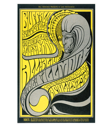
Ornamental embellishment is not inherently evil – even in excessive doses. In fact, sometimes excess is truly divine – take the psychedelic poster style, for instance. Nonetheless, passions are inflamed when the topic of ornamentation is injected into high-minded matters of design. The Bauhaus masters rejected ornamentation as symptomatic of a bourgeois aesthetic order. Followers of the Bauhaus and adherents of orthodox Modernism, even to this day, have maintained the belief that minimalism enables the clearest communication – purity is transcendent. They rail against what advertisers in the 1920s and 30s called ‘frou frou’ and fight it in manifestos about less being more. Yet there has long been a desire to inject complexity and even superfluity into design.
Concert poster ‘Bill Graham Presents in San Francisco: Buffalo Springfield, Steve Miller Blues Band all alive at the Fillmore.’ Artwork by Wes Wilson for Bill Graham, 1967.
Top: Wood engraving of trial page from Geoffrey Chaucer's The Canterbury Tales (the Kelmscott Chaucer designed by Edward Burne-Jones and William Morris, 1896. 
Ornament’s startling, though predictable comeback (see ‘The decriminalisation of ornament’, Eye no. 58 vol. 15) is as widespread and popular today as it was in the Victorian, Art Nouveau and Art Deco eras. Decorative patterns are largely born out of the hip-hop and street-culture aesthetics, rising in various media from textiles to clothing to Web to print. Illustrated letterforms – not calligraphic in the classical sense nor illumination in the medieval context – have complemented these new decorative tendencies. Lettering – stitched, scrawled, scraped, carved and more – has added an even more profound ornamental overlay to design of the 21st century. Sometime during the early 2000s, more than a decade after the computer became the primary design tool, squiggly serpentine, floral ornamentation was resurrected with a vengeance from its gilded-age crypt.
The reasons? Rebellion against the blandness of template-driven computer-generated design is one factor. But more likely, the fact that once-difficult drafting processes are now much simpler with computer programmes and this has spawned a new enthusiasm for ornament.
The DIY movements of the mid-1990s contributed to the growth of digital foundries that offered scores of ‘novelty’ faces made from materials including twigs, flowers and trees. The use of leaves, stamens and pistils today has been ubiquitous throughout the design world. In some instances, the plant is a perfect foil for Modernist austerity, but in others it is simply an opportunity to be fussy. Lettering made from branches and bark has a long history used both as a sign system for rustic homes and campsites, as well as graphically illustrated lettering. One of the most popular nineteenth-century novelty faces was Figgins’ Rustic or Log Cabin, made from logs. Current use is not much different, albeit more witty. When done well it can be surrealistically beautiful and comically engaging, as in Stefan Sagmeister’s poster for the School of Visual Arts, where branches are transformed into words. Done poorly it’s better off as kindling.
This decoflora (my coinage) resurgence also seems to have caught on because it animates so well. In Yellow Submarine, psychedelic plant life grew wild on the screen, choreographed to follow the Beatles’ music. That was the beginning of the kinetic squigglies as practised today on TV and computer screens. For HP printers, flora symbolises colour; for Bud Lite with Lime, vegetation suggests sweet hops. But florid arrangements are taking over so much more. Like ornamental psychedelic art in the 1960s, what began as a novel design approach was quickly co-opted by lesser talents for silly, exploitative purposes. Today, the internet is full of clip art services engulfed with ornamental weeds. T-shirt entrepreneurs have developed repetitive patterns of flowers and vines. Recently Vodafone introduced a totally irrelevant floral motif to a card instructing users of its phone how to make international calls. A similarly gratuitous usage is an English-edition paperback cover design for Alex Ross’s The Rest Is Noise, in which squid-like tentacles flail across the image area, serving not to underscore the content of this fascinating book, but to fill up the negative space.
And that’s the problem: when ornament is profligate, design is made trivial.
Vines and other flora have crept on to pages, packages and screens like bindweed after a summer’s rain. And like this everlasting pest the new ornament is almost impossible to control without a lot of brush clearing. Prune now before it strangulates again and again and again.
Eye is the world’s most beautiful and collectable graphic design journal, published quarterly for professional designers, students and anyone interested in critical, informed writing about graphic design and visual culture. It is available from all good design bookshops and online at the Eye shop, where you can buy subscriptions, back issues and single copies of the latest issue. You can also browse visual samples of recent issues at Eye before You Buy.

