Summer 2008
Oliver Knight
Who cares about graphic design history?
Olly Knight was born in the village of Windlesham in Surrey, and graduated from the University of the West of England, Bristol, in 2003.
Q1. What do you think is meant by ‘the canon of graphic design history’?
For example: The Bauhaus? Beck’s Underground diagram? Alvin Lustig’s book covers? Swiss Modernism? George Lois’s Esquire covers? Wim Crouwel’s New Alphabet? Milton Glaser’s ‘I [heart] NY’? Barney Bubbles? Ray Gun? Do you ever think about it, or buy design history publications?
A1. The canon includes those projects or movements that stand out as benchmarks of their era, approaches or styles that appear at the right time and in the right place to capture the imaginations of a generation. In some cases these are timeless pieces of design (Glaser’s ‘I [heart] NY’). In others, they are not (Ray Gun).
Q2. Is design history relevant to your design practice?
A2. It is important to be aware of design history. It contributes to a depth of knowledge and can often help to define key design principles. Swiss Modernism, for example, has had a lasting effect on me, and aspects of it have helped to define my approach.
Q3. Where did you learn about design history?
A3. Books, friends, colleagues.
Q4. Does history have any relevance to the new technology and techniques you’ve had to master in your work?
A4. The technologies available to graphic designers in the 21st century are hugely influenced by techniques used throughout history. Many or most of the functions available in InDesign, Photoshop and so on, are old techniques translated into computer form. Unfortunately, modern technology is in danger of taking away the hands-on process inherent in graphic design practice of the past.
Q5. If you were in charge of a design education programme, what aspects of design history would you teach to your students?
A5. Understanding typography is key to design education, so an emphasis on Swiss and Dutch history would be a solid basis. On top of this, all students need an outlet of expression to define their personalities. I think this comes from the individual, although a few pointers in the direction of certain designers, artists, poets, movements are always important.
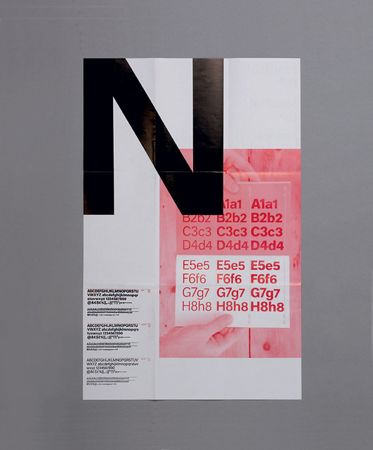
Top: Type specimen designed to promote a font (neutral) that was inspired by a quest for neutrality, taking its cues from some of the classic Swiss typefaces. Design: OK-RM (oliver Knight and Rory McGrath), 2007. Client: B&P type foundry.
First published in Eye no. 68 vol. 17 2008
Eye is the world’s most beautiful and collectable graphic design journal, published quarterly for professional designers, students and anyone interested in critical, informed writing about graphic design and visual culture. It is available from all good design bookshops and online at the Eye shop, where you can buy subscriptions and single issues.