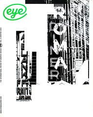
Winter 2004
Second fiddle
Two high-profile fine art magazines treat themselves to typographic makeovers. Critique by Rick Poynor
Art magazines pose their own special problems for the designer. The coming together of two parallel forms of visual culture exposes the broader tensions in art and design’s relationship with particular clarity. This is one place, as in art books, where the design isn’t supposed to intrude too noticeably on the content. Most art magazines are perfectly adequate – they look contemporary, as they must, and they show off the art nicely – but few ever rank among the most creative magazine projects of their day. Design seems to be free to shine brightest where it exists on a similar cultural plane to its subject matter. While graphic design might be capable of feats of virtuosity in its own right, when serving art it must preserve appearances, accept its place and continue to play second fiddle.
Yet design now occupies a central role as a positioning device, even for art, and the art world knows it. Two well established British art magazines, Frieze (founded 1991) and Tate (founded 1993), now retitled Tate Etc., have recently received much-needed makeovers. Tate Etc., published three times a year, arrived first with its summer issue, but there are some striking similarities of visual style and tone.
After a long period of consistency, when Stephen Coates designed it, editing and production of Tate passed to Condé Nast. Where the title previously had a clear sense of purpose as a lively but still institutional expression of the Tate galleries’ critical and historical concerns, the glossy magazine publisher glammed it up and tried to position Tate as a natural bedfellow for its lifestyle and fashion titles. Tate’s design struggled to reflect this, but it didn’t gel. Tate was unhappy and decided to relaunch. The magazine, a hybrid, is aimed at both Tate members and newsstand buyers. Swiss art director Cornel Windlin’s redesign looks much more authoritative, but in an approachably loose-structured way. The pictures float in unusually generous zones of white space, without pressure to conform to a grid, and this works especially well when collections of images are shown comparatively to illustrate a visual theme.
For the text, Windlin (see Eye no. 22 vol. 6) uses a modified version of Adobe Garamond chosen, he says, because ‘it is as normal and unassuming as it gets’. Most of the unjustified text is set in two broad columns, and many are allowed to fall short, contributing to the pages’ openness. In a note of controlled eccentricity, the headline face changes each issue. So far Windlin has used ITC Clearface Regular and ITC Serif Gothic Black (by Herb Lubalin and Antonio DiSpigna) and these, too, are allowed to play against soothing washes of white space.
The new look Frieze, published eight times a year, is a much steelier affair. The magazine’s previous text typeface, a slab serif, was strangely pale and unassertive for such a prominent European art title. Art director Marcus Werner Hed has replaced it with the much more incisive Georgia, used on a predominantly three-column grid to produce denser pages than Tate Etc.’s.
Frieze has come a long way since its early days when it shunned many magazine conventions. It now has consistent headline and standfirst treatments, editorials, regular columns, book reviews, advertisements facing editorial, and, after thirteen years without a letters page, new editors Jennifer Higgie and Jörg Heiser have introduced one. Editorially, Frieze looks considerably more focused and, like Tate Etc., it succeeds in projecting a strong sense of intellectual purpose without appearing stuffy or forbidding.
Frieze’s handling of pictures is less involving than Tate Etc.’s more discursive ‘slide show’ approach. Some are used large for impact, others descend from the top of the page into the text area, where they are knocked back by a tint behind the type. Image clarity and text readability lose out to a general page effect. By the third issue, they had dropped this, but it did leave the pages looking a little bare. The decision to separate the text and image pages in the review section could also prove limiting.
Considered as commercial projects, hoping to appeal to broad readerships, especially in Tate Etc.’s case, both titles have re-invented themselves shrewdly. These days Frieze rakes in the ads and the publisher has cemented its position in the art establishment by staging the annual Frieze Art Fair. Anyone hoping for a more overt and questioning role for design – as applied, for instance, in the Dutch architecture magazine Archis (see Eye no. 45 vol. 12) – may be disappointed. If art is truly committed to radical new forms of visual practice, then why so cautious when it comes to design? It’s a moot point whether such a publication could be viable, but the British art scene seems to be in no hurry to give it a try.
Rick Poynor, writer, founder of Eye, London
First published in Eye no. 54 vol. 14 2004
Eye is the world’s most beautiful and collectable graphic design journal, published quarterly for professional designers, students and anyone interested in critical, informed writing about graphic design and visual culture. It is available from all good design bookshops and online at the Eye shop, where you can buy subscriptions and single issues.