Friday, 12:00am
1 May 2009
The canon, aimed at your back
GenPrag’s T-shirts celebrate the most emblematic of twentieth-century graphic design heroes. So let’s have one for Will Burtin. Critique by Rick Poynor
Web-only Critique written exclusively for eyemagazine.com
This column has never addressed the subject of T-shirts, but we make an exception with the arrival of the Graphic Design Heroes series designed by GenPrag, alias graphic design professor Paul Nini of Ohio State University. Graphic design heroes? Is it really still permissible to use such an unreconstructed phrase in graphic design education? The approved line of thinking – for about 20 years now – has been to question the lamentable influence of the idea of the ‘design genius’ on impressionable students, who then enter practice only to find the real world isn’t like that. In 2009, shouldn’t a responsible, right-thinking series of design educator T-shirts be titled something more socially acceptable and inspiring to a young design worker, such as ‘Noteworthy group collaborations’ or ‘Exemplary instances of service design’?
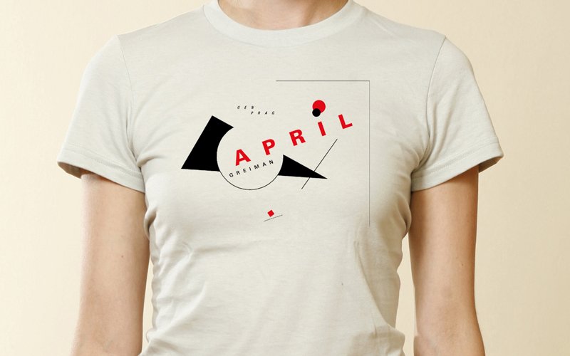
Unrepentant, Professor Nini has produced 24 designs, available through Skreened, a company started by Daniel Fox, one of his former students at Ohio State. Each T-shirt has an emblem with the designer’s name graphically treated in the style of his or her work. So Saul Bass is represented by the arm from The Man with the Golden Arm, Herbert Matter by a seamless remix of his New Haven Railroad logo with HM in place of NH, and Otl Aicher – you can see this coming – by a modular 1972 Olympics pictogram. One can’t complain if the imagery seems obvious, since the whole point of an emblem is to be emblematic.
As these names suggest, the individuals Nini has elected to celebrate are among the best-known graphic designers of the twentieth century. A few remain at the forefront of attention (Tschichold, Zwart, Rand, Müller-Brockmann, Crouwel, Glaser, Vignelli), while others are less often cited now (Lustig, Sutnar, Stankowski, Odermatt, Tissi, Hofmann, Weingart, Greiman), though they are all significant figures who have been widely published and acclaimed.
Top and below: T-shirts by GenPrag.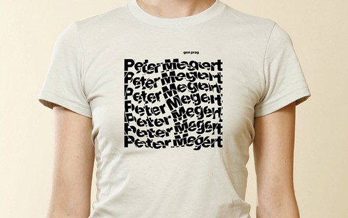
The only unfamiliar name in Nini’s line-up is Peter Megert, a Swiss designer – Richard Hollis shows a single poster in Swiss Graphic Design – who taught for many years at Ohio State. In a comment on Design Observer in 2007, Nini mentioned Megert as an example of a designer working outside the main metropolitan centres (in this case, Columbus) whose work deserves to be better known. Megert is a ‘hero’, then, in only a local sense and his inclusion is a strategic homage. Nini and his faculty colleagues are working on documenting his story.
This generous impulse to record the histories of unknown designers points up the absurdity of complaining about the fact that some designers are already famous and influential. Nini’s desire to gain attention for Megert comes from recognising at first hand that his work is the product of an individual engaging with his circumstances, and that his story has value, and might, if better known, have something to teach others.
The reality of graphic design’s piecemeal history is not that too many designers of achievement are known to us, but that so many designers of achievement are barely known at all. Even figures of manifest stature and significance can later sink into obscurity. This has happened to the innovative German émigré Will Burtin, who built a career in the US as an information designer, specialising in the visualisation of scientific ideas.
During a recent lecture about design books at Sheffield Hallam University, I asked the audience if anyone had read Design And Science (2007), a monograph about Burtin. Not a hand went up. A well argued post about Burtin on Design Observer by Lorraine Wild received the same dispiriting lack of response, despite the existence of the book and some positive reviews (I wrote one myself).
It’s a shame there isn’t a Will Burtin T-shirt in Nini’s set, though this could be rectified. Rand and Crouwel hardly need the publicity, after all, while Tschichold, Müller-Brockmann and Hofmann are favoured with two designs apiece. Despite the presence of one or two left-fielders, such as Blue Note cover artist Reid Miles, these heroes tend to epitomise a particular strain of modernist Swiss typography, reflecting the narrowing of taste, if not the conservatism, in today’s graphic design. Where are the Japanese designers, the Poles, the Cubans?
The typographic emphasis seems to rule out designers whose impact comes from the creation or manipulation of imagery. Glaser is reduced to a red heart, while the spirit of Alvin Lustig, master of book cover symbolism, eludes Nini’s perfunctory motifs. Pastiche is more acceptable, it seems, when it’s applied to type rather than to something as personal as a handmade image.
Rick Poynor, writer, founder of Eye, London
Eye is the world’s most beautiful and collectable graphic design journal, published quarterly for professional designers, students and anyone interested in critical, informed writing about graphic design and visual culture. It is available from all good design bookshops and online at the Eye shop, where you can buy subscriptions and single issues.