Winter 2011
All the flat boys
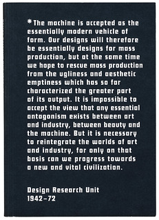
Design Research Unit 1942–72
By Michelle Cotton<br>Designed by A Practice for Everyday Life<br>Koenig Books, £16.95 / €19.80<br>

Michelle Cotton’s book, produced to accompany a Cubitt Gallery touring exhibition (see ‘From bombs to brands’ in Eye 77), is an admirably short and readable account of a big subject. Formed during the Second World War, the Design Research Unit (DRU) came to dominate British design life in the 1960s, pioneering the concept of a Modernist integrated design practice a generation before Pentagram, Total Design and Unimark. Founded and staffed by young designers determined to make postwar Britain a better place, the company’s optimism and talent was tested in big projects such as the 1951 Festival of Britain, for which it proposed an outrageously ambitious masterplan in 1946.
Cotton tells the story in a series of elegantly framed case studies, including extensive work for Watneys and British Rail, and ends with a chapter entitled ‘The New Heraldry’, which shows DRU’s identity design for Ilford and ICI, plus work for London Transport’s Victoria Line (1969) and street nameplates for the City of Westminster, now familiar in facsimile as tourist souvenirs of London.
The human side to DRU’s story – the personality mix, friction between partners, the problems of scale as the company mushroomed – is revealed in passing. We learn that graphic designers and architects within DRU were differentiated as ‘flat boys’ and ‘round boys’, and that intergenerational conflict reared its head in the 1960s. Cotton shows DRU’s roots in the Bassett Gray group of artists and writers (1920s) and the Industrial Design Partnership (1930s), and introduces key personalities, including designers Misha Black and Milner Gray, ad man Marcus Brumwell and ‘self-proclaimed anarchist, poet and critic’ Herbert Read, who was DRU’s first salaried member.
An appendix listing 365 DRU members and associates from 1944 to 1969 includes Edward Wright, Jock Kinneir and Richard Rogers, as well as Gerald Barney, who designed one of the more visible remnants of DRU’s legacy, the British Rail logo (1964).
The typography (Monotype Grotesque and Linotype Futura) and art direction (by Apfel) is pleasingly uncluttered, illustrated with a clear and well captioned mix of artwork, extracts from identity manuals, pack shots and documentary photographs. The only dissonant note is struck by its fussy cover, which displays an overlong quote from DRU’s 1943 manifesto, set white out of blue-black in Linotype Futura.
Images of the designs in use will have a nostalgic value for older Brits: the pub branding for Watneys encapsulates what Cotton calls Gray’s ‘particular craft in enlivening a predominantly pragmatic, modernist sensibility with … “traditional vernacular”’.
And she reveals that we have DRU to thank for ‘the yellow taxi lamp that indicates when the car is available’, first proposed by Gray in 1946.
Cover of Design Research Unit 1942-1972 by Michelle Cotton. Book design by APFEL (A Practice for Everyday Life).
Top: Spread from DRU’s mid-1960s identity designs for Watneys.
John L. Walters, Eye editor, London
First published in Eye no. 82 vol. 20 2012
Eye is the world’s most beautiful and collectable graphic design journal, published quarterly for professional designers, students and anyone interested in critical, informed writing about graphic design and visual culture. It is available from all good design bookshops and online at the Eye shop, where you can buy subscriptions and single issues.