Winter 2008
Big ideas and giant turkeys
For the Love of Vinyl: The Album Art of Hipgnosis
Picturebox, $45

The culture of ‘album cover design’ often runs in a kind of parallel universe to that of regular graphics. Design pundits drop such names as Reid Miles (Blue Note) and Peter Saville (Factory Records), even when the content puzzles them; music obsessives collect sleeves by Roger Dean and Barney Bubbles (see ‘What a Genius’). But in the days before ubiquitous music television and obligatory videos, Hipgnosis’s covers, lavishly featured in For the Love of Vinyl: The Album Art of Hipgnosis (Picturebox), were what rock music looked like – whether you liked it or not.
Their counterculture-inspired rejection of obvious marketing tropes – such as having the artists’ pictures or names on the cover – quickly became the norm, as record sales mushroomed in the inflationary 1970s. Hipgnosis founders Storm Thorgerson and Aubrey Powell revelled in the big idea – the impassive cows of Pink Floyd’s Atom Heart Mother, the typewritten screed of XTC’s Go2, the mysterious black void of Led Zeppelin’s Presence – in a manner that seemed closer to advertising (as Adrian Shaughnessy points out in his warmly expressed intro) or to fine art – Jonathan Ellery of Browns compares the Go2 sleeve to a Donald Judd or an Ellsworth Kelly.
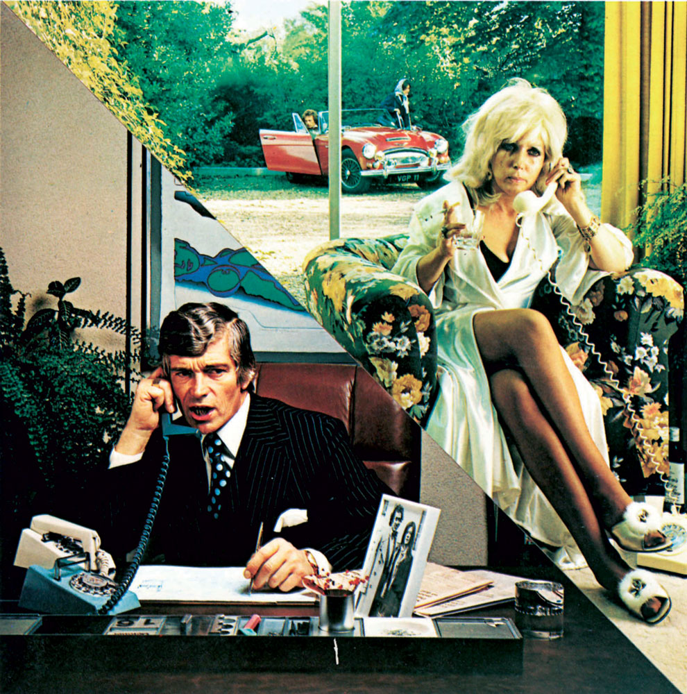
Cover from For the Love of Vinyl.
Top: 10cc's How Dare You, 1976.

The amiable (if slightly forgetful) Thorgerson and Powell, bylined throughout as ‘Storm’ and ‘Po’, admit they knew nothing about type or composition: ‘Graphically speaking, nothing necessarily lined up; fonts were alien to us and a concern with balance, diagonals, contrast and so forth came later.’ At the end of the book, they list their 249 works, with thumbnails and little turkey symbols against their less successful jobs.
They chose their collaborators well: George Hardie’s immaculate precision (see Eye no. 58 vol. 15) dominates Wish You Were Here and Dark Side of the Moon. Glossy photo prints (by John Blake among others) gave the work an expansive sheen that thrilled a generation, mirroring the multi-tracked vocals and expensive plate-echo of acts such as 10cc and Wings before CDs and jewel cases called time on the LP sleeve. Now, with the rapid decline in physical formats for music, this rich fund of visuals defines a short period in pop culture, which For the Love of Vinyl brings to life.
John L. Walters, Eye editor, London
First published in Eye no. 70 vol. 18 2008
Eye is the world’s most beautiful and collectable graphic design journal, published quarterly for professional designers, students and anyone interested in critical, informed writing about graphic design and visual culture. It is available from all good design bookshops and online at the Eye shop, where you can buy subscriptions, back issues and single copies of the latest issue. You can also browse visual samples of recent issues at Eye before You Buy.
