
Summer 2014
Freestyling text and image
The Graphic World of Paul Peter Piech
By Zoe Whitley<br> Four Corners Books / V&A, £20<br>
As a second-year undergraduate student at Reading in the early 1990s, I was shown the linocut posters and prints of Paul Peter Piech as inspiration for a project. I hated them. To me all this crude wonky woodcut stuff was not typography or graphic design, not beautiful or well done. How blinkered and narrow-minded of me. Two years ago I came across the work again at Reading and fell head over heels in love with its energy, power and vibrancy – above all its utter disregard for all the conventions of graphic design.
The Graphic World of Paul Peter Piech (Four Corners Books / V&A, £20) follows publications on Sister Corita and the posters of the May 1968 Paris protests. Handsomely designed by John Morgan, this book will certainly raise the profile of a man who has largely been overlooked in recent graphic design history. The work doesn’t neatly fit into categories such as printmaking, private press, art, graphic design, typography or illustration. It is none but all at the same time – how exciting.
Piech (1920-1996), a graduate from Cooper Union School of Art in New York and Chelsea College of Art in London, worked as an art director on both sides of the Atlantic, but this book focuses on his private press work, large prints and posters from the 1970s to 1990s. An insightful essay by Zoe Whitley tells his life story, followed by 125 prints reproduced at a good size, so you can actually see the work and read the text.
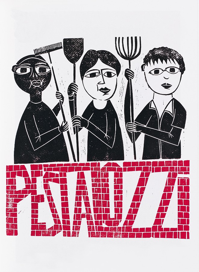
Here was a graphic artist with a social and political message to communicate, as in his 1991 poster campaign for the children’s charity Pestalozzi. He employed a skilful, creative and highly original combination of image (predominantly people) and text (lifted quotations), the key components of graphic communication.
With his experience in printmaking, linocuts offered a cost-effective and fast way of producing work, free from the technical constraints of letterpress types. Text could fall within images or wrap and bend and even become part of the image as in ‘I would challenge you today …’ from 1981 (below right), in which Martin Luther King’s body is built from a quote by his wife, Coretta.
The limitations and possibilities of hand-cut lettering with little or no planning are apparent throughout. Piech developed a unique flowing freestyle of dense upper- and lower-case mixed lettering. Spelling mistakes are forgiven, misprints and happy accidents celebrated. (But please don’t try to make a digital font from this: it won’t work. This is lettering, not type design.) There are surprises too: from 1981, an image of Saddam Hussein accompanied by the text: ‘The good leader and wise ruler is the one who feeds his people’.
What can we learn from Piech? We can be inspired to spend a rainy Sunday afternoon linocutting and printing a short run with immediate results; more, this book highlights the importance of printmaking within graphic design, for experimentation, individuality and creativity – a lesson for all of us.
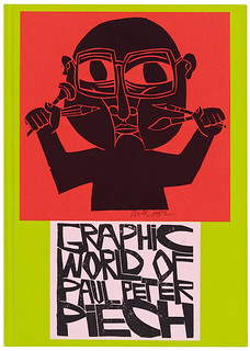
Cover of Zoe Whitley’s The Graphic World of Paul Peter Piech.
Top: 1991 poster campaign for the children’s charity Pestalozzi.
Fraser Muggeridge, graphic designer and founder of Typography Summer School, London
First published in Eye no. 88 vol. 22 2014
Eye is the world’s most beautiful and collectable graphic design journal, published quarterly for professional designers, students and anyone interested in critical, informed writing about graphic design and visual culture. It is available from all good design bookshops and online at the Eye shop, where you can buy subscriptions and single issues. You can see what Eye 88 looks like at Eye before you buy on Vimeo.