
Summer 2015
History of pictures worth reading
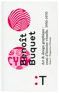
Art & Design Graphique: Essai d’histoire visuelle. 1950-1970
By Benoît Buquet Pyramyd, Paris, €16,50 / £11.56 (paperback 324pp), text in French
Benoît Buquet, a teacher of the theory and history of contemporary art, sees no reason to exclude graphic design from art history. Both deal with images. Even in the first year of the twentieth century, one of art history’s founding fathers, the Austrian Alois Riegl, crossed the border into graphic design. He wrote of the ‘configuration of the page, the form of the letters and the way of putting them together’.
Art & Design Graphique: Essai d’histoire visuelle. 1950-1970. Cover and book design: Bureau 205.
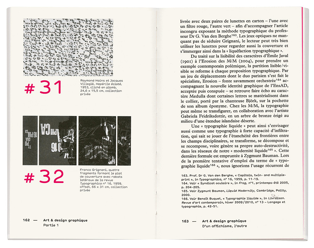
Top: Spread showing Franco Grignani’s cover for Typographica no.16 (1959), shown upside down below Raymond Hains and Jacques Villeglé’s ‘unforeseen typographic confusions’ (1953).
In this small, dense book, Buquet aims ‘to loosen certain threads of the history of graphic design and the history of art covering principally the years 1950 to 1970, to draw out crossovers between art and graphic design’. From two decades of ‘visual history’, Buquet chooses two fragments. The first is ‘affichisme’, the activity of European artists who cannibalised existing printed graphics. The second, titled ‘Poland, France, Panic’, is devoted to Polish posters and the work of Roman Cieslewicz.
Regarding ‘affichisme’, the Danish painter Asger Jorn said: ‘Posters are images already existing, they are cultural, not natural elements; these images are made by other artists who work with the same media as we do, everything combines to make a work of art.’ The reassembled film posters of Italian artist Mimmo Rotella aestheticised the banal in the manner of Anglo-American pop artists, allowing Buquet to introduce such ideas as the 1960s feminist politics of the male cinematic gaze – of the camera, the actor and the spectator at the service of a patriarchal society. As a contrast to Rotella’s re-assembling parts of film posters, Buquet cites and illustrates his mutilation of a famous poster for Punt e Mes aperitif by Armando Testa. ‘Punt e mes’ means ‘point and a half’ in Piedmontese dialect, which Testa represents in the poster by a circle and a half-sphere – showing neither the bottle, the glass, nor the drink itself.
This prompts the intervention of Umberto Eco, whom Buquet invokes to help the poster aspire to being a work of art: ‘A fundamentally ambiguous message, a plurality of signifieds that co-exist with a sole signifier.’ Because a poster looks like art, then it must be art. However helpful that idea is to Buquet, it is of little help to a critical reader. In moving to the work of Franco Grignani, a similar interpretation is offered. Because Grignani was an enthusiast for optical distortion, a link is made with Op Art. But though his work is contemporary with the paintings of Vasarely, or Bridget Riley, it does not aspire to being art.
In the second half Buquet asks: how could the graphic art renewal in Poland emerge in a Stalinist regime? He explains that, at a time when artists were obliged to conform to the tenets of social realism, the graphic designers were under no such constraint. The connections he makes between political events and the character of Polish design are revealing. Most of the well known names of Polish designers are cited. Did these designers form a ‘Polish school’ of poster design? Henryk Tomaszewski – hugely influential as a teacher of French designers, including Michel Quarez, Pierre Bernard and Alain le Quernec – claims that the Polish poster ‘was simply the proposition of a new method of communication between the artist and the public. We created a new semantic language … we changed from making the picture to be looked at into making one that was to be read.’
Buquet identifies a variety of influences: children’s drawings, what he redefines as the ‘graphics of immaturity’, Picasso, paper cut-outs – a Polish tradition – and those of Matisse. Cut-outs lead to a discussion of the work of Cieslewicz. Emigrating to France after a period in Italy, Cieslewicz is a perfect subject to bear the weight of Buquet’s analysis. His use of photomontage is the site where Dadaism, Surrealism and Constructivism meet. The book follows Cieslewicz’s integration into the Parisian world of fashion, style and marketing and ends with his part in the ‘anti-movement’, Panic. The graphic outcome was Cieslewicz’s design of the three numbers of the Panic journal, Kamikaze.
As history, this section is outstandingly thorough, and with colour illustrations, it would make a book in itself. Of the present book, it is difficult to convey the richness of ideas Buquet introduces. That art historians are now engaging with graphic design can only be good. They can bring an unprejudiced attitude to understanding the image in a social context. When they include the context in which images are made as well as the methods of their production and reproduction, they will provide yet more comprehensive histories in the future. Buquet has announced that a second volume will deal with the United States. It will be worth waiting for.
Richard Hollis, designer, writer, London
First published in Eye no. 90 vol. 23, 2015
Eye is the world’s most beautiful and collectable graphic design journal, published quarterly for professional designers, students and anyone interested in critical, informed writing about graphic design and visual culture. It is available from all good design bookshops and online at the Eye shop, where you can buy subscriptions, back issues and single copies of the latest issue. You can see what Eye 90 looks like at Eye before You Buy on Vimeo.