
Summer 2015
Master of the minimal
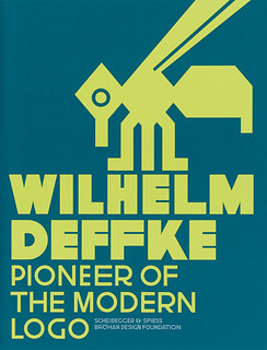
Wilhelm Deffke: Pioneer of the Modern Logo
Edited by the Bröhan Design Foundation, Berlin. Scheidegger & Spiess, £60 (hardback, 388pp).
When did logos begin? The wordmarks and symbols of Coca-Cola, Kellogg’s, Mercedes-Benz, Bayer, Shell and a good many other global brands have all been with us in one form or another for well over a century. But credit for the flat, geometric, reductionist visual shorthand that frequently characterises logo design should rest, according to a weighty new volume, with a little-known German designer called Wilhelm Deffke.
Deffke’s place in history, such as it is, has been blighted until now by a single, fateful association. In a 1917 promotional book for Wilhelmwerk – the prototypical design agency he established in Berlin with Carl Ernst Hinkefuss – a catalogue of Deffke’s trademarks and logos opened with a series of historical antecedents, intended to demonstrate the influence and power of symbols. These twelve ancient emblems had been redrawn in Deffke’s signature style, stripped of ornament and reduced to an emphatic, flat, black minimum. And the first in the series was a swastika – which would soon find its way onto the armbands and banners of Adolf Hitler’s National Socialist German Workers’ Party (NSDAP), the precursor of the Nazi Party.
Yet Deffke’s real legacy is the vast range of symbols and monograms that he crafted for German industry. Several are still in use today, including his Gemini logo for knife-maker J. A. Henckels and the three-ring symbol for Krupp (now ThyssenKrupp).
By most accounts a loner, Deffke was actively sought out by many of Germany’s largest industrial companies, who could not get enough of his simple, spare, sometimes humorous, sometimes imposing, designs, often based on heraldry, animals, names and initials. Deffke’s ability to distil complex industrial processes and products into memorable, minimal forms came from his first-hand observations of how each company worked, followed by relentless redrawing and reduction. His 1937 mark for the printing press manufacturer Koenig & Bauer – two touching circles, one bisected by a horizontal line – was preceded by 60 different designs. The logo is still in use and looks as if it were designed yesterday.
Having cut his teeth in the AEG corporate design office of Peter Behrens – alongside Walter Gropius and Ludwig Mies van der Rohe (later directors of the Bauhaus) – Deffke honed his monumental typography and strikingly simplified imagery into posters, book covers, advertising and brochures, before joining forces with ‘advertising consultant’ Hinkefuss in 1915. The pair signalled the intensity of their partnership in their own logo, a superbly indivisible ‘II’.
By 1921 Deffke and Hinkefuss’s partnership had folded, but Deffke’s prolific output had left permanent marks on every sector of German industry and had helped to shape the corporate design landscape. In the 1920s, Deffke branched out into architecture and exhibition design, before returning to logo design in the 1930s and establishing his own design studio, somehow managing to avoid commissions from the Nazi party or state.
With nearly 400 pages, 800 illustrations and fourteen essays, this long-overdue, scholarly monograph exhaustively details Deffke’s career and prodigious output. As Torsten Bröhan suggests in his introduction, Deffke’s influence extended beyond corporate design. In their stark imagery, his posters anticipated those of Müller-Brockmann and the Swiss movement.
The reduced visual language that Deffke used in his logos would also be developed for the purposes of graphic information by Otto Neurath and Gerd Arntz in the Isotype system. This in turn would lead to the translingual pictographic signing that we are now used to seeing in modern airports, user interfaces and mobile phones.
Wilhelm Deffke is as significant a figure in the development of graphic design between the wars as A. M. Cassandre, El Lissitzky and Herbert Bayer, and this book finally brings him out of the shadows.
Cover of Wilhelm Deffke: Pioneer of the Modern Logo. Cover design: Alessio Leonardi, Lion&Bee, Berlin.
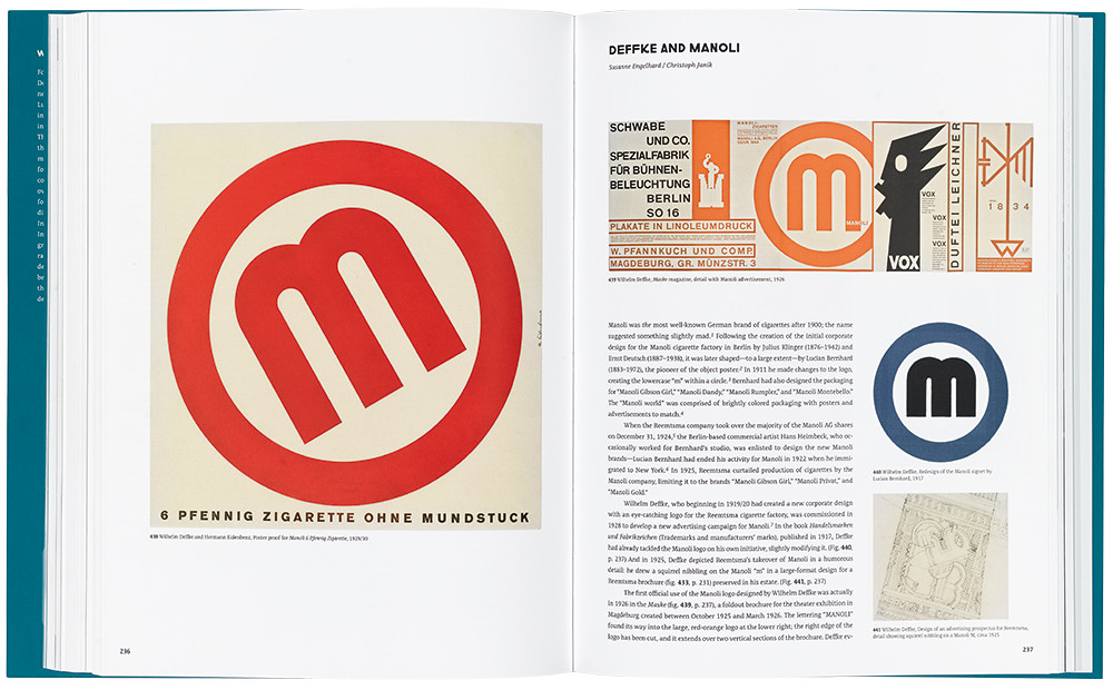
Top: Spread featuring a poster proof for the cigarette brand Manoli; a Manoli advertisement from Maske magazine, 1926; Deffke’s redesign of the Manoli signet; and a design for Reemtsma.
Michael Evamy author, independent copywriter, London
First published in Eye no. 90 vol. 23, 2015
Eye is the world’s most beautiful and collectable graphic design journal, published quarterly for professional designers, students and anyone interested in critical, informed writing about graphic design and visual culture. It is available from all good design bookshops and online at the Eye shop, where you can buy subscriptions, back issues and single copies of the latest issue. You can see what Eye 90 looks like at Eye before You Buy on Vimeo.