Summer 2008
More pricks and clicks
Mute Magazine Graphic Design
Eight Books, £19.99, <br>By Simon Worthington, Damien Jacques and Pauline van Mourik Broekman <br>
Back before we networked on Facebook by sending each other vampires, zombies and werewolves, back before the gentle ribbing of blogs, there was a golden age of magazine design, the 1990s, of Wallpaper*, of Ray Gun, of Mute. ‘Mute?’ you say. Yes, Mute, now with its own retrospective, written by its co-founders, with designer Damian Jaques.
I used to buy Mute, which was a technology and culture magazine like Wired or Mondo 2000. Wired, with its inky, Day-Glo look, had an audience of programmers who listened to ‘Personal Jesus’ carbing out on all-night pizza and code; Mondo 2000’s apocalyptic mix of West Coast cyberculture and new-age surrealism was for folks with Macs and tattoos. Mute was a more English / European take on the emerging Web.
Founded by two graduates of the Slade and Central Saint Martins School of Art, it was originally printed on the same presses as the Financial Times, on the same pink paper. Its aesthetic was what we might now call ‘steampunk’, an object that in design and layout looked nineteenth-century (or even eighteenth-century, as the book notes) but covered computers, technology and art; the deconstruction of Michael Jackson was one front page lead.
In the late 1990s it evolved into an A4 magazine with an artistic-political take on all things digital, and a digi-punk design.
Mute was the prickly digital conscience at the internet bubble party at the end of the 1990s. Its slogan, ‘Proud to be Flesh’, captured its spiky designer conceptualism. Even to a reader of the original, the idea of this retrospective book from the 1990s seemed as appealing, and as relevant, as a Furbys theme party. But clear the cache and refresh. This is a visually and journalistically astringent take on the birth of the internet, and a reminder of the rich visual innovation of independent magazines.
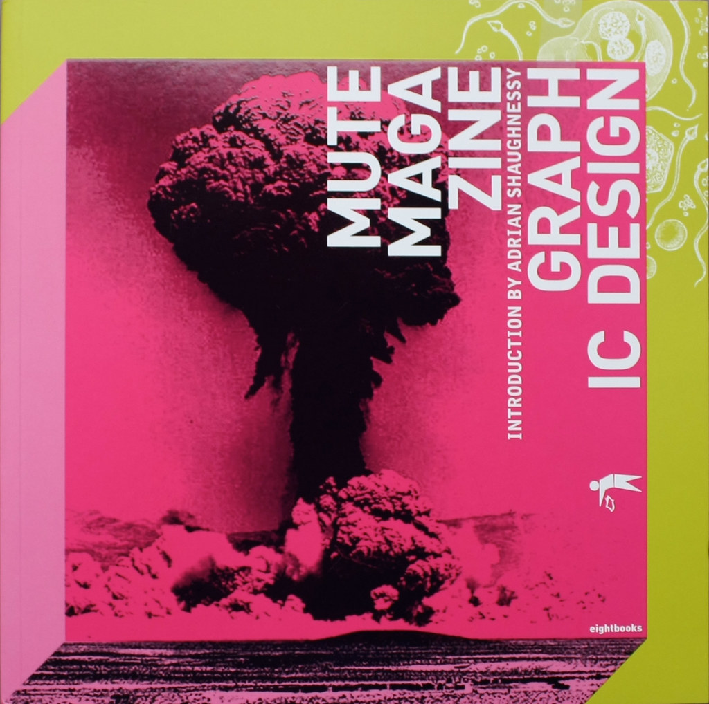
Top: Cover for Mute Magazine Graphic Design.
First published in Eye no. 68 vol. 17 2008
Eye is the world’s most beautiful and collectable graphic design journal, published quarterly for professional designers, students and anyone interested in critical, informed writing about graphic design and visual culture. It is available from all good design bookshops and online at the Eye shop, where you can buy subscriptions and single issues.